Want easy access to Codex on your Home Screen?
Create a shortcut to it from ChatGPT.
1. Create an open app shortcut
2. Search ChatGPT
3. Select Open Codex
4. Rename it to Codex
5. Add to Home Screen
6. Set the icon to Codex logo
Beginner video: How to install & use Grok Build (made for non-technical SuperGrok and X Premium+ users)
I got so many questions from friends, so I made this simple step-by-step guide.
You’ll see exactly how to:
• Install Grok Build in seconds with one command
• Create real websites
• Use Grok Imagine to auto-generate images & videos
• Run multiple projects at once in different folders
Grok even runs commands for you. No coding experience needed.
Watch the full walkthrough 👇
Codex and Claude Code are now being used for marketing and content creation.
Here are 7 Skills / Plugins I use daily for marketing inside Codex to grow to over 1.5M followers across all platforms.
00:00 Intro
05:59 Skill 1 - YouTube Researcher (Grounding)
11:43 Skill 2 - 2nd Brain
17:54 Skill 3 - Diagrams
19:29 Using Sub Agents
22:11 Skill 4 - Design Power Tool
27:10 Skill 5 - Remotion & Hyperframes
35:12 Skill 6 - Gen Media (Mini App)
40:49 Skill 7 - Email Manager
45:38 Bonus - Social Media Manager
Build iOS and Mac APPS with Codex in 20 minutes.
This is my Codex GPT-5.5 workflow for shipping real apps.
Chapters
0:00 My Codex GPT-5.5 App Workflow
1:18 App Creator: Xcode Projects Without Setup
1:50 Building a Tea Timer App from Scratch
3:50 Imagegen Creates the First Screen
5:07 Scaffolding the App with App Creator
6:31 The 20-Minute Tea Timer Result
7:26 From Tea Timer Demo to Real App Work
7:53 App Store Reviews → Feature Direction
8:33 Super Easy Timer Color Experiment
9:10 The Full Screen Timer Problem
10:32 Prompting Codex for the Fix
11:17 Steering GPT-5.5 Through UI Changes
11:49 First Full Screen Test
15:17 Fixing Bugs with Screenshots
18:25 What Actually Worked
Watch the video on YouTube: https://t.co/B1TpUPa5Ec
Easiest way to find iOS app ideas to build:
1. Go to TikTok
2. In the search bar, type “Creator Search Insights”
3. Filter by trending topics
4. Find hooks and high-performing content ideas instantly
5. Re-check low-competition keywords on Astro
6. Then check if similar apps are generating revenue on Sensor Tower
What if workouts were generated like this?
Built a dumbbell routine as a motion sheet with GPT Image 2
Then turned it into a video with Seedance 2.0
I tested 4 exercises in 15s, it works, but 2–3 exercises would probably give the best output.
Motion sheet:
Monochrome grayscale technical illustration, biomechanically accurate fitness instruction sheet, clean 3D anatomical character, scientific diagram aesthetic, minimalistic, no artistic exaggeration
2x4 grid layout (8 panels total), perfectly aligned cells, equal spacing, thin black borders, numbered from 1 to 8
Neutral athletic human body (gender-neutral), proportional anatomy, consistent character across all panels
Dumbbell workout sequence (key positions only):
1. Dumbbell curl (start position)
2. Dumbbell curl (top contraction)
3. Shoulder press (start at shoulder level)
4. Shoulder press (overhead lockout)
5. Dumbbell lateral raise (arms down)
6. Lateral raise (arms at shoulder height)
7. Dumbbell squat (standing start)
8. Squat (bottom position)
Top-left: bold number + exercise name (English)
Center: full-body pose (clear joint positions)
Bottom-left: short technical explanation (2–3 lines, correct form cues)
Overlay: directional arrows showing movement path (up/down/arc)
Correct joint alignment, neutral spine, proper elbow and knee positioning, realistic weight distribution, no exaggerated motion
Highly detailed grayscale shading, soft studio lighting, subtle shadows, clean linework, medical / sports science diagram quality
Pure white background
No colors, no background environment, no extra elements, no stylization, no blur
Household chores created using a movement sheet as reference to animate the entire scene using ChatGPT Image 2.0 and Seedance 2.0 on @yapper_so
GPT Image 2 Prompt;
[VISUAL STYLE]
Monochrome grayscale composition featuring a highly detailed 3D-rendered female character. Designed like a professional instructional guide with a technical, diagram-inspired layout. Clean white background, soft studio lighting, and strong contrast to highlight posture, actions, and object interaction.
[GRID LAYOUT]
Structured 4×4 panel grid (16 frames total), evenly spaced with thin black divider lines. Each panel is identical in size and clearly numbered from 1 to 16, showing a continuous sequence of household activities.
[CHARACTER]
Use the provided reference image for the face and overall likeness.
Same facial features, skin tone, and proportions
Natural makeup, soft expression
Consistent identity across all 16 panels
Realistic proportions and clean hairstyle (loose or tied back)
[WARDROBE]
Modern, modest casual outfit:
Fitted crop top (not revealing, clean neckline, practical for movement)
High-waisted straight or slightly wide-leg jeans (full length, neat fit)
Optional minimal sneakers or barefoot indoor styling
Fabric should react naturally to movement (subtle folds and tension)
[SCENE APPROACH]
Minimal, clean environment per panel — only essential props related to the chore.
No clutter, no complex backgrounds — focus stays on the subject and action.
[PANEL STRUCTURE – EACH FRAME]
Top-left: Step number + task title (e.g., “Step 4 – Vacuum Floor”)
Center: Full-body pose performing the chore
Bottom-left: 3–4 concise instruction lines
Overlay: Motion arrows and directional guides showing action flow
[CHORE SEQUENCE EXAMPLES]
Make the Bed
Tidy Up Room
Dust Surfaces
Vacuum Floor
Sweep Floor
Mop Floor
Do Laundry
Hang Clothes
Fold Clothes
Clean Kitchen Counter
Wash Dishes
Take Out Trash
Water Plants
Clean Bathroom
Organize Shelves
Final Room Reset
[MOTION INDICATORS]
Curved arrows → fluid actions (wiping, folding)
Straight arrows → directional movement
Circular arrows → repetitive motions (scrubbing, mopping)
[RENDER QUALITY]
High-detail sculpted 3D style with smooth grayscale shading, soft shadows, and clean linework. Polished, concept-art level finish with clarity in every pose and object interaction.
[RESTRICTIONS]
No color, no unnecessary background detail, no extra characters, no revealing clothing, no clutter — only the subject, props, and instructional elements.
Just recorded a full breakdown of my AI B-Roll process
in this video i cover:
- what i use to prompt each scene
- fully trasnparent look at my iteration process
- different style keywords (ready to be copy & pasted)
- the trick to make AI footage look real
comment 'PROCESS' + RT and i'll send it over (must be following so i can dm)
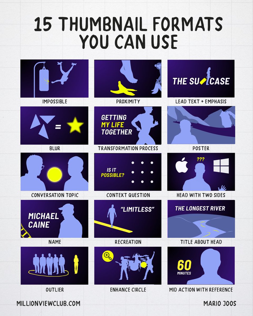
15 Thumbnail formats you can use this year.
Thumbnails are extremely important for grabbing someone’s attention. However, it’s not always easy to know where to start. That’s why I’ve put together another list of 15 thumbnail formats you can use. These are common compositions used for content that gets a lot of views.
1. The “Impossible”
In this thumbnail composition, we showcase something that is seemingly impossible to achieve. It could be a situation that isn’t realistic or someone taking an impossible trajectory. The power of this thumbnail sits in its ability to evoke questions in the mind of a viewer.
2. Proximity
Conflict is always a great means to grab attention. To make this composition work, you simple need to have two subjects that are about to interact with each other, where one object could be damaged by the other in a way that evokes a shared emotion. For example, having a foot close to something sharp.
3. Lead text + Emphasis
This composition is actually not as common because it requires people to think beyond your typical ways of dealing with text. In this case, we’re using the letters of text as a restraint for imagery. This composition can work well for longer videos, or channels that have in-depth topic discussions.
4. The “Blur”
While blurring is typically seen as a styling choice more than a format, when it takes priority in the thumbnail, I believe it’s fair to look at it as a composition. Especially when the blurred image is put in the center of the thumbnail and blurred out. Note that blur should never hide all detail. The goal is to still be revealing enough where the viewer can start guessing, but can never be truly sure.
5. Transformation process
The transformation process format is different from the two-panel transformation composition in the way that we’re showcasing ourselves performing an action that clearly indicates that we’re in the process of transforming. Often accompanied with text to clarify what happens, it’s a great thumbnail variation when you’re already having a two-panel in your A/B test.
6. Poster
The poster is a composition that focuses on a stylized snapshot of something that happens, or any composition where the “aesthetic” takes priority over anything else. The power of this format is to stand out in “how good it looks”, however, the downside about this one is that it typically lacks the “authentic feel”. So it’s mostly a choice for bigger content pieces.
7. Conversation Topic
This is pretty much the most straight-forward format we have in this list. Two people, one on each side, with the subject they’ll talk about in the middle. It’s a very common composition for podcasts.
8. Context Question
In this format, you’ll find that the viewer is already being challenged to resolve a puzzle before even clicking on the video. This could evoke the desire to want to learn more about the puzzle, or to want to find the answer. It also highlights that this video is going to stimulate that intellectual itch people sometimes have. These formats can be used in many scenarios, even for reaction content.
9. Head with two sides
Another straight-forward composition. The main creator in the middle and a contrasting visual on each side. This helps with branding (familiarity with creator) while still using the two-panel layout that works very well.
10. Name
This composition, mostly used by late night shows, is a composition that puts focus on the name of a famous person as a means to grab attention through relevance for that viewer. Often, the name then goes together with the face or character behind the name to double down on them. This is a great thumbnail format if the video itself isn’t that special, but the guest will grab attention. It does rely heavily on the channel’s recognizability though, which is why you’ll often see more elements consistent with other thumbnails on that channel.
11. Recreation
In the recreation thumbnail, we take something that the viewer is very familiar with. For example, a board game, a show, or even a person. Then we show that subject recreated in a setting where you typically wouldn’t see it. This evokes a lot of excitement around seeing something people like in a new setting, which is great for interest.
12. Title about head
This thumbnail composition is a simple composition where you have an image and then a title for that image. Typically, it works best to highlight what makes the image so special. This is why I added “the longest river” as an example. It gives the viewer a taste for what they’ll see and why it’s interesting.
13. Outlier
Humans are drawn toward things that stand out or are different. They also like contrast or even uneven conflict. This composition plays on all of these elements. It puts focus towards a singled-out subject, it can evoke a sense of conflict and is extremely easy to interpret as the composition clearly guides the eye. One of my personal favorites because of its strength.
14. Enhancement circle
In this composition, we’re using a clear “zoomed-in” version, or “hidden reveal” within a circle to showcase something that isn’t clearly visible in the thumbnail. Very successful thumbnail to evoke a sense of curiosity through depth. You can move away from the circle and use different shapes, but the concept is simple. Enhance a particular part of the thumbnail.
15. Mid action with reference
A classic mid-action shot never fails to help the viewer feel like it’s a story in motion. But the mid-action often lacks reference that could evoke a stronger sense of interest. That’s why we’re often adding a logo reference, or even a name to help the viewer understand what the snapshot is from. The main difference between this one and the “name” one from earlier is what the text or logo focuses on. Is the focus on familiarity with the person, or is the focus on the action?
There are many compositions you can use, my advice is to experiment with many to see which works best for you.
These AI claymation ads are crushing it on Meta right now 🤯
Images, videos, voiceover, music, captions: all made entirely with AI.
Perfect for DTC brands and agencies who want ad creative that actually stands out in the Meta feed instead of blending in with every other UGC talking head and static image.
If you're running the same creative formats as everyone else — UGC, statics, carousels — and wondering why engagement keeps dropping and CPMs keep climbing...
Animated ads break the entire pattern:
→ They look like nothing else in the feed, so they stop the scroll
→ They work as paid ads on Meta AND organic content on TikTok, Reels, and Shorts
→ You can produce them in-house without hiring freelancers or booking a studio
→ One workflow covers claymation, Pixar, anime, Wes Anderson miniature, retro cartoon, synthwave, and hyperrealistic CGI
The workflow uses Claude for all the creative assets, Nano Banana Pro for image generation, Kling 3.0 for animation, Gemini to rewrite the voiceover to match the footage, ElevenLabs for voice, Suno for music, and CapCut for the final edit.
Eight steps, one finished ad.
I'm giving away every single prompt I used to create this video for free.
Want all the prompts?
> Like this post
> Comment "CLAY"
And I'll send them over (must be following so I can DM)
Dreamina Seedance 2.0 is coming soon to the US, and it will CHANGE YOUR LIFE if you learn to master it.
BUT there's a secret trick to making films FAST.
Let me show you my entire framework for making this AI on the Lot ad in 7 simple steps🧵👇


![john_my07's tweet photo. Household chores created using a movement sheet as reference to animate the entire scene using ChatGPT Image 2.0 and Seedance 2.0 on @yapper_so
GPT Image 2 Prompt;
[VISUAL STYLE]
Monochrome grayscale composition featuring a highly detailed 3D-rendered female character. Designed like a professional instructional guide with a technical, diagram-inspired layout. Clean white background, soft studio lighting, and strong contrast to highlight posture, actions, and object interaction.
[GRID LAYOUT]
Structured 4×4 panel grid (16 frames total), evenly spaced with thin black divider lines. Each panel is identical in size and clearly numbered from 1 to 16, showing a continuous sequence of household activities.
[CHARACTER]
Use the provided reference image for the face and overall likeness.
Same facial features, skin tone, and proportions
Natural makeup, soft expression
Consistent identity across all 16 panels
Realistic proportions and clean hairstyle (loose or tied back)
[WARDROBE]
Modern, modest casual outfit:
Fitted crop top (not revealing, clean neckline, practical for movement)
High-waisted straight or slightly wide-leg jeans (full length, neat fit)
Optional minimal sneakers or barefoot indoor styling
Fabric should react naturally to movement (subtle folds and tension)
[SCENE APPROACH]
Minimal, clean environment per panel — only essential props related to the chore.
No clutter, no complex backgrounds — focus stays on the subject and action.
[PANEL STRUCTURE – EACH FRAME]
Top-left: Step number + task title (e.g., “Step 4 – Vacuum Floor”)
Center: Full-body pose performing the chore
Bottom-left: 3–4 concise instruction lines
Overlay: Motion arrows and directional guides showing action flow
[CHORE SEQUENCE EXAMPLES]
Make the Bed
Tidy Up Room
Dust Surfaces
Vacuum Floor
Sweep Floor
Mop Floor
Do Laundry
Hang Clothes
Fold Clothes
Clean Kitchen Counter
Wash Dishes
Take Out Trash
Water Plants
Clean Bathroom
Organize Shelves
Final Room Reset
[MOTION INDICATORS]
Curved arrows → fluid actions (wiping, folding)
Straight arrows → directional movement
Circular arrows → repetitive motions (scrubbing, mopping)
[RENDER QUALITY]
High-detail sculpted 3D style with smooth grayscale shading, soft shadows, and clean linework. Polished, concept-art level finish with clarity in every pose and object interaction.
[RESTRICTIONS]
No color, no unnecessary background detail, no extra characters, no revealing clothing, no clutter — only the subject, props, and instructional elements.](https://pbs.twimg.com/media/HG7QEy4bgAMy6D-.jpg)


