I’m Pouya — the designer behind Pouya Graphics.
I’ve worked across gaming, creators, and even the early web3 era, building visuals, websites, and brand systems for teams that needed clarity and intention.
Most thumbnails fail because they try to communicate five ideas at once.
The viewer only has room for one.
If you can’t describe your thumbnail’s idea in a single sentence, the viewer won’t understand it in a single glance.
Visual weight matters more than detail.
A simple shape with strong contrast will always pull the eye faster than a detailed object with weak contrast.
That’s why good thumbnails feel “clean” even when they’re full of information.
A creator’s visual identity isn’t built from a logo or a banner.
It’s built from consistency — the same shapes, the same colors, the same emotional tone repeated across every thumbnail.
Consistency is what makes a channel feel intentional.
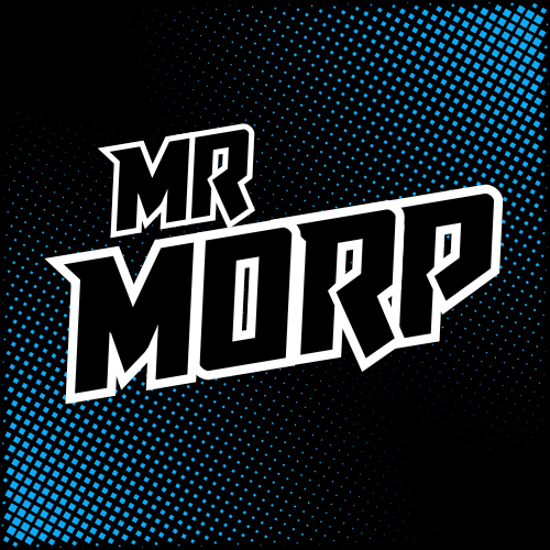
Full branding package for Mr Morp.
The goal was clarity, personality, and a visual identity that works across thumbnails, banners, and stream assets.
A strong brand makes every thumbnail easier.
Here's a link to his channel:
https://t.co/xCRd7Toglb
Creator branding isn’t just a logo — it’s a system.
This set works because:
• consistent shapes
• clean color hierarchy
• a recognizable silhouette
• a banner that reinforces the identity
Cohesion is what makes a channel feel intentional.
@MictyanEXE - My own gaming channel
Design is a language.
Most people try to speak it with decoration.
But the real fluency comes from hierarchy, contrast, and intention.
That’s what makes visuals feel premium.
Creator thumbnails don’t need to be complex — they need to be clear.
This one works because:
• strong icon hierarchy
• clean left‑to‑right flow
• one simple idea (“free & simple workflow”)
• bold shapes that read instantly
Clarity is what makes a thumbnail feel premium.
I used to design websites in the early web3 era.
It taught me a lot — but it wasn’t the work that made me feel anything.
Thumbnails and branding do.
They’re fast, emotional, and brutally honest. You know instantly if they work.
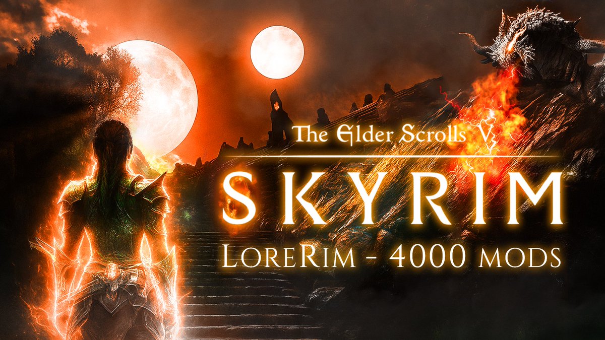
Cinematic thumbnails rely on atmosphere as much as composition
This one hits because:
• strong foreground silhouette
• atmospheric depth
• warm vs cool contrast
• a sense of scale that feels like a movie poster
When the atmosphere tells a story, the click becomes instinctive
The 3‑second rule is dead.
On YouTube, you don’t get 3 seconds — you get 0.3.
That’s why thumbnails need emotion, contrast, and a single idea. Anything more is noise.
Creator thumbnails don’t need to be loud — they need to be clear.
This one works because:
• Strong message hierarchy
• Clean left–right structure
• High‑contrast focal point
• A single, memorable idea
Clarity beats clutter every time.