Prototype of the home & chat screen for WHISPR messaging app.
✅FAB content
✅Menu dropdown
✅Typing indicator
✅Voice note indicator
✅Emoji reactions
Really wanted to achieve X kinda FAB interaction, where the main screen becomes blurred.
Would love to hear your thoughts🤭
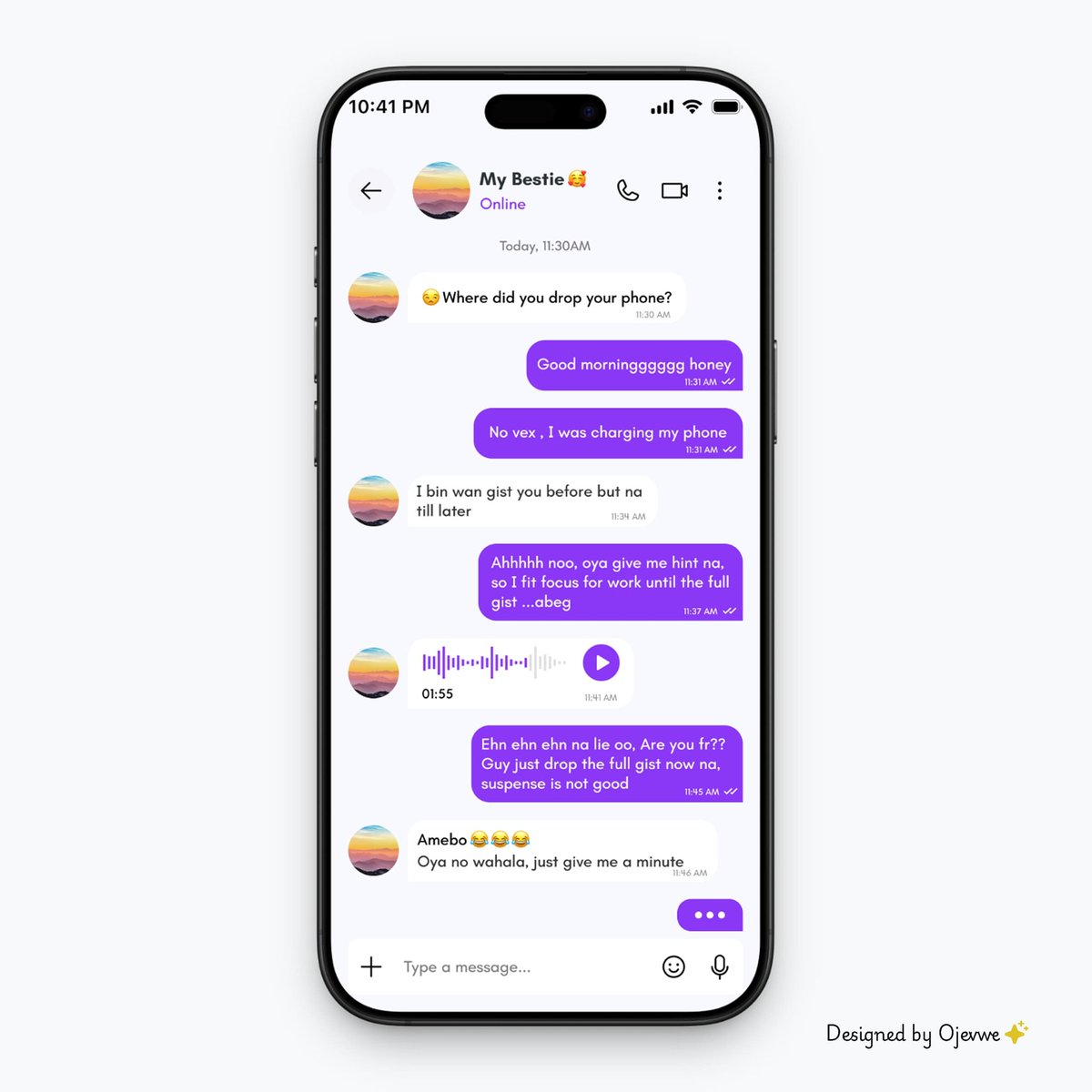
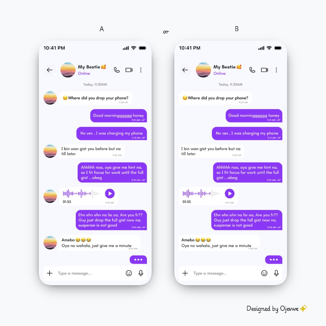
Designed a 1 on 1 chat screen for WHISPR.
Clean UI. Clear message flow.
Would you enjoy chatting on a screen like this?
And which layout feels better, A (with user avatar) or B (without user avatar)?
#uiuxdesign#ProductDesign
Designed a 1 on 1 chat screen for WHISPR.
Clean UI. Clear message flow.
Would you enjoy chatting on a screen like this?
And which layout feels better, A (with user avatar) or B (without user avatar)?
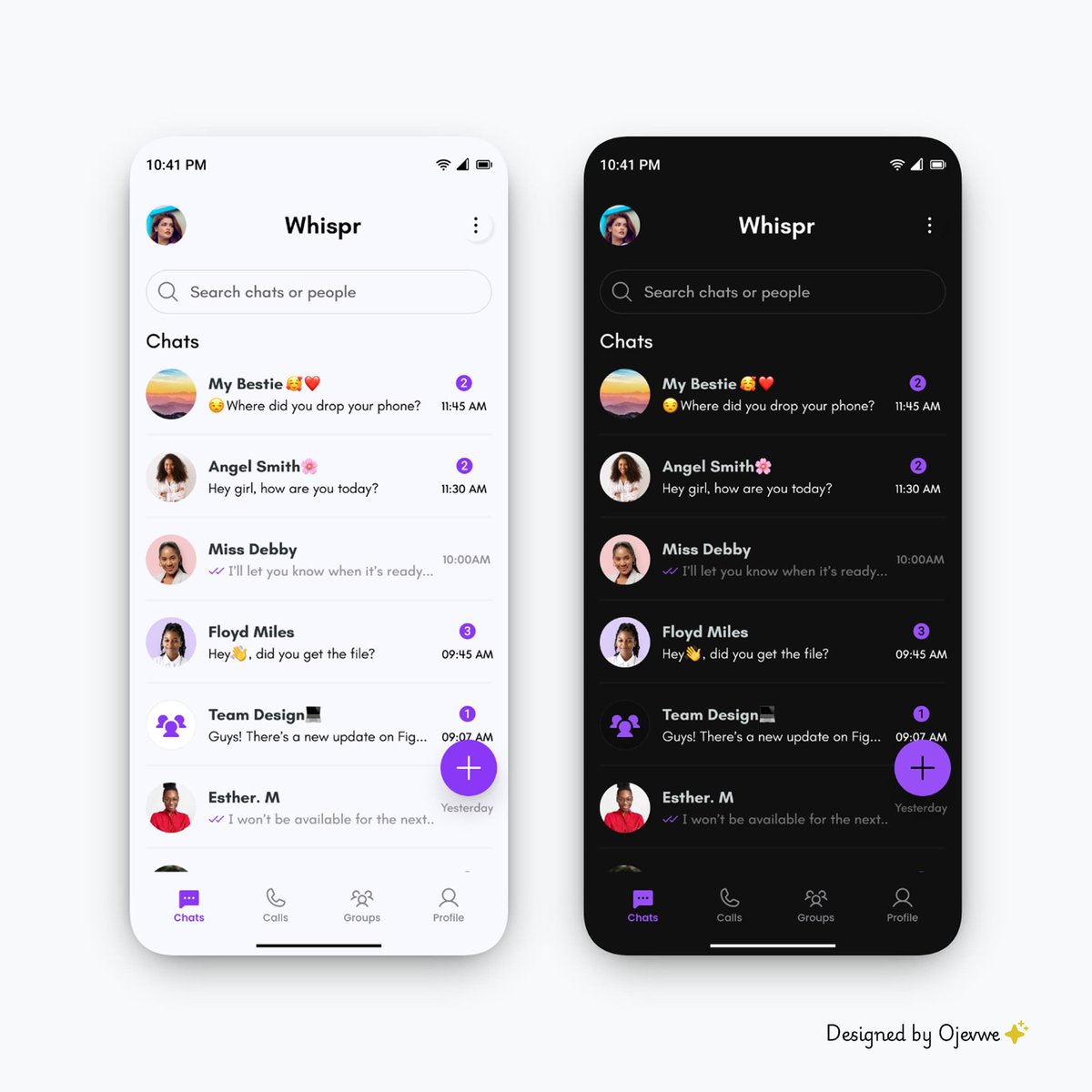
Just designed a clean minimal home screen for WHISPR,a messaging app.
Clear hierarchy and a layout built for quick conversations.
💭If you opened an app and saw this, how would it feel to you?
#uiux#ProductDesign
Designed a 1 on 1 chat screen for WHISPR.
Clean UI. Clear message flow.
Would you enjoy chatting on a screen like this?
And which layout feels better, A (with user avatar) or B (without user avatar)?
#uiuxdesign#ProductDesign
Just designed a clean minimal home screen for WHISPR,a messaging app.
Clear hierarchy and a layout built for quick conversations.
💭If you opened an app and saw this, how would it feel to you?
#uiux#ProductDesign
Just designed a clean minimal home screen for WHISPR,a messaging app.
Clear hierarchy and a layout built for quick conversations.
💭If you opened an app and saw this, how would it feel to you?
#uiux#ProductDesign
Just designed a clean minimal home screen for WHISPR,a messaging app.
Clear hierarchy and a layout built for quick conversations.
💭If you opened an app and saw this, how would it feel to you?
#uiux#ProductDesign