Day 30 Design Challenge — The Final Stretch 🥹
Grateful for my coach @TheEmma101, my fellow designers, followers & supporters who made this journey inspiring & impactful @odinakaleon@deradesign17,
For the growth, the lessons, and the creative fire— onward and upward, Cheers 🥂
Day 29 Design Challenge — Built for the Big Night ⚽🔥
Electric blues and fiery reds set the stage for rivalry, passion, & pride.
Warm gold tones add prestige, sharp contrasts heighten the tension before kickoff.
This match-day design is all about anticipation, energy, & thrill
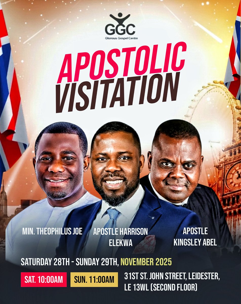
Day 28 Design Challenge — Designing with Intention✨
Rich wine tones and warm gold lighting reflect growth, confidence, & quiet power.
This birthday design celebrates evolution — poised, bold, and stepping fully into her light.
Another year. Another level. ✨
2 more days to go🥹
Day 26 Design Challenge
Soft whites and gentle lavender hues to express purity.
The clean tones reflect new beginnings, the radiant glow celebrates growth, self-belief, & inner beauty.
A design that doesn’t just mark a birthday,but honors presence, purpose, & personal elegance💜
Day 27 Design Challenge
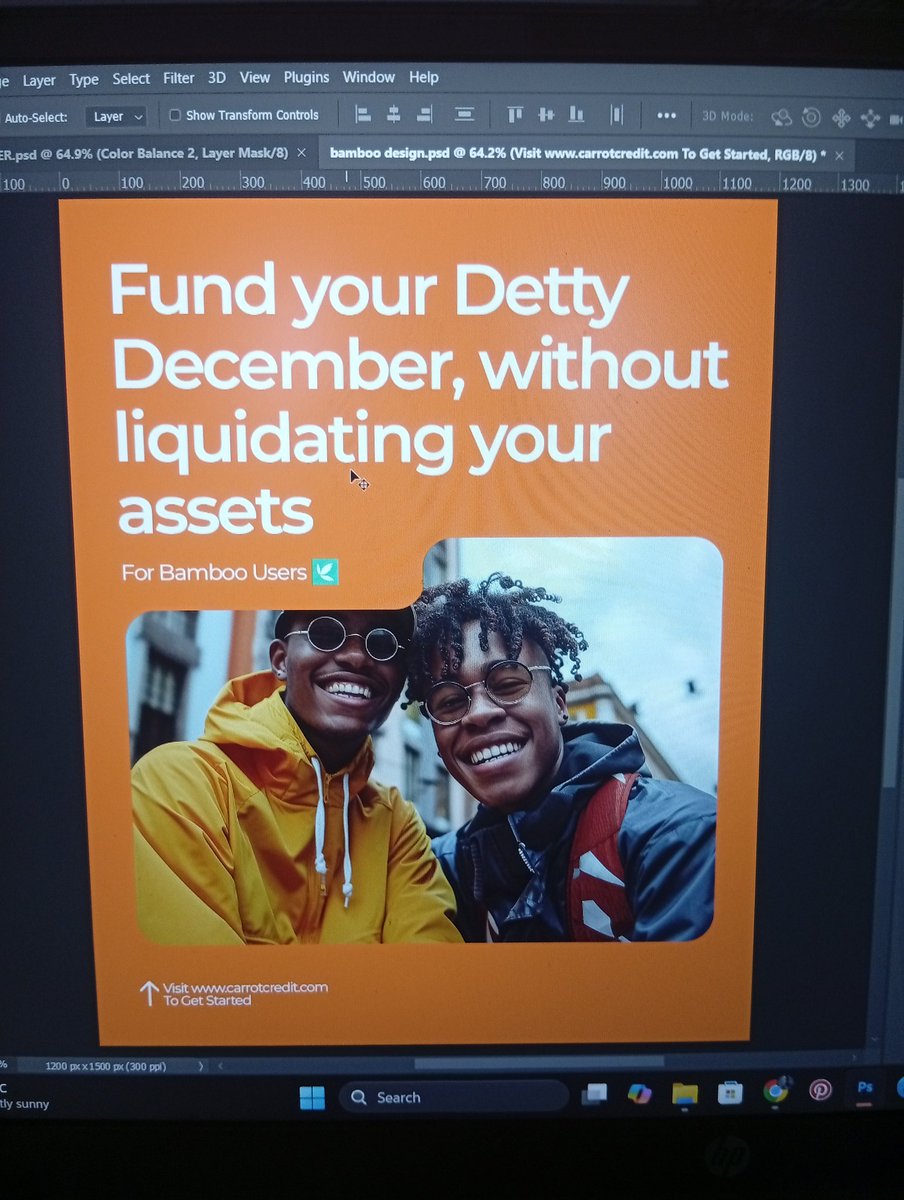
This crossover service design uses clean whites for clarity, green for new beginnings, and bold orange for transition and fire 🔥
Every element points to movement, expectation, and a shift into the new year.
Simple. Directional. Spirit-focused.
Cheers 🥂
Day 24 Design Challenge — turning moments into meaningful visuals
Warm brown tones symbolize stability, elegance & maturity —perfect for celebrating growth & grace.
Soft golden highlights represent joy & value.
This birthday flyer is designed to honor presence, beauty & purpose.
Day 23 of my Design Challenge — designing visuals that stir prayer and power.
Vibrant greens for growth & renewal, bold blues for faith & stability,
Warm golds to reflect fire, authority,& divine presence ✨
This design brings unity, leadership, and the sound of revival together.
Day 26 Design Challenge ✨
Sorry for late post 🥲
Apostolic Healing flyer — where green tones speak life, renewal, and hope, and gold accents reflect divine power and authority.
Designed to communicate faith, restoration, and expectation.
Clean. Purposeful. Spirit-led. 💚✨
Day 22 of my Design Challenge
Golden hues to reflect glory, authority, and divine presence.
Radiant light symbolizes heaven touching earth in power.
This design speaks of strength released and lives transformed.
Sorry for the late post. Cheers to more stunning designs 🥂
Day 21 of my Design Challenge 🚀
Hot pink energy that screams bold, fun, and confidence.
Clean whites for clarity, trust, & a smooth shopping vibe.
This design blends excitement with tech — making upgrades feel irresistible.
It's almost a wrap, cheers to more beautiful works🤭🥂
Day 20 of my Design Challenge — elevating faith through powerful visuals
Deep blues set the atmosphere for reverence, depth, and divine encounter
Bright accents ignite unity, passion, and the fire of revival.
This design captures worship, leadership, and a call to be renewed.
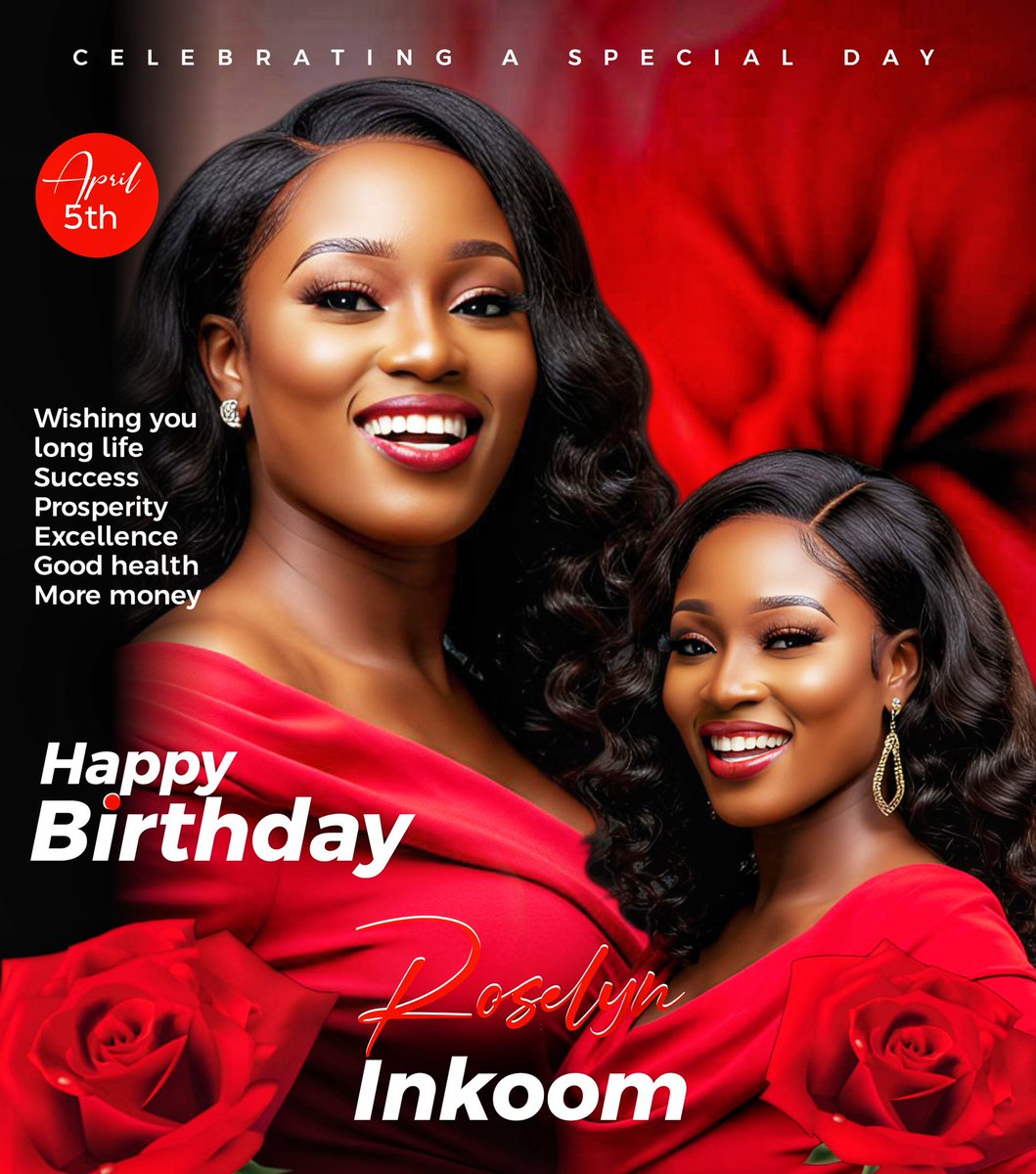
Day 19 of my Design Challenge — designing with emotion 🎉🌹
Rich red tones to symbolize love, elegance, & celebration.
This design captures beauty, grace, and a moment worth honoring.
Created to celebrate life, success, and special milestones.
Cheers to more stunning designs 🥂
Day 18 of my Design Challenge — creating with heart 🤍🔥
Bold orange tones to express energy, joy, and gratitude.
Clean whites for clarity, balance, & sincerity.
This design is a simple thank you to everyone on this journey.
Cheers to community, creativity, and shared progress🥂