Most scope creep doesn’t start with a big request.
It’s a “quick question” at the end of an email. Something the client mentions on a call that nobody writes down. A Slack message you reacted to without fully reading.
Three weeks later, you’re on the fifth round of revisions, trying to remember when exactly you said yes to this. I’ve been there more times than I’d like to admit.
Most times it’s not even the client’s fault. Everything’s just spread across email, Slack, calls, and you’re the one expected to keep track of it all.
So with Pollen AI, it's very understandable what the brand is trying to solve.
Pollen connects to your email, Slack, and calls, keeps track of what was agreed, and lets you know when something changes.
It also shows you where it was said, so you’re not going back and forth digging through threads.
For the brand, we leaned into the name. Pollen moves from flower to flower, the same way the product pulls context from different places.
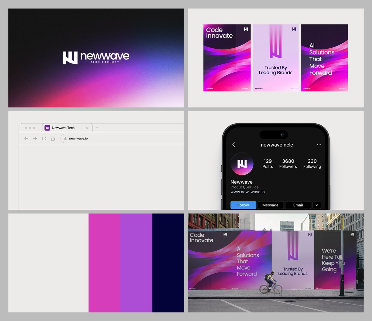
Here’s a look at the brand.
Expect more from us @Quaevstudios : )
This is exactly the direction or expression we wanted one to experience when you look at Pollen.
When it comes to branding, first, the right imagery plays a big role, but it doesn't end there.
We always consider what feeling we want to evoke with each project we work on.
For Pollen, we wanted one to feel the brand 'alive' on first impression, and here's a good example of the recent post I made about Pollen that did well.
Frame 1 shows the cards with their imagery bare. Have it in mind that we had to choose the right image in the first place. It had to be the kind of image you took a first look at and knew it felt right.
In Frame 2, we added blur effects (not a templated effect but one achieved with the help of AI). Each blur effect was tailored to the image; we wanted you to feel a movement looking at the cards, so we made each motion blur unique to the images.
Frame 3, we added dither and woven cloth effects (not together in a single card, but separate cards to add an uplift to the blur. We wanted the pollen's identity to have its personality. Now, it's not just the blur you notice with the brand, but the patterns you'll unconsciously take note of with the brand as you see more of it.
This is a glimpse into how we think @Quaevstudios
Yes, we play around. In fact, we play a lot when working on projects. It's fun to have fun.
Our goal is to deliver what would make your competitors wish they got that for themselves 😉
Dear founder,
Dare to have a brand that does the talking.
Dare to have an identity that can’t be forgotten.
Dare to have a brand that’s unapologetic to own its space.
Dare to work with us🫡
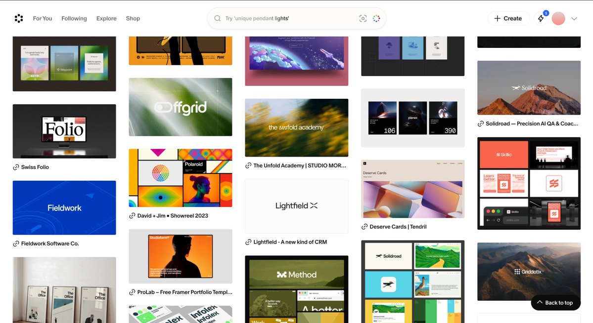
The last two weeks were a good reminder of what happens when you stop worrying about the noise and just keep sharing the work you actually care about.
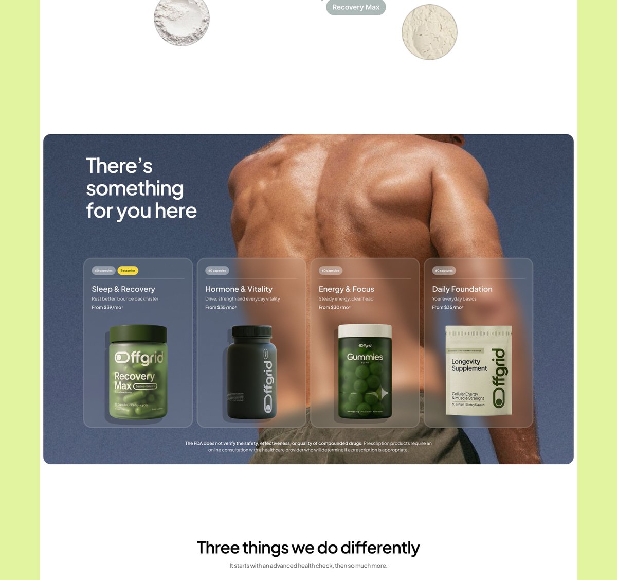
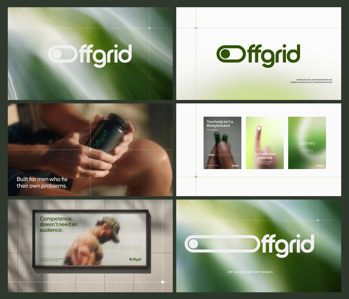
Finally got to put Offgrid out into the world, and the response alone made it worth building.
- Had a couple of calls booked
- Made some awesome connections off the back of this project
- Offgrid website is officially kicking off
And we're heading into 3d + motion.
Can't wait to see all that comes out of this :)
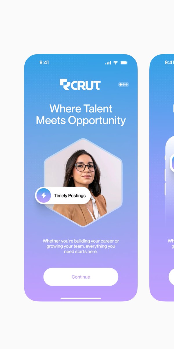
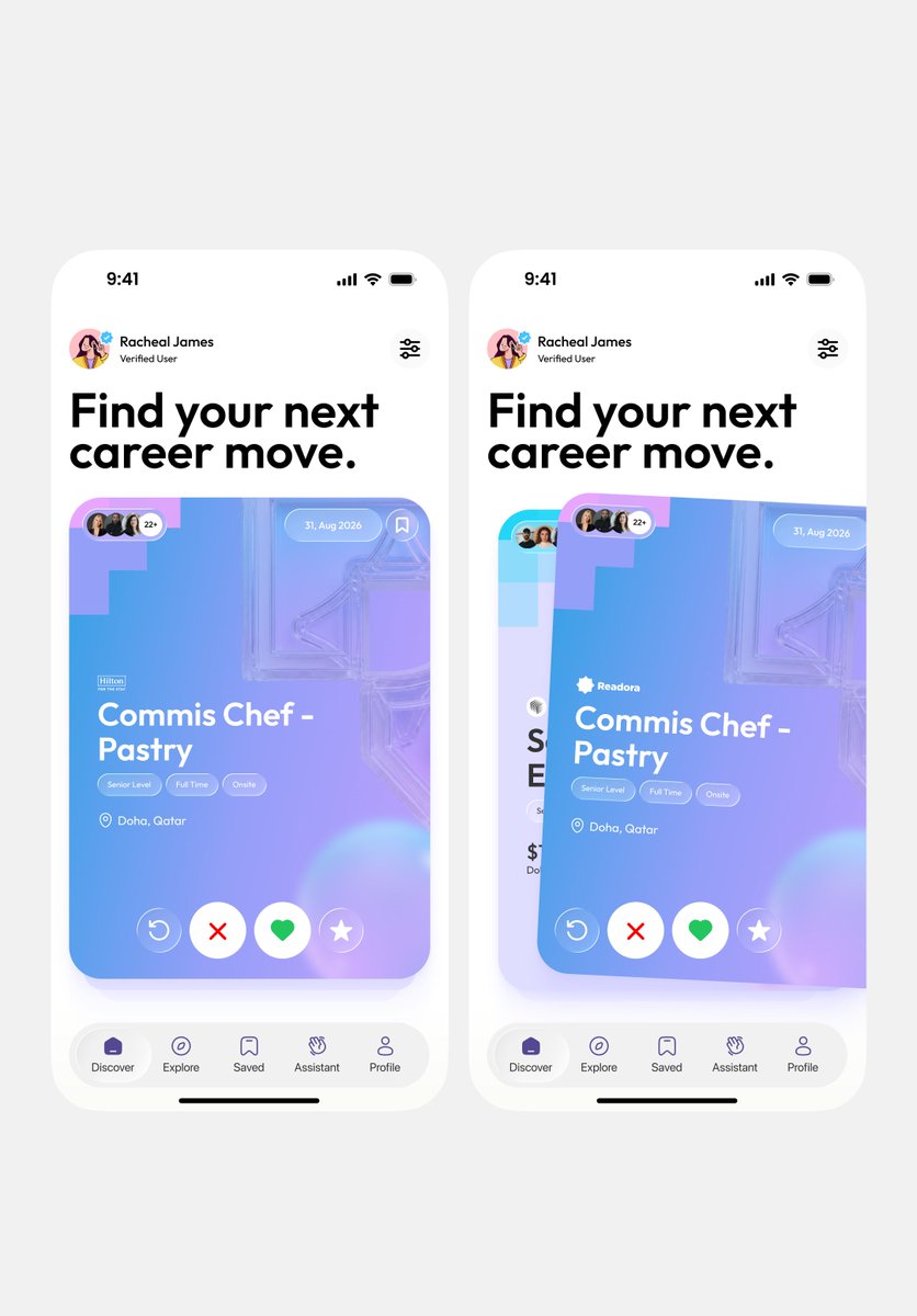
We redesigned Rcrut's website and brand identity, and it's live 🔥
Rcrut is AI-powered career support and job matching: pre-vetted talent for employers, real support for job seekers finding the right fit.
We redesigned the app too (still in progress), but since Rcrut's already live on the App Store, we brought the new app screens straight into the website redesign.
Live site here → https://t.co/T546Pbjmlw
Before → After