icons are one of the most underrated aspects of a design
next to fonts and colors, they set the tone of the entire vibe of your product and must standalone often without labels and still make sense
rounded? fun. squared? serious.
When creating art, human and AI are both impressionist. Key difference is human creating impressions based on real world, while AI creating impressions based on human’s impressions. #worldmodel#LLMs
the timeless George Carlin: "Smug, greedy, well-fed white people have invented a language to conceal their sins. Israeli murderers are called commandos. Arab commandos are called terrorists."
For 2023, we really want to get back to our roots of quality and craft, by fixing paper cuts like this.
@NotionHQ should stand for “high quality, useful software — for the many people”
In #China, CCP censors all online platforms and sometimes shuts down the internet in protest sites.
Protestors need safe and free internet access to circulate information, and the world needs to know the truth.
Should @elonmusk launch Starlink to support Chinese citizens now?
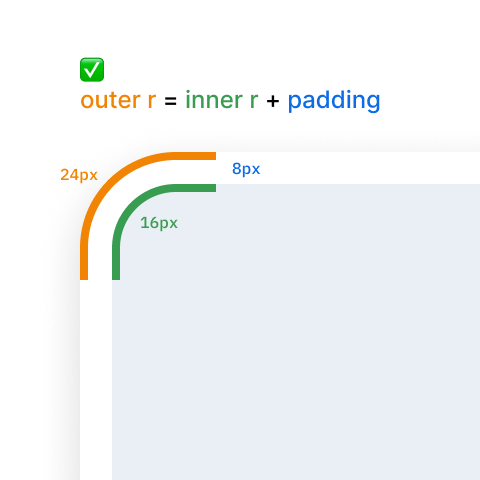
Tiny design detail: nested border radii look really funky if they're the same. To maintain the same curvature, the outer radius = inner radius + padding.
We always mimc each other. Aren’t the previous version the same? If you look at Revolute, Airbnb, Spotify. It’s not homogenization of tech logos. It’s homogenization of homogeneity.
SQUARESPACE: A visual (and wordplay) triumph.
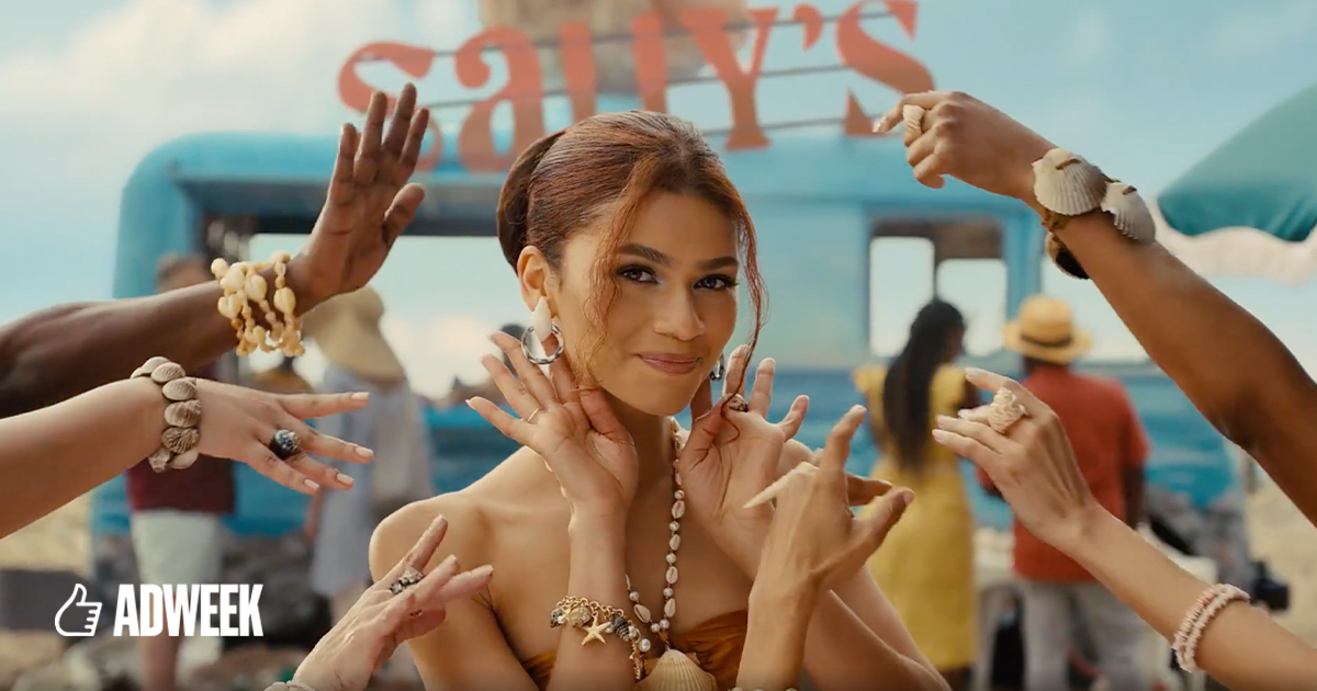
Stellar copywriting, Zendaya's enduring charisma, amplified by gorgeous cinematography—and topped with an Andre 3000 reveal at the end—make this an easy favorite. #BigGameReviews#SuperBowl
Design leaders who want to improve visual design in products should spend as much time advocating for better UI engineering practices as they spend focusing on practices within their team.
Quality of UI shouldn’t be dependent on a lottery of which engineer builds it.