🖨️ 🎫 NEW FONTS: The new RT DROMO Collection comes in a total of 16 fonts in 4 weights, freshly complemented with corresponding italic and monospace styles.
🖨️ 🎫 NEW SITE: Read more on https://t.co/30Ss65bVke
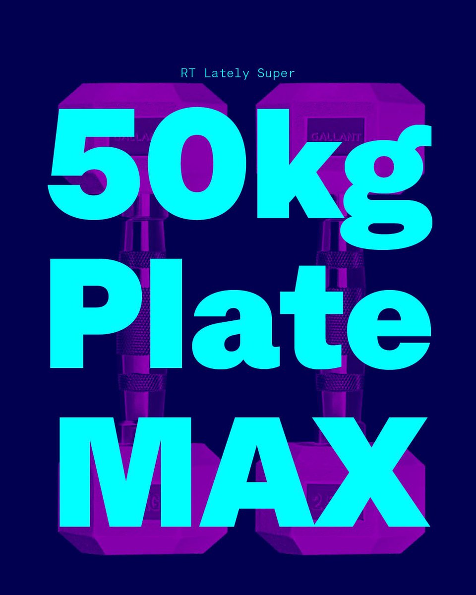
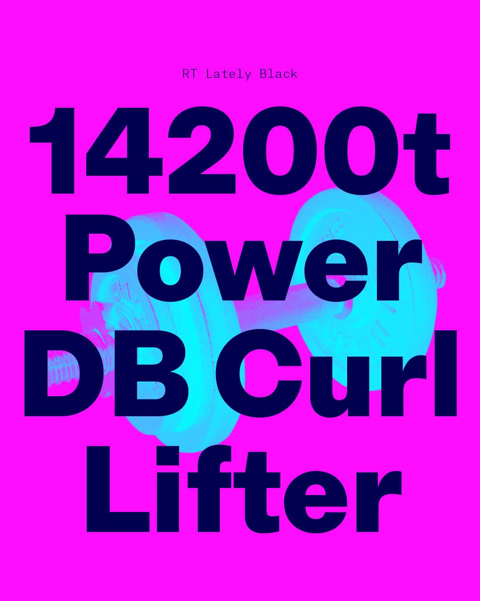
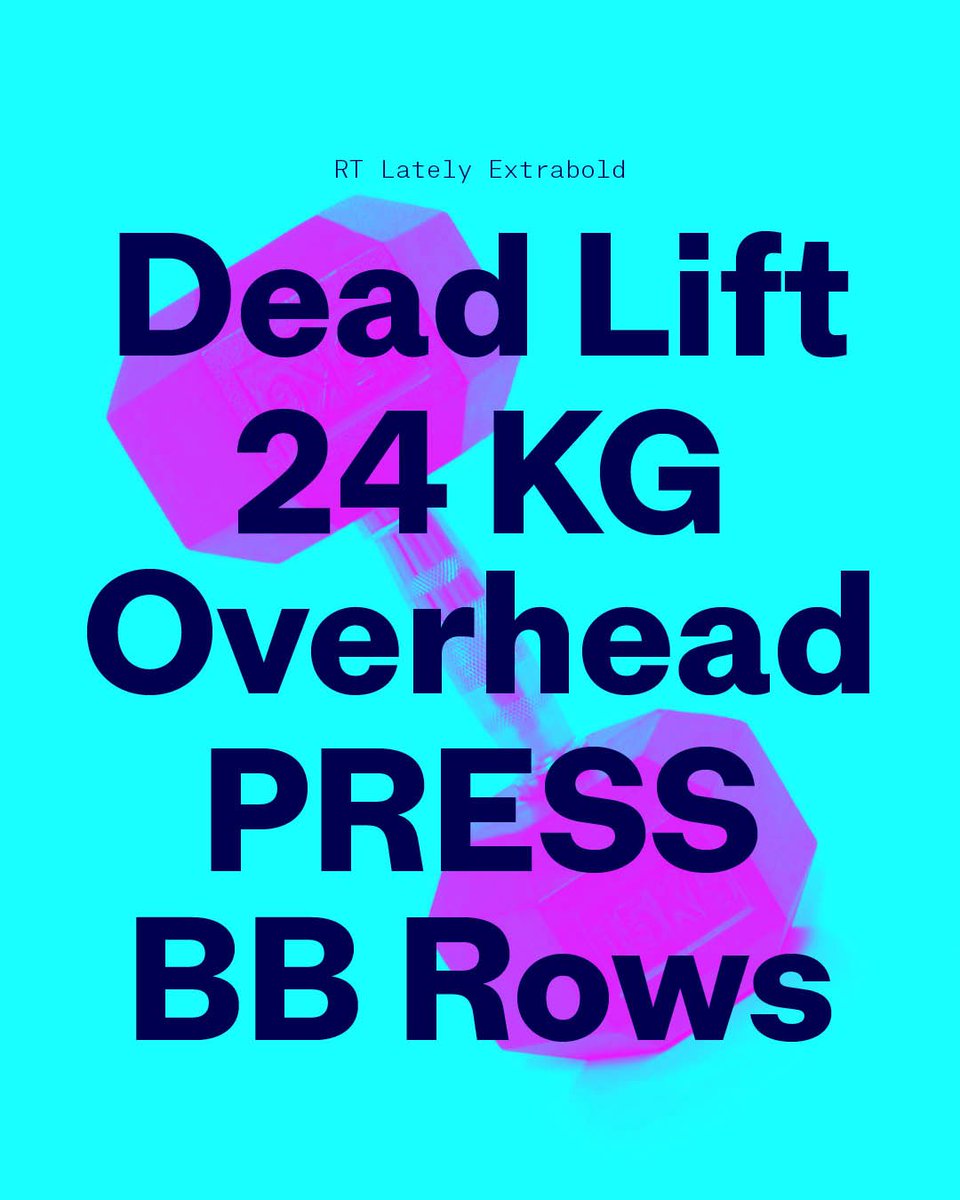
Bulking time for RT Lately too! 3 new weights were added: Extrabold, Black and Super including italics take RT Lately into the heavyweight class with now 14 fonts in total!
Read all about RT Lately here:
https://t.co/tE9Cc34EwH
Free test fonts here:
https://t.co/YL7WE5UBYB
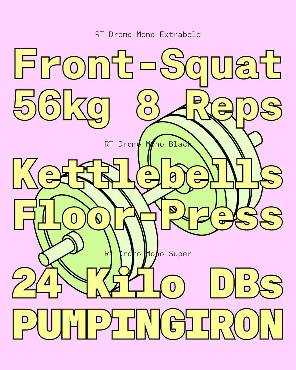
Get ready for a type bulk up! Your gym buddies RT Dromo and Mono have 3 new weights: Extrabold, Black and Super + italics make a total of 28 fonts in the Dromo Collection!
Read all about RT Dromo here:
https://t.co/30Ss65bVke
Free Test Fonts here:
https://t.co/mpi9NgQsRC
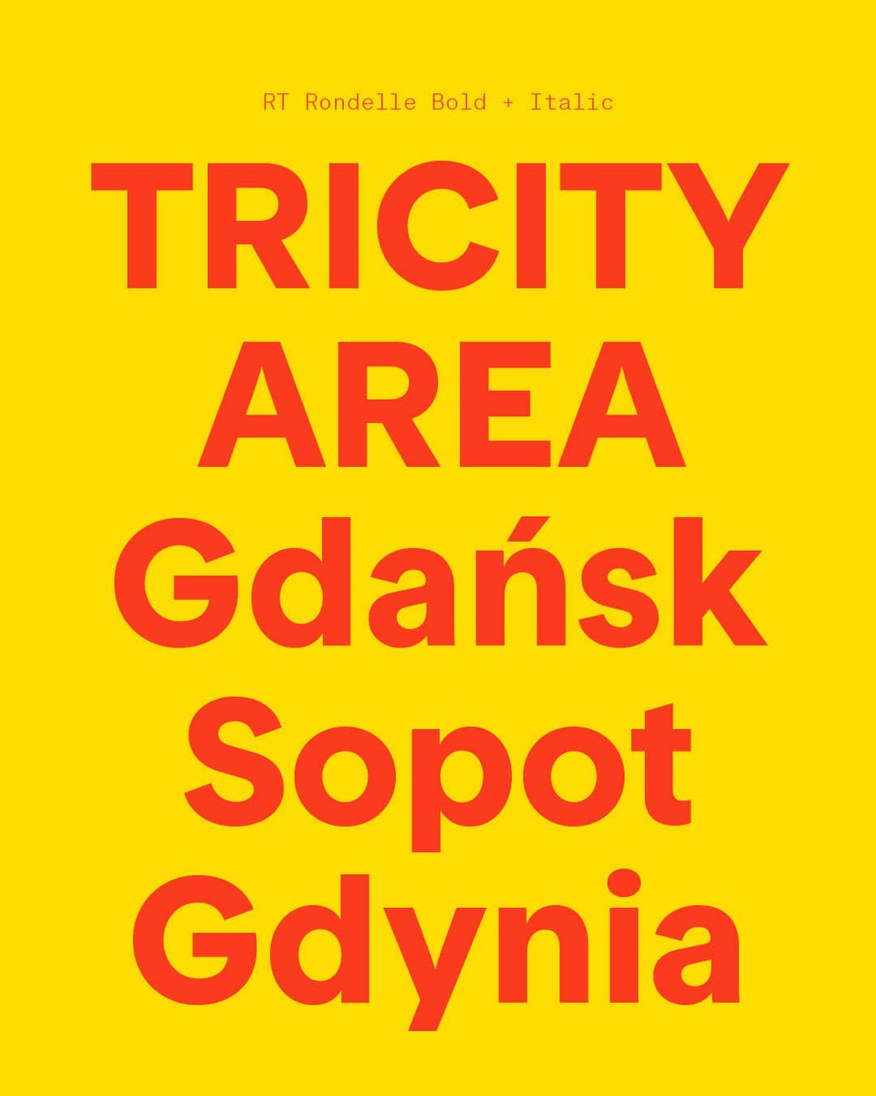
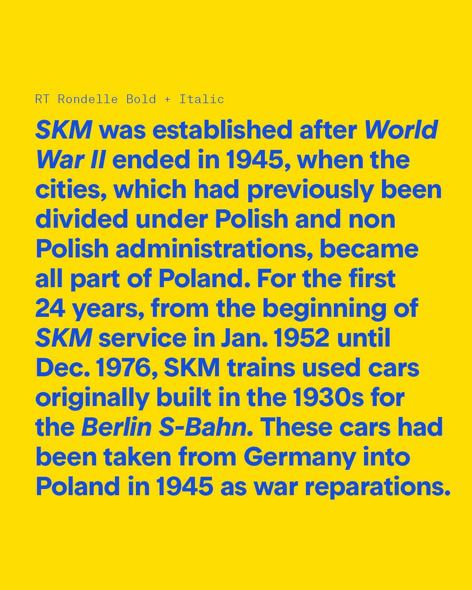
Today RT Rondelle pays tribute to the beautiful cars of the SKM line in the tricity area of Gdańsk, Sopot and Gdynia.
Read all about RT Rondelle's origin on https://t.co/T5l34ac2Az
Free test fonts available on https://t.co/mpi9NgPV24
#rtrondelle#razziatype
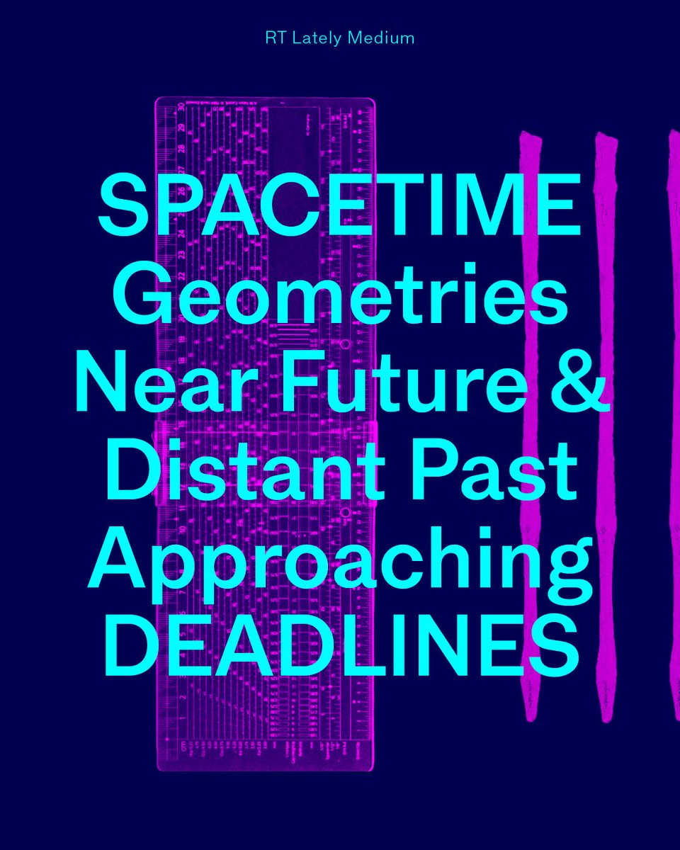
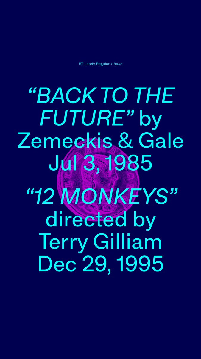
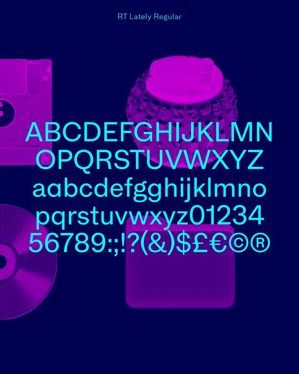
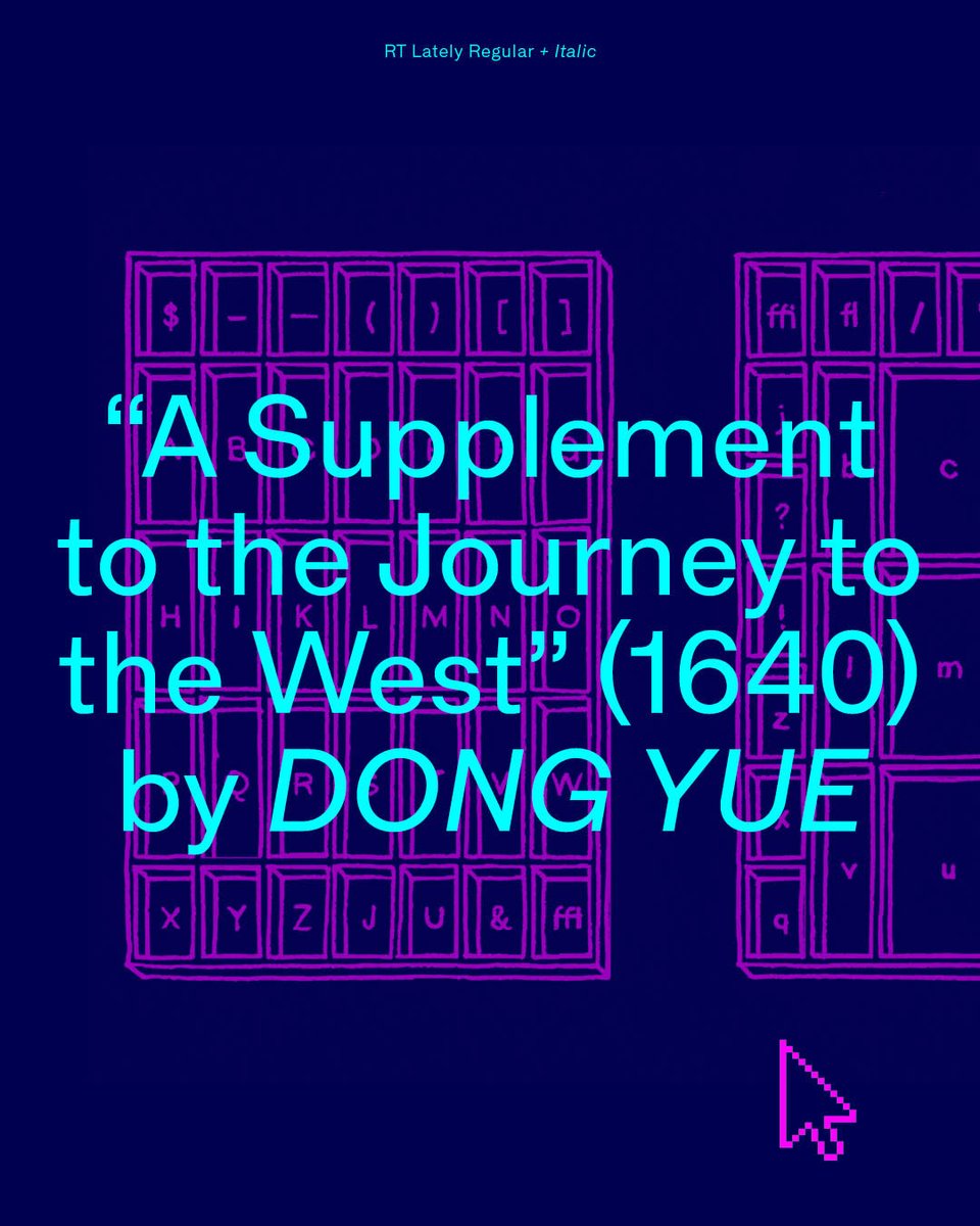
RT Lately is a sans serif from @RazziaType, inspired by the crude yet charming Times Gothic from a 1906 specimen. Developed over four years, it features deliberately heavier uppercase stems with less contrast than lowercase, a nod to early grotesque imperfections. The family includes four weights with italics, along with tabular figures, fractions, and circled numerals, making it a versatile option for contemporary applications.
Download free trial fonts from the link below ↓
Any recommenfations for good monochrome printers to proof typefaces? Quality of text print is basically the only thing I care about. My beloved Ricoh SP 4510 just retired.
RT Lately’s proportions are designed generously wide reinterpreting brutal geometry into softer and warmer shapes. It delivers a strong personality while at the same time guaranteeing the quality and functionality of each letter’s drawing.
https://t.co/tE9Cc34EwH
RT Lately’s vertical metrics nicely interact with the geometry of the design while the modest x-height leaves enough room for the ascenders to extend giving the typeface a graceful presence.
Read more on https://t.co/lyTwAUSBsB
RT Lately is a time-traveling witness to the evolution of gothics and recalls the memories of naive designs and timeless classics alike by morphing them into a contemporary sans.
Read more here: https://t.co/tE9Cc34EwH
Trigger warning if your a type designer: On the shoulders of giants... although not on Swiss ones this time... RT Lately coming next week 🔮⏰💜
#rtlately#razziatype
RT Dromo evolved from a custom font for the publication "Die Not hat ein Ende: The Swiss Art of Rock".
Read about RT Dromo's origin on https://t.co/YYx68yLTOa
Get your free test fonts on https://t.co/YL7WE5UBYB
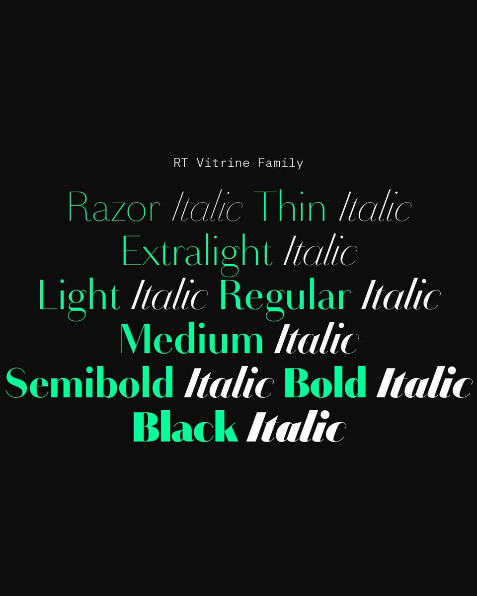
RT Vitrine is the show-off extraordinaire of my library. Caution: Reserved for display use only
Download free test fonts here: https://t.co/YL7WE5UBYB
Read about the orocess behind it here: https://t.co/dZaF88HSGx
#razziatype#rtvitrine