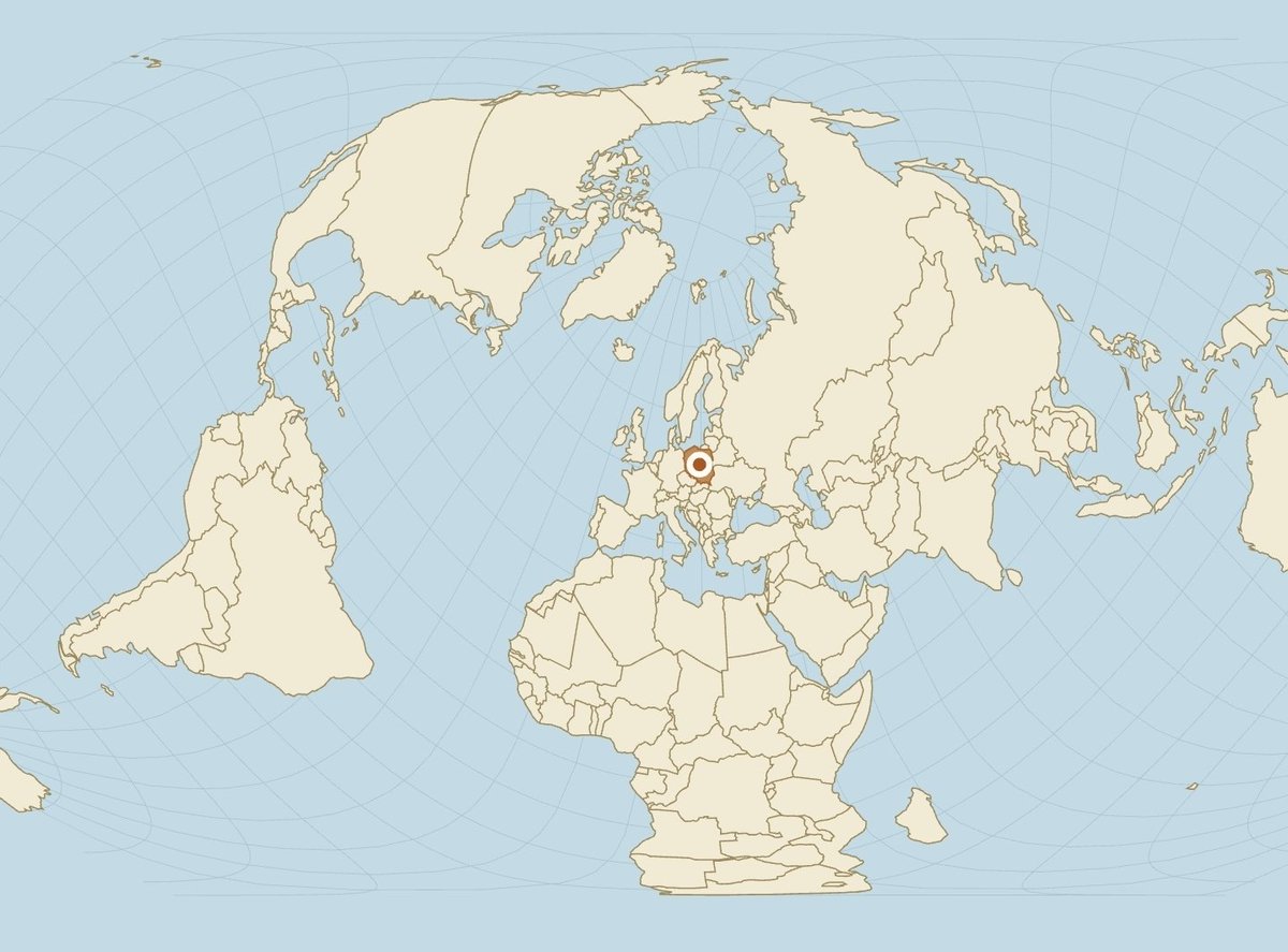
Europe according to Americans is basically ‘a few big blobs and some small ones we only remember when something explodes’.
You can kill that version instantly on https://t.co/lkgvGSwAaK park Poland, Ukraine or Turkey in the center, switch to Equal Earth or Mollweide, and watch the mental map collapse
A flat map always distorts something.
Area, shape, distance or direction: pick your poison.
On https://t.co/GGclFwisVp you can drop any country or US state onto 18 different projections and instantly see the trade-off.
Mercator for navigation. Equal Earth for honest sizes. Dymaxion for continuity. And more.
https://t.co/excDb6IelJ
The northern line looks longer because the map is stretching like cheap fabric. On Mercator that’s expected. On Equal Earth or Mollweide the same two lines suddenly tell a different story. Even better: park Africa dead center of the map and the ‘north is bigger’ illusion collapses. https://t.co/GGclFwisVp does the live switch across 18 projections and lets you drop any country in the middle (plus continental drift past + possible futures if you want to go full mad scientist). The lines are cute. The interactive version is meaner
https://t.co/excDb6IelJ
Greenland looks bigger than Africa on most maps.
It’s not. Africa is ~14× larger.
Most tools only let you drag countries on Mercator.
https://t.co/GGclFwisVp lets you do it on 18 projections Mercator, Equal Earth, Dymaxion, Spilhaus, Berghaus Star, Gall-Peters and more.
Switch projection, drag, and watch the trade-offs in real time.
https://t.co/XfhomuKLPQ
#MapProjections #TrueSize #Geography #EqualEarth
@TrueSizeOfMaps Russia as the single country between Norway and North Korea is the ultimate map trick. Center the map on Russia and you will see
https://t.co/vbOUcjjdZL