(2/2)
In order to create contrast and draw attention, a fifth colour was used. Red of course was the best choice being the polar opposite of blue.
To learn more about the different effects colours have on your brand, visit the link in our bio.
#branding#design#graphicdesign
(1/2)
Here we have a #doctor themed colour palette. This colour palette is suited for brands that are planning to enter the medical industry.
We used the classic blue and white colour scheme doctors are accustomed to as they re-enforce qualities of calm, intelligence and trust.
(2/2)
The more warmer colours draws attention subtly while still remaining friendly and engaging, while the blues and grays lay a solid foundation of trust and intelligence traits that all tech companies should have
#code#coding#design#webdev
(1/2)
For the up anrd coming #tech#startups this palette has all the creative ambition as well as cool programming aspects you could need
Using industry standard blues with a twist, this palette relies on sharp contrasts to create a fun, modern and colourful brand colour scheme
(2/2)
This is the perfect combo for the setting and atmosphere of a buzzing cafe.
Add calming and relaxing blues to the mix and the vibe will accomodate to soothe and keep your clientele in a good mood.
#designthinking#design
(1/2)
#wakeupandsmellthecoffee
Grab our #cafe themed colour palette above to give your brand a modern savoury feel and look.
The variations in brown hues help to stimulate the appetite while also creating an air of familiarity that is also homely.
#coffeelovers#graphicdesign
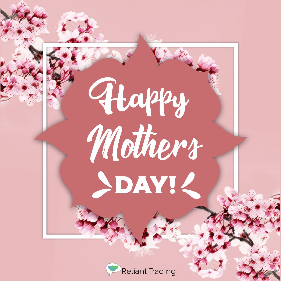
Floral themed #MothersDay design.
This design makes up the final in our set of Mothers Day designs.
Wishing all Mothers everywhere the appreciation they deserve this year 🌷
Let us know what you think of the design!
#designthinking#graphicdesign#MothersLoveIsReal
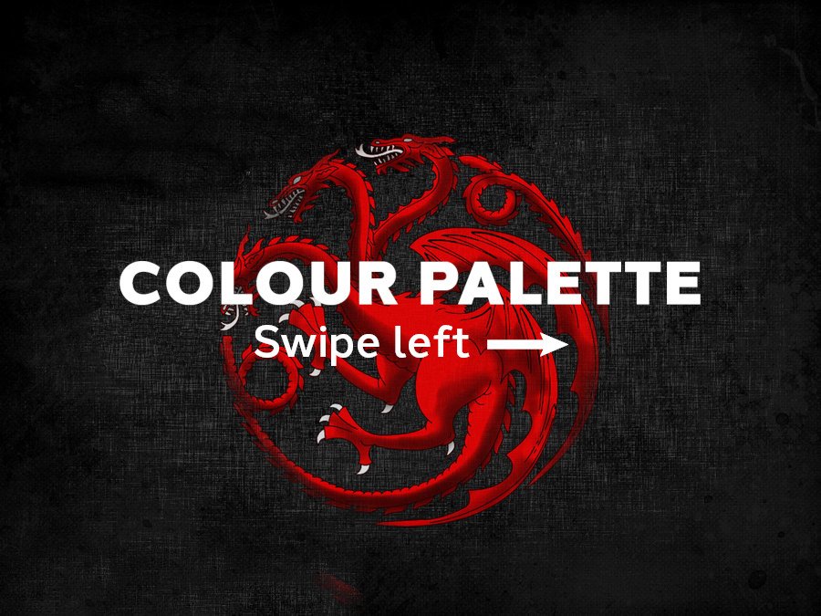
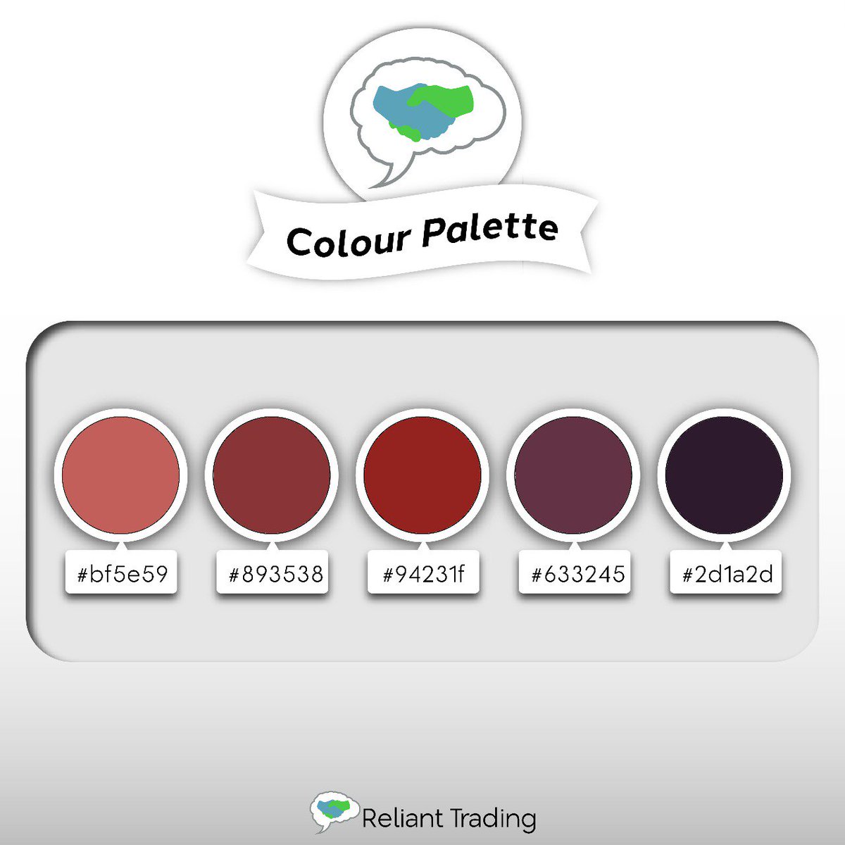
#FireAndBlood
Being one of the last of the remaining Targaryens, will Dany's claim to the iron throne win her the Seven Kingdoms?
Try out our our Targaryen inspired colour palette below
#design#GameofThrones#GameofThones#Daenerys
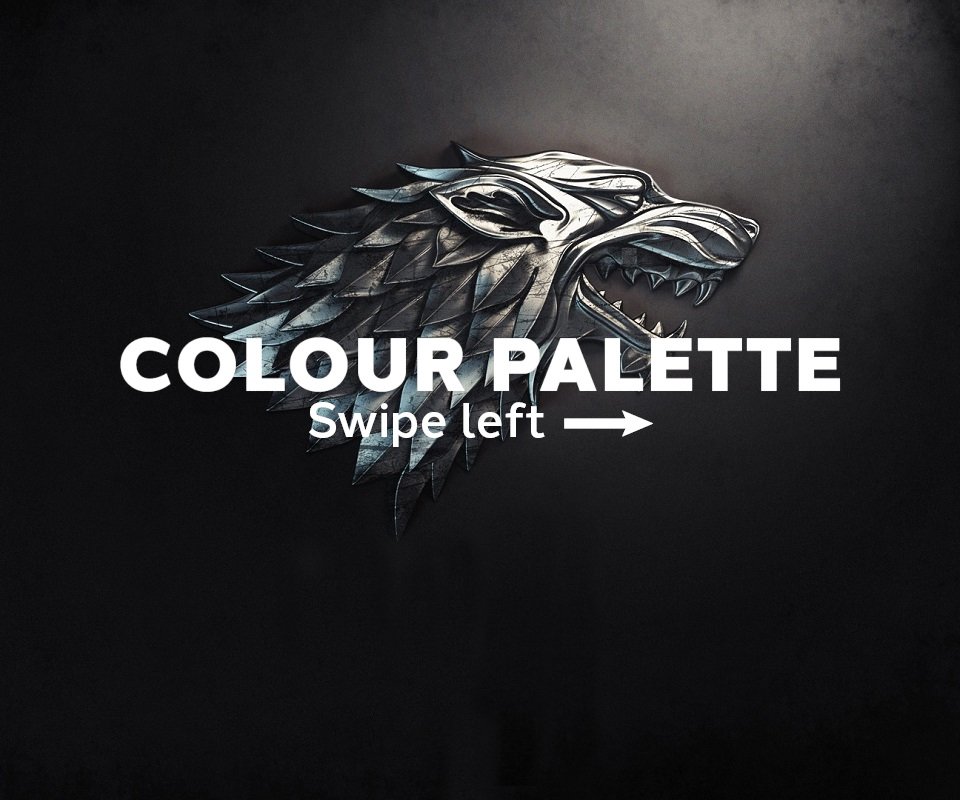
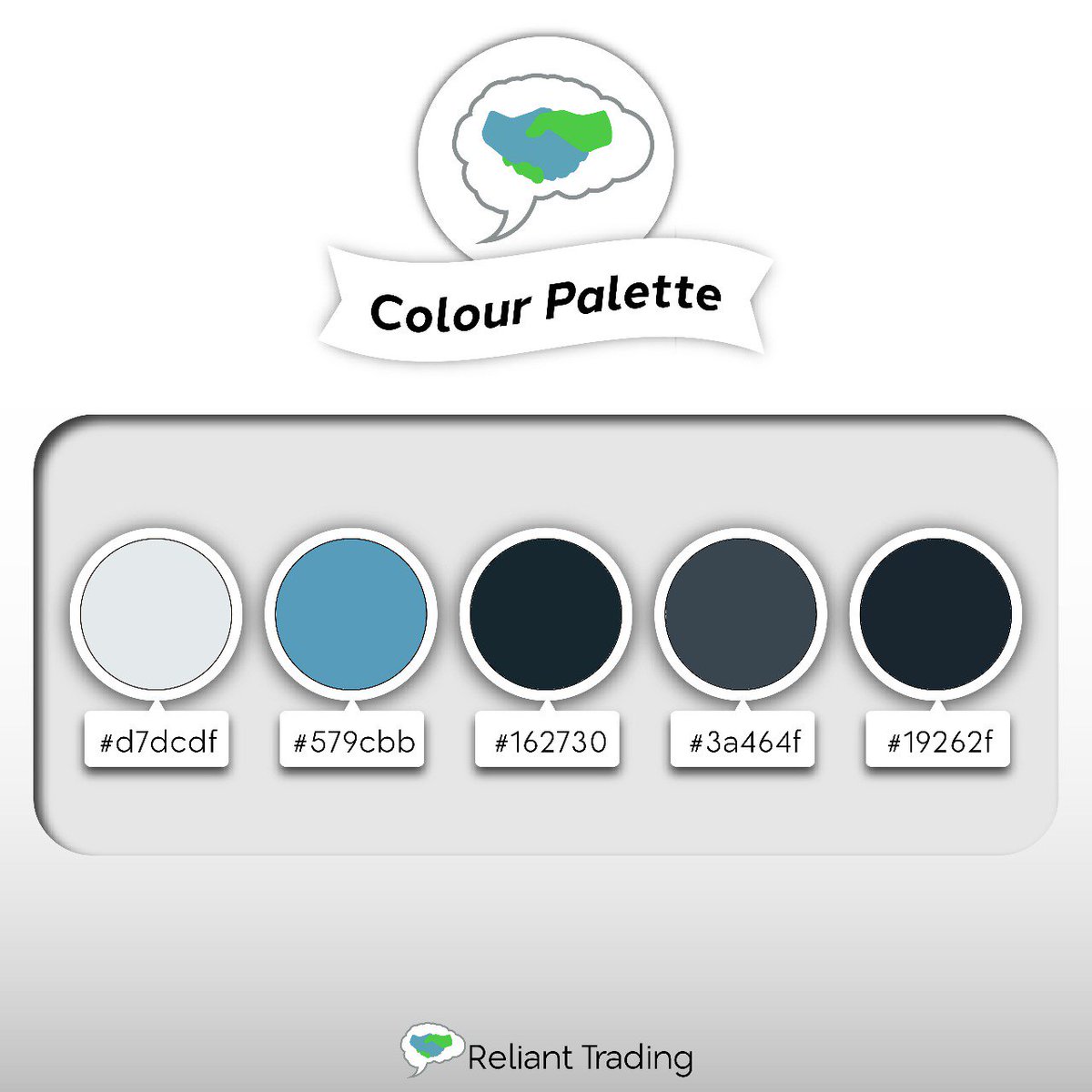
Next up on our #GameofThones palette series we have House Stark.
Consisting of the ice cold blues and stark whites that make up the harshness of the North, this palette is ideal for the more rugged brands that would make any Northener proud
#designthinking#Arya#GameOfThrones
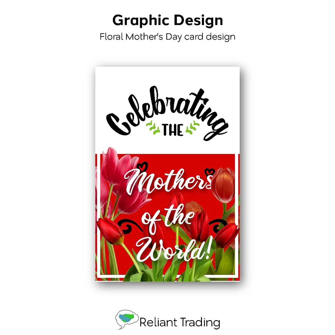
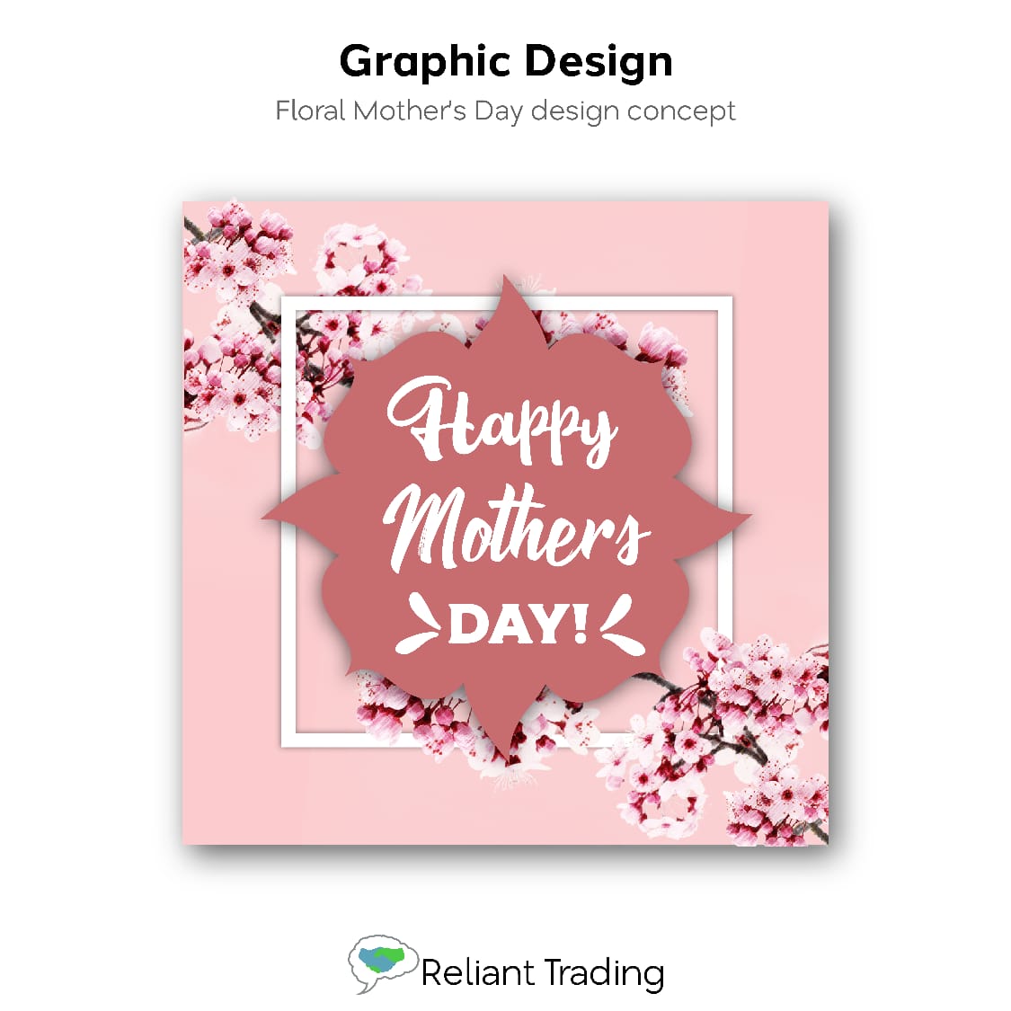
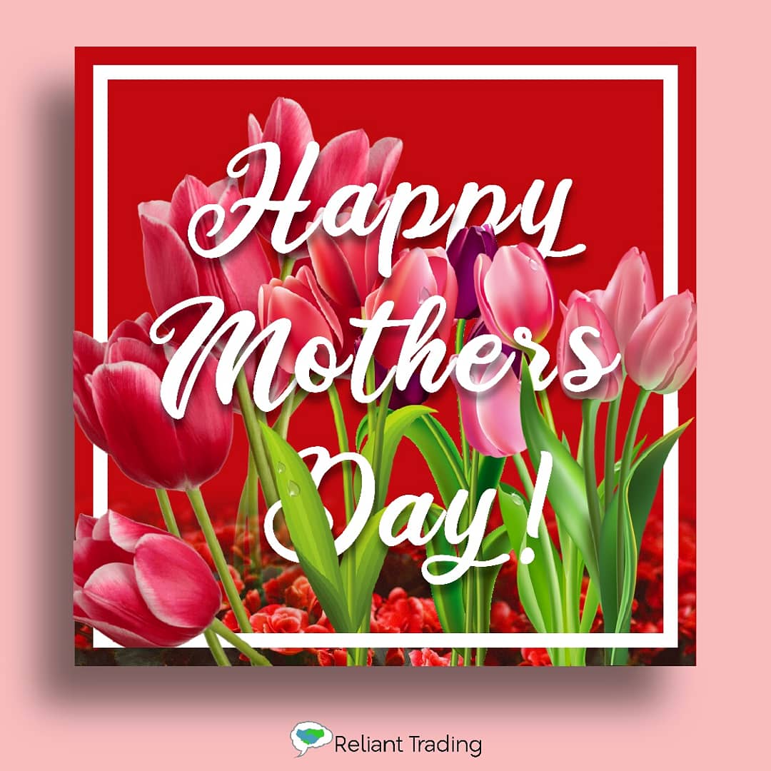
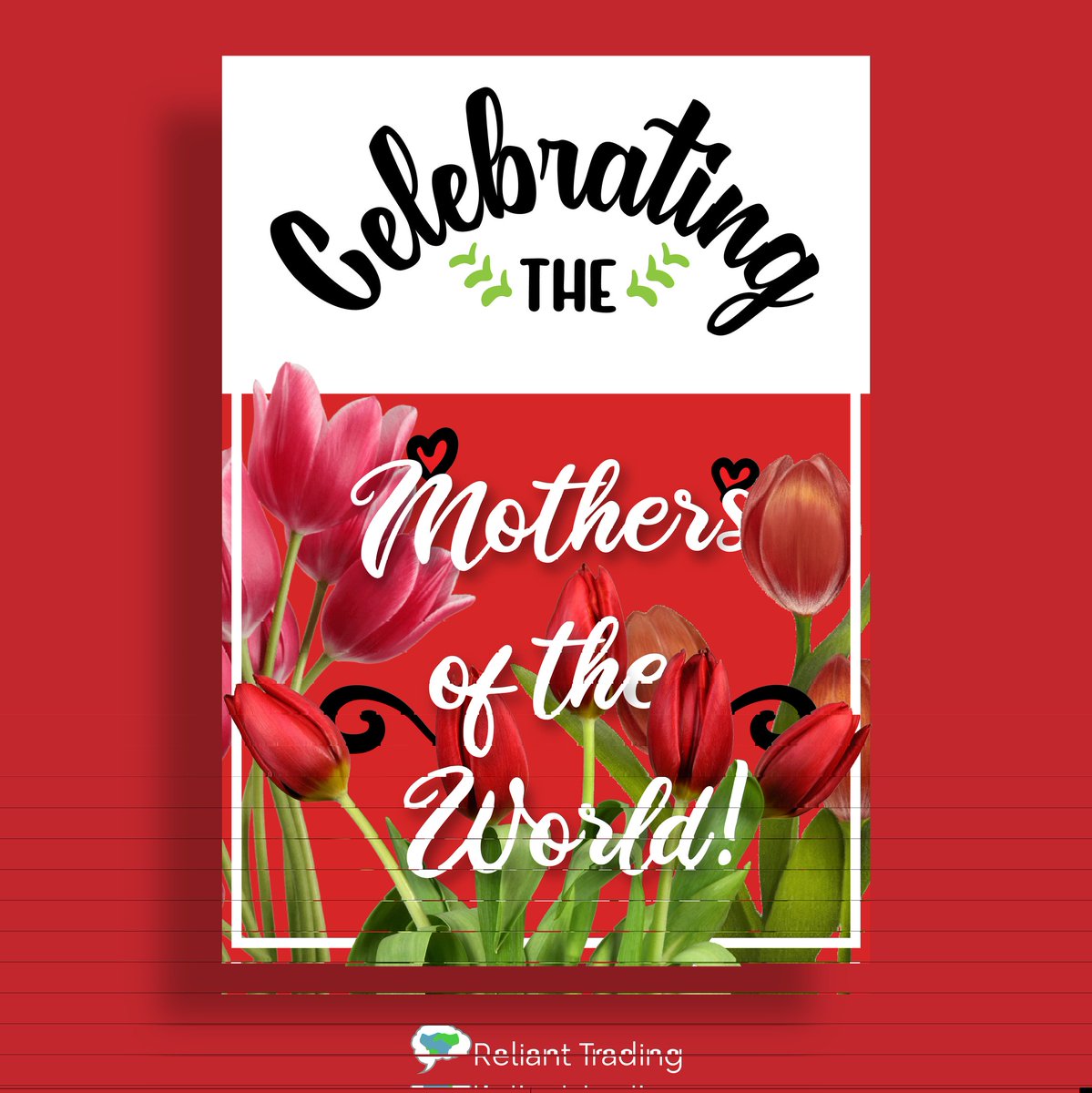
Celebrating all the mothers of the world with this decorative floral themed card #design.
Rich reds and a variety of fonts are used to make the design easier on the eye and more exciting.
Let us know what you think of this design
#MothersDay#MothersLoveIsReal#MothersDaygifts
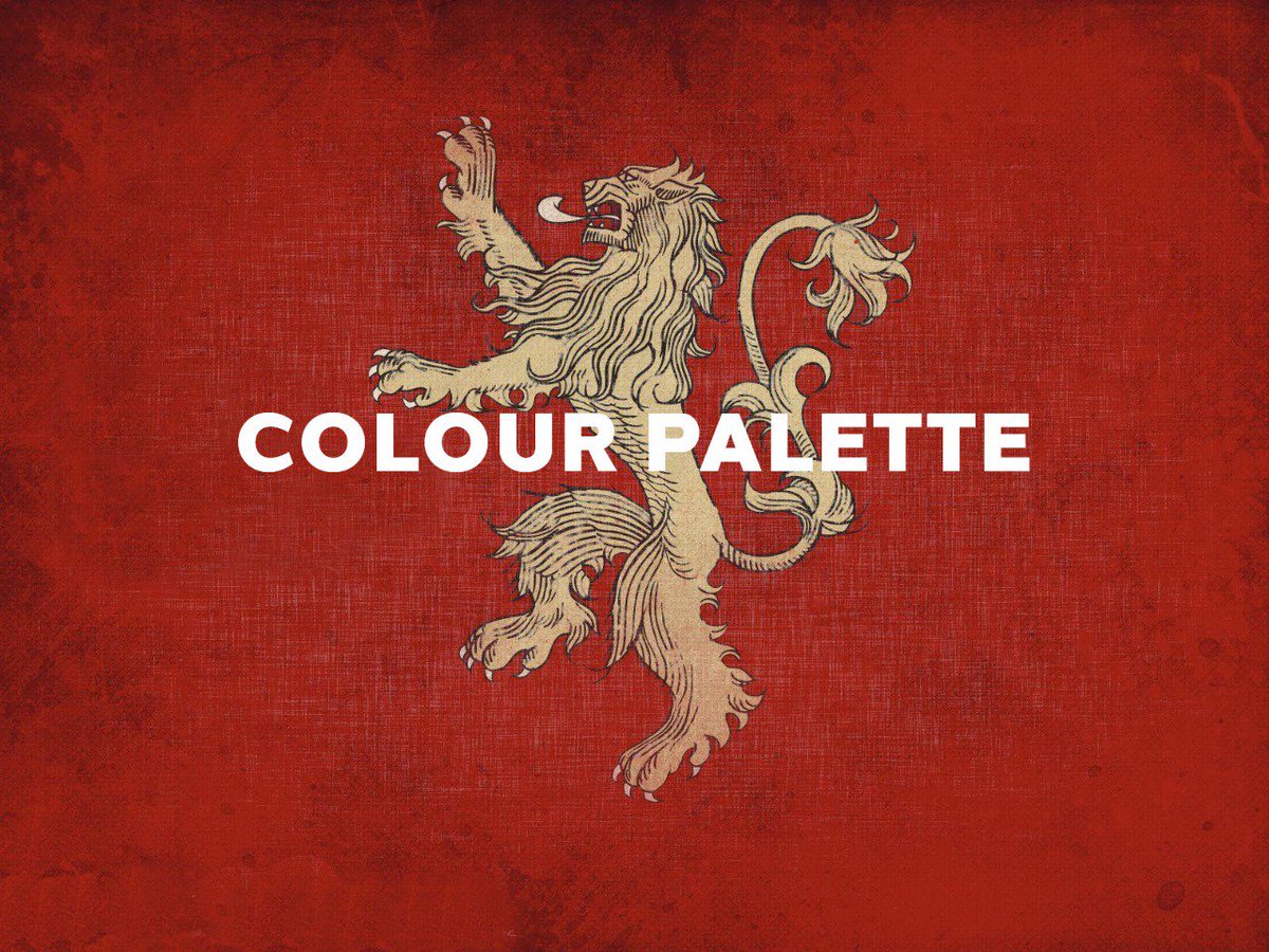
With the thrilling penultimate episode of #GameOfThrones having passed, take the time to cool off and explore our colour palette series based on the show.
First off we have Lannister Red
What colour palette would your house's banners be? 🤔
#design#GOTS8E5#GOT#CerseiLannister
A bit late but in honour of all #Mothers around the world we will be posting a series of Mothers Day designs today. This design features soft hues and floral aesthetics to bring home sentiments of love and compassion, aspects that we all appreciate our mothers for.
#mothersday
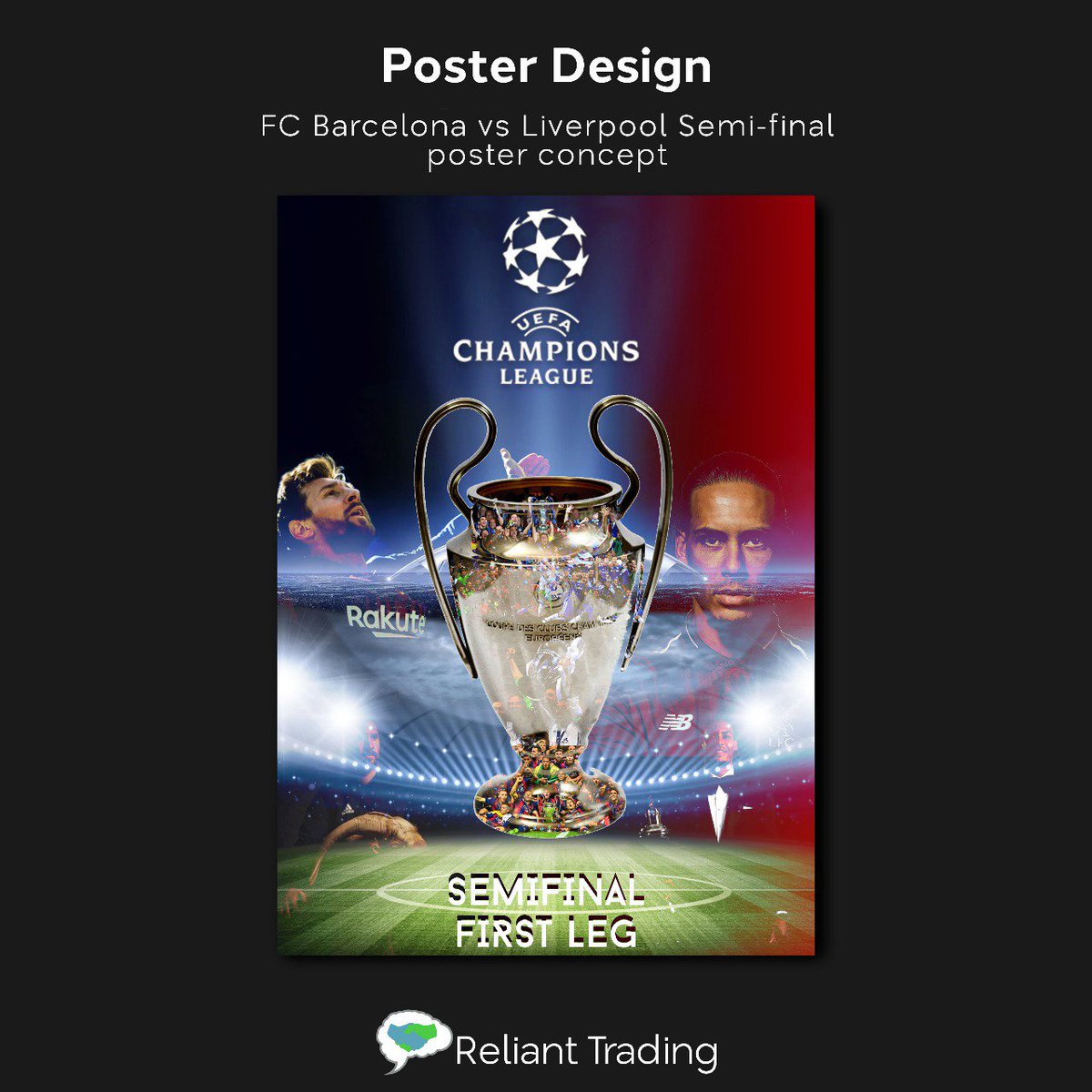
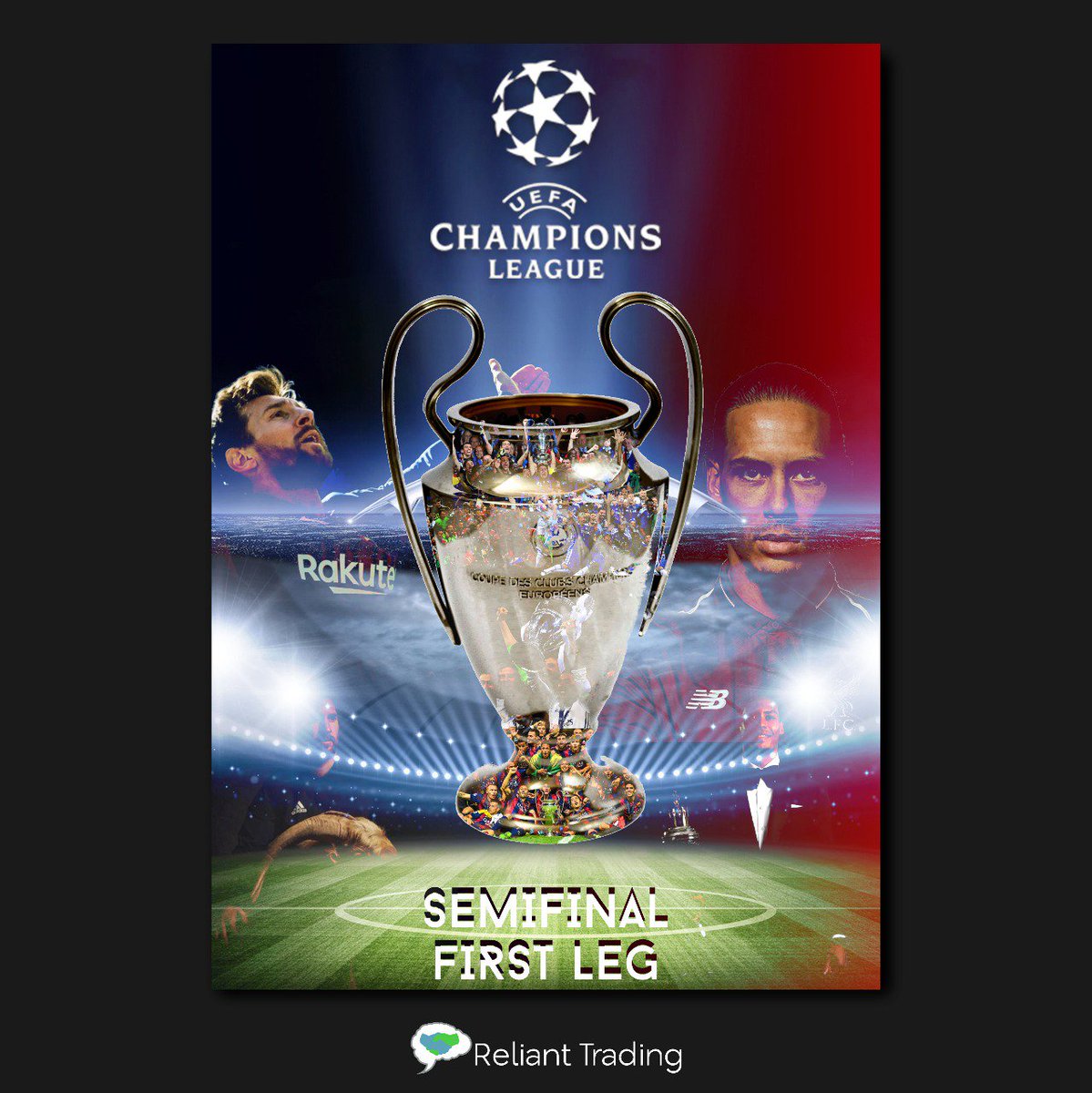
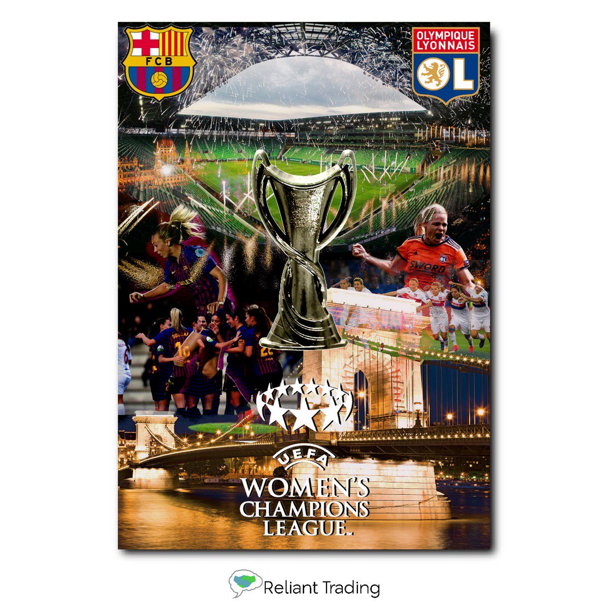
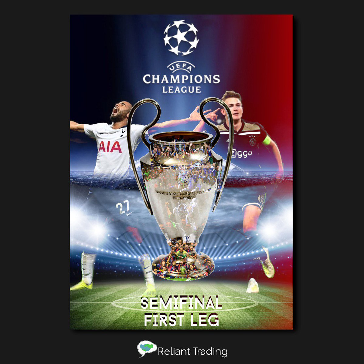
#UEFA poster design
FC Barcelona get 3 against their Merseyside counterparts, Messi clenching his fantastic #600thgoal for the team.
The Reds walked together to do the impossible as they score 4 at the fortress Anfield stadium.
#YNWA#posterdesign#UEFAChampionsLeague