Manila isn’t the gates of Hell. It IS hell! A vlog about finding solutions to traffic, transport and road safety. See a problem? Have a solution? Let’s talk!
National Capital Region, Republic of the Philippines
A THREAD (11 parts): So this is the problem with the implementation of the motorcycle lane along Commonwealth. Again, I'm not against the lane per se, I'm questioning its implementation.
The other night I went out on a motorcycle to see how the @MMDA 200m rule for u-turns works.
.@SkywaySOMCO Hello. Can you PLEASE, PLEASE, PLEASE put “Lane Ends/Merge Right” signs on the NB side of SLEX where the new left lanes end. It’s a crash waiting to happen. At around 31.8km and 29.2km. They should be 300m, 200m and 100m BEFORE the lane ends. SALAMUCH!!
If you want to reward the @MMDA enforcers for doing their job well, DON’T offer them P100,000 loyalty money. You advocate for living wages, overtime pay, a safer work environment, better hazard pay and health benefits, and world-class PPE, among others.
4. Advertising billboards/visual clutter: parts of EDSA are cluttered with ads. This visual clutter renders real road signs invisible. The corporate colors of one advertiser is similar to the color used in road signs. Contrast this with portions of EDSA with no clutter.
1. Incorrect use of signage color: the default color combination for signs seems to be white on green, which, according to the @DPWHph manual, is for DIRECTIONAL SIGNS. In the examples shown the color combo is incorrectly used for regulatory and informational signs.
3. Small size (micro-signs): micro-signs litter EDSA with completely unusable information (mostly in the wrong color combo of white on green - see #1 above). These signs are so small that they are only legible at very close distances and therefore provide info that’s unusable.
We went out and traveled along EDSA with @Amadeus_IOM of https://t.co/IyUutrvP02 to start our Informal Audit of EDSA. General findings:
1. Incorrect use of signage color
2. Bad placement
3. Small sized signs (micro-signs)
4. Advertising billboards/visual clutter
@mmda@DPWHph
13 words/1 number vs 3 words/1 number. Good signs must convey information efficiently. @MMDA, your sign is too long to be read (wrong color combination, too). Use symbols rather than words whenever possible, #MMDA. A preview of our audit of EDSA road signs/pavement markings.
@malskipot16@SkywaySOMCO@tiamy Not sure why white on green for directional signs here in the PH. That’s what is in @DPWHph’s manual. I think they follow the US MUTCD manual/standard. America has to be different. 🤦🏻♂️ #imperialvsmetric
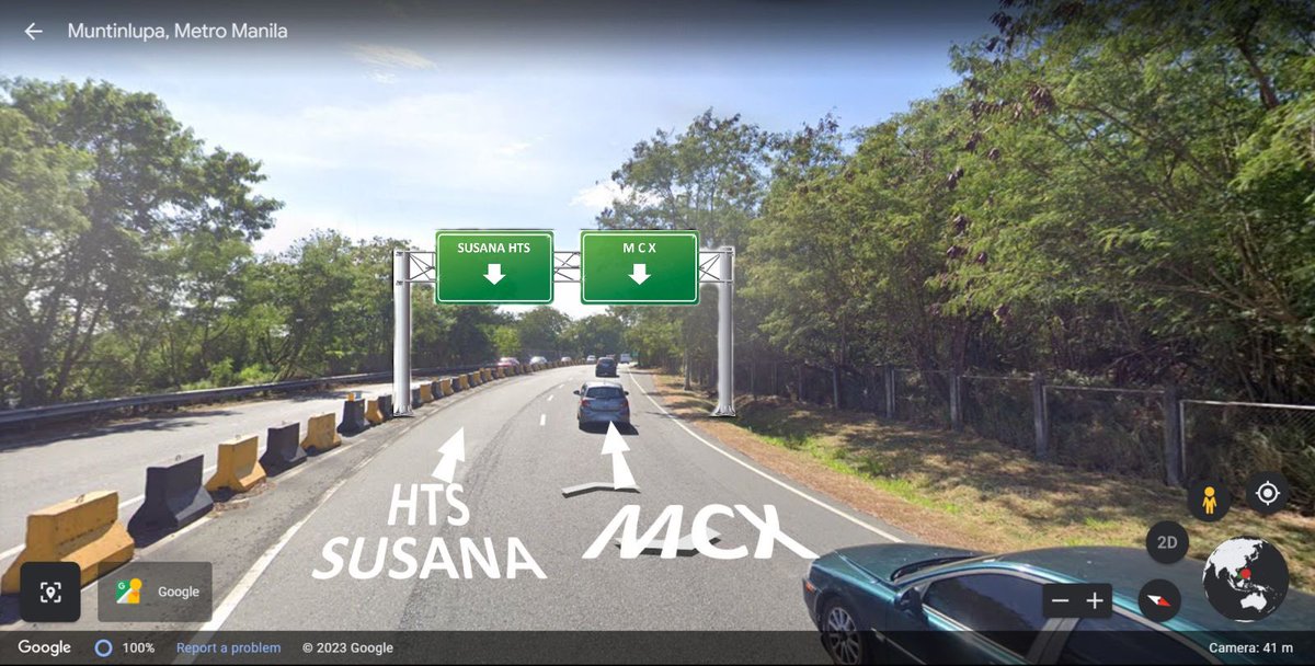
Hello @SkywaySOMCO, in addition to the suggestion of @tiamy could you install overhead signage and pavement markings. I’ve done crude mock ups for your consideration.
Thank you in advance. 🙏🏼
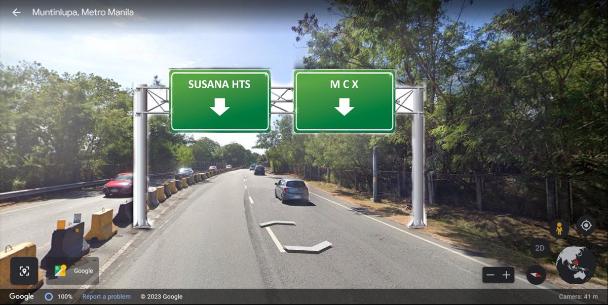
A subtle change in signage should lessen the confusion on this part of SLEX Susana Heights and MCX entry
We read things from left to right, top to bottom. Signage going to the left should be on the top-left side. It’s easier for the brain to digest @RightOfWayPH@SkywaySOMCO
@iamangelsam@MMDA PH is a signatory to the 1968 Vienna Convention on Road Signs and Signals. There’s also @DPWHph’s manual on road signs/pavement markings. AND YET, @MMDA still invents its own signs, not conforming to any known standard. Japan, like most other countries, abides by int’l standards.