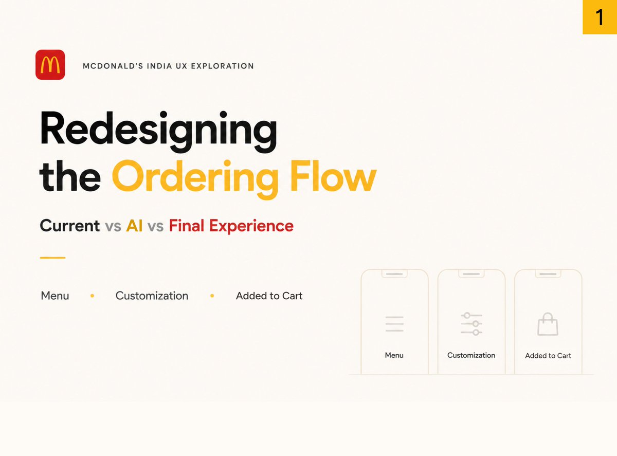
Last week, I shared my redesign of parts of the McDonald's India ordering experience.
I started thinking about what the checkout experience could look like, so I spent another 1hr exploring further.
Rather than reinventing the experience, I focused on making the final step feel easier to review and complete.
Key areas:
• Clearer order summary
• Better visibility of important information
• Improved cross-sell opportunities
• Stronger alignment with the McDonald's experience
Would love to hear your thoughts.
As someone who orders from McDonald’s regularly, I always felt the ordering experience could be faster and easier to navigate.
So I spent about 1 hour using AI to explore and redesign a small part of the flow:
Menu → Customization → Product Added State
I also compared:
• The current experience
• An AI-generated direction using Claude
• Final refined redesign (AI + Human).
This wasn’t meant to be a full redesign or deep case study, just a quick AI-assisted exploration of small UX/UI improvements, interaction ideas, and alternative interface directions.
My takeaway: AI helped generate visually interesting directions incredibly fast, but small human decisions around hierarchy, scanning behavior, and interaction flow still made a major difference.
Would love any feedback, thoughts, or suggestions on the approach or the redesign itself.
Tried experimenting with Figma AI prototyping today through a small interaction design concept.
The idea was to rethink the alarm experience; instead of tapping buttons, the alarm itself becomes draggable toward Snooze or Stop, with subtle motion, proximity glow, and magnetic snapping interactions.
Spent some time experimenting with Figma Make throughout the process:
- interaction prompting
- motion refinement
- AI-assisted prototyping
- state-based interaction design
A few things I learned while building this:
1. AI prototyping works much better incrementally instead of generating the entire interaction at once.
2. Breaking the flow into smaller interaction states created smoother transitions.
3. Proper layer naming and grouping had a huge impact on animation quality.
4. Simplifying the interaction actually improved the final experience.
Still polishing the visuals, but this was a fun way to explore motion, interaction design, and AI-assisted prototyping workflows in Figma.
I’ve been away for a while.
A few weeks ago, during a family vacation, the taxi I was in met with an accident. The front axle snapped while speeding, and before we knew it, the car lost balance, flipped onto its left side and skidded across the road.
I was sitting on the left side, that’s where the impact hit the hardest (plus the weight of 2 more passengers sitting next to me).
My shoulder took most of it, apart from the injuries on my legs and back, and for the first few days, even lifting my hand felt impossible.
Simple things like changing clothes or lying down comfortably became a task.
Thankfully, the scans showed no fractures, just deep tissue injuries and a lot of swelling. The healing process has been slow, but it’s happening. Each day I’m regaining movement and strength, a bit more than yesterday.
It’s strange how life forces you to pause sometimes. This accident did that for me, slowed me down, gave me time to reflect, and made me genuinely grateful for the smallest things: mobility, recovery, and just being here.
Feeling a lot better now and easing back into design, this time with more patience, more calm, and a bit more gratitude than before. 🙏
Used Sora to edit an old childhood photo so me & my sis are doing the 'yo' sign.
Now everyone’s like, how on earth did you do that? 😅
(Original pic: me on the floor, sis glued to the TV)
This was the moment I landed in the mountains, seeking a quiet reset.
Here's my story 👇
Last month, I wasn’t doing well.
Burnout had crept in quietly.
The kind of exhaustion where even the things you love feel heavy.
Overthinking everything. Doubting myself.
Disconnected from my work, and honestly from myself.
So I did something simple:
I booked a solo trip to Dehradun (a beautiful city in the hills).
No fixed plans. Just a quiet hope that a new place could bring me back to life.
Each day, I walked the streets slowly.
I’d find a new café, try their coffee, open my laptop, and just sit.
Some cafés were nestled in the hills, some hidden in forests, some vibrant with people and chatter.
Every place had a different vibe, and I let myself feel all of them.
I talked to locals, tried different foods, and took long walks with no destination.
The climate was just right.
The people, kind.
And the silence? It was the most healing part.
Somewhere in those mountains, something shifted.
I began to feel lighter.
The creative fog started to lift.
I was no longer forcing ideas; they were coming to me.
Not for deadlines. But for joy.
Somewhere between those mountain cafés and evening walks, I started feeling like me again.
And that feeling? I didn’t even realize how much I missed it.
Now that I’m coming back to form, I feel clearer.
Motivated, not because I have to work, but because I want to.
I’ve remembered what it feels like to just be, with myself, with the world.
And I want to say this:
If you’re feeling stuck, tired, or just “off”...
Sometimes, what you need isn’t more discipline or hustle.
Sometimes, you just need a different sky, slower mornings, and a good cup of coffee.
Nature revives what burnout hides.
And places, people, and slow moments, they bring you back to yourself.
Appreciate you sharing this so openly, Janu 🙌
I totally get your take, especially on tone and positioning.
My goal with this version was to speak directly to early-stage founders, where speed, clarity, and emotional resonance matter more than polish.
But if you're aiming to attract mid-market or established companies, the copy might need to feel more premium and flexible.
Definitely room to explore a hybrid direction. Thanks again for letting me try this on your site 🙏
Here’s my first copy + design roast of the MVP site https://t.co/lwStUKLm0Z, run by @JanuBuilds
Since the target audience is mostly founders, it’s crucial to speak their language clearly and emotionally.
So here’s a short breakdown of the hero section fixes.
From copy and layout to font and structure.
Before → After 👇
Fixes for the other pages (features, pricing...) dropping soon.
Want your site reviewed for COPY + DESIGN that actually sells?
DM me or book a call: https://t.co/4yaimWwJPl
🎯 End Result?
A hero section that:
✅ Speaks to the founder’s mindset/ language
✅ Shows exactly what they'll get
✅ Looks clean, but sells clearly
✅ Easy to scan quickly