The team at the Saskatoon Public Schools Foundation is doing amazing work in our community. We’d love it if our little corner of the internet would chime in + share your thoughts ✏️ https://t.co/QrkgsepOEA #yxe#saskatoon
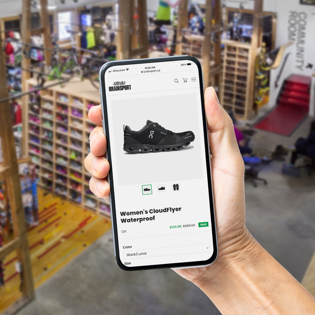
Our team hustled 🏃🏼♀️ to create an enhanced, online shopping experience for Brainsport's customers – easily filter products based on season or activity, and even schedule a virtual fitting w/ one of their fit specialists! Check out their new store here: https://t.co/XV45kLIKiO
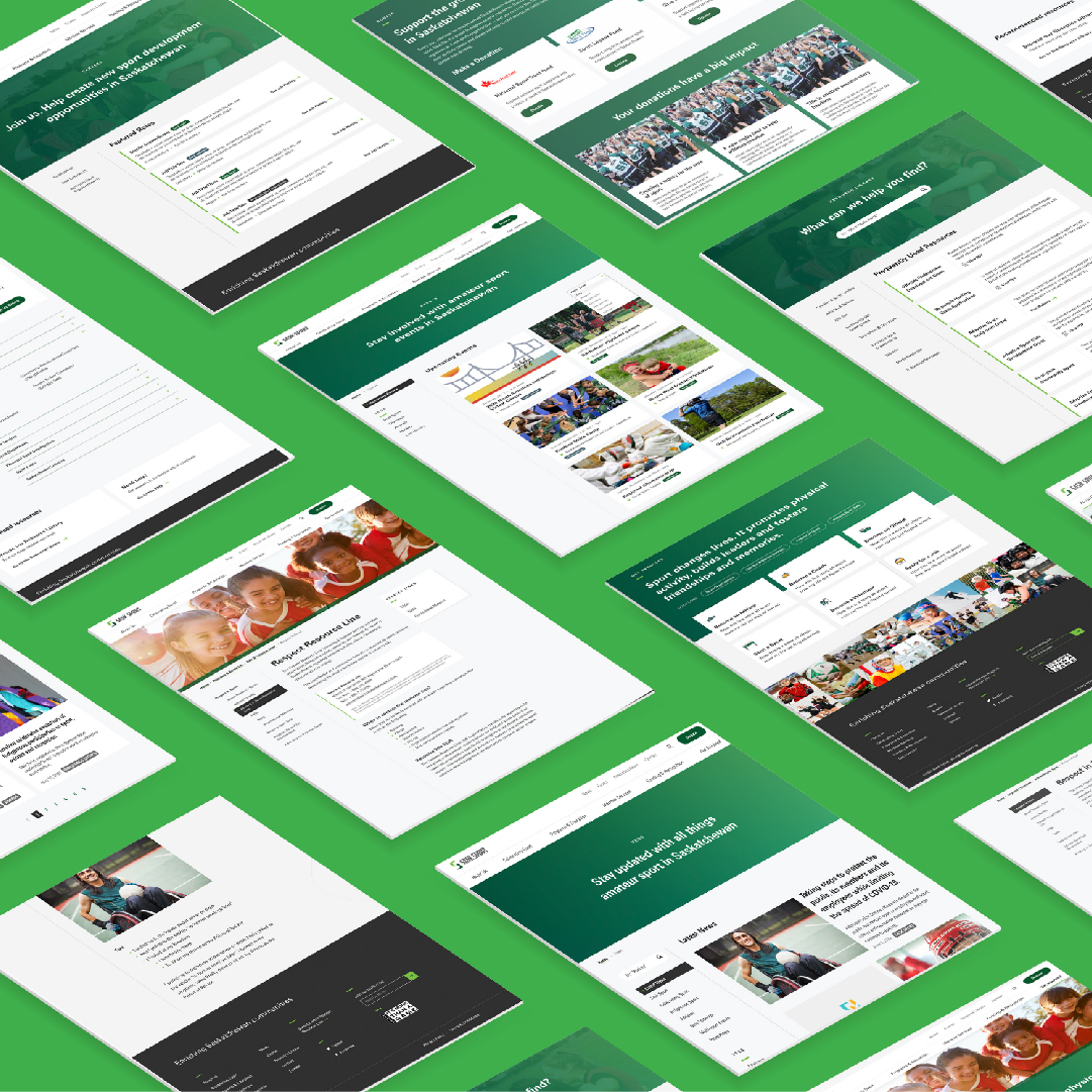
Since 1972 @SaskSport has played an integral role in amateur sport in SK. Our team had the pleasure of creating a new, intuitive site that better tells their stories and history, and serves as a hub for sport across the province! Check it out https://t.co/1VZiqwKn1l
For more than 70 years, Aero Delivery has provided unparalleled customer service across Saskatchewan and the prairie provinces. Head over to their new site and watch the history unfold: https://t.co/AxK9WMusG9
Aircon sought us out to elevate their brand + polish their online presence. The results? A brand new website that highlights their expertise and high levels of professionalism and safety, in a beautiful and articulate way 👉🏻Head over to their new site: https://t.co/R5LtB8YN1i
@RiversdaleBID has a new look! The updated brand is expressive and bold, with versatility to resonate with locals and tourists alike. Our HQ is at 20th and D, so this project was close to home and heart. https://t.co/9yfmDS6LJ1
Naming a business, or even re-naming one, may be more of a challenge than choosing your own child’s name. Thankfully, our team has it down to a science! Check out Arc Orthodontics' new identity and site 🦷 https://t.co/pILpdS27ZU
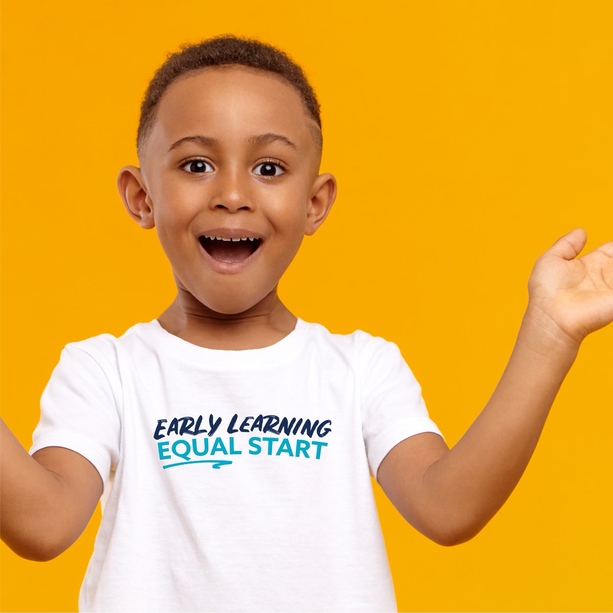
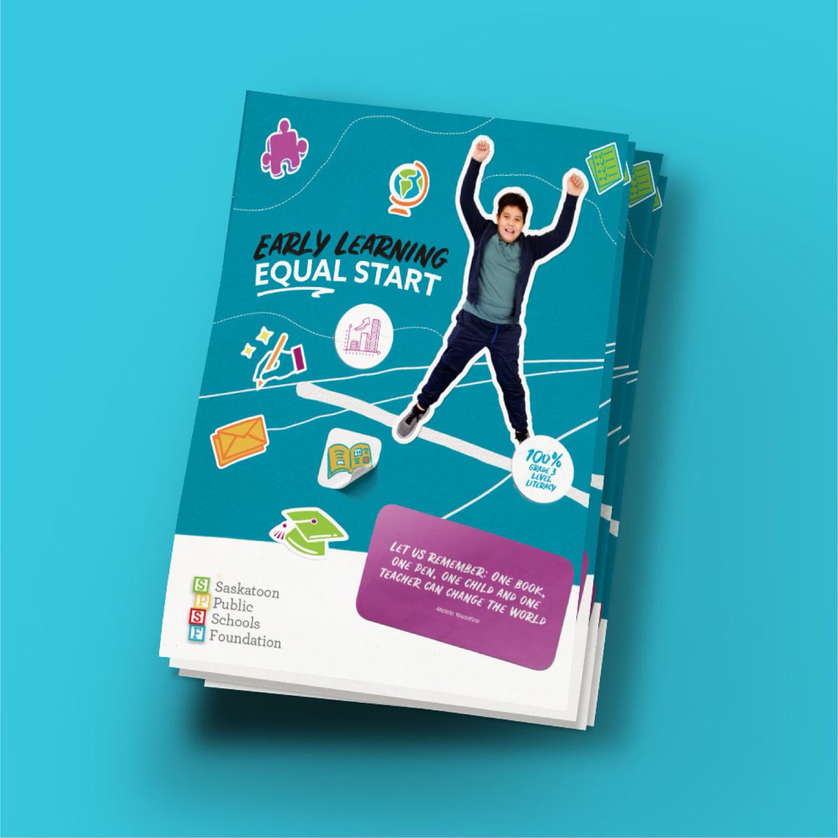
@StoonPubSchFd has an incredible goal to help students reach Gr. 3 level literacy. We had the privilege of bringing this campaign to life with kid centric illustrations, colours and a playful feeling at the centre of it all! ✏️ Check out the full site: https://t.co/kaE34oAsZ3
A visual identity with expression, emotion and movement. Artistic photography that honours your story.
Website and rebrand for Chelsea Klette Photography created by our killer team.
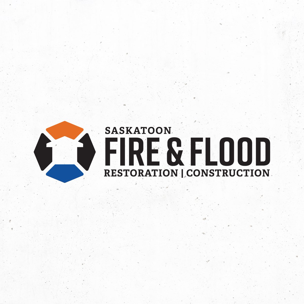
@SaskFireFlood logo is meant to serve as a symbol of trust and confidence. The orange + blue colors tie together the fire and flood name; the house formed from negative space gives context while also serving as a subtle upwards arrow.
We recently updated the brand + website for Redekop Mfg; improved user experience, optimized for global sales + a new “Build Your Own” section. The results are clean and professional and easy to navigate, even from the cab of a combine - https://t.co/zHSzdwCprR
The new @WESK306 program name paired with the concept of a spark and a vibrant colour palette, conveys the excitement of the entrepreneurial spirit. Our team is proud to be a part of such a beneficial program in our province! https://t.co/utGgnk53sw
Congratulations Chelsea! We love working with Parr Auto Body, a company doing big things in their industry and shaking up the norm. #yxe
Read about how Chelsea accidentally found herself in the auto industry: https://t.co/iJry3Oexsk
Is there anything worse than realizing you're fresh out of beans, right before a client mtg!?
.
Fear not friends, for Road Coffee Co. offers coffee subscriptions specifically tailored for offices and their unique needs. Subscribe to a new era of coffee ☕️https://t.co/oI9XffAUGo