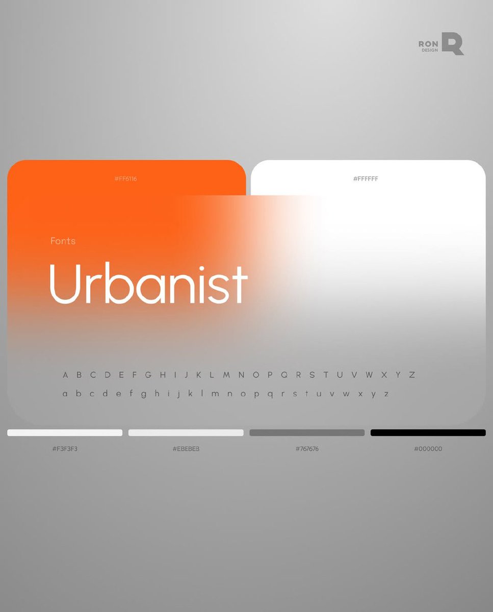
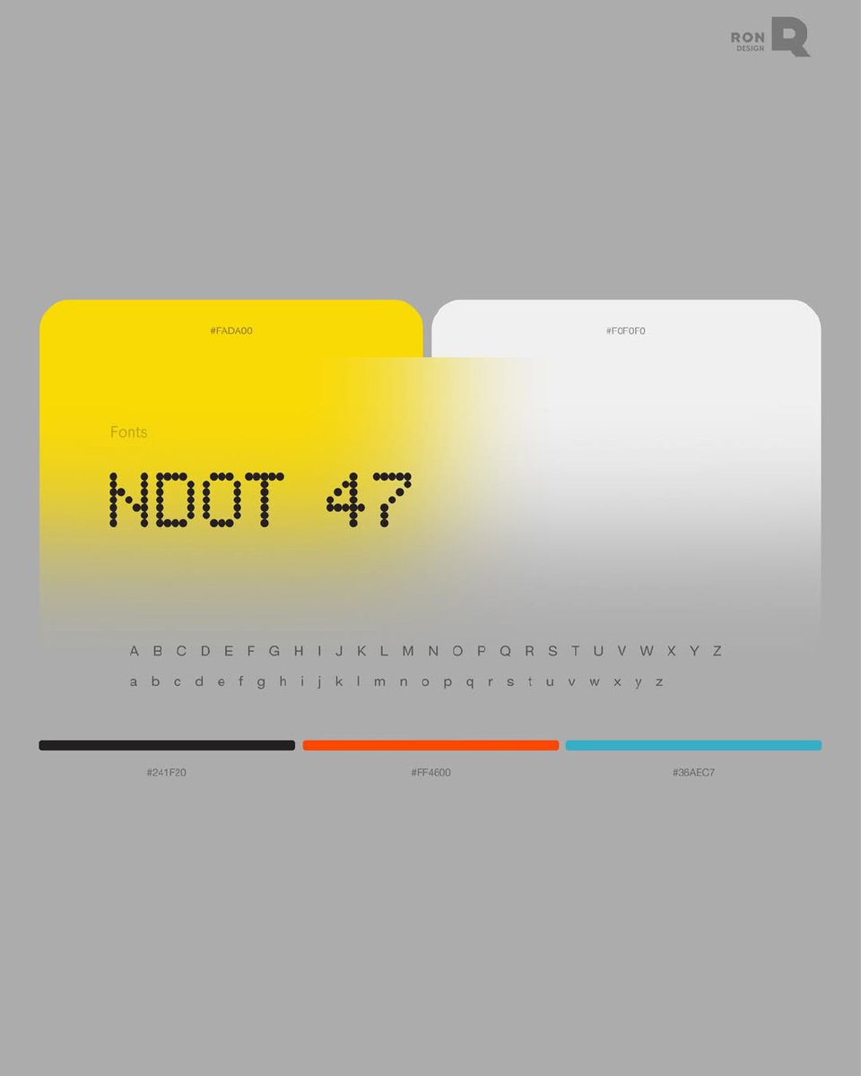
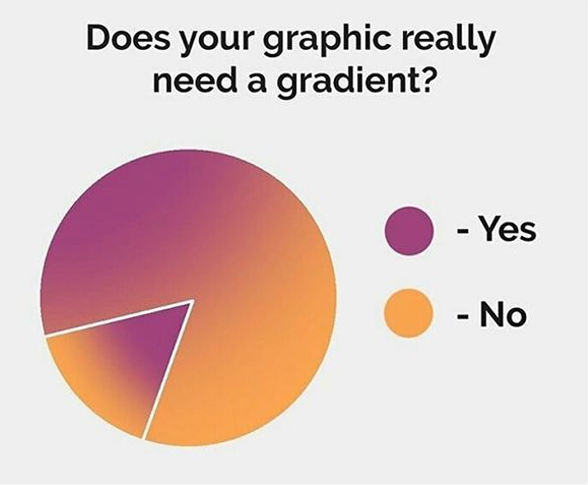
does your design really need a gradient? had a project where everything looked perfect on screen. then it went to print – colors shifted, contrast disappeared, blur looked messy. spent a week redoing it.
now we always ask first: does this gradient actually need to be here?
spent a week redoing everything from scratch
so now we always ask the question early — does this gradient actually need to be here
would've saved us a week if we asked it sooner
we've been doing this for 20 years and honestly — sometimes no 👇🏼
had a project once where everything looked perfect. gradients, blur, real depth to it. then it went to print colors shifted. contrast vanished. the blur turned into a mess on paper.
founders see their product as logic and features
users see buttons, flows, and whether it makes sense in 3 seconds
the designer is the only one standing between those two realities
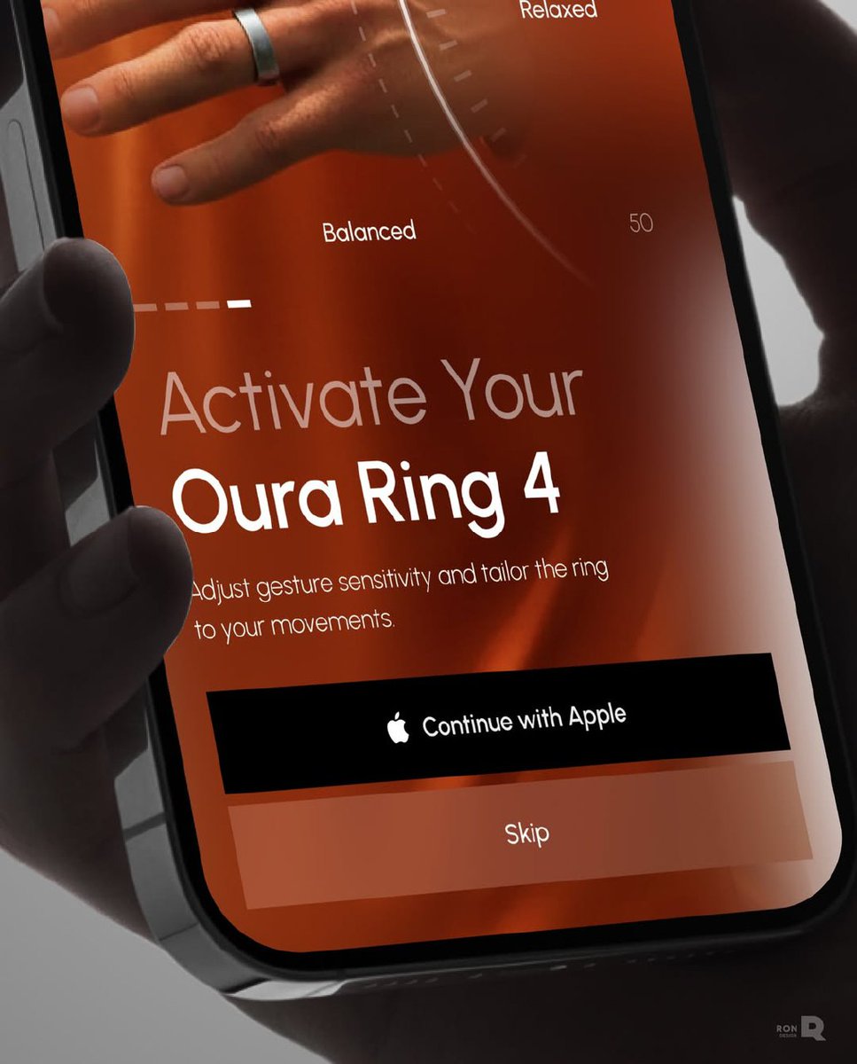
Veri – Smart Health Tracking App
It utilizes AI and real-time analytics to monitor glucose and key health metrics in a single system, providing users with clear data, faster insights, and improved daily control through a unified dashboard.
Today, we're releasing Claude Code for marketing.
It does a marketer's work in minutes by browsing, clicking, and posting like a human would.
The marketing hire is now optional:
Hey guys!
Quick dive into the Business Model Canvas — one of the most powerful tools we use to shape clear, scalable, and profitable products.
Here’s how we break ideas down into a smart, visual strategy.
Hi guys❣️ Meet our upcoming Rytheo case from Behance 💙
Rytheo is a health monitoring app designed to track biometric data such as heart rate, recovery, and sleep performance.
#uiux#appdesign#fintech#uxdesign#mobileappdesign
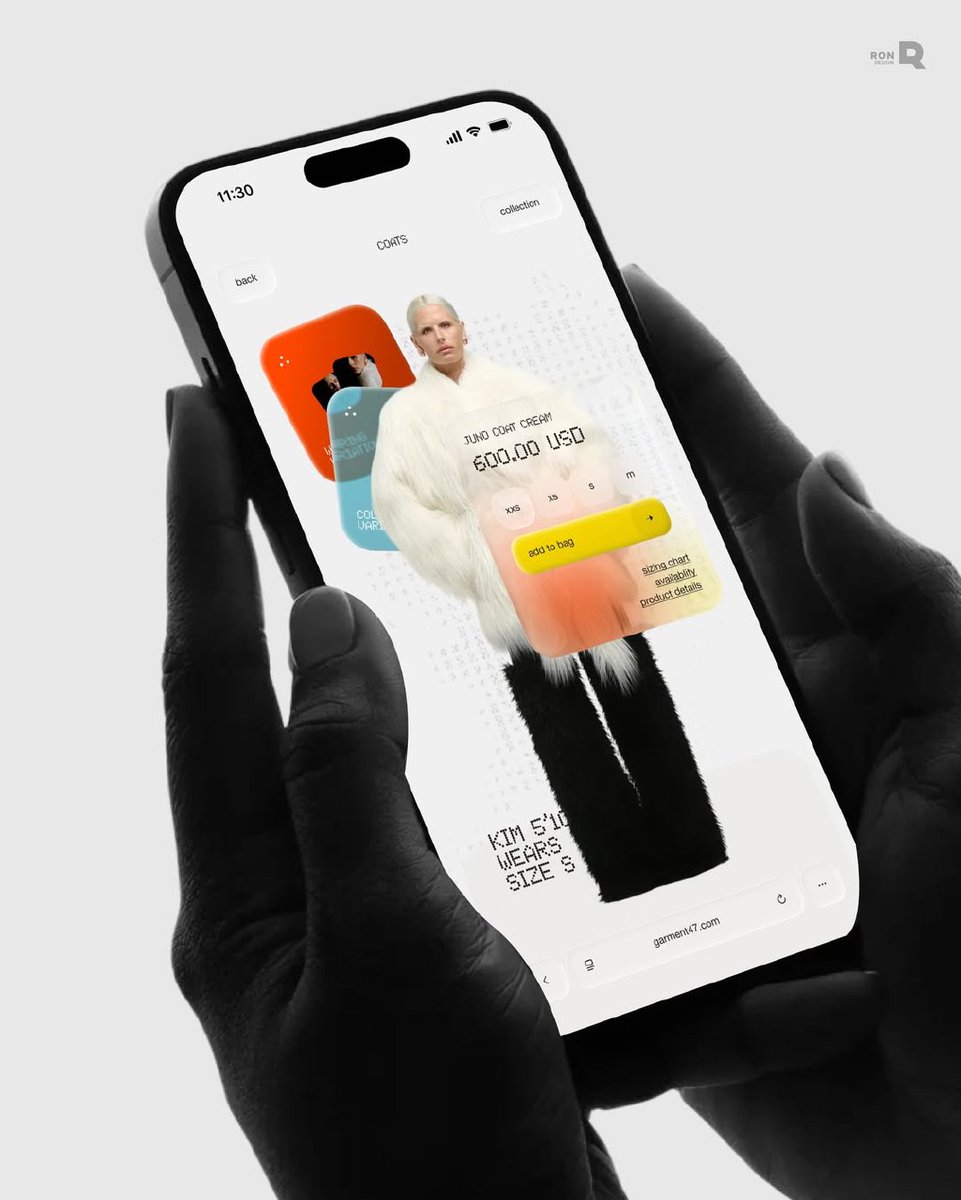
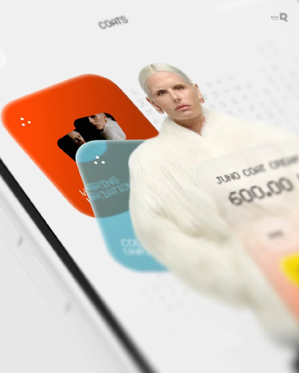
GARMENT47 needed a clean, modern flow that makes buying effortless. So we redesigned the store with clear visuals, simpler navigation, and a smoother product journey.
👉 Drop us a DM and uncover the real power behind your product
#webdesign#web#ui#ux#uidesign#uxdesign
@samm_duc@hellouisupply thanks a lot, Samuel!
the key was reducing the data into clear priority groups first, and then iterating on the visual structure until it felt intuitive. balancing density with readability was the main challenge
Orriso came to us because their content production was slow and hard to scale. Too many edits, no consistency, lost time.
We built an AI-powered workspace with ready layouts, smart images, and quick typography tools.
#webdesign#web#ui#ux#uidesign#uxdesign#dribbble