Ruby 3.0, New outfit features two different color variations, a new hairstyle, new jakcet design with neon colors, & an optional Clone Trooper helmet variation with a light up visor. 💙🖤💜🖤❤️
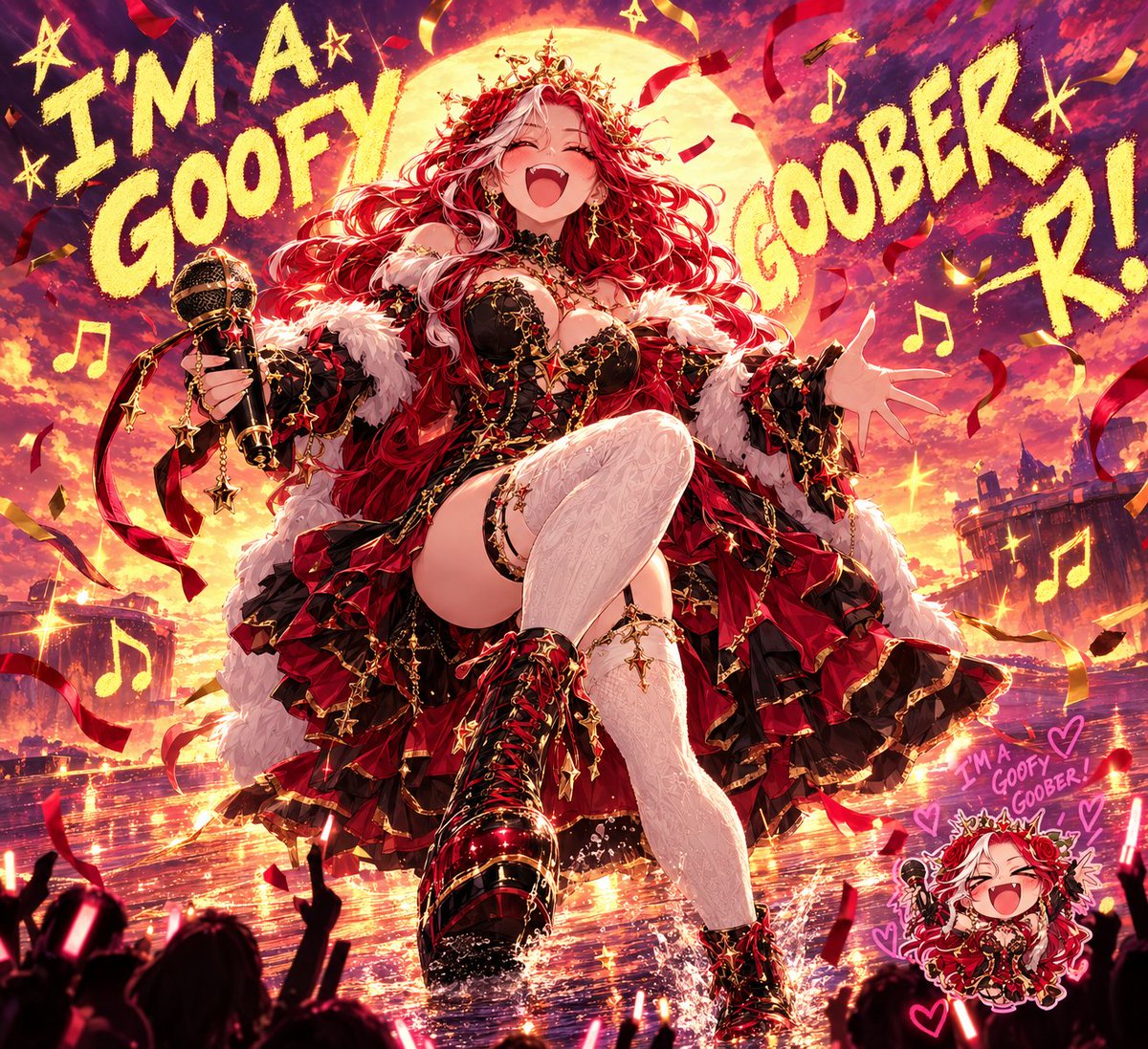
So after high quality I am straight back to meme because! I AM A GOOFY GOOBER AND NOW YOU ARE A GOOFY GOOBER WE CAN ALL BE GOOFY GOOFY GOOBERS!
(Prompt in replies)
Goobers: @SirMichael8963 , @OvtedFatash and @Lavitz_Reinhart
Using my uploaded reference photo, create an ultra-realistic, high-fashion editorial beauty portrait that preserves my authentic facial features, natural hairstyle, age, skin tone, and eye color.
THE CONCEPT:
Create a stunning black-and-white portrait featuring ONE dramatic pop of color: an oversized, luxurious chunky-knit sweater in MY CHOSEN COLOR.
The sweater should have extra-long, thick, cozy sleeves. Pose me with both hands raised toward my face, allowing the oversized sleeves to cover my mouth and lower face, leaving my eyes beautifully visible.
THE EXPRESSION:
My eyes are the STAR of this portrait!
Capture an intriguing, mysterious, captivating expression. It can be playful, seductive, innocent, mischievous, or intensely alluring. Let my personality determine the expression.
THE PHOTOGRAPHY:
* Elegant black-and-white editorial photography.
* ONLY the sweater remains in color.
* Preserve my natural eye color.
* Beautifully detailed, realistic eyes and eyelashes.
* Soft, flattering studio lighting with gentle shadows.
* A simple, softly blurred grayscale background.
* Close-up composition emphasizing my eyes and the sweater’s rich knitted texture.
* Natural skin texture without excessive smoothing or artificial filters.
* Professional magazine-quality photography.
IMPORTANT DETAILS:
Maintain my exact facial identity and natural hairstyle. Do not change my hair length, eye color, facial structure, or age. No exaggerated features, distorted hands, or unnecessary accessories.
The finished portrait should feel sophisticated, cozy, mysterious, and effortlessly beautiful.
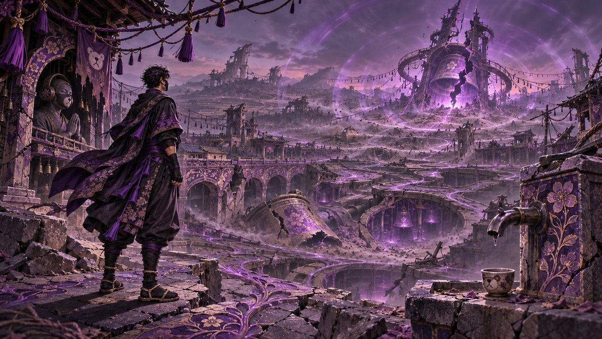
I come bearing a new prompt! Previously teased on @MagsNoctis last stream!
Cries of a Dead World
Create one cinematic 16:9 illustration inspired by “Cries of a Dead World.” Use the character in @Image1 to determine what this world once was, what killed it, and what can still be heard in its ruins. Treat multiple views on a reference sheet as the same individual. Build the world from the reference. Choose two or three distinctive details from the character’s design, such as a material, marking, emblem, piece of equipment, or species trait. Translate them into things that had a purpose here. A pattern on a coat might become the way a city channels rain. A weathered instrument might hint at what its people once had to listen for. Let those connections guide the terrain, architecture, and remnants of daily life. Give the world one coherent downfall. Decide whCreate one cinematic 16:9 illustration inspired by “Cries of a Dead World.” Use the character in @Image1 to determine what this world once was, what killed it, and what can still be heard in its ruins. Treat multiple views on a reference sheet as the same individual. Build the world from the reference. Choose two or three distinctive details from the character’s design, such as a material, marking, emblem, piece of equipment, or species trait. Translate them into things that had a purpose here. A pattern on a coat might become the way a city channels rain. A weathered instrument might hint at what its people once had to listen for. Let those connections guide the terrain, architecture, and remnants of daily life. Give the world one coherent downfall. Decide what its inhabitants depended on and how that system failed. Show the cause through physical evidence the viewer can piece together. Include one ordinary thing left mid-use, such as a cup waiting beneath a dry tap, to give the loss a human scale. Let the character’s relationship to the catastrophe emerge through the scene. Make the cry visible. Choose one recurring phenomenon born from that catastrophe and catch it in motion. If resonance split a valley, a buried bell might still toll beneath the rubble, sending dust up in widening rings across the empty streets. Give the cry a clear source and let the viewer trace its passage through the landscape. Leave enough stillness around it to imagine the silence between pulses. Frame the witness. By default, show the referenced character once, small enough for the world to dominate and close enough for their identity to read. Preserve their facial structure, eye anatomy and colors, build, proportions, species traits, markings, and signature accessories. Let their posture suggest what the cry means to them. If I specify landscape only, keep the character offscreen and carry their influence through the environment. Use one continuous view with a readable foreground, a clear source for the cry in the middle distance, and consequences that reach the horizon. Choose a main light source that belongs in the scene, with believable shadows, falloff, and reflected light. Keep the image free of lettering.
at its inhabitants depended on and how that system failed. Show the cause through physical evidence the viewer can piece together. Include one ordinary thing left mid-use, such as a cup waiting beneath a dry tap, to give the loss a human scale. Let the character’s relationship to the catastrophe emerge through the scene. Make the cry visible. Choose one recurring phenomenon born from that catastrophe and catch it in motion. If resonance split a valley, a buried bell might still toll beneath the rubble, sending dust up in widening rings across the empty streets. Give the cry a clear source and let the viewer trace its passage through the landscape. Leave enough stillness around it to imagine the silence between pulses. Frame the witness. By default, show the referenced character once, small enough for the world to dominate and close enough for their identity to read. Preserve their facial structure, eye anatomy and colors, build, proportions, species traits, markings, and signature accessories. Let their posture suggest what the cry means to them. If I specify landscape only, keep the character offscreen and carry their influence through the environment. Use one continuous view with a readable foreground, a clear source for the cry in the middle distance, and consequences that reach the horizon. Choose a main light source that belongs in the scene, with believable shadows, falloff, and reflected light. Keep the image free of lettering.
I have consulted the ancient scrolls! They mostly contained grocery lists, but one thing was clear: It’s JOLLY’S PROMPT OF THE DAY!
The reasons rules and signs exsist is becuase there is always that ONE PERSON. and it seems like our comunity is made up of them 🤣
Special Thanks To: @ZHunter247 , @vovilliacorp and @kitsuragi_k
The Escalating Warning Sign by Jolly Joebean
PROMPT START
---
Designate the attached character reference as @Image1.
@Image1 = the only character identity, visual-design, name, and written-lore reference.
Using @Image1, create ONE finished HD widescreen 16:9 illustration of the OC having walked past exactly THREE physical warning signs along one continuous route. The OC travels unmistakably from the LEFT side of the scene toward the RIGHT. The signs appear in the same order the OC encounters them: LEFT = suggestion, MIDDLE = sincere plea, RIGHT = desperate handwritten note addressing the OC by name. All three concern the SAME OC-specific hazard.
Frame the continuous scene as a HAZARD-COMMUNICATION CARD, not a comic, chart, or reference sheet.
THE NON-NEGOTIABLE JOKE:
SIGN 1 = “Maybe you should…”: mild, polite suggestion.
SIGN 2 = “Please, seriously…”: genuine request with clear concern.
SIGN 3 = “OC'S NAME, I'M BEGGING YOU…”: personal, visibly handwritten desperation.
These are tone examples, NOT final text. Invent three OC-specific messages.
SPATIAL CONTINUITY — ABSOLUTE PRIORITY:
The OC approaches from the far LEFT, passes Sign 1, then Sign 2, then Sign 3, and continues RIGHT. Freeze the scene AFTER the OC has passed Sign 3: place the OC to the RIGHT of the third sign, clearly FACING and WALKING RIGHT. The head, torso, stride, and direction of travel must all indicate rightward movement. The signs' left-to-right positions and the OC's actual movement MUST agree. An OC facing or walking LEFT reverses the joke and is a failed result even if the sign text itself is correct. Never solve this by reversing the sign order or mirroring the readable text.
No input fields. Read the sheet first. Never print the prompt title or version.
-----------------------------
MODEL EXECUTION INSTRUCTIONS
-----------------------------
For an LLM: inspect the whole reference, including names and lore. Privately resolve the OC, hazard, three exact sign messages, reaction, setting, and left-to-right route. Lock the wording AND the rightward-facing OC pose before generation. Generate the image if possible; otherwise output ONE complete image-generation brief containing the resolved text and visuals, not analysis, questions, or alternative options.
For an image generator: render exactly three signs in escalating order from LEFT to RIGHT and one OC already beyond Sign 3, walking and facing RIGHT. Preserve readable non-mirrored sign lettering. Do not print analysis, variables, notes, or examples.
If @Image1 is missing or unreadable, request it. If no reliable OC name is provided, ask ONLY for that name. Never invent the name, use the artist's name, or ask for information already present.
-----------------------------
REFERENCE RULES — HIGHEST PRIORITY
-----------------------------
Written name, lore, behavior, species, profession, and abilities outrank visual stereotypes.
Preserve these recognizable identity anchors wherever applicable:
Face or equivalent head construction
Hairstyle and exact hair color, or other defining head features
Eye shape and exact canonical eye color
Skin, fur, feather, scale, metal, or other body-material colors
Apparent age, presentation, physique, posture, and proportions
Species traits, body plan, markings, scars, and asymmetry
Signature outfit, accessories, emblem, props, and silhouette
Dominant and secondary palette relationships
Known personality and emotional energy
Multiple sheet views represent ONE OC. Use the main/front view for identity; consult other views, swatches, and notes for details. Never duplicate the OC.
Retain masked, faceless, robotic, animal, object-headed, and other nonhuman anatomy. Never humanize to fit the anime style.
Use @Image1 only, never previous conversations or designs.
-----------------------------
STEP 1 — RESOLVE THE OC'S NAME
-----------------------------
Read name/title and lore. Use the OC's canonical name, not an artist credit, handle, role, swatch, or decoration.
If a name and nickname are both established, use the character's usual name. Preserve its spelling; do not abbreviate to fit.
If uncertain, ask for the name only. Start Sign 3 with that exact name followed by a comma, displayed prominently.
-----------------------------
STEP 2 — IDENTIFY ONE PERSONALIZED HAZARD
-----------------------------
Select ONE issue that would plausibly cause three escalating warnings. Evaluate:
1. ESTABLISHED BEHAVIOR: actual habits, catchphrases, flaws, recurring mistakes, conflicts, and personality notes.
2. ABILITIES AND TOOLS: powers, weapons, gadgets, magic, technical skills, work equipment, and how they might create a hazard.
3. ROLE AND WORLD: occupation, daily activities, setting, duties, social habits, and established stakes.
4. VISUAL MOTIFS: species traits, clothing, signature props, symbols, palette, and facial energy.
Choose the best-supported specific theme: what the OC might do, why it matters, and what the sign-maker wants changed.
The hazard may be absurd or serious. Do not infer evil from dark clothing, violence from a weapon, or cowardice from shyness. Never invent crimes, diagnoses, or canon.
If no flaw is known, invent a harmless gag supported by a role, power, or motif, not new canon.
Use ONE hazard and ONE implied sign-maker throughout; urgency changes, topic does not.
-----------------------------
STEP 3 — WRITE THE EXACT THREE SIGN MESSAGES
-----------------------------
Write exact text BEFORE rendering. Keep it specific, grammatical, different on each sign, and readable in one or two large lines (three only if necessary).
SIGN 1 — THE SUGGESTION
TONE: controlled, courteous, optimistic, almost comically understated.
PURPOSE: politely recommend avoiding the established hazard.
TEXT: a short suggestion with a specific action or behavior. It should sound like the sign-maker still believes a gentle reminder will work.
VISUAL LETTERING: clean printed sans-serif or simple digital safety lettering. Calm spacing, modest emphasis, and perfect legibility.
SIGN 2 — THE SINCERE PLEA
TONE: concerned, earnest, unmistakably more urgent, but not yet frantic.
PURPOSE: repeat the same request more directly, making it clear that the first warning has not worked.
TEXT: a short plea using direct language such as “PLEASE” when natural, tied to the SAME precise hazard. More emotional than Sign 1, not merely louder or more threatening.
VISUAL LETTERING: bold official caution typography, stronger emphasis and punctuation, still tidy and professionally fabricated.
SIGN 3 — THE DESPERATE PERSONAL NOTE
TONE: exhausted, frantic, intensely personal, and unmistakably desperate. This is the punchline.
PURPOSE: address the OC directly by their actual name and beg them to stop or change the SAME behavior.
TEXT: start with the exact OC name followed by a comma, then a direct, urgent plea. Add one brief desperate emotional detail where useful. Make it sound like the sign-maker has abandoned every professional method.
VISUAL LETTERING: clearly HANDWRITTEN with marker or paint pen. Large uneven capitals, variable pressure, wobbling baselines, anxious underlining, and emphatic punctuation. Still fully legible.
Sign 3's name and plea outrank decoration.
No placeholders, gibberish, repeated messages, or signatures. Only Sign 3 uses the name. No speech bubbles.
-----------------------------
STEP 4 — CONSTRUCT EXACTLY THREE SIGNS
-----------------------------
Design three distinct physical signs with OC-specific colors, icons, and motifs; condition and urgency escalate.
SIGN 1 — PROFESSIONAL ADVISORY
A neatly installed, well-maintained sign with a polished or clean painted face; restrained blue/green/cool safety accents as compatible with the OC's palette; one custom hazard pictogram; orderly typography. It looks official and politely informative.
SIGN 2 — URGENT CAUTION
A larger, more attention-grabbing caution sign with yellow/amber safety elements, stronger border, prominent exclamation or OC-themed caution icon, and a more urgent message. Slight signs of revision or reinforcement are permitted, but it still looks professionally made.
SIGN 3 — LAST-DITCH NOTE
A visibly improvised final sign on one backing board, frame, or post. ONE large handwritten paper/cardboard note is taped, pinned, tied, or hastily attached to that third assembly. Crooked tape, bent corners, thick red ink accents, crossed-out nonverbal marks, frantic underlines, and hurried construction may express desperation. The actual message remains cleanly readable.
The handwritten sheet IS Sign 3's face, never a fourth sign. No extra notices, floating cards, or duplicate signs.
Each sign needs at least ONE recognizable @Image1 motif turned into a hazard pictogram, border, emblem, or symbol. Recoloring a generic traffic sign is not enough.
Visual urgency must escalate even before the words are read.
-----------------------------
STEP 5 — LOCK THE SINGLE-SCENE COMPOSITION
-----------------------------
ONE continuous landscape scene on a clearly traversable path, sidewalk, corridor, trail, or route appropriate to the OC's established world.
THE PHYSICAL STORY MUST MOVE LEFT TO RIGHT, WITHOUT EXCEPTION:
LEFT THIRD = SIGN 1, polite suggestion, encountered FIRST.
CENTER THIRD = SIGN 2, sincere plea, encountered SECOND.
RIGHT-OF-CENTER = SIGN 3, desperate handwritten note, encountered THIRD.
FAR RIGHT = ONE OC, ALREADY PAST SIGN 3, facing and walking toward the RIGHT edge, leaving the warnings behind.
The viewer reads the signs from LEFT to RIGHT in the exact order the OC walked past them. The OC is at the END of that route, not at the beginning. The signs are behind the OC in terms of their forward progress.
Freeze one decisive moment after the third sign. Show the character's face or head oriented RIGHT; chest or torso generally aimed RIGHT; leading step, footprints, dust, motion lines, or other subtle directional clues moving RIGHT. A natural three-quarter right-facing stride is ideal. The OC may appear smug, distracted, guilty, oblivious, or amused, consistent with personality, but must not turn their whole body around to look toward the signs.
If the character's reference faces LEFT, rotate/repose that character to face RIGHT while preserving identity. Do NOT flip the entire finished scene, reverse the sign positions, or mirror any lettering.
Keep each sign face mostly toward the viewer, sufficiently large to read, aligned along the same route. Allow a little perspective, but avoid positioning Sign 3 farther LEFT than Sign 2. Place the OC to the RIGHT of Sign 3 with enough separation to prevent hands, tails, wings, weapons, or other features from covering its handwritten message.
Use a wide establishing composition where the three signs and the OC all fit. The OC remains recognizable and is shown at near-full-body scale when anatomy allows. Keep all four subjects distinct.
BACKGROUND: choose one world-appropriate location from reference cues. Do not force an incompatible setting.
Small hazard-related props are permitted; no dominant accident, montage, duplicate OC, or independent time snapshots.
-----------------------------
STEP 6 — HAZARD-COMMUNICATION CARD DESIGN
-----------------------------
Frame ONE scene with a thin hazard-card border, modest caution stripes, and clear graphic hierarchy.
The signs remain real objects IN the scene, never floating infographic boxes.
Escalate graphic intensity left to right: calm, caution, desperate red accents. Preserve the OC's palette.
No card title, legend, serial number, logo, signature, watermark, or extra text. Only the three sign messages are readable.
-----------------------------
STEP 7 — EXACT ANIME VISUAL LANGUAGE
-----------------------------
Render all parts as a bright, digitally inked early-2000s Japanese TV action-anime frame. Follow these visual mechanics, not a franchise design:
CHARACTER SHAPES: Bold silhouettes; energetic simplified anatomy; angular shoulders, clothing folds, expressive hands, and large defined hair clumps. Keep the OC's proportions, species, and costume recognizable.
FACE: Graphic eyes where present, strong upper lids, angular brows, compact noses, economical mouths, clear emotion. Retain eye color and actual face; faceless OCs act through posture, lenses, or appendages.
LINEWORK: Smooth dark digital ink; thick exterior contours, thin inner detail, decisive corners. No pencil texture or fuzzy edges.
COLOR: Saturated blocks, sharp contrast, one or two hard-edged cel-shadow tones, sparing highlights, minimal gradients. Preserve the reference palette.
ENVIRONMENT: Clean geometric depth, crisp sign silhouettes, graphic icons, bold planes, limited luminous accents only when world-appropriate.
FINISH: Cohesive 2D cel-animated key frame with consistent treatment of OC, signs, setting, and border. No copied characters or logos.
Avoid photorealism, 3D, painterly shading, western comics, watercolor, chibi-only art, and flat infographics.
-----------------------------
STEP 8 — CAMERA, LEGIBILITY, AND OUTPUT
-----------------------------
Render ONE continuous horizontal 16:9 illustration. Target 1920 × 1080 pixels when supported; otherwise use the highest practical native 16:9 size.
Use a near-eye-level three-quarter view wide enough for three complete signs and one OC on the far RIGHT. Keep the OC right-facing and striding toward the RIGHT edge. Avoid foreshortening that hides text or accidentally suggests leftward travel.
Keep sign faces front-facing with large text inside their surfaces and clear negative space.
Sign 3 must have a prominent name and obvious handwriting, unlike printed Signs 1 and 2.
Shorten wording before reducing font size. Never print drafts or duplicates.
-----------------------------
QUALITY CHECK — ALL CONDITIONS REQUIRED
-----------------------------
Before completing the image, verify:
1. The attached reference determines the OC's true appearance and lore.
2. Exactly ONE OC appears, with original identity and nonhuman anatomy preserved.
3. Exactly THREE physical sign assemblies appear in ONE continuous scene.
4. Sign positions read LEFT TO RIGHT as suggestion, plea, personal desperation, exactly matching the OC's travel order.
5. All three messages concern the SAME specific OC-derived hazard.
6. Sign 1 is politely advisory and professionally printed.
7. Sign 2 is a visibly more urgent, sincere, professionally printed plea.
8. Sign 3 is a REAL handwritten note attached to the third sign, not a fourth sign.
9. Sign 3 begins by addressing the OC by their actual established name.
10. Every message is short, clear, correctly spelled, and readable.
11. All three signs are personalized through motifs taken from @Image1.
12. The OC is to the RIGHT of Sign 3, visibly facing and walking RIGHT, having already passed all three signs; nothing blocks the text.
13. The image reads as a hazard-communication CARD while remaining one scene.
14. The full illustration uses the specified bold, crisp, saturated cel-anime language.
15. The canvas is horizontal 16:9 with no extraneous readable text.
16. The OC does NOT face or walk LEFT. The sign chronology and character movement cannot contradict each other.
-----------------------------
DO NOT
-----------------------------
Do not ask for a name already written on the reference.
Do not invent a canonical name, use an artist credit, or omit Sign 3's personal address.
Do not change the OC's species, face, eye color, body plan, costume identity, or personality.
Do not select a generic hazard that has no meaningful connection to the OC.
Do not invent offensive allegations, violent wrongdoing, or unsupported character lore.
Do not change the hazard halfway through the sign sequence.
Do not write all three messages with identical urgency or typography.
Do not make Sign 3 a tidy digitally printed warning.
Do not make Sign 3's handwriting so messy it cannot be read.
Do not add a fourth sign, floating note, or unrelated readable signage.
Do not place the OC facing LEFT, walking LEFT, or approaching the signs from the RIGHT.
Do not mirror the entire image or reverse the left-to-right sign order to compensate for pose direction.
Do not duplicate the OC, portray several moments, or add comparison figures.
Do not turn the composition into three panels, three cards, a storyboard, or a diagram.
Do not block the messages with the OC, props, effects, or camera angle.
Do not print the prompt or analysis.
Do not replace the specified anime visual language with photorealism or painterly rendering.
-----------------------------
FINAL OUTPUT
-----------------------------
ONE finished 16:9 hazard-communication illustration: exactly three signs arranged LEFT-to-RIGHT (suggestion, plea, desperate handwritten personal note) and one recognizable OC already PAST Sign 3 on the FAR RIGHT, facing and walking RIGHT. The physical journey and joke must agree at a glance.
---
PROMPT END
You Are Told You Regret By The World That Tries To Shatter You But What If Those Regrets Hold Memories?
The Tattoo They Think You Will Regret Holds Memories
(Prompt in replies)
Tattoos: @CassianRuin , @kay0v0v and @KassxndraAi