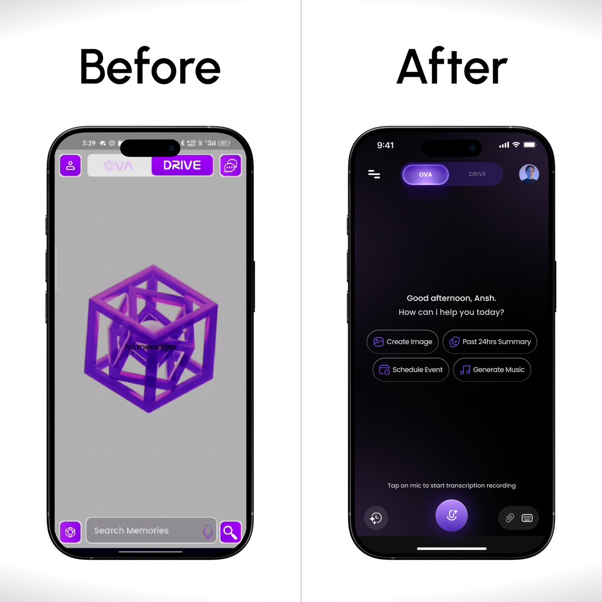
My UI/UX process usually starts like this:
What problem are we actually solving?
Who feels this pain the most?
What does success look like for the user?
Only after this do I open Figma.
Design tools don’t solve problems, clarity does.
I was reviewing a product today and noticed something simple yet costly
❌ Too many CTAs on one screen
✅ No clear primary action
If everything is important, nothing is.
As designers, our real job is prioritisation.
One design belief I strongly stand by:
Good UI should feel invisible.
If users stop to admire the design, it might already be failing at its job.
My goal is always:
�� Reduce thinking
– Guide attention
– Make actions obvious
What’s one design principle you never compromise on?
I’m starting something new today.
I’m a UI/UX designer who believes good design isn’t about “looking cool”, it’s about clarity, intent, and impact
Over the next few weeks, I’ll be sharing
– UI breakdowns
– UX thinking
– Design decisions behind real screens
– Mistakes I’ve made