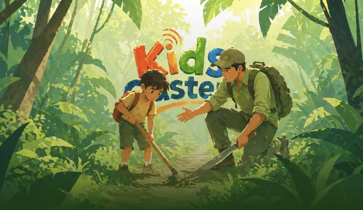
🎉 Excited to share my latest UI/UX Case Study — Kids Caster Tracking Website!
Designing for children's safety and parental peace of mind is both a responsibility and a privilege. In this project, I explored how thoughtful design can make real-time tracking feel intuitive, reassuring, and accessible for families.
🔍 What this case study covers:
→ User Research & Problem Definition
→ Information Architecture & User Flow
→ Wireframing & Prototyping
→ Visual Design & Design System
→ Usability Considerations for Parents & Guardians
Every design decision was rooted in clarity, trust, and ease of use — because when it comes to kids' safety, there's no room for confusion.
👉 Check out the full case study on Behance:
https://t.co/d3LZgAzkNu
Would love to hear your thoughts and feedback! 💬
#UIUX #CaseStudy #ProductDesign #UXDesign #UIDesign #Behance #ChildSafety #TrackingApp #DesignProcess #UserExperience
Arcalea — Transforming Growth, Driven by Data
This project explores how data-driven thinking can reshape digital experiences and business growth.
👉 The challenge:
How do you design a product experience where data isn’t just shown — but actually drives decisions?
👉 My approach:
• Turn complex data into clear, actionable insights
• Design with a growth-first mindset
• Balance visual clarity + business impact
• Create an experience that speaks to both users and stakeholders
👉 The result:
A modern, scalable UX that aligns data, design, and growth strategy into one seamless experience.
💡 One key insight from this project:
Good design is not about making things look good —
It’s about making data useful, decisions faster, and growth predictable.
If you're building a product where data matters, this case study might give you a fresh perspective.
🔗 Check it out here:
https://t.co/CKv88O6NQd
Your website looks beautiful. It's also quietly killing your business.
And before you blame your developer — stop.
They did exactly what you asked. The colors are on-brand. The animations are smooth. The hero section looks like it belongs on an agency portfolio.
But here's the uncomfortable truth:
Aesthetics don't pay your invoices. Conversions do.
The mistake most businesses make:
They treat their website like a brochure — something to admire, not something to act on.
So they obsess over:
- Color palettes that "feel right"
- Fonts that look premium
- Scroll animations that impress
- Stock photos that seem professional
And completely overlook:
- Whether visitors understand what you do in 5 seconds
- Whether your CTA is visible without scrolling
- Whether your homepage speaks to the visitor's problem — or just talks about you
- Whether trust signals (testimonials, case studies, results) are placed where decisions are actually made
Here's what bad UX actually costs you:
Let's say 1,000 people visit your website this month.
If your conversion rate is 0.5% — you get 5 leads. Fix your UX to 2% — you get 20 leads.
Same traffic. Same ad spend. Same product. 4x the leads. Just from fixing the experience.
That's not a design upgrade. That's a business decision.
What "broken UX" looks like in real life:
- Your headline talks about you, not your customer's pain
- Your CTA says "Learn More" instead of "Get My Free Quote"
- Visitors have to scroll past 3 sections before they understand what you sell
- Your contact form has 9 fields (visitors abandon at 4+)
- Mobile users see a layout that clearly wasn't designed for them
- Your fastest-loading page... is a blank white screen for 4 seconds
None of this is visible to you because you know your website too well. Your visitors don't.
The fix isn't a redesign. It's a rethink.
Start with one question:
What is the single action I want a visitor to take — and is everything on this page pointing toward that action?
If the answer is no, you have a UX problem.
I audit homepages for exactly this.
No fluff. No 40-page reports. Just 1 clear, actionable fix that could move the needle this week.
Comment "UX" below and I'll personally review your homepage and tell you the one thing holding it back.
(First 10 only — I do this properly, not at scale.)
Save this post if you're planning to revisit your website this quarter. You'll thank yourself later.
This is my new look after a fresh haircut and beard styling.
It cost me $20 here in the UAE.
Back in my home country, I used to pay only $3 for the exact same service.
Over the last 3 months, I visited two salons and spent around $40 in total.
But nothing really changed—same hair, same beard, same person, same service.
Only one thing changed: the location.
This made me realise something important:
👉 Sometimes, it’s not the quality of your work that defines your value.
👉 It’s where—and how—you position yourself.
When you place yourself in the right market, especially where your skills are rare, your value increases automatically.
Many talented people stay undervalued not because they lack skill, but because they are in the wrong environment.
If you feel undervalued, don’t just upgrade your skills—
upgrade your positioning.
Your potential deserves the right stage.
Just completed another UX consultation session today with a new client — and also received a $15 tip 😊
Total earning: $115 in just 30 minutes.
Honestly, I’m really enjoying this. UX is not only about design, it’s more about solving real problems and giving proper direction.
If you also want to learn how to earn through UX consultations, do follow me. I will be sharing more practical insights very soon.
For now, you can check my Medium article where I explained everything in detail:
https://t.co/e5dQRMMAB8
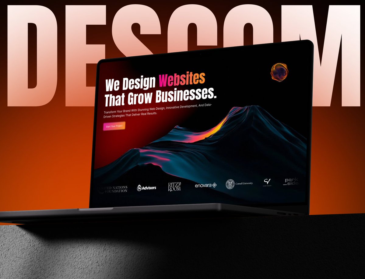
I’m excited to share my latest work — Descom Website UI/UX Design.
This project was focused on creating a modern, user-friendly, and conversion-driven website experience. From research to final UI, the goal was to simplify user journeys while maintaining a clean and professional visual style.
🔍 What I worked on:
• User Research & Problem Understanding
• Wireframing & Information Architecture
• High-Fidelity UI Design
• Responsive Design (Mobile, Tablet, Desktop)
• UX Improvements for better engagement
💡 The main objective was to design not just a good-looking website, but a seamless experience that helps users take action easily.
👉 Check out the full case study here:
https://t.co/NJZGiw6D2y
I would really appreciate your feedback and thoughts 🙌
#UIUX #WebDesign #CaseStudy #ProductDesign #UserExperience #UIDesign #DesignProcess #ResponsiveDesign #Behance #UXDesign
@piotr_dev_ Thank you for your question. Before publishing any case study, we need to put in significant effort. This includes designing a dedicated landing page and showcasing the design through various mockups from different perspectives so that it looks polished and visually appealing.
I’m very happy to share my latest UI/UX case study:
🔗 EVSPARK – Mobile Application for EVs
Nowadays, EV users are facing many challenges like finding charging stations, availability, and smooth overall experience. In this project, I tried to solve these problems by designing a simple, clean, and user-friendly mobile app.
In this case study, I have covered:
- User research and problem understanding
- User flow and information structure
- Wireframes and UI design system
- Mobile-first modern UI design
- Focus on usability and better user experience
My goal was to create a platform where EV users can easily manage their journey without confusion.
Please have a look at the full case study and share your valuable feedback 🙏
View here:
https://t.co/EvUlCVUVYQ
#UIUX #UXDesign #UIDesign #CaseStudy #MobileApp #EV #DesignCommunity #ProductDesign #Figma