$Mefai $BTC #5|| Macro Dashboard
Bitcoin does not trade in isolation. It responds to global liquidity, yield curves, dollar strength, and institutional positioning. Ignoring macro is like trading with one eye closed.
Mefai's Macro Dashboard fuses data from FRED, Yahoo Finance, and CoinGecko into a single institutional grade macro overlay for Bitcoin. The Regime Score is a weighted 0 to 100 composite built from 10 sub signals: net liquidity trend, yield curve shape, DXY direction, VIX level, M2 money supply growth, real yields, credit spreads, ETF flows, MSTR NAV premium, and halving cycle position.
Net Liquidity chart plots Federal Reserve balance sheet minus Treasury General Account minus Reverse Repo against BTC price on a 5 year dual axis. When net liquidity expands, risk assets including Bitcoin tend to follow with a lag.
M2 Lag Correlation panel measures this relationship with monthly log returns across multiple lag windows.
Cross Asset Correlation Kaleidoscope shows rolling 30/90/180 day correlations between Bitcoin and gold, S&P 500, Nasdaq, DXY, and bonds. When BTC correlation with equities breaks down, regime change is happening.
Halving Cycle Overlay plots the current cycle against 2016 and 2024 with percentage returns from halving day. This is not prediction. This is pattern recognition from the only three complete cycles in Bitcoin history.
14 panels. Every metric live.
#Mefai. Macro Context. Cycle Awareness. Institutional Grade.
Great news for everyone who has been missing the Mefai Panel. Full package access included, MEFAI PANEL will be back online with its new engines on June 3rd . We really missed.
$Mefai $SOL Node #1 || Network Health Cockpit
If you trade Solana tokens, you trade on Solana's infrastructure. When that infrastructure degrades, your transactions fail, your swaps timeout, and your bot misses entries. No price chart warns you about this. By the time you notice, you have already lost money to a network problem, not a market problem.
Mefai's SOL Network Health Cockpit tells you whether the network you are trading on is healthy right now. Not yesterday. Not from a status page that updates every hour. Right now, every 30 seconds.
TPS split into real transactions vs consensus votes. A network reporting 3,000 TPS but only 1,500 non vote is processing half the trades you think it is. When non vote TPS drops below 800, swap execution slows and DEX arbitrage windows close.
Nakamoto coefficient tells you how many validators could theoretically collude to halt the network. At 18, Solana is reasonably decentralized. If this drops below 10, the network's censorship resistance weakens and your transactions can be delayed or reordered by a small group.
Skip rate directly affects your trade execution. Validators that skip slots create gaps in block production. When average skip rate rises above 8%, block times become inconsistent and time sensitive trades (liquidations, arbitrage, sniper entries) become unreliable.
Staking economics show whether validators are profitable. When staking APY drops, validators leave, decentralization weakens, and network stability decreases. When it rises, new stake enters and security improves.
Top Protocols panel shows where capital sits on Solana. If you are trading on Raydium and its TVL is declining while Jupiter is growing, liquidity is migrating and your execution quality on Raydium will deteriorate.
You don't need to be a node operator to need this data. You need to be a trader who doesn't want to lose money to infrastructure failures.
#Mefai. Trade The Chain. Know The Chain.
$Mefai $SOL Node #3|| SPL Token Analyzer
This is a serious problem in the Sol and Mefai is solving it.
🧩 Most token scanners on Solana are copies of each other running the same RugCheck API with the same misclassified data.
🧩They show burn addresses as risky holders. They flag DEX liquidity pool accounts as whale concentration. They cannot detect locked liquidity on PinkSale, Raydium CPMM Lock, or Streamflow because they only check one locker program. When a token has 40% of supply in a burn address and 20% in a Raydium pool, these tools report 60% held by top 2 wallets and flag it as dangerous. That is not security analysis. That is misinformation.
🧩Mefai's SPL Token Analyzer runs its own risk engine. We do not display RugCheck scores as our verdict. We pull raw holder data, classify every address (burn sink, AMM pool, locker PDA, creator authority, real wallet), filter out the noise, and present what actually matters: how much of the circulating supply is held by real humans who can sell.
🧩Holders showing 0 balance are filtered out. Mint authority pseudo entries showing 100% are removed. The concentration metrics (Top 1, Top 5, Top 10, Top 20) calculate from actual token balances of real wallets, not from inflated totals that include dead addresses and protocol accounts.
🧩Authority Radar checks whether mint, freeze, and update authorities are active, revoked, or delegated. A token with active mint authority can print unlimited supply. A token with active freeze authority can lock your wallet. Most scanners bury this in a generic risk score number. We show each authority status explicitly.
🧩Token 2022 extension detection surfaces hidden transfer fees, permanent delegates, and transfer hooks that standard SPL token scanners miss entirely. These extensions can silently take a percentage of every transfer or redirect tokens to a third party.
🧩Insider Network detector identifies clusters of wallets that received tokens in the same transaction pattern, a signature of coordinated distribution before public sale.
🧩LP lock verification reads locker program state directly from the chain. Not from a third party API that updates once per hour. If liquidity is locked on PinkSale, Raydium CPMM Lock, or burned to the SPL burn address, we verify it at the program level and show the lock duration.
🧩Social links are rendered safely with proper type checking. Websites open in new tabs. Wallet addresses link to explorers. No raw objects dumped into the UI.
#Mefai. Real Holders. Real Risk. Zero Misclassification.
🔗
https://t.co/MH7dgXl3NG
https://t.co/0iybgcfnKg
$Mefai $SOL Node #2 || DEX Cockpit
!!!!!!!!!!! Solana DEX volume hit $1.5 billion in 24 hours across 87 tracked protocols. !!!!!!!!!!!
However, most of that volume is wash trading. Right now, if you check other popular platforms, you will see protocols with $250 million in daily volume that have no website, no X account. !?!? Yet they are listed and ranked as legitimate DEXes. This is a massive layer of misinformation served directly to the end user. On Mefai, these protocols are automatically filtered out. We do not list what we cannot verify.
Most traders see none of this data. They trade on one DEX, check one chart, and miss the others venues where liquidity, pricing, and opportunity differ.
DEX Leaderboard ranks every protocol by 24 hour volume with 1 day, 7 day, and 30 day change columns. Suspected wash trading protocols are automatically filtered out. When Orca drops from 15% to 9% dominance while Raydium climbs, liquidity is migrating. Traders on the losing DEX get worse fills. Traders who see the shift early move first.
Top Pairs and Top Pools show where actual trading happens. The difference matters: a pair can have high volume but low TVL (momentum driven meme trading) or high TVL but low volume (parked liquidity earning nothing). The Buyer Seller Flow panel decomposes each top pair into buy vs sell transaction count, revealing whether a pump is broad based or driven by a handful of wallets.
New Pair Velocity tracks how many pools launched in the last 1 hour, 6 hours, and 24 hours. A spike in fresh pools during a memecoin wave means new opportunities and new rugs are arriving simultaneously. The Gainers and Losers panelsrank tokens by 24 hour price change with minimum $10K volume filter to exclude dust.
The Pool TVL Lorenz Curve and HHI concentration index tell you whether Solana DEX liquidity is healthy or dangerously concentrated. When a few pools hold most of the TVL, a single withdrawal can collapse liquidity for everyone.
Fee Revenue estimates what each DEX earns from trading activity. Protocols generating outsized fees relative to their volume are charging more. Protocols with high volume but low fee share are subsidizing traders. Both signals matter for choosing where to trade.
#Mefai. Every DEX. Every Pair. Every Pool. One Page.
@MetaFinancialAI $Mefai is setting the standards once again. This cockpit should definitely be an open tab on the browser of anyone actively trading on the Solana network.
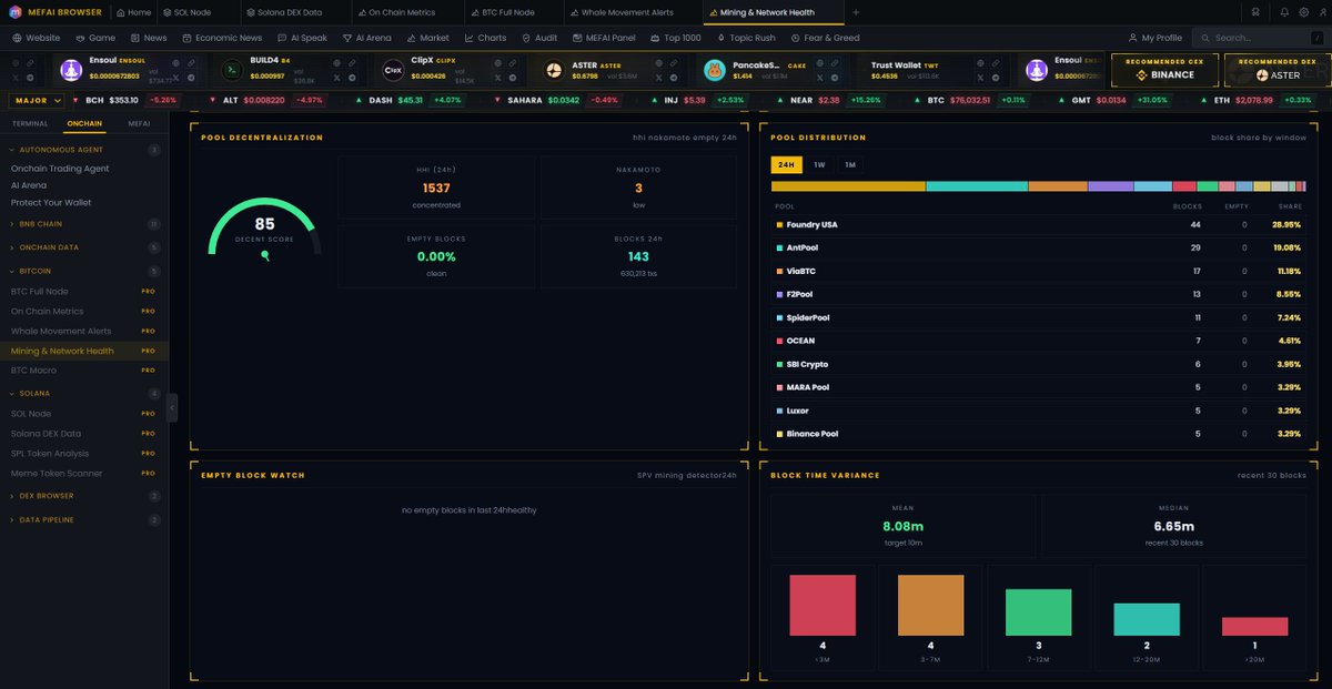
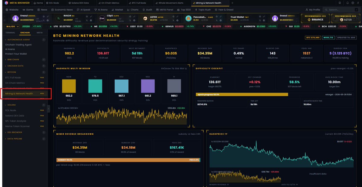
$Mefai $BTC #4 || Mining Network Health
Hashrate is not just a security metric. It is a real time window into miner economics, and miner economics drive sell pressure. When hashprice drops below operating cost, weak miners capitulate, hash rate declines, and forced selling follows. When hashprice recovers, the opposite happens. No retail tool connects these dots.
Mefai's Mining page tracks 14 panels of mining intelligence from hashrate multi window trends to pool decentralization metrics. The Hashprice chart shows revenue per terahash per day over a full year, the single most important metric for understanding whether miners are profitable or underwater.
Pool Decentralization measures HHI concentration and Nakamoto coefficient across the last 24 hours of block production. When a single pool approaches 30% share, centralization risk increases. The Empty Block Watch detects SPV mining patterns where pools submit blocks without transactions to claim subsidy faster.
The 51% Attack Cost model estimates the theoretical security budget based on current hashrate and hashprice. Block Time Variance shows the distribution of actual block intervals against the 10 minute target, revealing network health at the protocol level.
#Mefai. Miner Economics. Network Security. Full Stack.
@MetaFinancialAI@crypto__tiger3 Most analysis platforms only show you RSI.
$MEFAI tries to read the entire chain, from government wallets to miner activity.
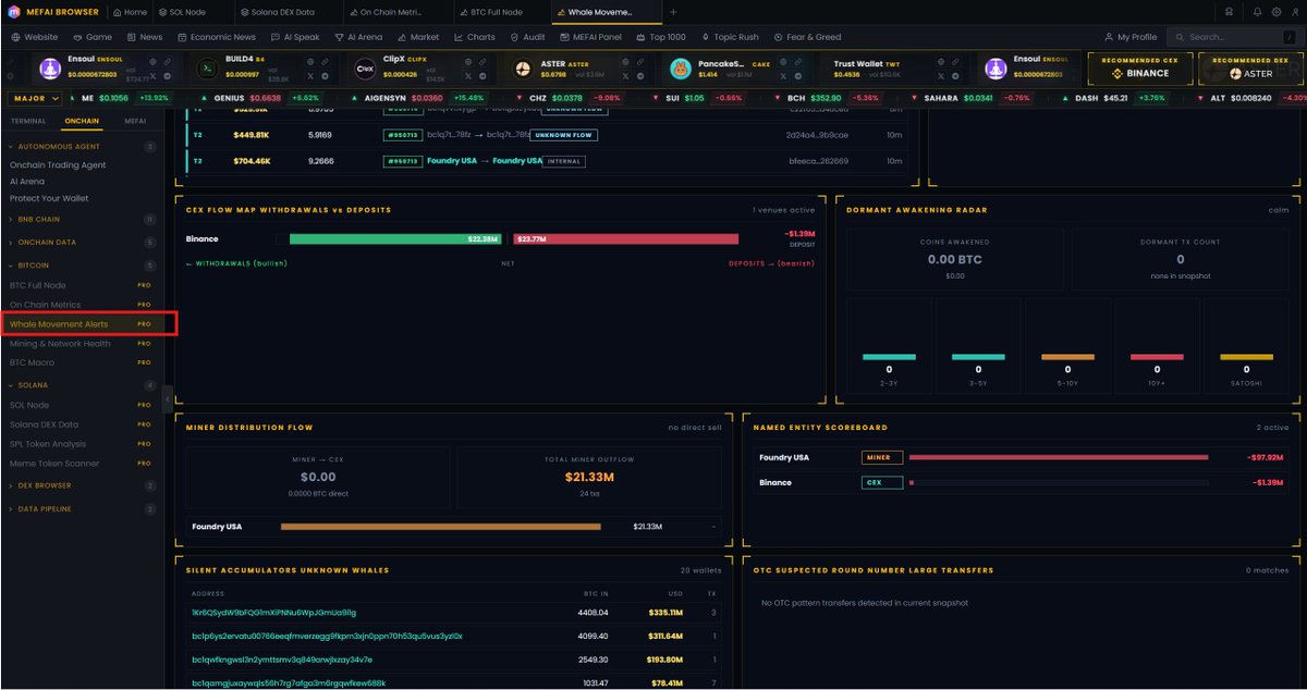
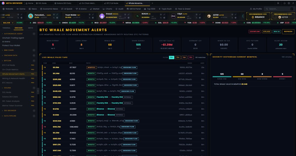
$Mefai $BTC #3 || Whale Movement Alerts
Exchange deposits precede sell pressure. Miner outflows signal capitulation or profit taking. Dormant coins awakening after years of silence indicate long term holders making decisions. None of this shows up on a price chart until after the move.
Mefai's Whale Movement Alerts scans the Bitcoin mempool every 45 seconds and classifies every large transaction through a 34 entity registry covering 11 exchanges, 9 miner pools, and government trustee wallets. Each transaction is decoded into a direction, CEX withdrawal (bullish), CEX deposit (bearish), miner sell, internal transfer, OTC pattern, or unknown flow.
CEX Net Flow tracker shows real time exchange balance delta. When net flow is negative (outflow), BTC is leaving exchanges, reducing available sell pressure. When positive (inflow), holders are depositing to sell. The Dormant Awakening Radar watches for coins that haven't moved in 2+ years suddenly transacting, one of the strongest signals in Bitcoin on chain analysis.
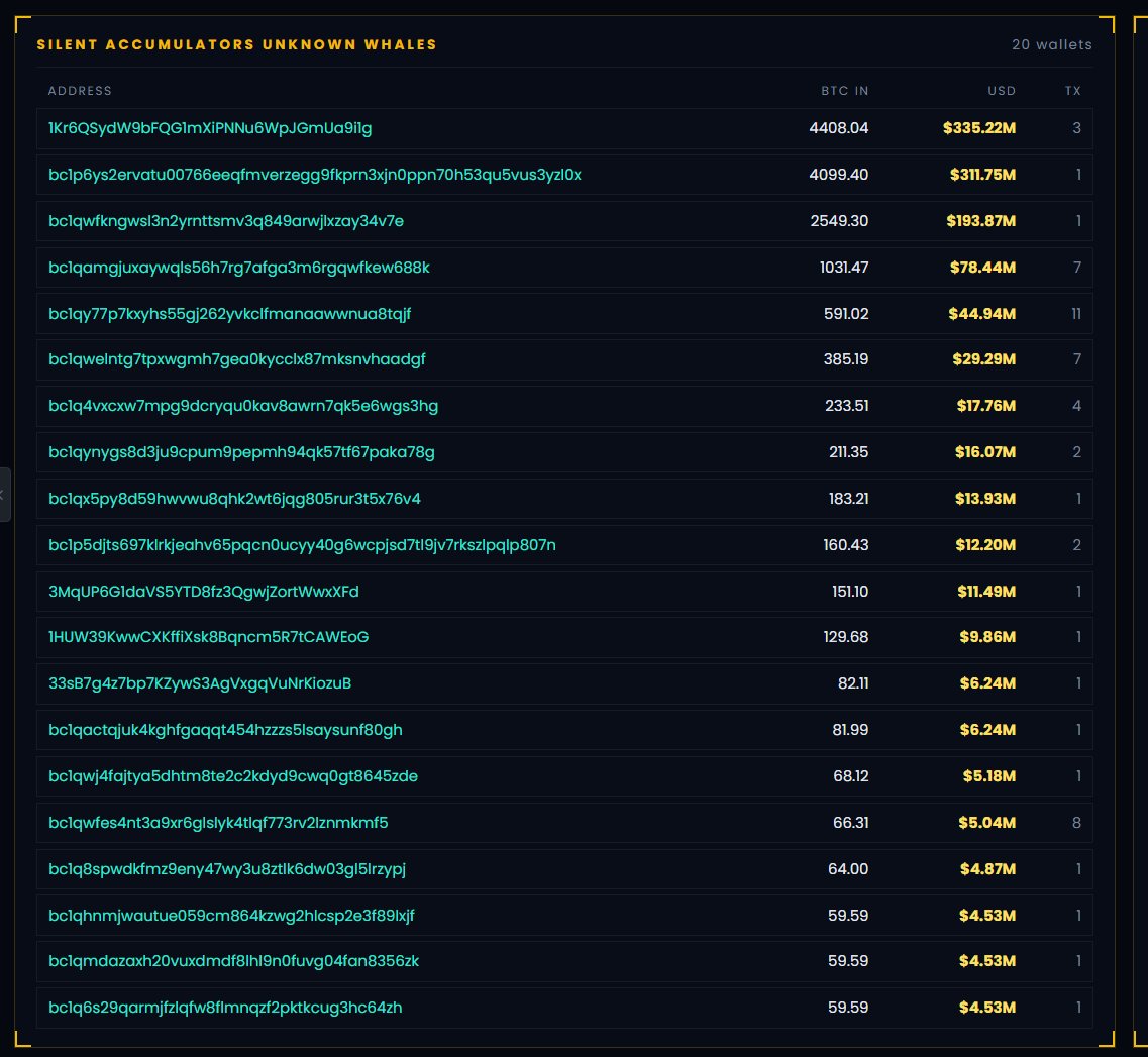
Silent Accumulators surfaces unknown wallets receiving large amounts without any identified entity tag. OTC Detection flags round number transfers above $10M between unknown addresses, the signature pattern of institutional over the counter deals.
$Mefai. Every Whale. Every Move. Before The Candle.
The MEFAI ecosystem continues to grow with strong foundations.
Full Node systems, AI powered analytics, trader psychology data models, risk management infrastructures, and much more...
This may only be the beginning.
One day, when the market finally learns the difference between real technology and artificial hype, many people will remember these days.
$MEFAI
The future belongs to intelligent systems, not emotional reactions.
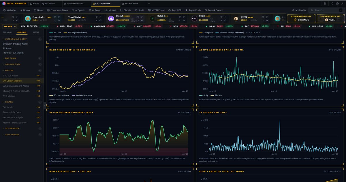
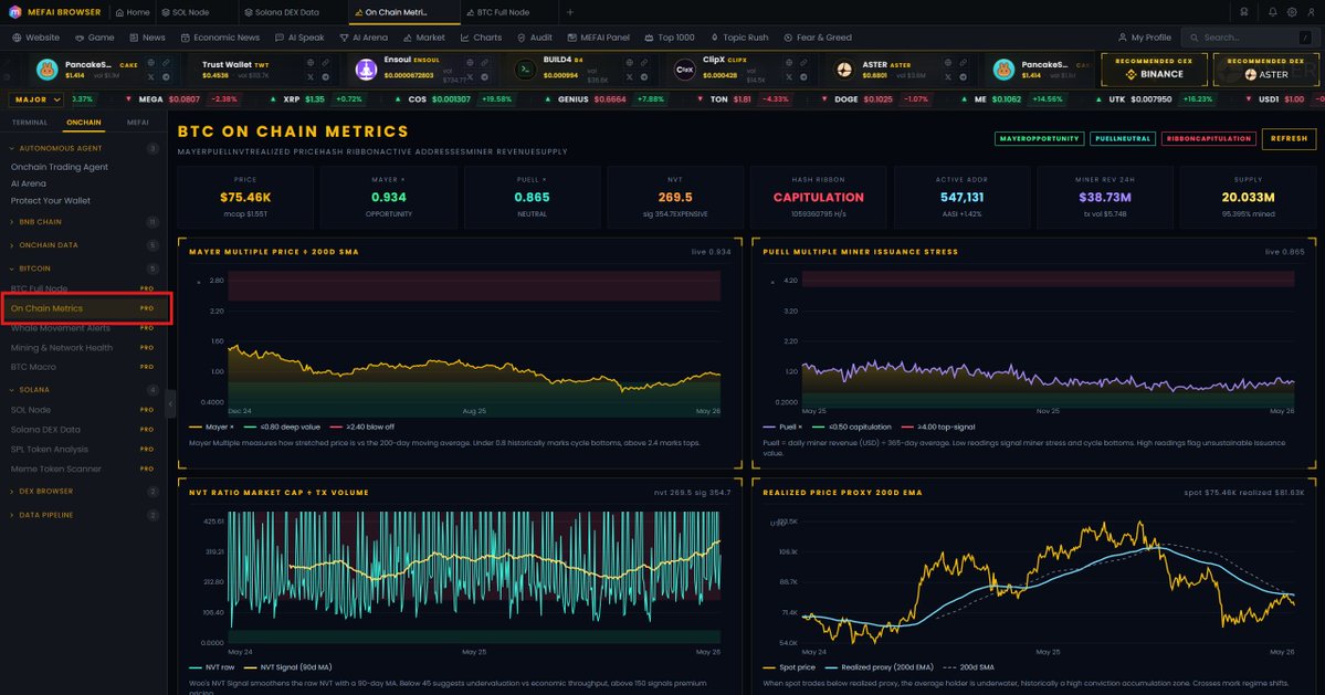
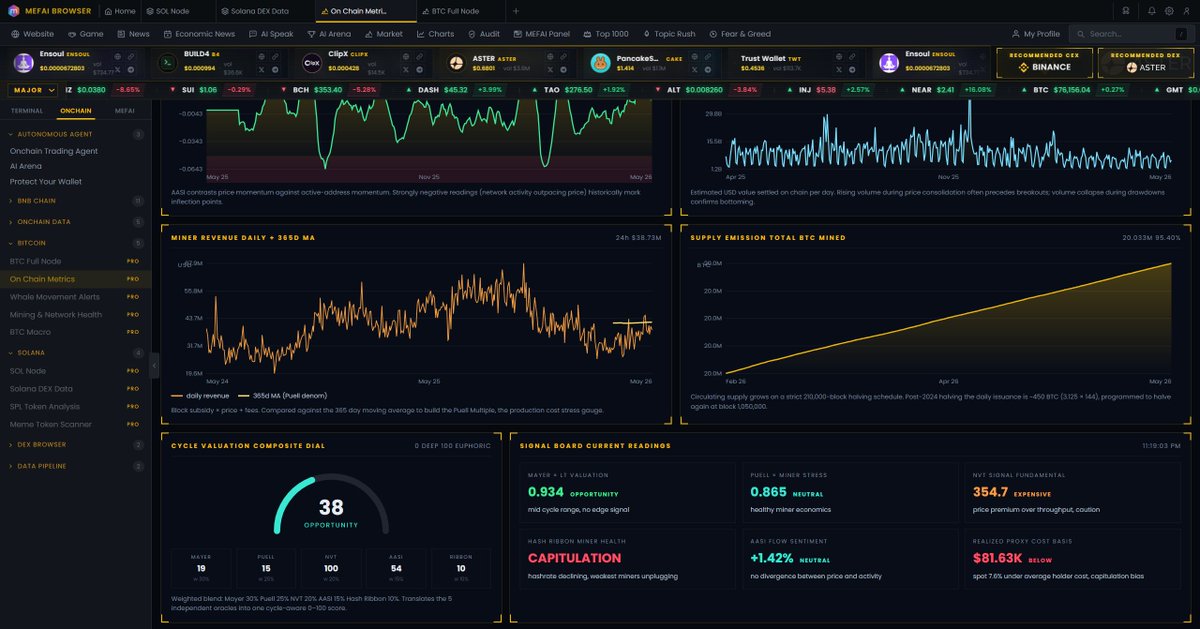
$Mefai $BTC #2 || On Chain Metrics
Most Bitcoin analysis tools show you price and RSI. Maybe a fear greed index copied from alternative .me. None of them answer the only question that matters: is Bitcoin cheap or expensive right now relative to its own on chain fundamentals?
Mefai's On Chain Metrics page runs five independent valuation oracles simultaneously. Mayer Multiple measures price against its 200 day moving average. Puell Multiple tracks miner revenue stress against yearly baseline. NVT Signal compares market cap to actual transaction throughput. Hash Ribbon detects miner capitulation and recovery phases. AASI measures whether active address growth is outpacing or lagging price movement.
Each oracle produces its own verdict. The Composite Dial fuses all five into a single 0 to 100 cycle score with weighted inputs: Mayer 30%, Puell 25%, NVT 20%, AASI 15%, Hash Ribbon 10%. When the dial reads below 20, Bitcoin is historically undervalued across multiple independent metrics. When it reads above 80, caution is warranted regardless of price momentum.
Realized Price Proxy shows whether the average holder is in profit or loss. When spot trades below realized, the market is in capitulation. When spot trades significantly above, distribution risk increases. This single metric has marked every major cycle bottom and top in Bitcoin history.
#Mefai. Five Oracles. One Verdict.
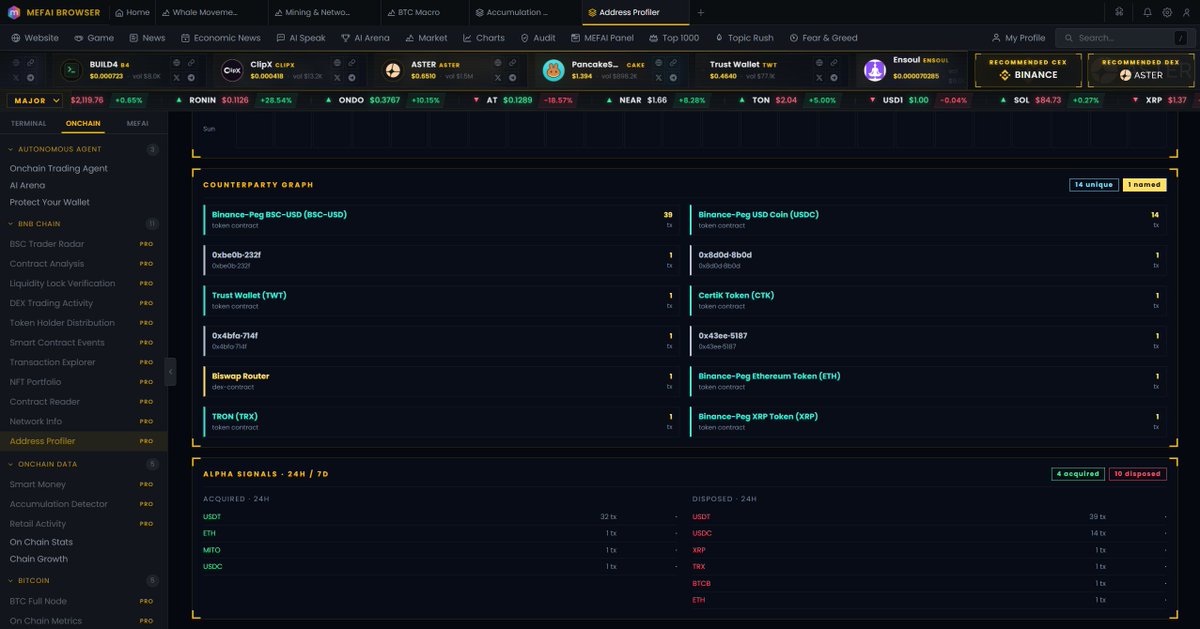
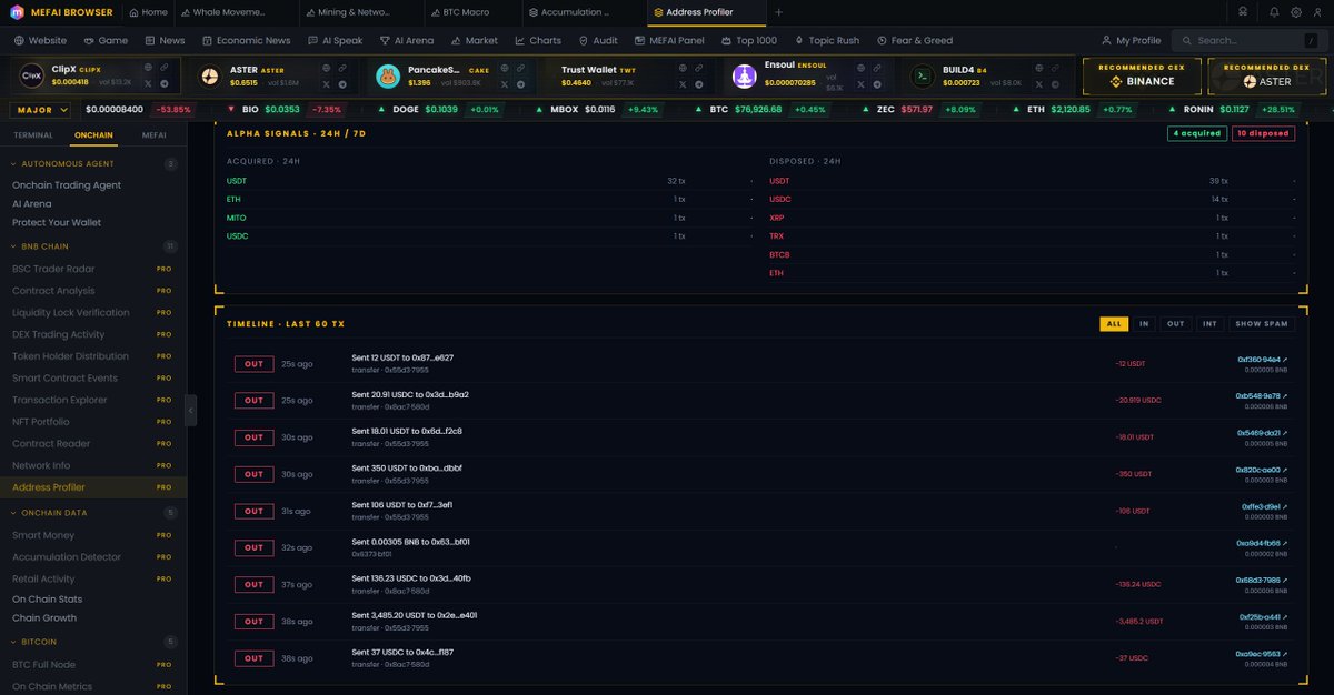
$Mefai BNB CHAIN #10 || Address Profiler
10 panels. 1 address. Complete intelligence.
Every data point is pulled from live our node. No cached profiles from last week. You paste an address, we read the chain, we build the profile.
Most wallet lookup tools show you a balance and a transaction list. Some add a pie chart. That is not a profile. That is a spreadsheet with a circle on top. You learn nothing about who this wallet is, how it trades, who it interacts with, or whether it is safe to transact with.
Mefai's Address Profiler takes any BSC address and builds a full institutional grade profile in under 2 seconds. Not a balance check. Not a block explorer clone. A complete behavioral, financial, and risk intelligence layer for a single wallet.
🟢1. Identity || Named entity detection from our whale registry, bytecode fingerprinting. Shows wallet age, nonce count, native balance, and whether it is a contract or EOA. If this wallet belongs to a known exchange, bridge, or project, you see the name immediately.
🟢2. MEFAI Score || Composite 0 to 100 trust dial with component breakdown. Not a third party score you cannot verify. Our own scoring engine based on on chain behavior, risk flags, portfolio quality, and activity patterns.
🟢3. Portfolio || Every token held with USD value, 24h change, and concentration percentage. Not just balances. Actual dollar values at current market price with change tracking.
🟢4. Net Worth Spark || 24 hour net worth movement as a sparkline. See whether this wallet is gaining or losing value in real time, not from a snapshot taken yesterday.
🟢5. Behavioral Signature || Automated classifier that categorizes the wallet as trader, holder, bot, airdrop farmer, or contract operator. Shows average gas usage, router preference, and transaction category mix.
🟢6. Activity Heatmap || 7 day by 24 hour UTC grid showing exactly when this wallet is active. Bot wallets show uniform 24/7 activity. Human traders show timezone patterns. This grid reveals which one you are looking at.
🟢7. Counterparty Graph || Top 12 addresses this wallet interacts with most frequently, with named entity labels. See whether this wallet's primary counterparties are exchanges, DEX routers, or unknown addresses.
🟢8. Risk Radar || Severity flagged risk indicators. Approval exposure, interaction with flagged contracts, unusual patterns, bluechip vs scam token ratio. Each flag has a severity level so you know what matters.
🟢9. Alpha Signals || Tokens acquired and disposed in the last 24 hours and 7 days. Fresh deposits from external sources. This is the panel that tells you what this wallet is doing right now, not what it did last month.
🟢10. Timeline || Last 60 decoded transactions with method names, token transfers, and counterparty labels. Not raw hex.
Human readable transaction history.
#Mefai. Full Profile. Any Address. Zero Blind Spots.
Mefai BNB CHAIN #9 || $BNB Chain vs $Ethereum Network Intelligence
Every trader on Ethereum knows the pain. A simple token swap costs more in gas than the profit on a small trade.
Deploying a contract can cost hundreds of dollars. Running an arbitrage bot is economically impossible unless you are moving six figures per transaction. The Ethereum network charges premium prices for basic operations, and most traders accept this as normal because they have never seen the alternative presented with live data.
Mefai's BNB Chain vs Ethereum page is a real time network comparison dashboard that pulls live gas prices, block times, TPS, and transfer costs from both chains simultaneously. Every number updates every 10 seconds. There are no static benchmarks, no outdated blog post comparisons, no theoretical maximums. This is what each network costs right now, at this block, at this gas price.
The Head to Head section visualizes the gap with proportional bars. BNB Chain processes over 300 transactions per second while Ethereum handles 13. BNB Chain produces a block every 0.4 seconds while Ethereum takes 12. BNB Chain gas sits at 0.1 gwei while Ethereum fluctuates between 1 and 50. The bars make the magnitude of difference impossible to ignore.
Our Cost Calculator is where the real impact becomes clear. We take the live transfer fee from both networks and project it across 10 real trader scenarios, from a single token send to a full year of whale level trading at 100 transactions per day. The total savings column shows exactly how much money you keep by choosing BNB Chain. At current gas prices, an active trader saves over a thousand dollars per year on fees alone.
BSC Gas Pulse monitors gas percentiles across a 15minute rolling window with a live sparkline, so you can see whether the network is cheap, normal, busy, or spiking. The Block Engine panel shows realtime block production metrics, blocks per minute, gas utilization, active validators, all from live RPC data.
Every data point on this page is computed from live network state. No third party aggregator. No cached API from yesterday. Direct RPC calls to both BNB Chain and Ethereum public nodes, parsed and compared in real time.
$Mefai. Live Data. Real Savings. Zero Compromise.