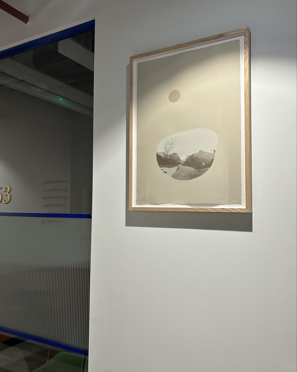
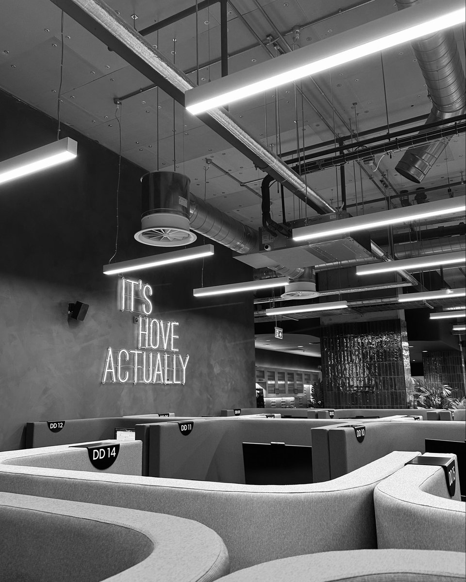
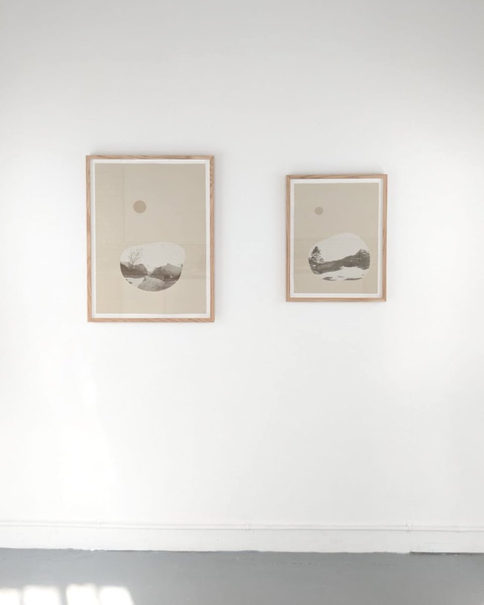
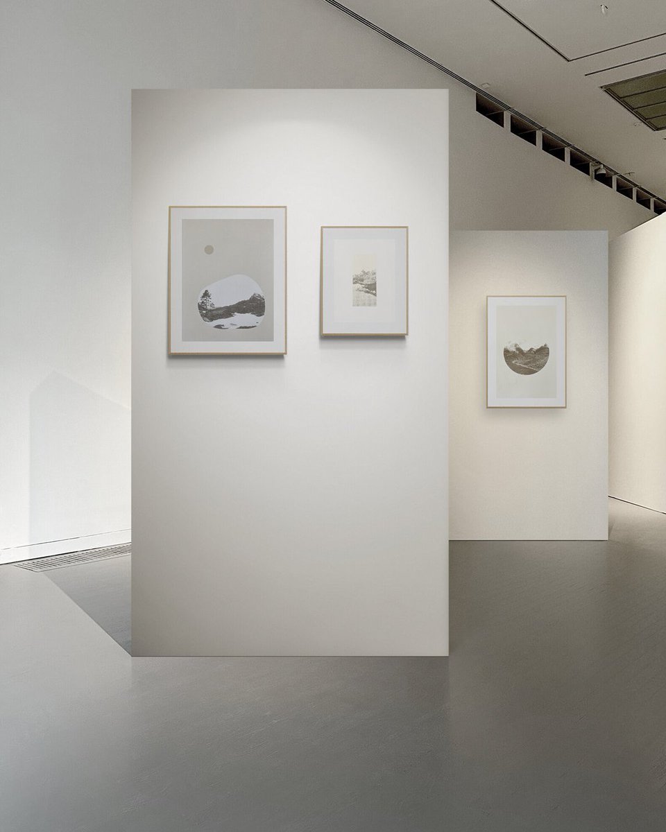
Some in situ shots from the newly opened coworking space, FOUNDRY Hove, just round the corner from Hove station, where I have some prints on display alongside a few other local printmakers. I think there will be a meet the artist reception next month, so I’ll keep you updated.
U.S. Shipping Update - I know there’s been a lot of confusion around this, so I just wanted to share that I’m still shipping to the U.S. it may just take a little longer to arrive, and there shouldn’t be any extra charges.
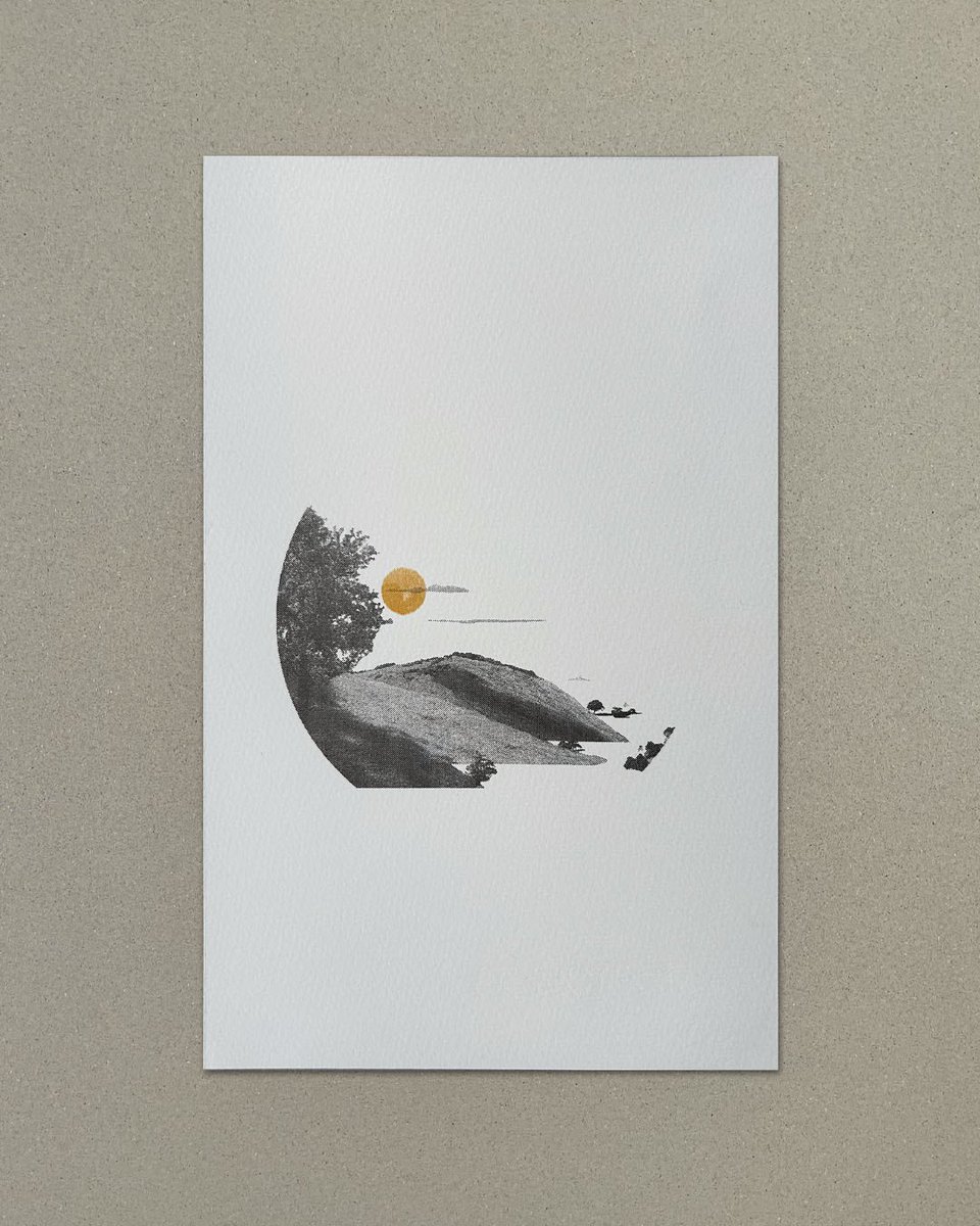
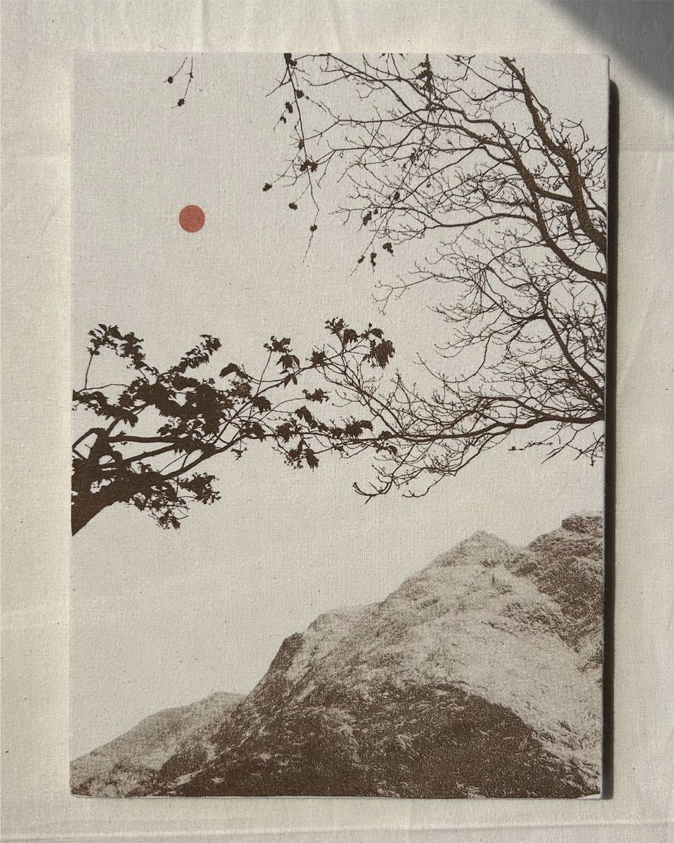
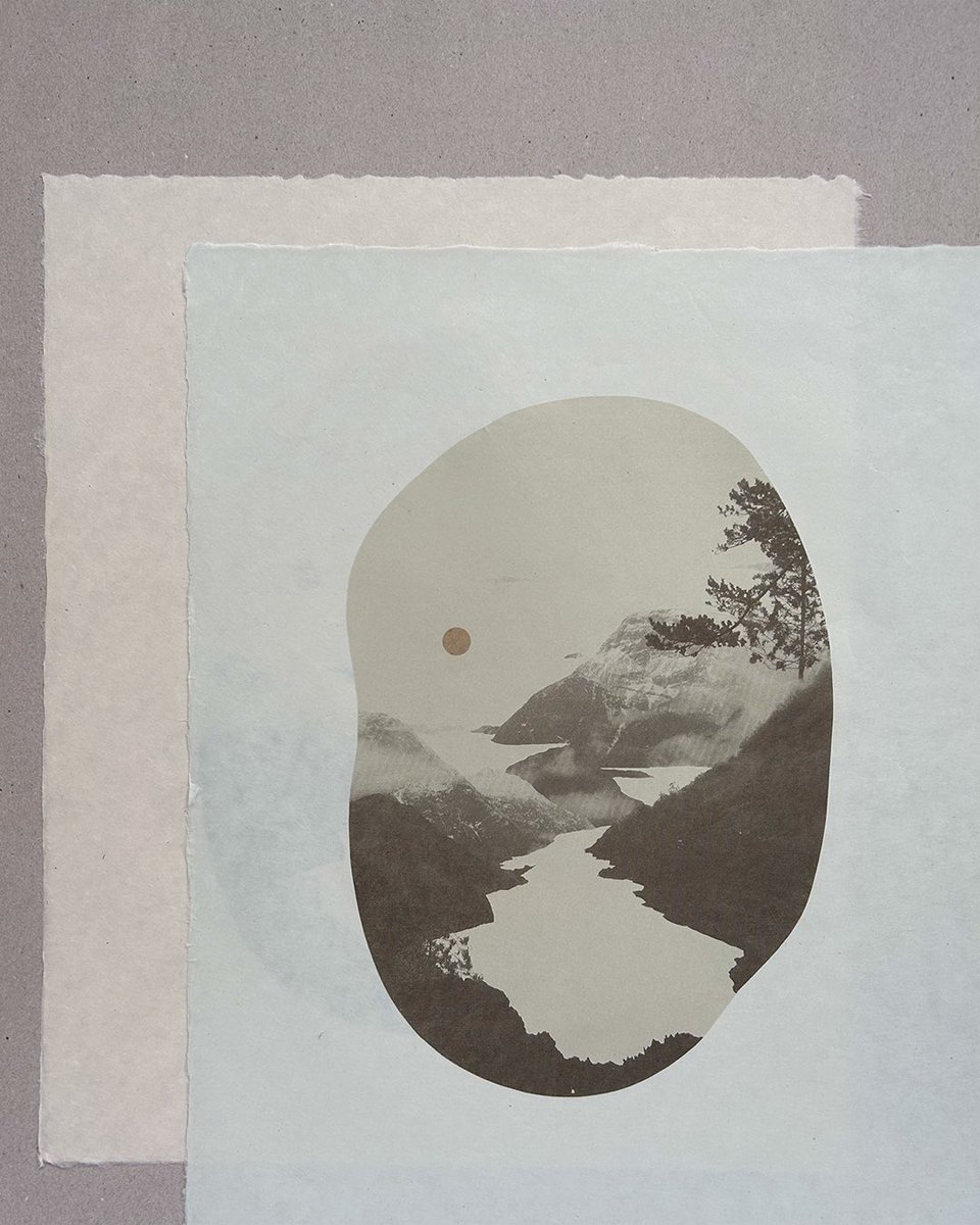
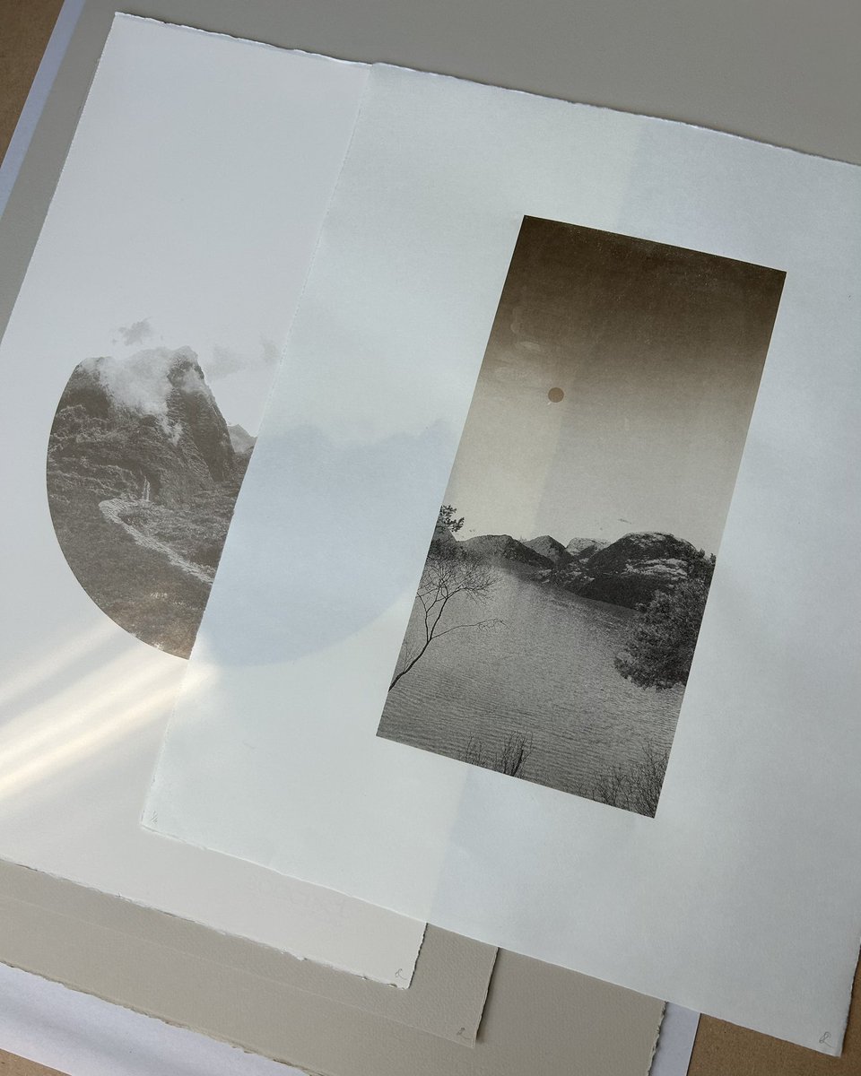
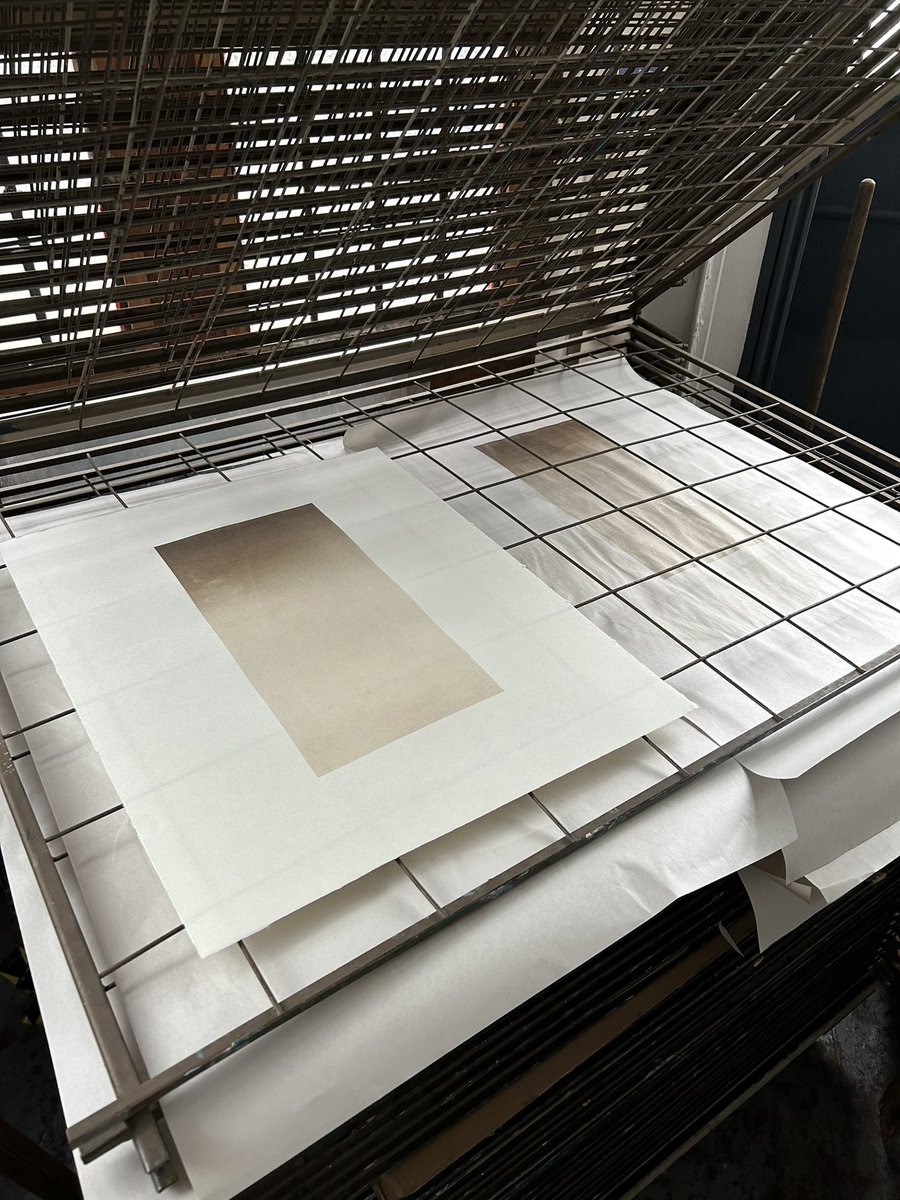
‘In The First Glow of Light’ part of a body of small works that I’m working on and look forward to sharing more of soon.
In The First Glow of Light
Screenprint with pigment and ink on calico
23.5 x 32.5cm
Limited Edition of 5
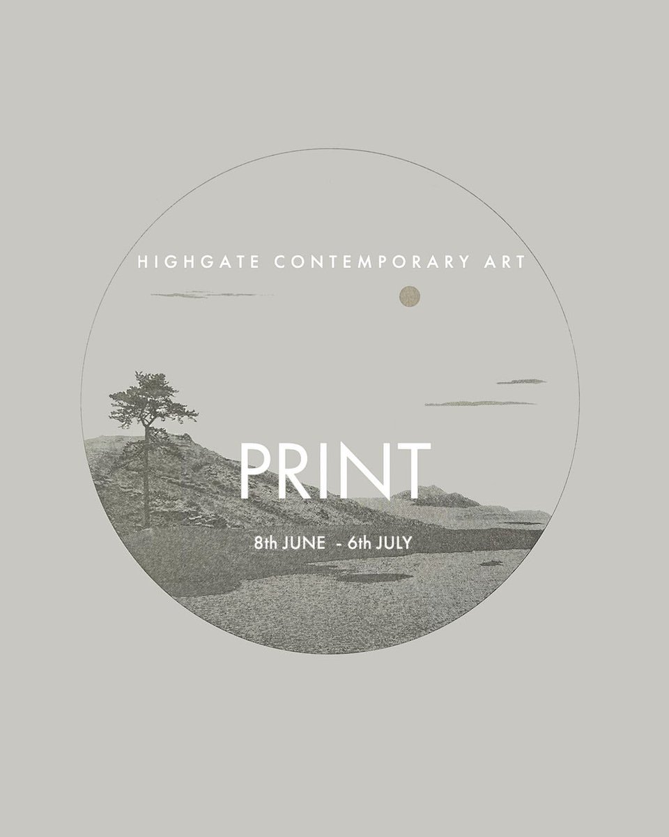
I’m showing a selection of screenprints in PRINT with Highgate Contemporary Art. The exhibition showcases a curated collection of works by 20 contemporary printmakers, which you can view online here: https://t.co/xnrJzOQcr5
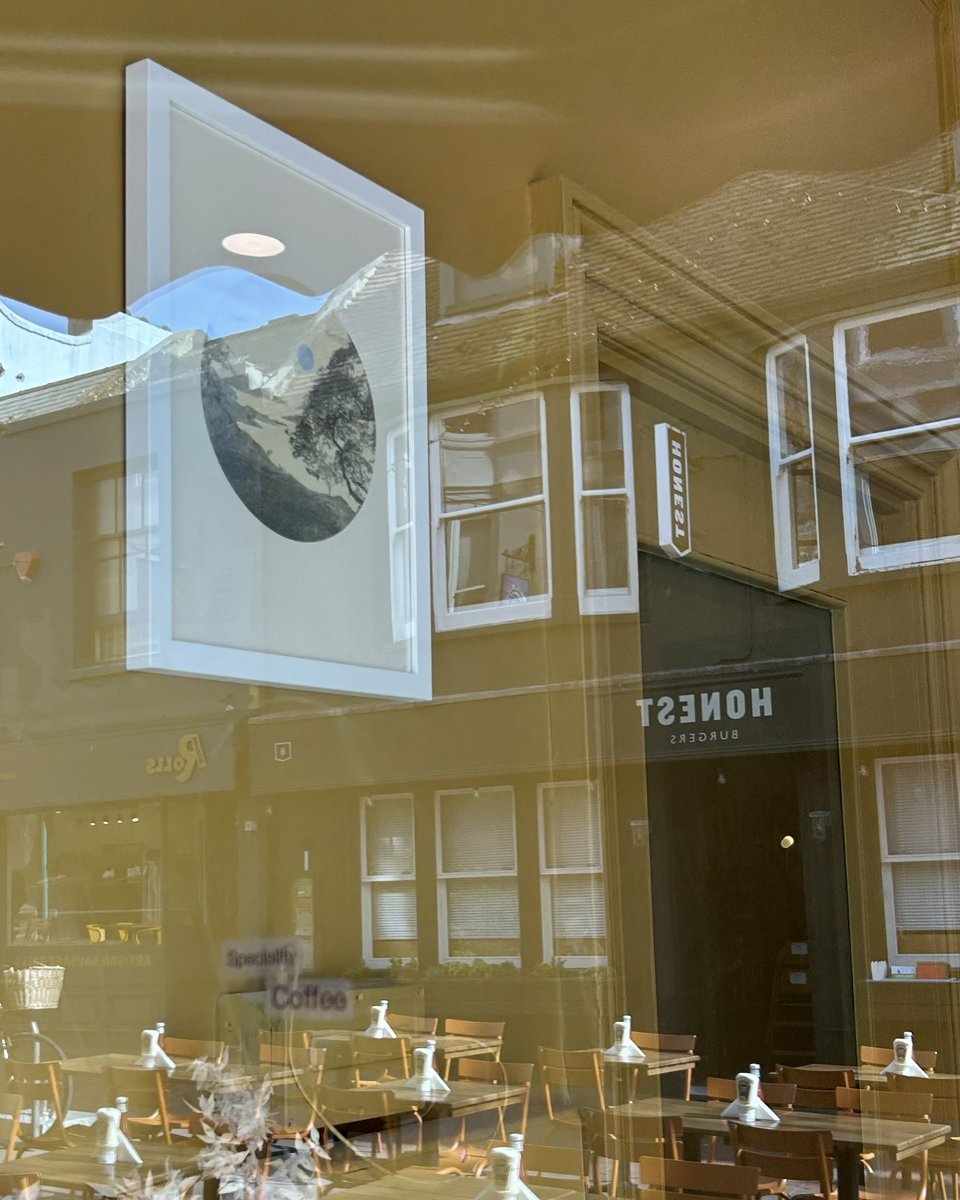
Works on display at Neeko extended until the end of May. Lots happening in Brighton this month with artists open houses, Brighton Festival and Brighton Fringe, so a perfect spot for a little break if you’re in the area.
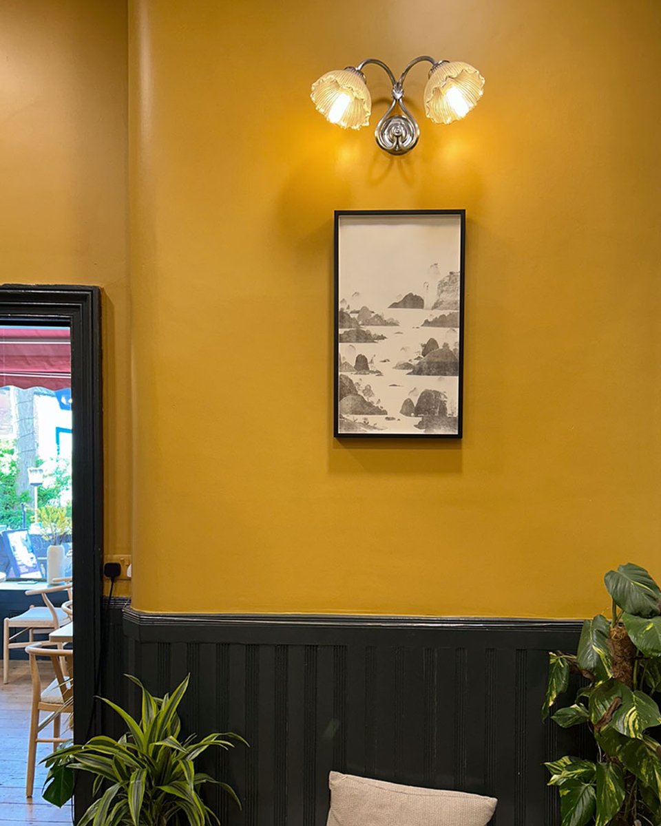
𖡡 36 Duke Street, Brighton and Hove BN1 1AG
View a selection of my prints at Neeko and enjoy their award winning coffee, cakes and matcha - a combination of Japanese and French influences, alongside my prints that draw inspiration from Japanese prints & the Shin-hanga movement.
📍36 Duke Street, Brighton and Hove BN1 1AG
Thank you so much to everyone who has purchased a print so far, forever grateful for your support 🤍 Please take the opportunity to enjoy 20% off all prints for a limited time, as it’s only on for a few days, ending midnight on Thursday - link in bio for details.
My prints bring a sense of calm and connection to nature, bringing the outside into your space, adding a moment of quiet to the every day, an opportunity to pause and take in the imagined landscape view. 🌿 My Spring Studio Sale goes live tomorrow, join my newsletter to save 25%.
Some pink for Sakura season 🌸
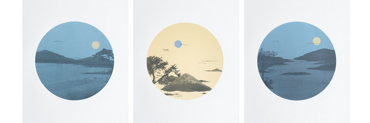
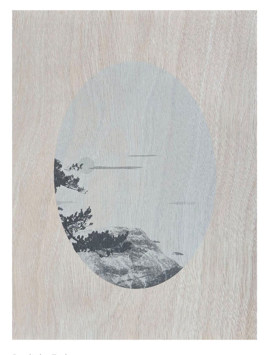
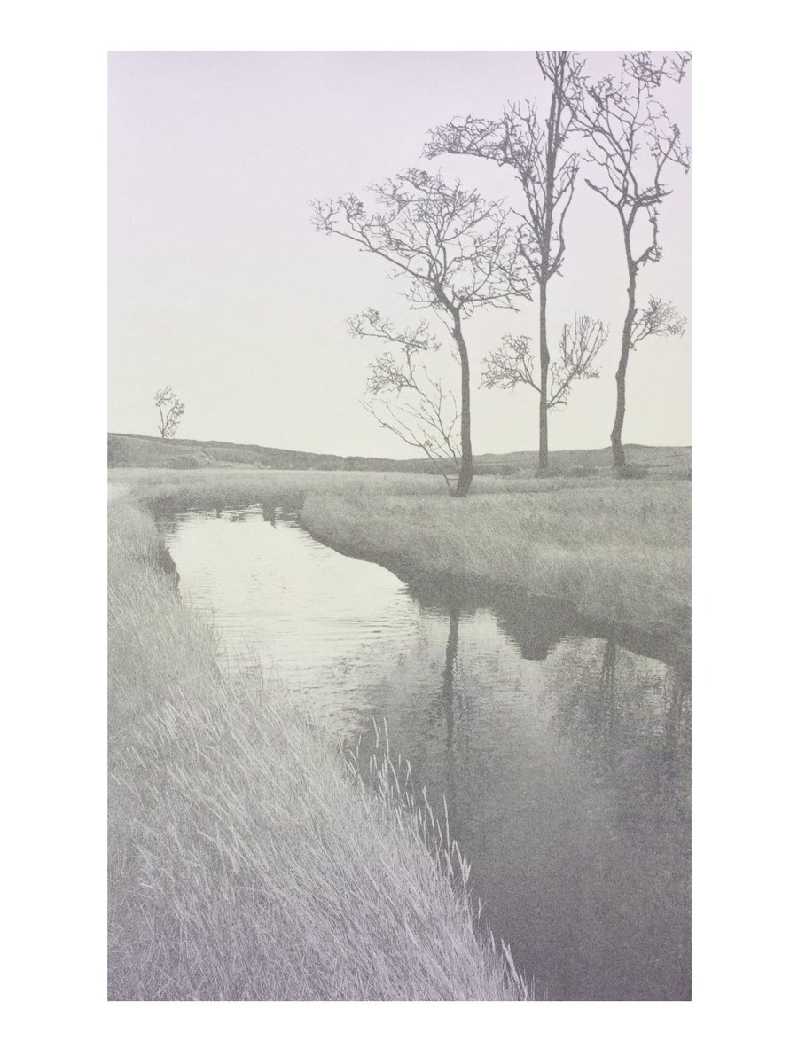
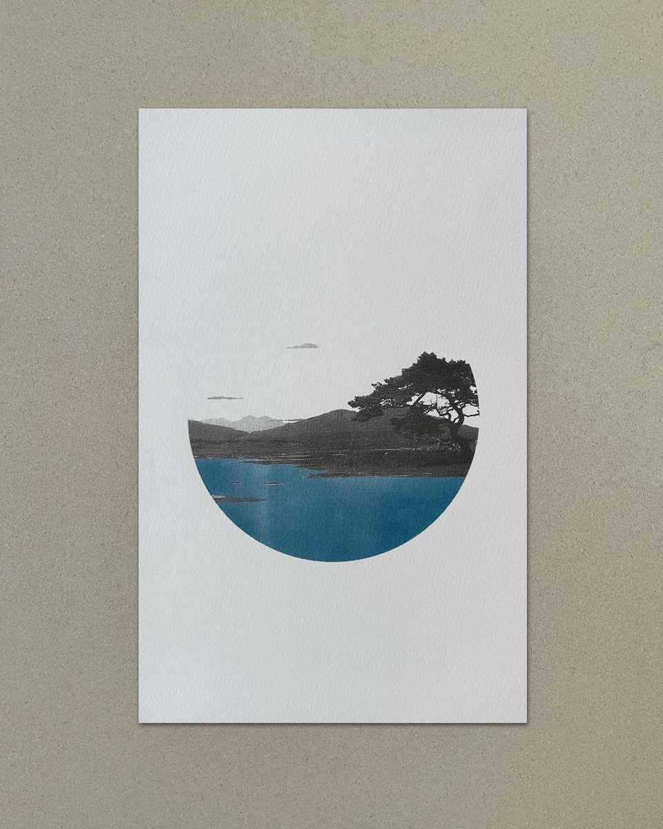
A soft, muted colour palette to help create a serene atmosphere, with the mood from the subdued colours creating an ambient light, the dawn sky reflects on the surrounding landscape and curve of the river. River by Dawn (after Koho Shoda)
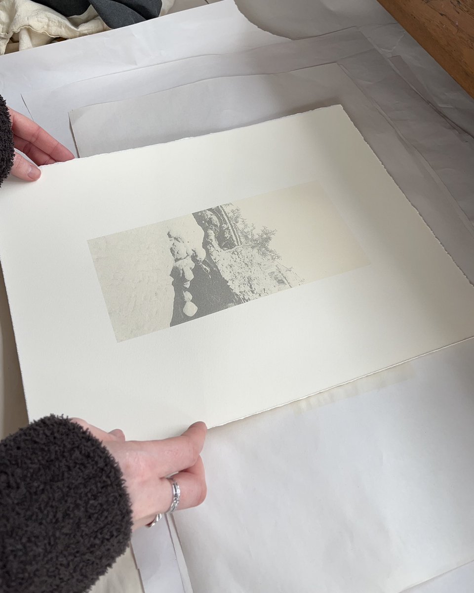
I’ll be going through my print inventory over the weekend ahead of my upcoming Spring Studio Sale. I already know some editions only have a couple of prints left, so if you’d like to be notified first when my sale goes live, please sign up to my newsletter https://t.co/hWMRHxanwo
Spring Studio Sale 🌸 It’s been a while (a few years since my last one) but I feel like spring is the perfect time to make some extra space in my plan chest. I’m still finalising everything but will share more details soon - subscribe to my newsletter for an exclusive discount.
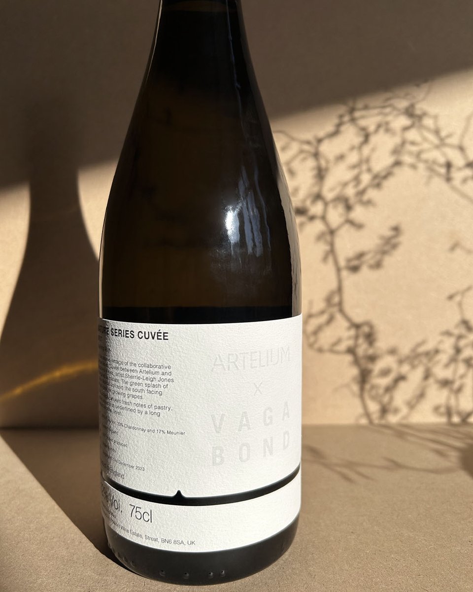
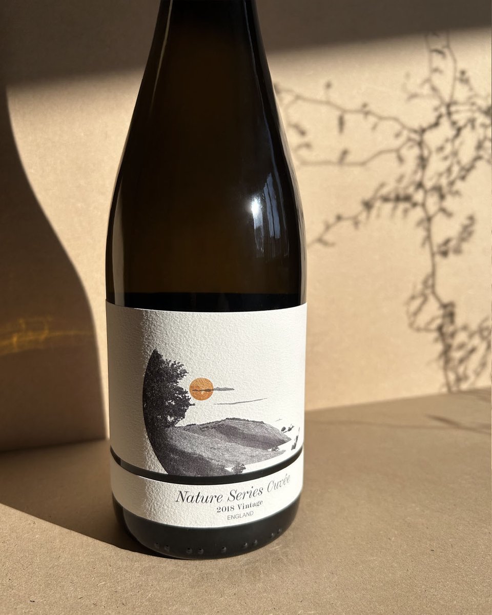
Three original prints created for the Artelium collection to coincide with the Nature Series Cuvée, 2018 Vintage wine labels that I designed responding to the themes of Light, Soil and Water.
Screenprints with graphite and ink on 250gsm Somerset White Satin Paper.
Labels created for the Nature Series Cuveé 2018 Vintage between @ArteliumWine & @VagabondWines Water: A key element of grape juice that becomes wine. Soil: A splash of green depicts soil & south facing slopes ideal for growing grapes. Sunlight: Warmth of the sun to ripen grapes.
Sharing some snaps of what I think was probably the highlight of this year for me, my solo show, Of Mountains and Light. Wishing you a Happy New Year and thank you for your continued support with my journey as an artist and printmaker. 💫
Hope you had a good Christmas! If you’re looking for something to read, have a look at my journal https://t.co/rZDGZ0xym3 where I’ve shared posts about my process, how-tos and book recommendations, amongst other things.
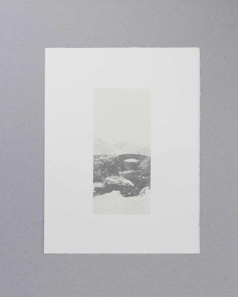
A peaceful, snowy scene to wish you a Happy Christmas 🎄✨
Under A Pale Moon
Screenprint with graphite powder and ink on 300gsm Somerset Soft White Satin paper
Paper size 38 x 28.5cm, print size 23.5 x 10.5cm
Limited Edition of 10
Have you seen Pantone’s Colour of the Year for 2025? It seems to divide opinion, boring for some or for others, calming and timeless. I’m very much here for ‘Mocha Moose’ and love to use brown, earthy and natural tones inspired by nature in my work for a sense of calm and quiet.