企業の独自性を活かしたコミュニケーション設計を軸に取り組むSitoh inc.は、ブランド戦略・ビジュアルアイデンティティ構築・コミュニケーションデザインまで一貫した伴走を強化し、継続的なアップデートを重ねてきました。
現在は、AI事業・ロボット事業・宿泊業・スキンケア事業・スポーツ事業・住宅事業など多様な領域のブランド構築に携わっています。
実績の詳細はプロフィールよりご覧ください。
⸻
Grounded in communication design that brings out each company’s unique identity, we have strengthened our consistent partnership across brand strategy, visual identity development, and communication design while continuously evolving our approach.
Currently, we are engaged in brand development across diverse sectors, including AI, robotics, hospitality, skincare, sports, and residential industries.
For more details on our work, please visit our profile.
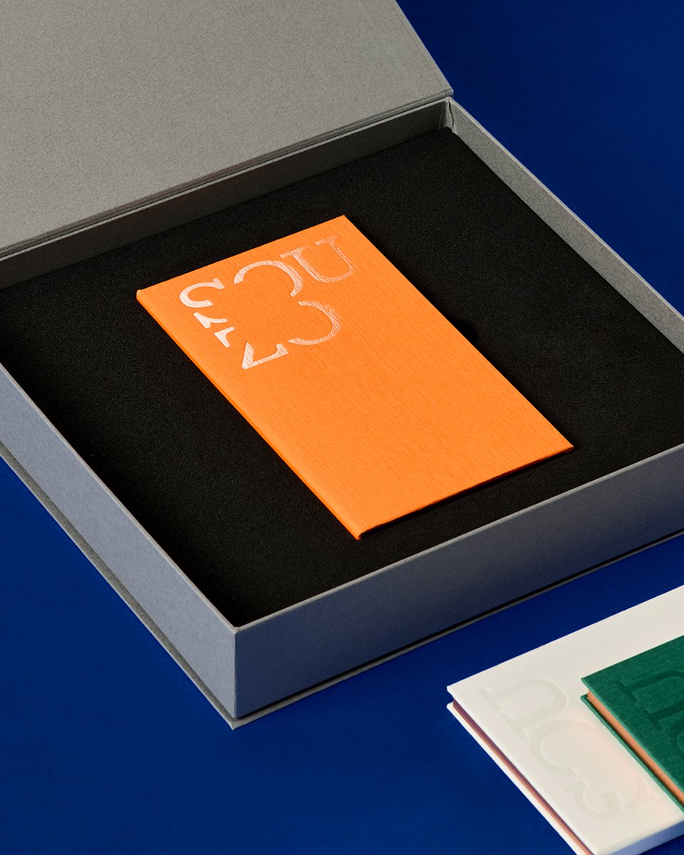
We developed the brand identity for Maruman’s new lifestyle brand, “SOUZO by maruman,” as well as the packaging for “Essence Journal,” a notebook with a custom-designed case from the brand’s first product collection.
The name “SOUZO” comes from two Japanese words with the same pronunciation: sōzō, meaning “imagination,” and sōzō, meaning “creation.” Guided by the brand’s central concept, “the beauty of incompleteness,” we created an identity that expresses a sense of openness, the freedom to explore one’s sensibilities, and the idea of a brand that grows together with its users.
The brand logo expresses “incompleteness” through deliberately omitted sections of the letterforms. The square-shaped negative space at its center is designed to evoke the form of a notebook, a symbol of Maruman.
art direction, design: @motoi_shito (Sitoh inc.)
motion design: Motoi Furuya (Sitoh inc.)
写真家 丸尾和穂さんの名刺デザインを行いました。お名前に含まれる「丸」をモチーフに、名刺の矩形と組み合わせることで、カメラに見立てたデザインとしています。
タイポグラフィーでは、撮影される被写体だけでなく、その周辺にある空間までも包み込む写真の特徴に加え、丸尾さんが写し出す自然の佇まいや揺らぎを、文字の配置によって表現しました。
We designed a business card for photographer Kazuho Maruo. Using the circle implied by the kanji character “Maru” in her name as a motif, we combined it with the rectangular form of the card to create a camera-like composition.
In the typography, the design reflects not only the photographed subject but also the surrounding space that embraces it, as well as the quiet presence and subtle sense of movement found in the natural scenes Maruo captures―expressed through the placement of text.
長岡亮介さんがナビゲーターを務めるJ-WAVEの番組「CITROËN FOURGONNETTE」の世界観をまとめた小さな冊子「フルゴネット パピエ」のエディトリアルデザインをSitoh inc.で行いました。季節ごとの番組エピソードや素敵なイラストは、ぜひ実物を手に取ってご覧ください。
A small booklet titled Fourgonnette Papier captures the world of the J-WAVE radio program CITROËN FOURGONNETTE, hosted by Ryosuke Nagaoka. With editorial design by Sitoh inc., the booklet features seasonal episodes and delightful illustrations—something best enjoyed by holding it in your hands.
creative direction: Polar Inc.
illustration: Taiki Yamanaka
photography: Mitsugu Uehara
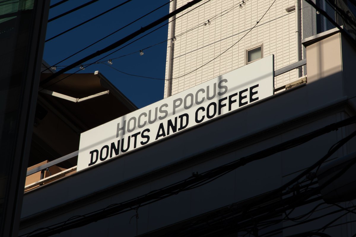
Hocus Pocus, a brand that creates experimental doughnuts using carefully selected ingredients regardless of the method, opened its Omotesando No.2 store, for which we designed everything from the brand identity to the signage and tools.
Rinnai’s flagship category “G:LINE” challenges conventional kitchen norms with robust design and advanced technology. With the renewal of its official Instagram account, we were responsible for everything from research and content planning to overall direction and design. To more vividly convey the brand’s worldview, we integrated the functional beauty of the products with refined lifestyle scenes, creating touchpoints expressed through visuals that are both minimal and powerful.
art direction, planning: @motoi_shito (Sitoh inc.)
research: Johnny Hu (ex-Sitoh inc.)
motion design: Motoi Furuya (Sitoh inc.)
produce, cgi, copywriting: amana inc.
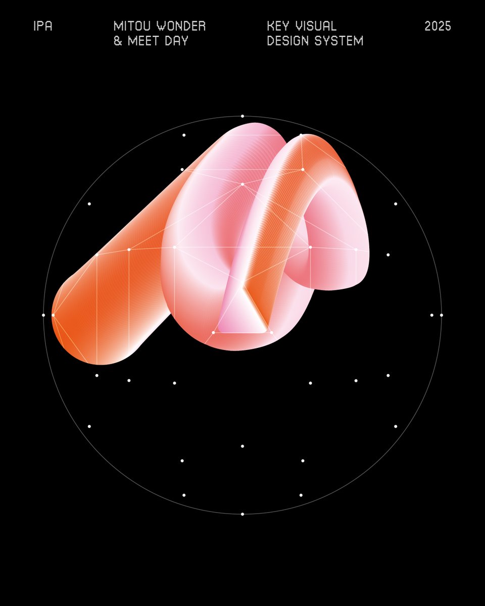
The MITOU Project is a national program implemented by the Information-technology Promotion Agency (IPA) to discover and foster outstanding IT talent. Project Managers (PMs) who are active in both industry and academia play a vital role, overseeing everything from selection to development and helping to nurture talents that might otherwise remain unnoticed.
In 2025, under the theme “MITOU WONDER,” we designed the key visual and logo.
The key visual expresses the “accumulation of trajectories” that emerge as diverse perspectives and approaches take winding paths toward uncharted territories. The vibrant gradients illustrate how new possibilities arise through the intersection and overlap of these paths. As they intertwine and ultimately form a single sphere, the design symbolizes the expansive future that MITOU’s challenges can bring.
With the launch of ORIENTAL HOTELS & RESORTS, a new hotel brand offering distinctive and immersive stays, Sitoh inc. supported the project through the redesign of its logo mark and typeface, as well as the development of a comprehensive brand guideline for the chain.
The brand is built on the philosophy of transforming hotels into unique destinations that engage with their local surroundings. By uncovering, embracing, and reimagining hidden regional cultures and resources, the brand aims to evolve the guest experience into something truly valuable and memorable.
The new logo embodies this concept: the “O” represents a sunrise with a perfect circle, symbolizing a forward-looking spirit and ambition to become a leading hospitality brand from Japan. The “H” visualizes the overlapping of “two ports of Kobe” and the cultural fusion of the West and Japan, reflecting the brand’s layered identity.