I built something cool for designers and developers.
This came from a personal problem. There were times I wanted to use a font in a project but wasn’t sure about the license. Most of the options online are either too complex or filled with legal terms that are hard to understand.
So I built Font Check.
A free font license checker that skips all the legal jargon and tells you in simple terms whether a font is safe to use.
You can:
Search for a font (with autocomplete if it’s in the database) or upload a font file
It will show whether the font is free to use, limited, paid, or not allowed for commercial use, along with a link to the official license.
Preview: https://t.co/676wDses2Q
I’m still updating the database, so feel free to try it out and share your thoughts.
Disclaimer: This tool simplifies font licensing for easier understanding. Always verify with the official source before using a font in commercial work. #ShipwithAI @darasoba
@desgnwitkinsley Here is my submission.
Here is a link to my portfolio: https://t.co/7SvxG1RDOd
Updated designs mostly on X: https://t.co/KIpBWpcfbn
I wrote a tiny piece on the design thinking here: https://t.co/unKuGVyP3J
Day 30 of 30-Day Product Design Challenge ✅
Can’t believe I’m typing this… but I made it to Day 30.
Wrapped up this journey with a Travel Booking flow. But honestly, this challenge became more than UI screens for me.
Between life, work, family, and all the crazy moments I’ve shared here… I kept going. Some days, I didn’t feel like designing. Other days, I questioned if I’d finish. But showing up daily, no matter how little, that was the real win.
This final screen is for that version of me that started this challenge unsure but finished it proud. 🙌🏽
Thanks to everyone who followed along.
I can't tag everyone but these ones followed every step of the way @slimdaddyoflife@vectorvelocy@Son04Grace@TheTweezyTee@leyeConnect@OlajideOginni@serio_efosa@FagbayiboO@Dex_concept @Pharkman_ @Nifemzz @UNIVERR5E @design_with_ayo@AdepojuPeace2@pj_uiuxdesign@DesignedByIni.
I’ll be sharing a recap soon.
Let me know what you think of this final screen?
#Buildinpublic
Day 29 of 30-Day Product Design Challenge ✅
We’re almost there! Today, I explored a paywall screen for the focus/productivity app.
I kept it clean and inviting with a subtle gradient background, while highlighting the value of going Pro.
Tried out 2 layout variations:
Version 1 keeps feature highlights short and tidy
Version 2 expands on each feature with simple descriptions
Still thinking about which version hits better for onboarding and clarity.
Let me know which version you'd pick! 👇
Day 28 of 30-Day Product Design Challenge ✅
Took a quick detour from the usual productivity stuff to design something a bit more health-conscious.
This is a Telemedicine Booking Flow. It lets you choose a doctor, check their reviews, pick your consultation type, and schedule a session.
Let me know your thoughts? Would you add anything to this flow?
Day 27 of 30-Day Product Design Challenge ✅
Today I designed a Community Leaderboard to track top performers and give users a little nudge of inspiration.
You can view weekly, monthly, or all-time rankings and tapping a user shows more stats like streaks and focus sessions. There’s also a personal view showing how you’re doing compared to the rest of the community.
The idea is simple: make progress visible and friendly, celebrate the wins, no matter how small.
Let me know what you think?
#buildinpublic #buildingInPublic
Day 25 of 30-Day Product Design Challenge✅
Today I explored a social comment system focused on self-growth.
The idea was to create a space where users could reflect on their focus sessions or share productivity.
Let me know what you think?
Day 26 of 30-Day Product Design Challenge ✅
Today I tackled the Settings screen with a focus on appearance preferences. I wanted a clean, organized layout that lets you find what you need at a glance.
I explored two options for theme switching.
Option one(L): A simple toggle to switch between light and dark mode.
Option two(R): A more customizable setup with an “Auto-Switch by Time” feature and live previews so you can see the changes in action.
Which one would you rather use? Would you hide or add anything here?
#buildinpublic #buildingInPublic
Day 24 of 30-Day Product Design Challenge ✅
I designed a Quick Polls & Feedback screen where users can vote on trending topics like “best focus method” or “when they feel most productive,” and also drop feedback about their accountability group.
The idea is to keep things light and frictionless. No long forms, just a tap or emoji and you’re done.
The goal was to make these screens clean and beautiful enough to make you want to vote without overloading the user.
Let me know what you think?
Day 23 of 30-Day Product Design Challenge ✅
Today’s focus: Progress & Profile.
I wanted to create a screen that reminds you just how far you’ve come. From your daily XP, to the number of tasks completed, focus sessions, and those little badges you unlock along the way. This design is all about celebrating the doings.
On the second screen, you can scroll through badges you've earned (or still working towards). Whether it’s your first task, a journaling streak, or back-to-back focus sessions.
Let me know what you think?
#Buildinpublic #buildinginpublic
Day 22 of 30-Day Product Design Challenge ✅
I designed a Chat UI where you can connect with your accountability partner, check in on goals, share progress, and even get little reminders like “you’ve got 15 mins left in your focus session.”
Sometimes, all you need is a simple “how’s it going?” from someone on the same journey.
The vibe here was: clean, focused, and familiar to your go-to messaging app, but with a productivity twist.
Click to see the full conversation flow and how the app keeps you in sync with your partner’s sessions too.
Let me know what you think?
#Buildinpublic #BuildingInPublic
Day 20 of 30-Day Product Design Challenge ✅
This one feels like something I’d actually use every day.
Designed a Focus Dashboard that gives you a quick overview of how your day’s going. Task streaks, focus sessions, time spent, and even a motivational quote to keep your head in the game.
I wanted it to feel like a quiet coach in your pocket. Just vibes and clarity.
Swipe to see the session breakdown screen too. You can track what you got done, how long you stayed locked in, and how you felt about the day overall.
Honestly, this felt like a clean wrap-up to a long stressful day.
Let me know what do you think?
#BuildingInPublic #BuildInPublic
Day 21 of my 30-Day Product Design Challenge
Today’s task was all about designing the notification system.
I wanted a notification center that does more than just buzz. It reminds, encourages, and even warns without overwhelming you.
I added CTAs for actionable items.
Would love to hear your thoughts.
#buildinpublic #buildinginpublic
Day 19 of my 30-Day Product Design Challenge
Took a break from productivity tools and explored something new, a book discovery app UI.
The goal was to create a personalized reading experience that helps users pick up where they left off, find fresh recommendations, and dive deeper into stories they love.
From tracking chapter progress to surfacing similar reads, this design balances visual delight with usability.
Would you use an app like this? Let me know what you’d add!
#BuildInPublic #BuildingInPublic
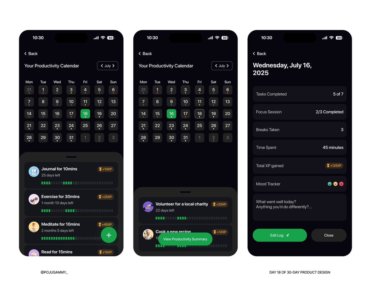
Day 18 of my 30-Day Product Design Challenge
Today I worked on a Productivity Calendar UI that helps users track their streaks, XP, mood, and time spent daily.
You can view each day’s breakdown:
Tasks completed, focus sessions, breaks taken, mood, and a short reflection prompt to wrap it all up.
The idea is to help users see their progress and spot patterns in their productivity habits over time.
Also added a little XP gamification to make staying consistent more rewarding.
Let me know what you think or what you’d add.
#Buildinginpublic #buildinpublic
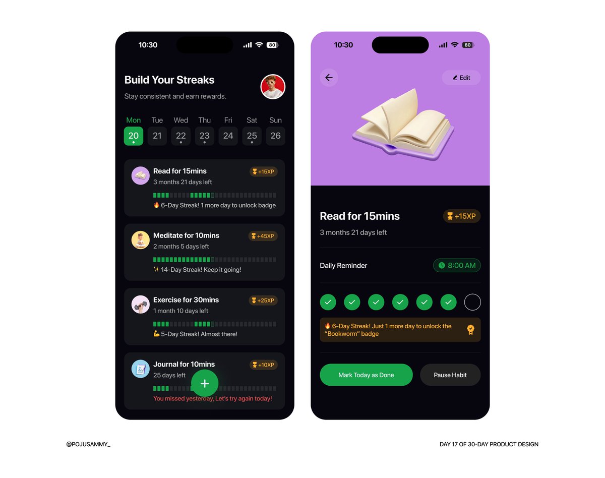
Day 17 of 30 – This one is personal (STORY TIME)
Today was one of those days where everything tried to get in the way. From early morning work meetings to hospital visit to bank wasting my time.
Just when I thought I could finally start designing this evening, a fuel tanker exploded right at my house junction.
At that point, I honestly just wanted to call it a day.
But I reminded myself why I started this challenge in the first place.
So here is day 17, a habit streak tracker to help users stay consistent. Felt like I was designing for myself today.
If there’s anything I’m learning, it’s that I can still show up even when the day isn’t perfect.
Let me know what you think?
Day 16 of my 30-Day Product Design Challenge
Today’s focus was on designing a calm, reflective journaling experience. The goal? Help users process thoughts, track emotions, and revisit growth.
To set the tone, I blended serif and sans-serif fonts to give the interface a thoughtful yet modern feel. The serif font adds warmth and depth to journal entries, while the sans-serif keeps the overall layout clean and easy to navigate.
The home screen gently prompts a daily reflection, with easy access to past entries. Each post captures date, mood, tags, and even images to make the experience feel personal and expressive.
Let me know what you think?
#buildinpublic