When we started TrendGo, the goal was to cut through market noise. Along the way we realised the name described what we did - not what we'd built. So today, TrendGo became Structura. Here's why 🧵
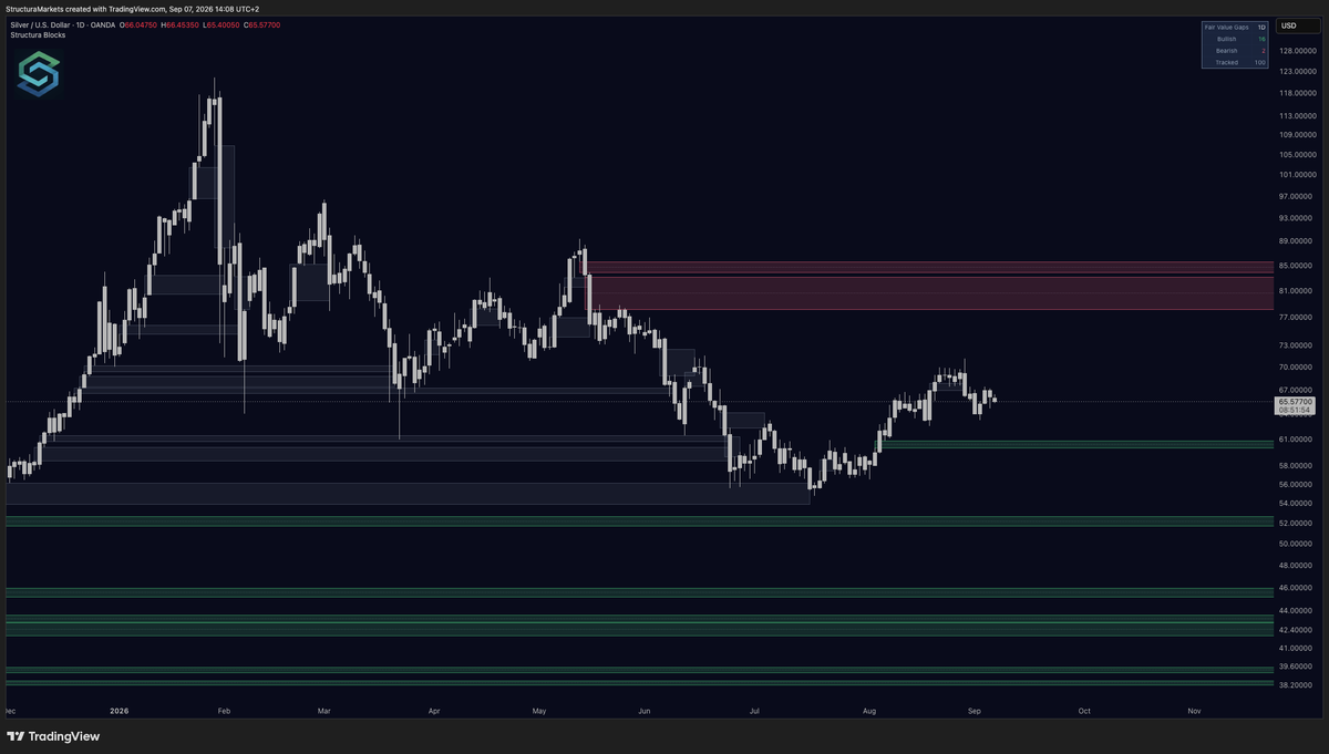
The room voted. Blocks ships first - the imbalances price leaves behind when it moves too fast to trade fairly.
The zone stretches right for as long as it goes untouched, so its width is its age. When price fills it, it turns grey and stays on the chart.
Founders September 10. Everyone else the 24th.
$VIX
Everyone's volatility chart has the spikes circled. This one marks the other thing: where volatility kept coming back to rest before it moved.
Nine marks in three decades on the monthly. Some sit right under the famous years. Several sit under years nobody remembers, because nothing followed.
A marker records where the accumulation happened, not what came next - and the marks that led nowhere are the reason the others mean anything.
Today the zone sits above price, and the last mark is twenty-two bars old. The market has spent most of that time underneath it.
$NI225
First session anywhere to put a price on the weekend's headline, and it opens inside a band it has been trading for six weeks.
Nothing has been built under that band. The last accumulation signal on the daily is more than three hundred bars old, so the only references on the chart are the July high and the August low.
Money Flow sits at zero on every clock, weekly to four-hour. The volume side hasn't taken a position either way, which means there is no gap to track yet - just a strong weekly frame with a flat daily inside it.
Horizon came back to the zero line and stopped there. That's a where, not a when.
Members read the full board earlier.
@TrendSpider A hammer is one bar casting one vote. The part that ages well is where it printed: a wick into an area price had already spent time in, and got bought there, reads differently from the same shape in open space. The candle is the reaction; the area under it is the reason.
@TheProfInvestor The diagram already knows where the cycle ends; the chart doesn't yet. What the tape can show today is narrower: whether this is the first time price has stopped here, or a return to somewhere it stopped before. The first is a guess, the second is a reference.
$MSFT Eighteen months of one chart, and about fifteen divergence marks on it.
One was followed by a two-hundred-dollar decline. Several were followed by nothing at all.
The quiet ones are the reason you can believe the loud one. New series starts today: one layer at a time.
Four numbers and no words is a fair way to put it. The levels are the same for everyone looking, and that is exactly what a drawing can and can't do.
What it can't say is which of them price actually built something on, and which it only touched once on the way past. The first kind tends to get defended when the market comes back to it. The second gets crossed without anyone noticing.
@Barchart Worst decade in history is a statement about a period, not about a place. The chart has a time axis and no price axis: it can't say whether anything was built under where bonds trade today, or whether this is just a level the tape passed through on the way down.
@Mr_Derivatives Two decades on one screen, and the part a chart can settle isn't why - it's what each one left behind. One kept building areas that were still there when price came back to them. The other kept crossing back down through its own. Same period, two different records.
Everyone wants a tool that tells them what happens next. Nobody wants the version that tells them when it doesn't know.
A read you can check beats a read that sounds certain - and the difference shows up in the weeks the market ignores you.
You didn't call it. You saw someone call it, and you remember it because it worked.
The timeline is right every week about something. The names it was loud about that went nowhere are gone from your memory by Monday - nobody quotes their own misses.
Discipline isn't picking the right voice. It's writing down what you'd have needed to see before the move, and checking whether it was there.
@wallstengine Six names, two directions, one thing in common: none of next week's buying or selling will be about the chart. Which of the six has an area built beneath its current price, and which arrived here in a straight line, is the one part the index committee did not decide.
@StockSavvyShay Removal is a seller who never looked at the chart, and that makes next week readable: the flow is known, the ground is not. Whether the last area the tape built under this name still sits beneath price, or this leg ran through space that never held, decides where selling lands.
$LULU
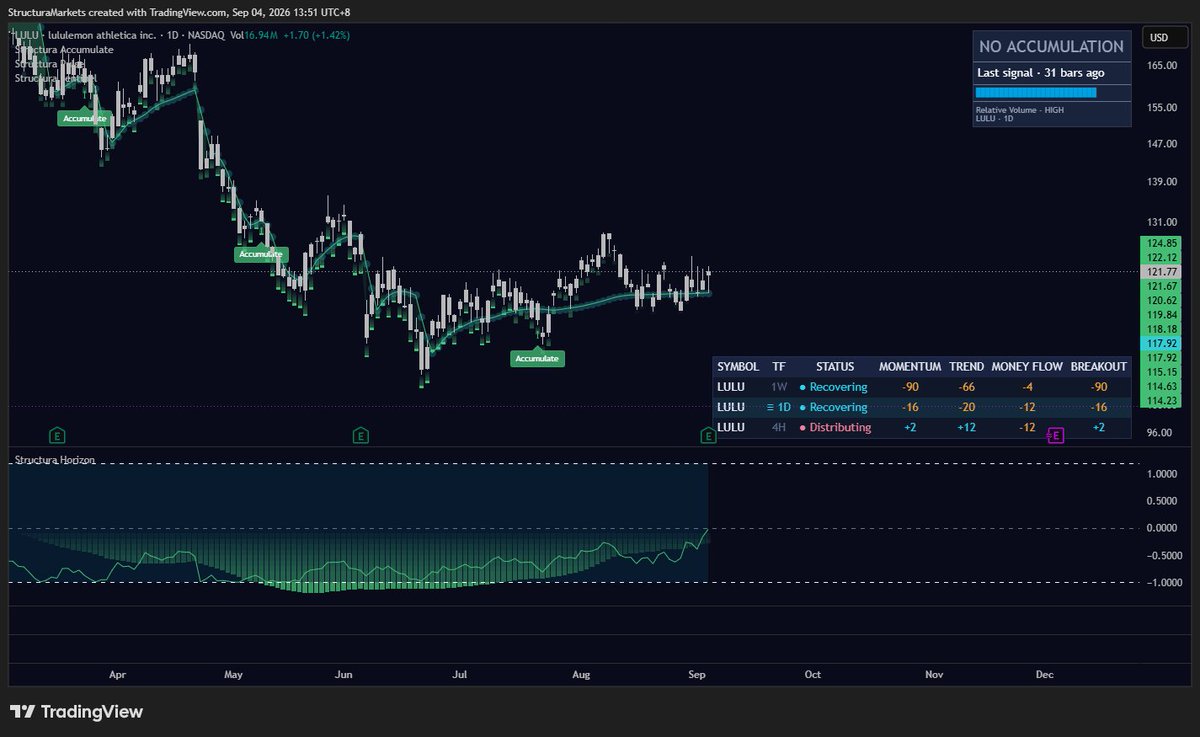
This is the chart as it stood into last night's report, every layer on. Members read it earlier.
The structural layer stamped an area in July and went quiet: thirty-one bars without a signal, the reference it left sitting just beneath the close. Weekly momentum was still deep in negative territory while the status read Recovering - a disagreement the tool leaves visible rather than resolves.
The after-hours print opens below that reference and below the July area. Where were the signs? There was one built area between the close and the print, and the print went straight through it. Silence before a report is a reading too.
$AUDUSD
The Australian dollar has climbed back into the band where the trend layer spent all spring drawing its structure overhead. Weekly still reads Recovering; daily and four-hour already read Distributing - the two faster clocks flipped, the slow one hasn't.
The part to track is the gap: momentum runs hot on every clock while money flow is barely positive. Price has moved a long way ahead of the flow behind it, on low relative volume.
The structural layer hasn't stamped this chart in over two hundred bars. The only reference it left sits far below - a wide stretch of price with nothing built under it.
Members read the full version earlier.
A door kicked open is a good description of the bar. What the pattern can't say is what was standing behind the door: a breakout that leaves a built area behind it has a place to come back to; one that leaves the apex of a drawing has only the drawing.
The next few weeks record which this was.
@KobeissiLetter Correlation says how the two groups moved this month, not where either is standing. Software recovering most of a drawdown is back at prices it left last autumn; whether the area it left behind held, or was simply crossed on the way up, is the part a correlation can't record.
@ChrisCamillo Conflicting data is the honest state going into most reports, and the tape tends to agree: a structural layer that only stamps after something has been built spends earnings week silent. The pass and the silence are the same reading - no trade, nothing to defend.
@Mr_Derivatives Nobody is lying - the three charts just aren't answering the same question. A trendline is the part anyone can draw on all three. What differs is the ground underneath: which move is running over an area the tape built, and which was carried up through space it never traded in.