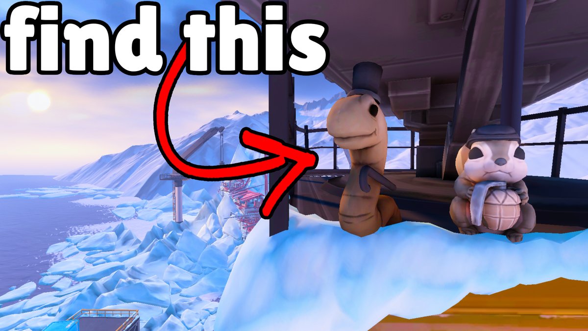
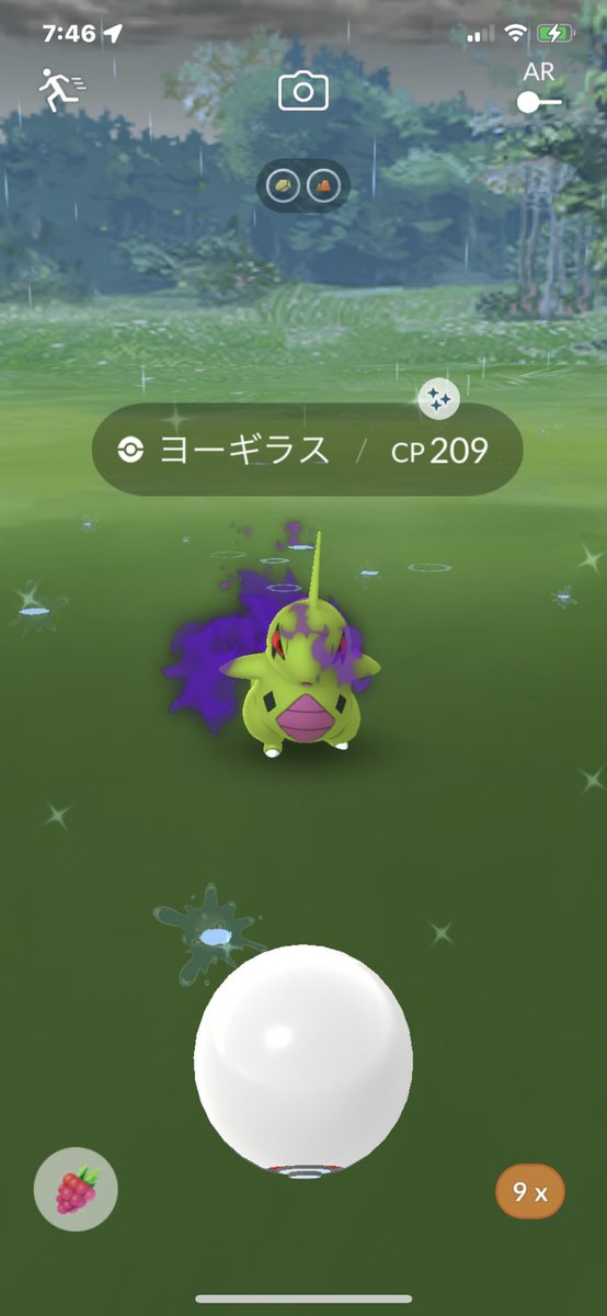
@msscottytv 1st for sure. More to look at, but that allows for viewer to have many reasons to click on vid: “what map is that” “thats in val?” etc. Other one looks way too boring imo. Way too much blank space. Gets to the point, but so does the first.