Your app's tooltips look like a default browser title attribute. Here are 4 ways to tell.
Default LLM: a black box with white text. No arrow. No delay. Appears instantly. Disappears on pixel-shift. Users squint to read 11px text on a 10px tooltip.
The prompt that makes tooltips feel polished: https://t.co/e2kIqGXCrF
Tell 3: It clips behind modals, dropdowns, and card edges.
User hovers a help icon inside a card. Tooltip renders behind the card border. Half-visible. Unreadable.
Tell AI:
- Always render in a portal (append to document.body, not inside the component)
- z-index: 9999 minimum - above modals (1000), dropdowns (500), sticky headers (100)
- Use getBoundingClientRect() to position relative to viewport, not parent
- Flip direction if tooltip would overflow viewport edge (top preferred, fallback to bottom or side)
Tell 5: Line-height is always 1.5. Everywhere.
Tight headings that need room to breathe. Dense body paragraphs that need more space. One value for all.
Tell AI:
- Display / headings (24px+): line-height 1.1 - 1.2 (tight, editorial)
- Body text (14-16px): line-height 1.6 - 1.7 (readable, comfortable)
- Dense data tables / labels: line-height 1.3 (compact, scannable)
Follow @SuperDesignDev for daily design prompts.
https://t.co/AXxJsIG5za
Your app's typography screams AI-generated. Here are the 5 tells.
Default LLM: 16px everywhere. Random bold. No hierarchy. Labels in ALL CAPS next to Title Case next to sentence case.
Here's the prompt that makes your text feel intentional: https://t.co/Kocj4LHdSa
Tell 4: Text color is all or nothing.
Either full black (#111) or a random gray (#999). No color hierarchy. Body text same shade as metadata. Critical info same shade as helper text.
Tell AI:
- Primary text (headings, key values): #111827
- Secondary text (body, descriptions): #374151
- Tertiary text (labels, timestamps, metadata): #6B7280
- Disabled / placeholder: #9CA3AF
- Never use pure #000000 - too harsh on white backgrounds
Sign 5: No scroll position memory.
User clicks an item. Reads it. Hits back. They're at the top. The entire list resets. They have to scroll back to where they were.
Tell AI:
- Save scroll position in sessionStorage on click: sessionStorage.setItem('listScrollY', window.scrollY)
- On mount, restore: window.scrollTo(0, sessionStorage.getItem('listScrollY') || 0)
- Clear on intentional navigation (not back button)
Follow @SuperDesignDev for daily design prompts.
https://t.co/woEtQgpLI8
5 signs your app's list loading was built by AI.
Default LLM: scroll to the bottom, wait, content pops in. The page jumps. You lose your place. It feels broken.
Here's the prompt that makes infinite scroll feel smooth: https://t.co/Rm1P5WLwaO
Sign 4: 'Load More' with no count.
A gray button that says 'Load More'. How many more? Users have no context. They click it blindly 7 times or don't click at all.
Tell AI:
- Button label: 'Load 20 more ({n} remaining)' - always show the remaining count
- If remaining > 100: 'Load 20 more (100+ remaining)' is fine
- Disable and show spinner inside button while loading - never navigate away mid-load
@froessell@pencildev@framer@usewonder@claudeai @138773682 This is great - SuperDesign → Framer is an exact workflow our users have been asking about. Would love to help you test the integration when it's ready.
@Kyriakos_Pelek@carno478 Both are solid - Lucide is lighter (better for React), Heroicons if you're already in a Tailwind stack. Pick one and never mix them in the same sidebar.
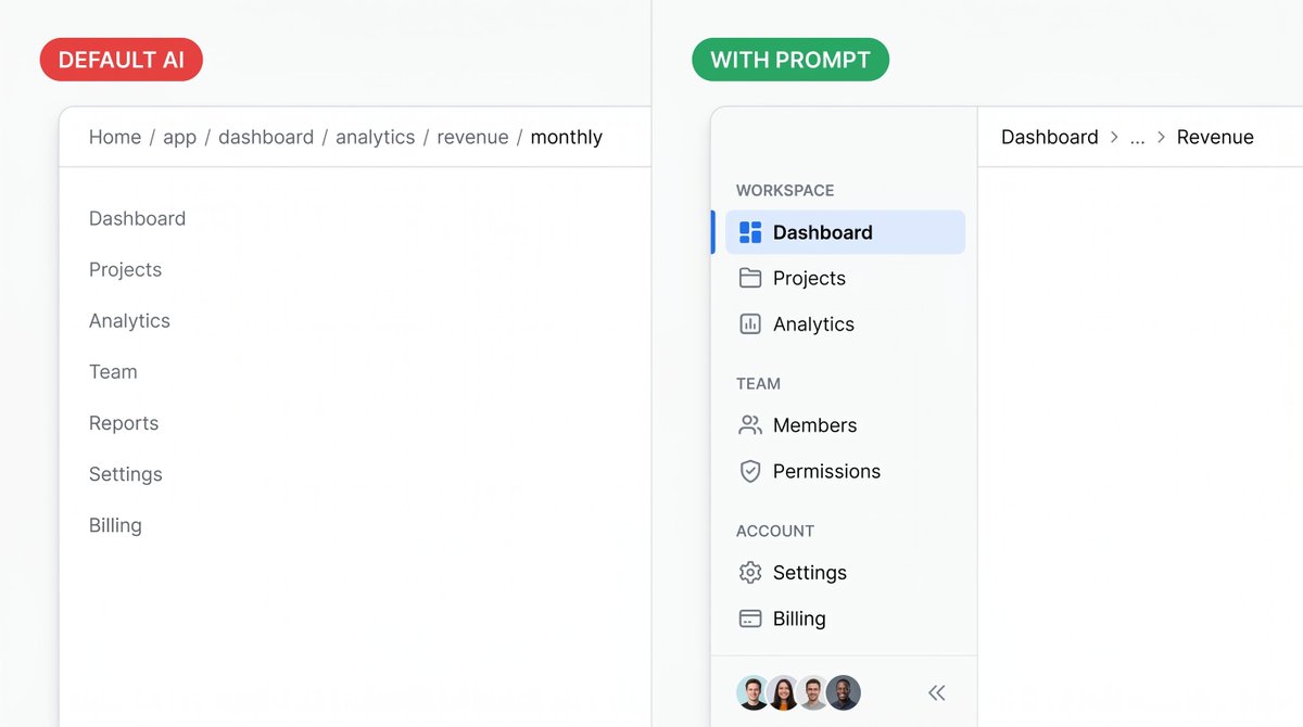
5 signs your app's navigation was built by AI.
Default LLM: a flat list of text links. No active state. No icons. No sections. Every page looks like the one you're already on.
Here's the prompt that makes navigation feel intentional: https://t.co/OqxHUxqtBv
Sign 5: Navigation that doesn't collapse on mobile.
The sidebar takes up 240px. On mobile it eats 60% of the screen. Or it disappears with no way to open it.
Tell AI:
- Mobile: collapse to hamburger (24px icon, top-left, 16px from edges)
- Tap: sidebar slides in from left (240px), rest of screen gets 50% black overlay
- Tap overlay or any nav item: closes sidebar
- Never show full sidebar on screens under 768px
Follow @SuperDesignDev for daily design prompts.
https://t.co/mkNwfUbseK
Sign 4: Breadcrumbs that are just the full URL path.
Home > app > dashboard > analytics > revenue > monthly
This is route structure, not navigation. It tells users where the code lives, not where they are.
Tell AI:
- Max 3 levels. Truncate the middle: Dashboard > ... > Revenue
- Each crumb is a link except the last (current page)
- Current page: font-weight 600, no underline
- Separator: '/' with 8px padding each side, gray-300


