"Maine - A Coastline Paradox" is my first ever #ironviz entry! Many thanks to @katebrown_5 and @theneilrichards for helpful feedback, @sarahlovesdata for the blog post that inspired me to enter, and @aarondf1 for keeping me sane.
https://t.co/G6KhhqO7vh
What the fax?! I guess faxing isn’t dead 🤷♂️ Use Dropbox Fax by @DropboxSign to send and receive faxes from anywhere. #DropboxFax https://t.co/iay5tS42Rm
What the fax?! I guess faxing isn’t dead 🤷♂️ Use Dropbox Fax by @DropboxSign to send and receive faxes from anywhere. #DropboxFax https://t.co/iay5tS42Rm
@katebrown_5 I couldn't make the Vizzies but @itsmechaylene told me you won one for Prep! So well-deserved. Congratulations and thanks for all your work for the community.
Pence demanding that Harris answer *his* own personal questions when he won’t even answer the moderator’s is gross, and exemplary of the gender dynamics so many women have to deal with at work.
@ZachBowders I've been off of twitter for a while and just saw your CMYK #IronViz entry. What a great story! Thank you so much for creating that - it's really powerful, beautiful, and fun!
https://t.co/Sw3HrLbP3n
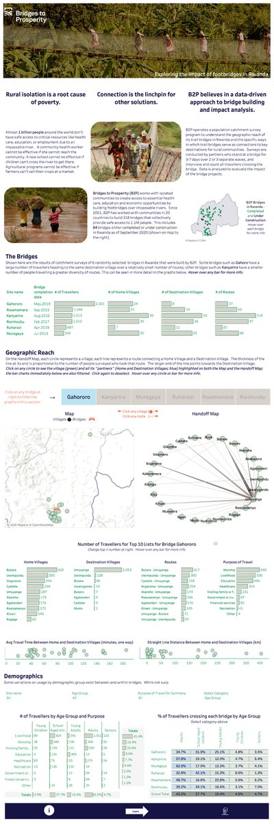
For the current #VizForSocialGood project, I created a dashboard to facilitate understanding the villages served by each bridge. A bit of a workhorse viz for drilling down into geography. :-) https://t.co/0A6zErsHzv
@VizFSG @B2P
Hey #datafam, If you work in healthcare (even if you think I should remember, trust me I may not) could let me know! I want to add you to a twitter list for Tableau healthcare folks. I know I’ve connected with so many of you! 😊 TIA!
New #VizForSocialGood project for #BlackHistoryMonth. This is a great way to help out a worthy cause while using your data visualization skills. Check it out!
🚨NEW PROJECT! 🚨
Check out our new project for Minnesota based @OsirisOrg
here - running from 1st-29th February for #BlackHistoryMonth
https://t.co/3GYOXfu0Tr
@WindsCogley FYI A colleague of mine asked me for resources on designing good dashboards, and I mentioned your work as an excellent resource. I forwarded your blog post on visual overstimulation related to dashboard design, which is both insightful and a fun read. Thanks!
@maf2k @data_jackalope @VizAllDay @vizzingbrocks @ZenDollData@WindsCogley This is a great post, Michelle! Thanks for sharing about the entire process, both technically and emotionally. There's hope for me for moving past the inevitable frustration at my first attempts at something big! Your sharing really makes a difference for others. 💛
@RobParker_GT Yes, the dark blue dots (and possibly light blue, depending on your cutoff) in the righthand shaded area are the "resistant" districts. You can set your own cutoff for the high poverty (shaded) group by clicking on the scatter plot. I'd be interested in hearing your thoughts.
@AdamMico1@HipsterVizNinja@datakmart@trappedalien@quantum_relic What a great list - Thank you so much Adam!!!
As for the inevitable "and what about [x]..." - I recommend Free Solo if you haven't seen it. And Spellbound (the documentary). Those are 2 of the tensest movies I've ever seen, in different ways.
@VizFSG@GSTTCharity Thank you guys! And thanks for organizing the #data19 session - it was very inspirational. Have a wonderful New Year - here's to more great things in 2020. 🎇