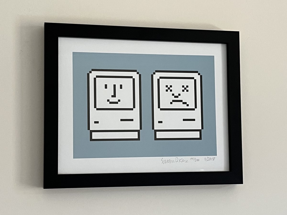
This wonderful artwork by @SusanKare hangs in my home office, and every morning that I work from home I stop to reflect on whether I'm feeling like the "Happy Mac" or "Sad Mac" today 😁
@bzotto Thank you—agree! Not really sure why it makes sense to create curvy vector versions of Chicago; the font was designed to make pixellated characters that were smooth—no ‘jaggies’. : n )
Fun fact since its come up in my mentions. Chewie‘s cute trash-panda/raccoon logo was designed by the legendary @SusanKare who created the icons for the original Mac (and also co-created my cofounder @htannenbaum)
here's another wip look at the marimon bestiary project! a much smaller and cleaner font like this (kitchen sink font by @Polyducks) looks better for this i think, and gets across the guidebook feel more, but I still gotta fancy up the rest of the format before im 100% satisfied