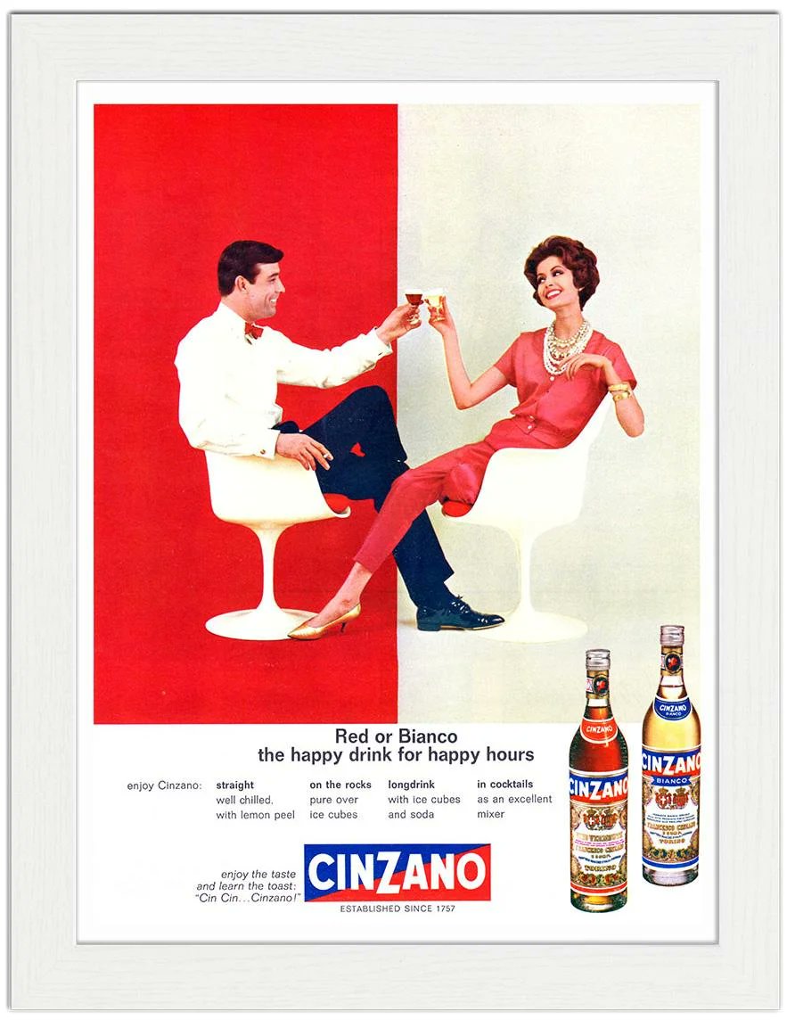
The Cinzano “Rosso o Bianco” ads from the 1960s are a masterclass in mid‑century graphic discipline — the red/white split, the mirrored poses, the crisp Italian type. A perfect concept and execution.
Emmett McBain used typography like music—bold, rhythmic, and willing to take the lead. His mid‑century modernist style turns type into a dense visual grid. On his album covers, the typography isn’t decoration; it is the composition.