Data Analyst/Scientist(aspiring) 🤔 Why not?😜| Just enough room for growth, change, and flexibility 📈| 2Tim 4:7 keeps me grounded and goal-oriented💆🏿♀️
Again with Python😅. I must really love Python to keep restarting and not just picking up from where I left off😆. Today, I learned string manipulation, debugging, the input function, variables, and built a band-name generator. It's the output for me😂#Day1#100daysofCode#Udemy
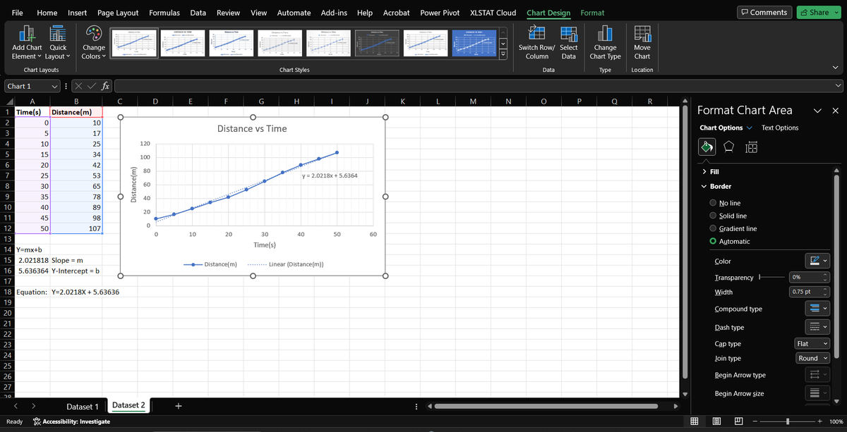
Day 11🔔
Today I revised using line and area charts for data visualization. I replicated some examples done on YouTube.
@Codevixens#Cdv20daysofdatachallenge
Day 11🔔
Today I revised using line and area charts for data visualization. I replicated some examples done on YouTube.
@Codevixens#Cdv20daysofdatachallenge
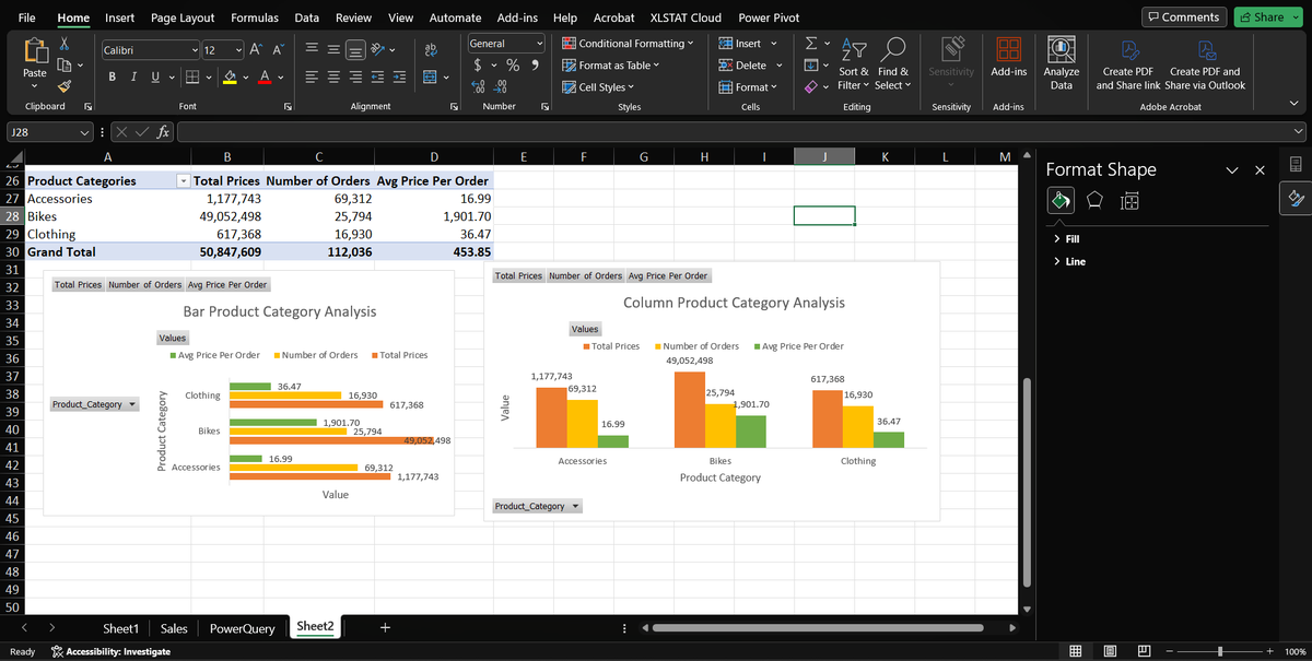
Day 10🔔
Today I learned about the role charts play in data visualization. When to use pie charts, bar charts, or line graphs. I did a simple example of this using bar and column charts.
#Cdv20daysofdatachallenge@Codevixens
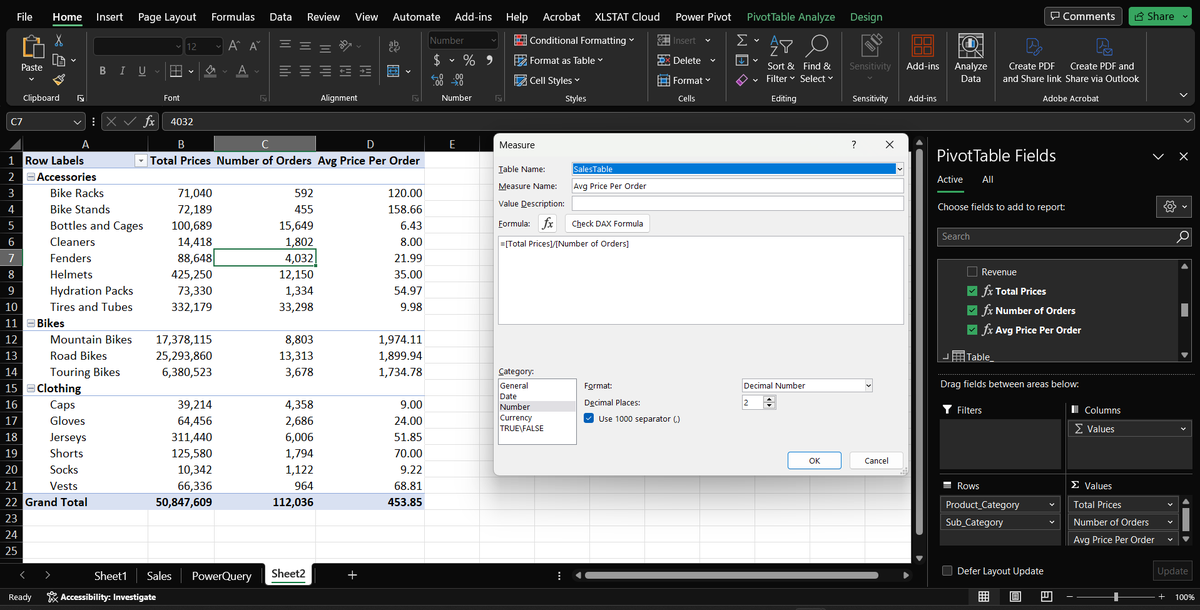
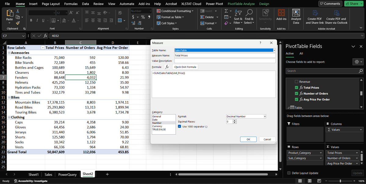
Day9🔔
I learned about DAX (Data Analysis Expression) in Excel. It is a formula language similar to Excel formulas. I did an elementary example to illustrate this concept.
#Cdv20daysofdatachallenge@Codevixens
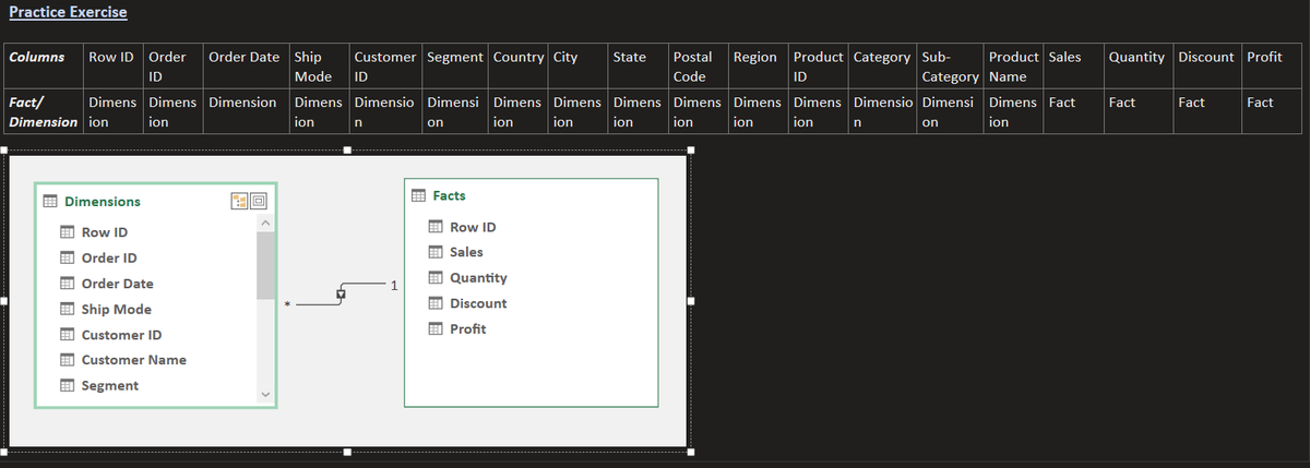
Day8🔔
Today I learned how to identify Facts(metric) and Dimensions(descriptive entity) in a dataset and Data Modeling in Excel. The task was to identify the Facts and Dimensions in the dataset and to create a basic Data model between them
@Codevixens#Cdv20daysofdatachallenge
Because of time constraints, I revisited a pivot table I made recently using a diabetes prediction dataset from Kaggle. The pivot table was used to create a chart that shows a count of diabetes patients vs age(age = 80 had the highest count)
@Codevixens#Cdv20daysofdatachallenge
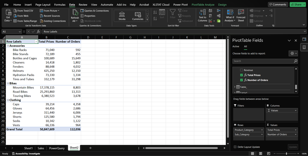
Day7🔔
Today I worked on creating pivot tables in Excel. By creating pivot tables, one can easily visualize data based on the fields they choose in the dataset. This allows for flexibility as the analyst can create charts to view data trends using so few or many fields.
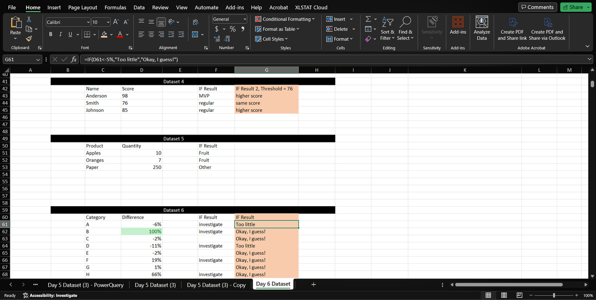
Day6🔔
Learned Conditional formatting in Excel and how to use IF statements to make comparisons. A few datasets were provided for practice and I explored the best way I could think of.
@Codevixens#Cdv20daysofdatachallenge
PS: I'll be back with Day 5 updates :)
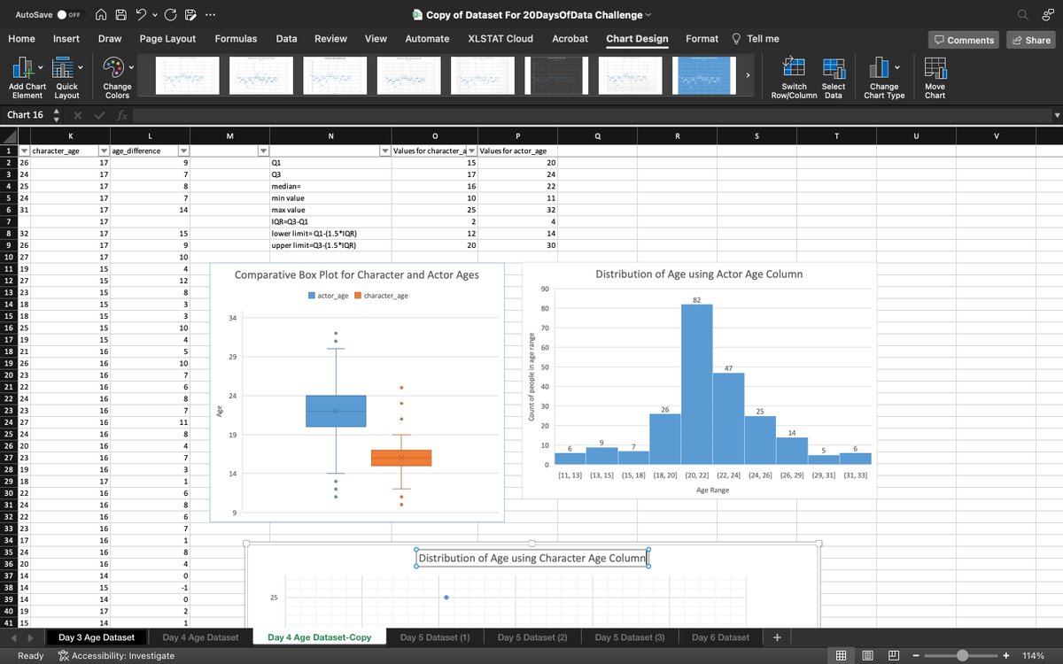
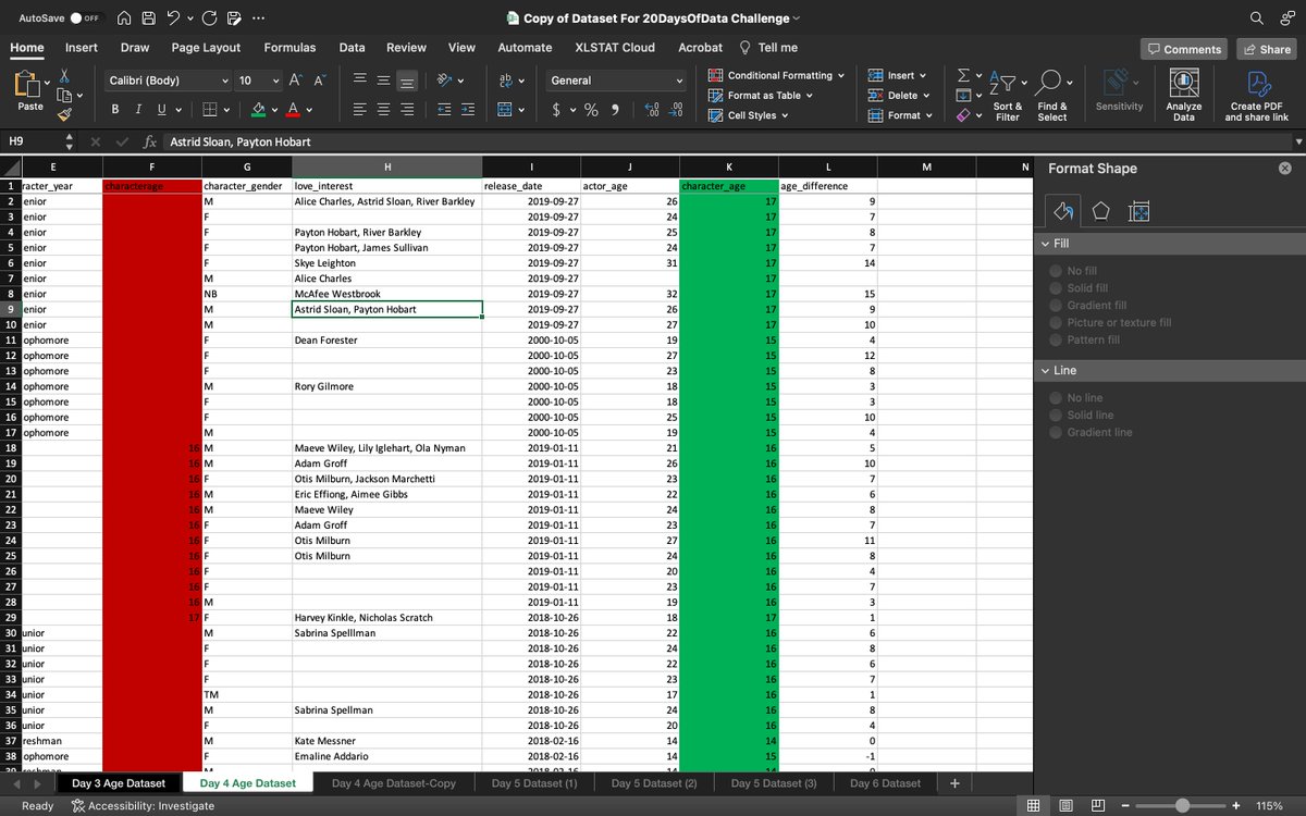
The highlighted red column is a duplicate. According to the visualization, the box and scatter plots clearly show the outliers while the histogram shows the count of people in each age range. The scatter plot gives a rough visual of this too.
@Codevixens#Cdv20daysofdatachallenge
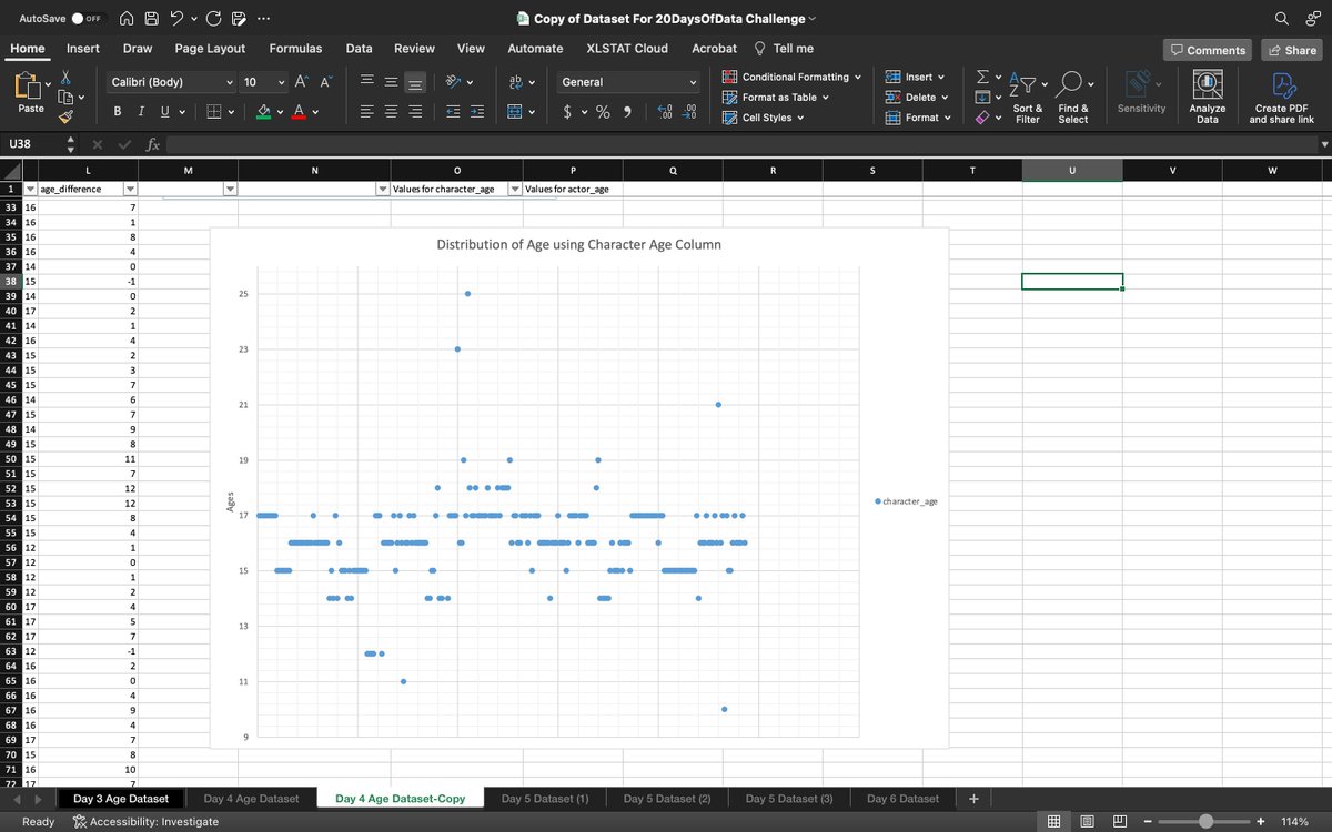
Day4🔔
Today I learned how to use charts for outlier detection in a dataset. I used a Box Plot, Histogram, and Scatter plot in the exercise to visualize and detect outliers. First I cleaned the dataset by deleting the duplicate column, then proceeded with the visualization.
Since the dataset generally has outliers, using the median would be a better choice, but there was no difference in the charts when using mean or median as seen below
@Codevixens#Cdv20daysofdatachallenge
Day3🔔
How to measure the center of a dataset using various methods particularly mean and median. For today's exercise I first found outliers in the dataset, then I found the mean and median of the dataset, with and without the outliers.
Day2🔔
I learned how to identify outliers(the odd data points) in a dataset using the Interquartile Range(IQR).
The result of today's exercise was a little confusing. My lower range(Q1) was negative but the dataset was made up of ages, so that could not be correct I'm guessing
Day 1🔔
Learned Cell Referencing in Google Sheets and how to use the different types; Relative and Absolute Cell Referencing.
Did a simple exercise to illustrate how both referencing methods can be used in simple calculations
@Codevixens#Cvd20DaysOfDataChallenge#DataAnalysis