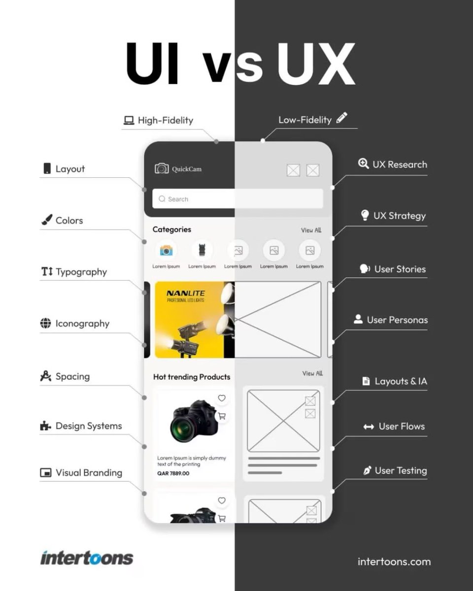
🚀 UI/UX Designer – 2026 Reality Check
The role hasn’t changed.
The toolkit has.
From 2023 to 2026, the shift is real:
Then:
Figma, Adobe XD, Photoshop, Manual Design, Static Screens, Plugins, Focus on Visuals.
Now:
Figma AI, Google Stitch, AI UI Generation, Vibe Design, Design Copilot, Claude/Cursor (UX Writing & Logic), Prompt Engineering, AI Design Systems, Dynamic Flows – Ship, Test, Iterate.
💡 The core of design is still problem-solving and empathy.
But how we get there? Smarter, faster, AI-augmented.
New tools. New mindset. New impact.
Let’s embrace the evolution – not as a threat, but as a superpower. ⚡
#UIUXDesign #AIDesign #DesignEvolution #FigmaAI #UXStrategy #2026RealityCheck
UX writing is the most underrated design skill.
The words in your interface ARE the design.
Bad UX copy examples vs. better alternatives:
❌ "An error occurred"
→ ✅ "We couldn't save your file. Try again."
❌ "Invalid input"
→ ✅ "Email addresses look like: [email protected]"
❌ "Submit"
→ ✅ "Get my free quote"
❌ "Are you sure?" →
✅ "Delete project? This can't be undone."
Clear copy = fewer support tickets = happier users.
#UXWriting #ContentDesign #UIUX #CopywritingTips #ProductDesign
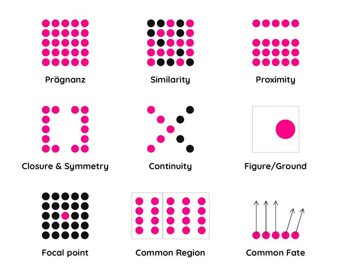
Gestalt principles are the reason your brain sees a face in clouds.
They're also the reason great UI feels effortless and bad UI feels "off" without users knowing why.
The big 4 every UI designer needs:
→ Proximity: Things close together = related things
→ Similarity: Same shape/color = same category
→ Continuity: Eyes follow lines and curves naturally
→ Closure: The brain completes incomplete shapes
Next time a layout feels wrong, ask which Gestalt principle is being violated. You'll find the answer every time.
#Gestalt #UIUX #DesignPrinciples #UXEducation
Most people scroll past designs not because they're ugly, but because nothing tells the eye where to look first.
That's a visual hierarchy problem.
Here's the 3-second rule: if someone can't figure out the main message of your design in 3 seconds, restructure.
How to fix it:
→ Make the most important element the largest
→ Use contrast (color, weight, size) to guide attention
→ Whitespace is not wasted space — it's direction
Your eyes should travel in a Z or F pattern naturally. If yours don't, something's off.
Test: Cover your design. Uncover it. What did you see first?
#UIUX #DesignTips #VisualHierarchy #ProductDesign