🎉 Dive into our newest YouTube tutorial! Learn how to easily update your library for compatibility with the latest Tetrisly plugin.
https://t.co/VRGVZayjdt
#React#Figma#designsystems#plugin
🔗 Discover how SyncDesk, powered by @VirtusLab, is revolutionizing hotel management.
A cloud-based B2B SaaS web app tailored to make your guests' experience smoother than ever.
>> https://t.co/Lj9cWAFxsp
#HospitalityTech#SaaS#HotelManagement
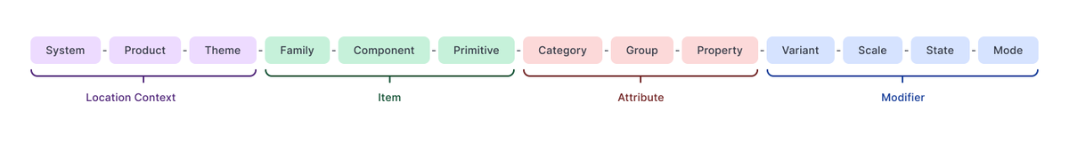
Attributes determine a token's category and usage context (e.g., color, size, border).
They include 'Property' information that defines the token's role within a category and indicates the conveyed property (e.g., 'color.background,' 'border.radius,' or 'space.gapX').
🚀 Get ready to stack your UI components with precision! 🧩 #TetrislyForReact has officially launched on ProductHunt! 🎉
✨ Experience the ultimate design system toolkit for React developers. Say goodbye to messy code and hello to seamless design-to-code integration. 🌟
🔥 Features:
- Reusable Component Library
- Efficient Workflow Enhancements
- Perfect for Teams & Solos
- Easy to Customize for Your Project
🔗 Upvote and dive in now: https://t.co/tasPWtNM8G
👀 See why developers are flipping over Tetrisly. Leave us feedback, and let's shape the future of UI development together! 🛠️ #ProductHunt #ReactJS #DesignSystems #DeveloperTools
@ProductHunt@ReactCommunity@Tetrisly
Now all our #Icons are ready to be used in a #React project by pasting a short code. No more exporting and uploading SVG files. Now you can add freshness to your interface with just a few clicks 👌
Get Tetrisly Icons for free: https://t.co/LEZYAqCGVb
Tokens indicate destination, specifying system, product, and theme affiliation. Tetrisly ensures that all products in an organization's portfolio have shared components.
Example: Tokens for Google Workspace, specifically Gmail, which offers various themes. ✨
Tetrisly for React is Live! 🚀 User-friendly components designed for effortless integration.
✨ Comprehensive #typescript support
✨ Ready-to-use components
✨ Integrated with @figma
✨ Interactive @storybookjs
More: https://t.co/SqhE8UUj8l
👀 Announcing a big change for Figma Tokens users: I’m rebranding my plugin Figma Tokens to "Tokens Studio for Figma". It’s been in the works for a while, and I’m excited to finally unveil that change.
🧵 Read why
🚀 Just like Tetris aligns perfect blocks, #DesignTokens align the building blocks of your #DesignSystem.
Find out how Tetrisly simplifies the chaos and creates harmony in UI/UX with a solid architectural approach. 🎨💻
Dive into Part 1 of the series ➡️ https://t.co/APIEDUk3HA
#UIDesign #UXDesign #WebDevelopment #Tetrisly
We're launching the Tetrisly Tools plugin.
But, it's not just any plugin.
This is a wizard that empowers greater customisation in your design system. It lets you easily tailor the UI without clicking through @figma
How cool is that? 🚀 Learn more: https://t.co/SqhE8UUQXT
Tetrisly for React is Live! 🚀 User-friendly components designed for effortless integration.
✨ Comprehensive #typescript support
✨ Ready-to-use components
✨ Integrated with @figma
✨ Interactive @storybookjs
More: https://t.co/SqhE8UUj8l
Attributes determine a token's category and usage context (e.g., color, size, border).
They include 'Property' information that defines the token's role within a category and indicates the conveyed property (e.g., 'color.background,' 'border.radius,' or 'space.gapX').
Tokens indicate destination, specifying system, product, and theme affiliation. Tetrisly ensures that all products in an organization's portfolio have shared components.
Example: Tokens for Google Workspace, specifically Gmail, which offers various themes. ✨
We used materials from Nathan Curtis to create a scalable system for assigning unique token names. Our method is elaborate but easy to understand. To create a universal product that can adapt to many users, we expanded the structure of token name components.
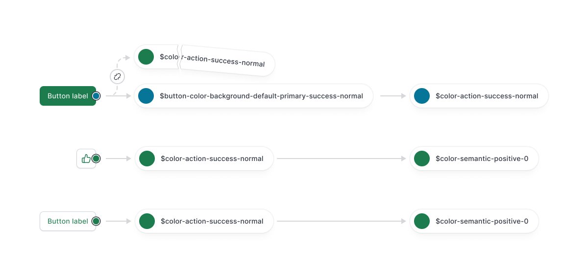
We repurposed component tokens to enable deep customization through the Tetrisly plugin.
Component tokens make local changes without affecting alias values (Tier 2), while maintaining consistency with global values (Tier 1).
Based on user testing feedback from developers and designers, we discovered a few challenges with the current structure:
1. Use of component tokens creates a significant entry barrier 😓
2. They prolong the learning curve ⏰
Component tokens pose two main issues:
1. Overwhelming quantity: For example, our button component had over 500 tokens. When multiplied by the number of components, it becomes alarming. 😱
2. Time investment: Creating token lists for each component requires significant time. ⏳


