Huge update to Showcase Studio on Ostendo!
tl;dr - you can now use it without an account on your computer at https://t.co/EZLhFOKKqe
Showcase Studio makes it SUPER easy to share thumbnails on Twitter or with clients!
Drag and drop from your computer and then just play around with the controls to get great looking assets in seconds.
You can even preview what it'll look like on Twitter/X!
You can now access your thumbnail collection with Ostendo on mobile!
Scroll through your collection, check out Dailies, and add thumbnails all on the go!
It’s still in beta,so to access the full power of Ostendo, you’ll still need a computer, but it’s a great start
4 approaches for including the creator's logo in the thumbnail to reenforce brand identity instantly.
◉ Standard Header: the most obvious one, logo or branding centered at the top for maximum visibility.
◉ Corner Badge: small logo tucked into the corner without competing with the main hook. Clean and high contrast.
◉ Corner Tabbed: framing the logo in the corner with a triangular tab. This draws more attention to itself but enforces brand identity even stronger
◉ Integrated branding: a more subtle approach where the logo fades into the design and becomes part of it. These are harder to notice but the subtlety becomes part of the brand.
The goal isn't making your logo bigger. It's making your thumbnails recognizable from across the homepage.
Finding all of these examples took 2 seconds btw, I just filtered my collection in Ostendo by "logo".
4 Adventure thumbnails to study if you want viewers super curious and excited.
◉ Shared perspective: position the creator so we're looking where they're going while they look into camera (the expression you choose here can make it range from "i'm really scared" to "this is going to be awesome").
◉ Leading lines: tracks, pathways, rivers, and roads naturally pull the eye forward.
◉ Hidden destination: don't fully reveal what's waiting at the end.
◉ Discovery framing: make the thumbnail feel like the beginning of an adventure rather than the destination itself.
Humans are naturally curious about what lies beyond the edge of the frame.
Finding all of these examples took 2 seconds btw, I just filtered my collection in Ostendo by "adventure".
4 Hero shot thumbnails to study if you want to instantly pull viewers in across multiple niches.
◉ Inviting: natural lighting + eye contact makes the viewer feel personally included in the scene.
◉ Product: tech thumbnails work best when the value proposition is visually obvious in under 1 second (prices, colors, comparison).
◉ Mystery / Drama: create an immediate question in the viewer’s head.
◉ Food: clean backgrounds and close-up texture shots let the food completely carry the thumbnail without needing text.
A good hero shot puts the subject front and center with as few distractions as possible.
Finding all of these examples took 2 seconds btw, I just filtered my collection in https://t.co/CBZZvbgHQ9 by "hero".
4 Survival thumbnails to study if you want challenge videos to instantly HOOK viewers.
◉ Environment First: jungle, prison, abandoned mall, etc. the location itself becomes the thumbnail hook.
◉ Expression: the emotion sells the difficulty, so play it up.
◉ Visible Stakes: bars, scratches, a building falling apart, etc. You need to show the viewer what makes this survival situation dangerous.
Most survival thumbnails work because they make the viewer imagine themselves there. They should be able to get a snapshot of the entire video's vibe in a 2 second glance.
Finding all of these examples took 2 seconds btw, I just filtered my collection in https://t.co/CBZZvbgHQ9 by "survival".
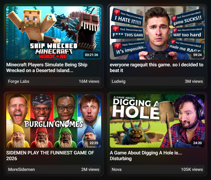
4 stand-out Gaming thumbnails to study that don’t feel generic.
◉ Custom Moments: instead of screenshots from the video, create a scene viewers haven’t seen before to create the perfect hook.
◉ Challenge Framing: center the creator and visually communicate WHY the game is difficult.
◉ Side by Sides: multiple faces instantly increase energy, these are super popular when multiple creators team up (this style always hits btw)
◉ Composited: putting the creator inside a scene from the game is always a banger. Much more exciting than a floating head and feels more premium.
The best gaming thumbnails feel like a unique EVENT, so using one of these tactics will help to break out of the lazy gameplay screenshot + floating head combo.
Finding all of these examples took 2 seconds btw, I just filtered my Ostendo collection by "gaming".
4 thumbnails to study with BANGER typography front and center (and how you can use them).
◉ Bold Premium: we see this a lot in tutorials and vlogs. Oversized lettering, often with a subtle gradient and drop shadows that overlap each other that gives it a really clean premium look.
◉ Handwritten: imperfect text feels personal, emotional, and human. This is great for video essays and vlogs especially.
◉ Cinematic: treating the text like a movie poster instantly raises perceived quality. You don't want the text too large for these, keep it tasteful
◉ Stylized: horror fonts, distortion, texture, and custom lettering can become the entire hook especially when the style matches the theme of the video. This is HUGE for video essays and gaming videos.
Good thumbnail text doesn’t explain the image. It embodies the feeling of it.
Finding all of these examples took 2 seconds btw, I just filtered my thumbnail collection in https://t.co/CBZZvbhfFH by "typography".
4 Challenge video thumbnails to study if you want to nail the niche.
◉ Checklist / Roadmap: show the viewer the series of mini goals that will need to be accomplished.
◉ Consequences: show what could go wrong in the worst case scenario.
◉ Exaggerate (Danger): raise the danger by 200% to make the viewer curious.
◉ Exaggerate (Fun): make the house LARGER, make the theme park TALLER, TRIPLE the amount of food/snacks, etc.
Choosing the right approach for a challenge video makes all the difference.
Finding all of these examples took 2 seconds btw, I just filtered my collection in https://t.co/CBZZvbhfFH by "challenge"
🚨GIVEAWAY🚨
Mets are hot, sun is shining -- let's get somebody a little brand new swag. Tags still on this baby, one-size-fits-all, leather brim and strap
You know how it goes: random winner picked in 48 hours. Be following me and RT to be entered
4 Food thumbnails to study with VERY different packaging.
◉ Challenge: exaggerating how difficult it is and laying on a bed of fast food (this style is actually picking up traction rn)
◉ Ranking: taking advantage of the classic A or B style holding up 2 competing items
◉ Fitness: showing a whole meal plan laid out with low price tags to reenforce the point of the video
◉ Relaxed Cooking: great looking food front and center, peaceful and uncluttered.
Different packaging for different audiences.
Finding all of these examples took 2 seconds btw, I just filtered my collection in https://t.co/CBZZvbgHQ9 by "food".
Thumbnail Designers!
We've added a fun new way for you to grow your collection.
Every day 4 great thumbnails will be recommended to you, add what you like, ignore the rest.
Just click the Dailies button in the top bar.
#thumbnails#thumbnaildesign