THIS MIGHT BE THE REASON YOUR DESIGNS STILL FEEL RANDOM.
You spend hours designing, tweaking and rearranging again and again.
Yet it still doesn’t look right. 😪
That’s because you’re designing without structure!
A grid doesn’t just organize your work. It gives INTENTIONALITY.
A BAD FONT CAN MAKE A PREMIUM BRAND LOOK CHEAP!
That's why the strongest brands don't choose fonts based on preference. They choose them strategically.
When you see Disney’s typography, what’s the first feeling it evokes?
Playfulness. Magic. Wonder.
That’s intentional.
It’s not just a "font". It’s part of the brand experience itself.
#brands#design#thetower
WHEN HOPE SEEMS LOST AND PRESSURE BECOMES OVERWHELMING
WHAT DO YOU DO? 🤔
Do you go silent or shrink back?
Or do you keep showing up, creating, improving and pushing forward?
PERSISTENCE is sustained by A VISION Keep pursuing that vision until it manifests.
#brands#design
Think of it this way:
A typeface is the design family; the overall visual identity of the letters.
A font is a specific member of that family with a defined weight, style, and size.
Save this for later. 📌
Follow The Tower for more design insights.👍
#brands#design#thetower
If you want to create more balanced layouts, build a stronger visual identity, and communicate the right emotions through type, then you need to understand the anatomy of typography. ✨
#brands#design#thetower
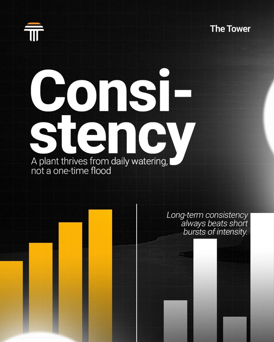
Consistent visibility creates familiarity.
Familiarity creates trust.
And trust is what keeps a brand relevant long after trends fade.
Trust is not built through one loud appearance. It’s built through repeated experience.
#brands#design#thetower