Greetings from Shanghai, where the view (and people and food) never disappoints. I have now had several dozen meetings over the past 2 weeks in Korea, Japan, and China, with three more days coming up in Taiwan and Hong Kong before returning home in time for the July 4th fireworks.
As I take stock of the conversations, several major themes jump out for being consistently on the minds of the institutions visited. First and foremost, the same question that is on our minds stateside is equally prevalent here: is the AI boom sustainable or is it a bubble? How much is too much, and how can I simultaneously monetize this boom while also protecting myself if it’s a bubble? That topic was quickly followed by questions about the Fed under Kevin Warsh’s new leadership. Beyond that, gold was a prevalent topic, which is quite interesting. Finally, the conversation tended to evolve into a discussion of what a diversified portfolio looks like in a post-60/40 world.
Let’s review.
https://t.co/9QfBOzcOPl
The first topic regarding the paradox of profiting from a boom while protecting from a bubble is of course an existential one and reflects the duality of the profit seeking polarity juxtaposed against loss eversion. Fortunately, in my view there is a solution to this challenge, illustrated by the decision “tree” below. 🧵(1/3)
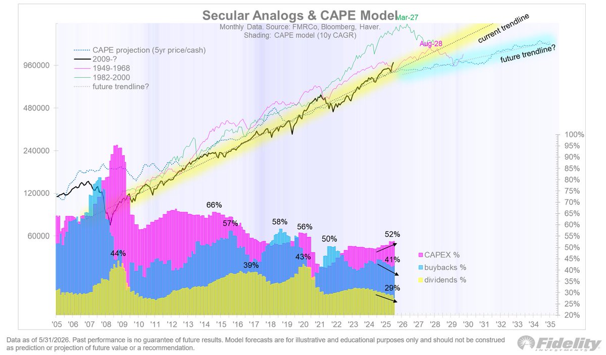
As for the secular trend, one thing I have been pressing on clients is to harvest the beta while we can, while appreciating how plentiful it has been and that it’s not going to last forever. The secular wave has been alive and well but getting on in age. Per the chart below, for the S&P 500 the 10-year price CAGR is 13.7% and the income (dividends and buybacks) is 3.9%. That means that the “share” of income of the total return is only 25%. 🧵(1/2)
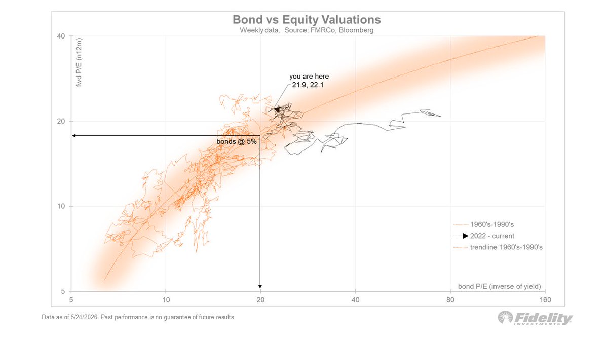
If the 10-year does climb into the danger zone from here, say to 5%, that would equate to a 3 point P/E compression, taking us down towards the pink line below. Again, rising earnings provide the offset to falling valuations, with price as the residual.
The Equity Valuation and Fed Model chart below shows the distribution of the P/E ratio (top) and the Fed model signal (bottom). Fortunately, equity valuations are largely justified and the Fed model signal is near the middle. That suggests that the current left tail risk is only moderate for now (as compared to the extreme signals in 1987 and 1999).
With the 10-year yield flirting with the danger zone of 4.5%-5.0%, the Fed model is once again “active.” We are nowhere near the extremes reached in 1987 and 1999, but with stocks and bonds now positively correlated and with the risk-free offering the same yield as equities, this is a left tail risk that will probably be with us for a while.
We can see that the narrowing or broadening is really just an AI vs ex-AI dynamic. Excluding AI, the market has not even taken out the pre-Iran highs, although in recent days it has come close. On Friday when the SPX was down 2.6%, the Goldman Sachs ex-AI basket was flat. It’s a good reminder to remain diversified.
With the S&P 500 cap-weighted index down 2.6% on Friday and the equal-weighted index down 1.4%, it is clear that the market narrows on the way up and broadens on the way down as shown in the S&P 500 Index chart below.
Looking at the heat map below 👇, we see that the right tail drivers of earnings (+20%), margins (15.8%) and credit spreads (73 bps) continue to propel the cyclical and secular bull market. But the left tail is perking up too, via the 10 year nominal yield (4.53%), real yield (2.16%), and now a rising SOFR curve. Crude oil remains elevated and the 12-month forward contract at $81 (Brent) remains near its level from when the conflict began 4 months ago ($82). Meanwhile, Cushing inventories are getting more depleted, which makes you wonder what the endgame is going to be for the Strait of Hormuz, oil prices, and inflation.
For me the biggest outlier is the 5-year TIPS break-even spread of 2.48%. Either the market is whistling past the graveyard in the hope of a quick resolution, or it’s assuming that demand destruction will eventually bring oil prices back down.
Off to 9 cities in 5 countries throughout AsiaPac for the next 3+ weeks (with one carry-on) to vist clients, so my charts (and photos) will be coming at you from a different timezone. For now, I am leaving a very lush and green Boston behind.
Secular bull markets always end with a valuation reversal, either because they reach bubble levels unsupported by fundamentals (1929 and 2000) or because they get derated by inflation (1968). Whenever the current trend comes to an end (hopefully not anytime soon), it will likely be for one of those two reasons. Perhaps it will even be both, if the two tail risks manifest at the same time. But for now, valuations are supported by the fundamentals of margins and credit spreads, so let’s enjoy the ride while we can.
A boom-turned-bubble is one scenario for an end to the secular trend, but an inflation bust is another. Below in the Commodity Super Cycles chart we see that commodities appear to have entered another secular bull market of their own. What’s interesting about this is that super-cycles for commodities and equities tend to be mirror images of each other (illustrated by the 10-year CAGRs below). So perhaps the strength in commodities is a subtle early warning sign for the secular trend in equities.
If commodities continue to rally, the “open jaw” below between the Bloomberg Commodity Spot Index and the 5-year TIPS break-even will be a challenge for the bond bulls. One of those lines is wrong, I think, and if it’s the inflation break-evens, then it has implications for the Fed and therefore for bonds and therefore for equities via the Fed model.
The Fed model returned to relevance in 2022 after being dormant for several decades. The Fed model simply holds that if the risk-free asset is competitively priced against the risk asset (equities), and its valuation derates, then so must equities. Hence, per the above chart, if inflation remains sticky in the 3-4% area and pushes up the TIPS breaks, then bond yields may well rise into that danger zone of 5% or above, which per the Fed model could force the stock market to derate.
While buybacks are still a dominant feature of the financial engineering landscape, we can see below in the secular analogs and cape model chart that the capex boom is forcing down buybacks and dividends, at least as a percentage of earnings. It’s a minor nuance (I think), but it might be a sign that the financial engineering bonanza is cresting.
The equity supply & demand chart is a look at the supply and demand over time. Remember that there are two sides to this equation, with the demand for shares overwhelming the supply of shares.
This bull market started slowly in terms of earnings, but boy have they caught up. Based on current estimates, earnings will likely continue to play a large role in shaping this cycle.
And those earnings are supported by margin expansion, which are a powerful driver for valuation. While the S&P 500 index is in the upper reaches of its valuation band, the 22x forward P/E ratio is supported by both margins and credit spreads.
We know that inflation is less driven by commodity prices than in the past, but the chart below shows that goods inflation still matters. When the 5-year CAGR of the Bloomberg Commodity Spot Index is consistently above the 5-year inflation rate, it tends to “pull” the CPI higher.
All of this suggests that while it’s important to celebrate the epic earnings cycle we are in, we shouldn’t forget the valuation risks if bonds enter the 5% danger zone and the Fed Model takes its revenge. Price is at the intersection of earnings and valuation.
I look to get a sense of how much the P/E-multiple might fall if the 10-year yield rises to 5% or beyond, at a time when the 5-year earnings CAGR is already at peak levels. The scatter plot shows that the S&P 500 with its 22.1x forward P/E is exactly in line with the 10-year “P/E” of 21.9x. As we saw in recent weeks, when the competing valuations are this close, they move in lock step. That’s why yield changes around the 4.5% are so impactful. If rates do rise to 5%, the Fed Model indicates that the equity P/E would fall to 18-19x. Not the end of the world, but not nothing either, depending on the earnings offset.
We know from history that the higher bond yields go, the more positively correlated equities and bonds become. If the 10-year yield continues to rise to 5% or beyond, stocks and bonds could become even more correlated than they are now, which brings back the Fed Model was a powerful valuation driver.
A rudimentary regression analysis of margins, earnings, rates, and credit spreads shows that these four variables explain quite a bit of the market’s valuation since the 1960’s. If we exclude rates from the equation, we see that the market is very close to fair value, but if we include rates the market is a tad rich. Should rates continue to rise to 5% or beyond, we could see the orange and blue lines diverge further.