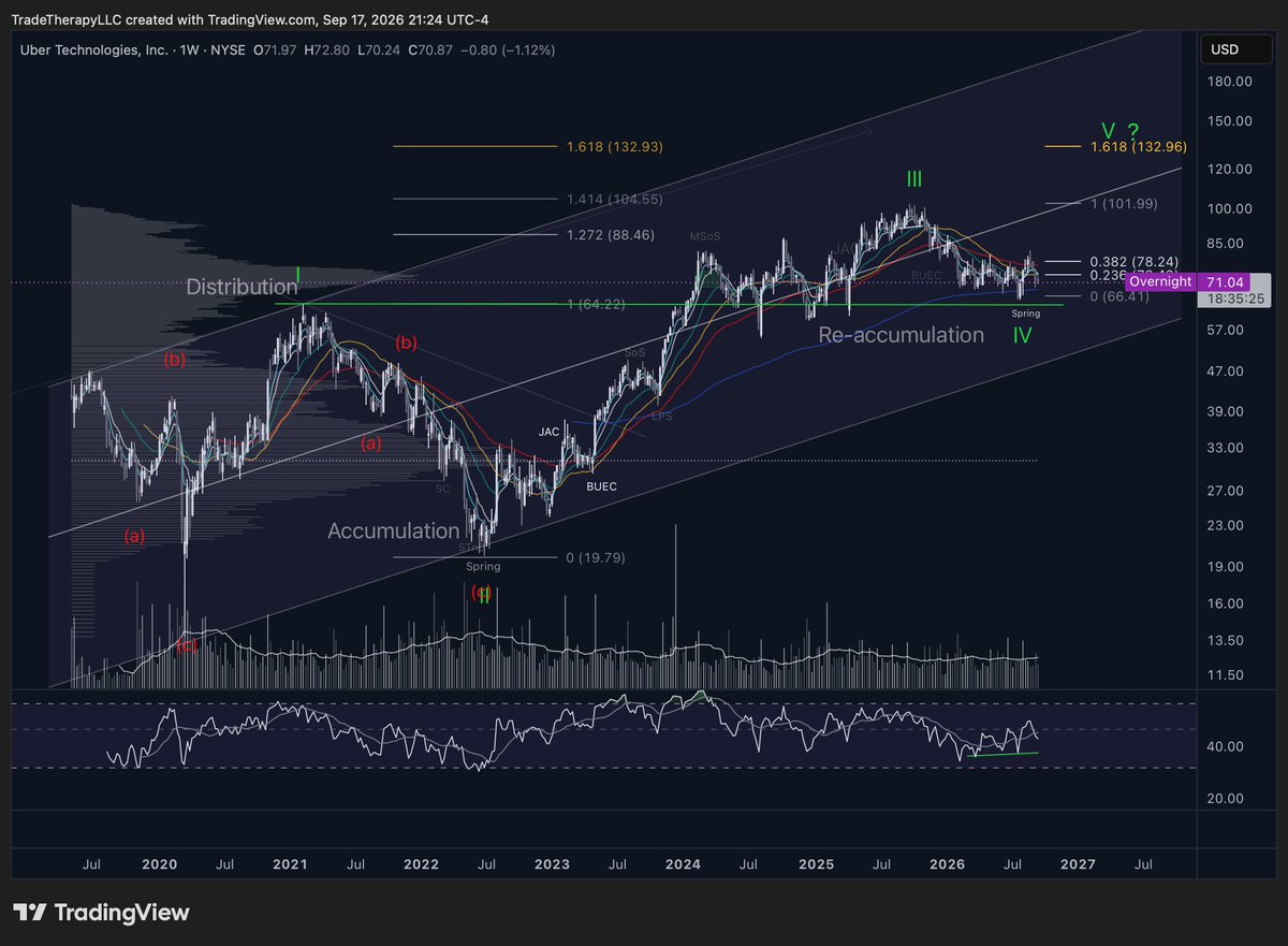
Full UBER breakdown, including why DoorDash took a very different path over the same six months, in this week's Clarity.
Subscribe for the research, stay for the education.
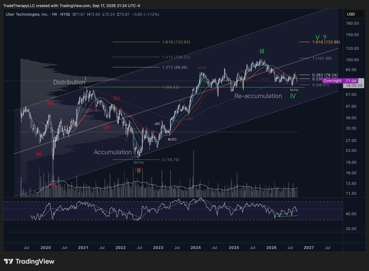
Uber reported earnings three times this year.
Every report produced a sharp move. Every move ended back inside the same range.
That's the institutional business cycle at work, and it's one of the most useful things a retail trader can learn to recognize.
Earnings bring headlines, and headlines bring traders who think they've timed the breakout.
That's the liquidity institutions need. They can't buy a million shares without forcing price up, so they buy in pieces and sell back into the gap.
That is one name. Our members get this read on every ticker we have covered in the last six months, every week.
Subscribe for the research, stay for the education.
$UBER, March 20, 2026: cascading risk identified in advance. Tier one at 72, the tight boundary. Tier two at 65 to 62, the structural reference.
The low printed 66.41. Tier one was taken. Tier two was never touched.
The entry failed. The structural read stayed available. That distinction is the whole discipline: a tier one stop is a position decision, not a thesis verdict.
Six months later the campaign is intact, the spring at 66.41 is on the chart, and the burden has moved to efficiency.
Vol. 116 is out.
Try Clarity for free: https://t.co/jHfagzORwa
The March 20 Clarity published two levels of risk on $UBER. Price later traded through the first and held the second. That gap is where single-stop traders get removed. Sunday we pick it up from $70.87.
Subscribers get the full breakdown.
https://t.co/8o2AOkvInk
Four editions of Clarity on $UBER since 2024. We identified the exhaustion and mapped the retracement zones before the correction ran. We identified the reaccumulation completing in May 2025. Near $70.87, the next one publishes Sunday.
https://t.co/8o2AOkvInk
Bearish divergence on the monthly.
Bearish on the weekly.
Bullish on the daily.
They don't cancel each other out.
Different degrees measure different parts of the same auction. The fast chart can be building the setup the slow one is warning about.
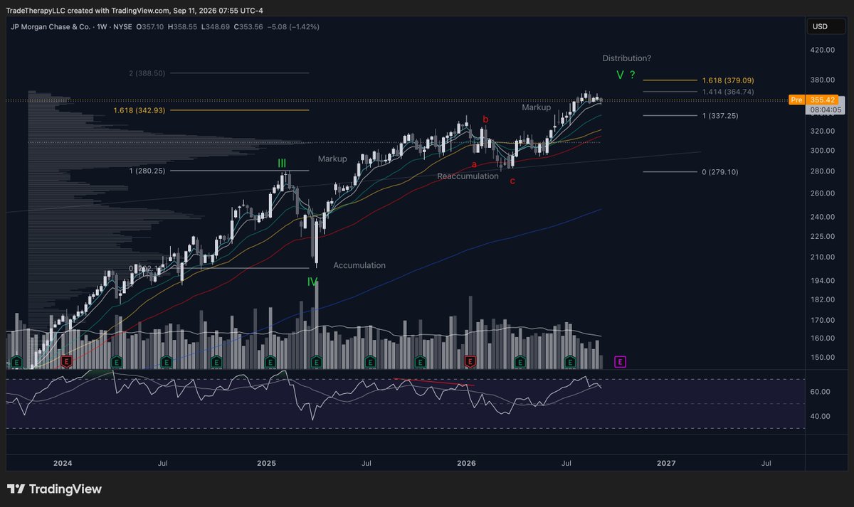
$JPM
Source: Clarity edition 9/11/26
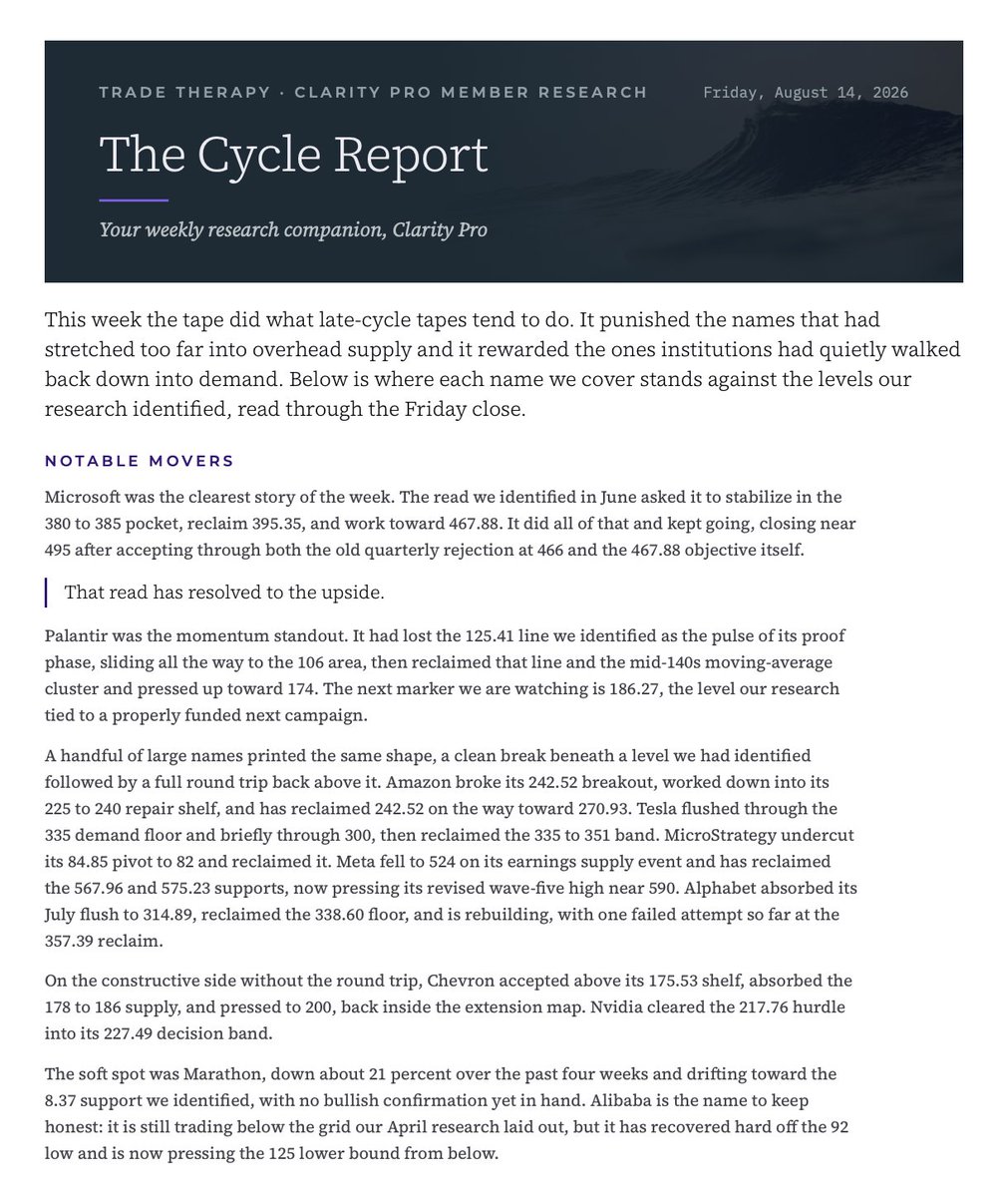
Every week, The Cycle Report walks the full Clarity coverage in a single pass: where each name sits in the institutional business cycle, the levels under test, and the current standing of every active setup across the names and macro instruments we cover.
Some weeks the table barely moves. Other weeks a level gives way and a read resolves, updates, or gets retired. Following that motion, week after week, is how the framework becomes something you can see on a chart.
New for Clarity Pro members.
Subscribe for the research, stay for the education.
https://t.co/BGQdohSIUV
$JPM is carrying completed bearish divergence on the monthly and weekly, and completed bullish divergence on the daily. All three are real. They belong to different degrees of the same campaign.
Monthly: upper wicks, smaller bodies, a shooting star near the highs. Price is reaching higher and giving the gains back.
Weekly: same divergence, distribution still an open question, wave five still open.
Daily: price holding its late-August range while shorter-term selling loses efficiency.
Preliminary Supply is this week's key term. JPM meets part of the checklist through price and momentum. Volume is not obviously expanding, so the effort component is missing and the label stays off the chart.
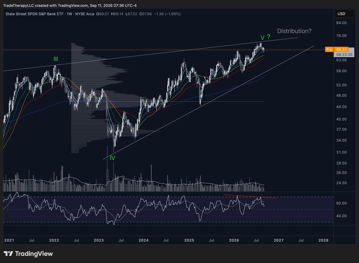
Divergence is now present across $SPY, KBE, GS and JPM. $BAC is the dissent, no divergence and an unfinished impulse. All covered this week in Vol. 115
Try Clarity free: https://t.co/jHfagzORwa