Useful Flow Diagram to Help You Design for Better Errors! in your next Design Project! 🔥
FREE Cheatsheet attached! 🙌
Design thoughtful errors to improve user trust in our product.
First, anticipate and prevent errors
Make time for errors in your work process:
- Errors are not edge cases. They can impact user trust in our brand.
- Effective and considerate error design translates into better user retention and satisfaction.
- Bring up the topic of errors early on in the design cycle. Discuss with developers so the team makes time for errors in the sprint.
- Run an activity with your team using the workshops available in the Design Team Workshop Kit on Miro. Imagine everything that could go wrong when a user tries to perform an action, and plan how to prevent these errors from happening.
Design with errors in mind:
- Use smart defaults
- Use data to determine what defaults could be useful to reduce errors for users.
Highlight required fields:
If users often forget to fill out a required field, check that
- The label is clear
- The field stands out appropriately
- Were asking for this information at a good time for the user
Use help patterns when needed:
- Make sure users understand what they need to do, and that they have all the information they need to complete the action.
- For example, add more explanations or instructions next to a field. For better accessibility, position the information above the field if users should read the info before filling out the field.
Then, craft efficient errors
Create useful and usable errors:
- Focus on the solution
- Rather than dwelling on the error, nudge users towards the solution.
- Sometimes, you don't actually need to show an error message.
- Show users how to solve the error by themselves, without insisting on their mistake.
Make the error visible. It should be obvious to users where they need to act, and what they need to do:
- Use consistent messages
- Using the same patterns for errors makes them more scannable, and improves user recognition.
- Check if an error message pattern is available for your use case in the error messages guidelines. If you think you
Save it for future reference 🔖
#UX #UI #UXDesign #UIDesign #ProductDesign
Excellent Cheatsheet for B2B UX Research 🙌 (Free below)
When you don’t have access to users, here’s what you can’t do — and what you can do instead.
by Vitaly Friedman
UX Research in B2B
Things you can't do
01 - Stakeholder interviews - too busy
02 - Competitor analysis - not public
03 - Data analysis - no data collected yet
04 - User interviews - no users yet
05 - Interview potential users - IP concerns
06 - Concept testing, prototypes - NDA
07 - Usability testing - IP concerns
08 - Sentiment analysis - no media presence
09 - Surveys - no users to send to
10 - Speak to support - no clearance
11 - Study help desk tickets - no clearance
12 - Use research tools - no procurement
Things you can do
01 - Focus on requirements + task analysis
02 - Study existing workflows, processes
03 - Study job postings to map roles/tasks
04 - Scrap frequent pain points, challenges
05 - Use Google Trends for related search queries
06 - Scrap insights to build a service blueprint
07 - Find + study people with similar tasks
08 - Shadow people performing similar tasks
09 - Interview colleagues closest to business
10 - Test with customer success, domain experts
11 - Build an internal UX testing lab
12 - Build trust, confidence with stakeholders
📎 Free Cheatsheet attached
#UX #UI #UXDesign #UIDesign #ProductDesign #B2B
Learn about the Types of UX Deliverables to Boost Your Next Design Project 📷
FREE cheatsheet attached 📷
User Persona
• Who your users are, holistically
• Segmenting different types of customers
• Understanding user needs and motivations
Empathy Map
• What users think, feel, say, and do when interacting with your product
• Visualizing the internal ind external experienc or different persona
• Aligning teams with empathy for the user
Customer Journey Map
• What your users do in the process of becoming a customer
• Understanding the different steps and touch points users go through to become a customer
• Identifying common pain points
Jobs to be done
• What your users are trying to accomplish in order to buy your product
• Understanding the different steps and touch points users go through to become a customer
• Prioritising development based on user goals
User Stories
• Why users want certain functionalities written from the user's perspective
• Communicating the value of specific features for different customer types
Task Analysis
• How users accomplish their desired outcomes with your product
• Breaking down all the steps a user takes to accomplish a goal
• Identifying opportunities to solve user pain points more effectively
#UX #UI #UXResearch #UXDesign #ProductDesign
Excellent Resource with FREE eBooks for Designers to 10x Your Knowledge! 🙌
Save to Bookmarks for reference 🔖
FREE Book Collections for:
- Design systems
- User Experience (UX)
- Visual design
- Usability
- Typography
- Front-End Development
- Startup
- Career
#UX#UI #UXDesign #UIDesign #UserExperience #ProductDesign
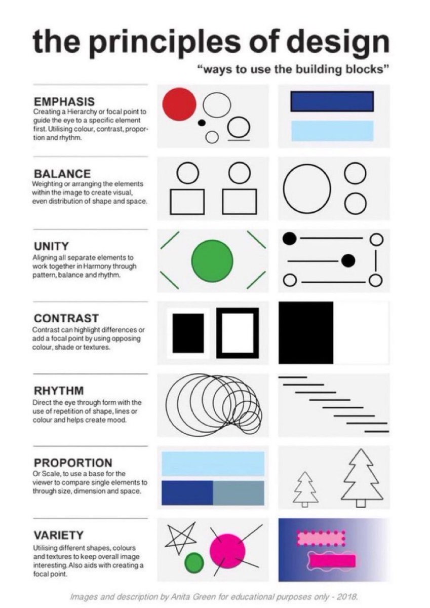
Learn the Principles of Design with this quick, practical cheatsheet 🙌
Perfect to save for later 🔖
EMPHASIS
Guide the eye with hierarchy — using colour, contrast, scale and rhythm.
BALANCE
Arrange elements so the visual weight feels evenly distributed.
UNITY
Make every element feel like it belongs — through harmony, balance and pattern.
CONTRAST
Highlight differences with opposing colours, shades or textures to create focus.
RHYTHM
Lead the eye through repetition of shapes, lines or colour to set the mood.
PROPORTION
Use scale to help the viewer compare elements and understand their importance.
VARIETY
Mix shapes, colours and textures to keep the design interesting and draw attention.
Save or bookmark the cheatsheet 🔖
#UX #UI #UXDesign #UIDesign #ProductDesign
15 Principles of Good Design to Boost Your Next Design Project 🙌
Great design isn’t just beautiful, it’s usable, accessible, and intentional.
These 15 principles help guide meaningful UX 👇
1. Discoverability
Users should easily find what actions are possible and where to begin.
2. Feedback
Every action should have a clear, timely response to show it’s working.
3. Constraints
Limit choices to prevent errors and guide users toward the correct path.
4. Mapping
Controls should match users’ mental models (e.g., up means increase).
5. Consistency
Keep patterns, terms, and visuals uniform across your product.
6. Affordances
Design elements should suggest how they’re meant to be used (e.g., buttons look clickable).
7. Structure
Group related content and actions logically to reduce cognitive load.
8. Simplicity
Remove unnecessary elements—clarity beats clutter every time.
9. Tolerance
Design should forgive errors—make undo easy and prevent destructive mistakes.
10. Equity
Ensure your design works for users of all abilities and backgrounds.
11. Flexibility
Support different user needs and preferences without forcing one path.
12. Perceptibility
Make important information visible and legible to all users.
13. Ease
Reduce friction—fewer steps, simpler wording, smarter defaults.
14. Comfort
Design for emotional and physical ease—no stress, no strain.
15. Documentation
When needed, provide clear guidance to help users succeed.
Design with these in mind and you’ll build experiences people actually want to use 🙌
#UX #UIDesign #DesignPrinciples #ProductDesign #Startup #Business
9 timeless design principles every UI designer should know 🙌
FREE Cheatsheet attached 🔖
Summary:
1. LAYOUT
Layout is the arrangement of visual elements in a design to create balance, clarity, and visual appeal.
2. ALIGNMENT
Aligning elements in a design along a common axis to create order and visual consistency.
3. HIERARCHY
Organizing elements to establish a clear order of importance, guiding the viewer's attention.
4. PROXIMITY
Placing related elements close together to indicate their connection or importance.
5. BALANCE
Weighting or arranging the elements within the image to create visual, even distribution of shape and space.
6. REPETITION
Consistently using the same design elements (e.g., fonts, colors, shapes) to create unity and reinforce visual identity.
7. COLOUR
Utilising colours intentionally to convey mood, meaning, and visual impact in a design.
8. CONTRAST
Contrast can highlight differences or add a focal point by using opposing colour, shade or textures.
9. NEGATIVE SPACE
Also known as white space, it's the empty or unmarked area around or between design elements, used to enhance readability and create visual balance.
Original cheatsheet by Jaxon White
#UX #UI #UIDesign #UXDesign
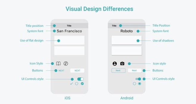
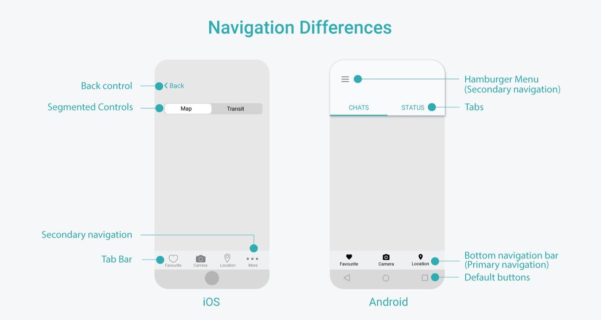
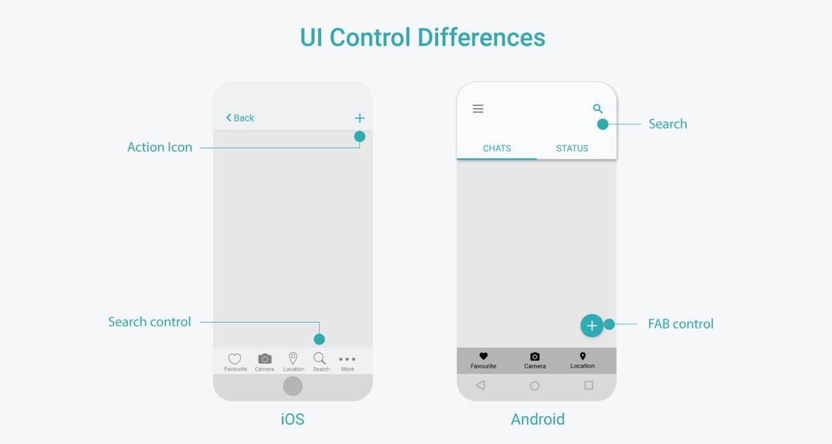
Useful iOS and Android Platform Design Comparison Cheatsheets to Boost your Next App Design Project 🙌
Save for reference 🔖
Includes:
- Visual Design Differences
- UI Control Differences
- Navigation Differences
- Other Differences
#UX#UI#UXDesign#UIDesign#ProductDesign #Business #iOS #iPhone #Android
15 Principles of Good Design to Boost Your Next Design Project 🙌
Great design isn’t just beautiful, it’s usable, accessible, and intentional.
These 15 principles help guide meaningful UX 👇
1. Discoverability
Users should easily find what actions are possible and where to begin.
2. Feedback
Every action should have a clear, timely response to show it’s working.
3. Constraints
Limit choices to prevent errors and guide users toward the correct path.
4. Mapping
Controls should match users’ mental models (e.g., up means increase).
5. Consistency
Keep patterns, terms, and visuals uniform across your product.
6. Affordances
Design elements should suggest how they’re meant to be used (e.g., buttons look clickable).
7. Structure
Group related content and actions logically to reduce cognitive load.
8. Simplicity
Remove unnecessary elements—clarity beats clutter every time.
9. Tolerance
Design should forgive errors—make undo easy and prevent destructive mistakes.
10. Equity
Ensure your design works for users of all abilities and backgrounds.
11. Flexibility
Support different user needs and preferences without forcing one path.
12. Perceptibility
Make important information visible and legible to all users.
13. Ease
Reduce friction—fewer steps, simpler wording, smarter defaults.
14. Comfort
Design for emotional and physical ease—no stress, no strain.
15. Documentation
When needed, provide clear guidance to help users succeed.
Design with these in mind and you’ll build experiences people actually want to use 🙌
#UX #UIDesign #DesignPrinciples #ProductDesign #Startup #Business

