Because I’m a glutton for punishment I decided to take on the question “what is a product manager?” in this week’s blog post.
Be gentle with me. :-)
👇👇👇 https://t.co/b6RdBKDgzC
When you make something new and beautiful, sometimes the mechanism is strange and uncomfortable. Perhaps even ugly and you don’t think it should work. People fight. It’s not easy or elegant. The outcome makes it worth it. 💎
🤯 allegory by Steve Jobs in the Lost Interview 👇
Become a Friend of Phil in the Greenhouse Challenge. Win €25.000 of pilot opportunity to beta test your creations with some of https://t.co/dV4H7QV5i4 clients while receiving mentorship and access to all the horticulture industry institutional knowledge https://t.co/t5O2TaF4tg
How Dark Mode Really Affects Us • If for some reason you prefer the Dark Mode interface, only use it when you don’t have much reading to do and accuracy isn’t an absolute must. https://t.co/0f0Iony4KP
A history lesson for people who think that history doesn't matter:
What's the big deal about railroad tracks?
The US standard railroad gauge (distance between the rails) is 4 feet, 8.5 inches. That's an exceedingly odd number.
Why was that gauge used?
Well, because that's the way
Tip 3! Wat is het doel van het onderzoek? Hou het aantal vragen beperkt en zorg dat je de gebruiker niet het hemd van zijn lijf vraagt en een half uur van zijn leven. Meer antwoorden, minder ruis, met minder maar beter gerichte vragen. @statistiekcbs
Tip! Stem je kanaal af op de doelgroep. Wil je iets weten over mensen die onderweg zijn? Let dan vooral op de mobiele experience! Na de derde brief op de mat van @statistiekcbs toch maar even naar de url gegaan om vragenlijst in te vullen, maar helaas!
Tip 2! Gebruik standaarden, maak het leuk en simpel! Desktop experience viel helaas ook tegen, en daarmee ook mijn vertrouwen in de data die @statistiekcbs verzamelt op dit onderzoek. Zoveel vragen, zo veel klikken, zo veel moeite; zo verlies je de gebruiker.
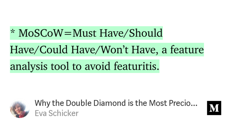
FEATURITIS - my word of the day! Thanks to Eva Schicker: "Why the Double Diamond is the Most Precious Diagram in UX Design" - Eva Schicker https://t.co/y4GjKV8Igh