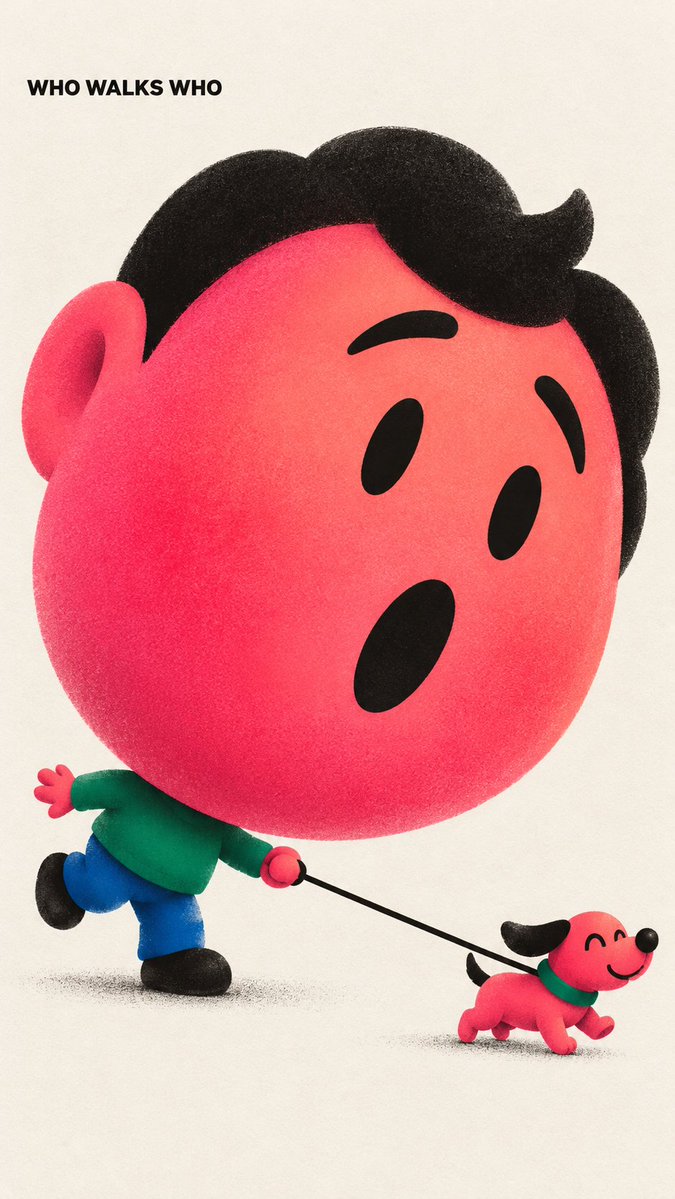
01 WHO WALKS WHO — tiny dog pulling the leash, startled O-mouth.
02 BIG LOVE SOFT STEPS — sleeping baby in a swaddle, one foot on tiptoe.
03 I OUTGREW THIS — seated on a miniature chair, knees up.
04 SORRY IS A START — bowing to a small friend, hand on chest, one red flower.
VISUAL OS 096
Huge heads, tiny bodies. Hot pink, fine grain.
WHO WALKS WHO — a tiny dog leading a giant face.
BIG LOVE SOFT STEPS — tiptoeing with a baby.
I OUTGREW THIS — a big face on a tiny chair.
SORRY IS A START — a giant face bowing with one flower.
Prompt below ↓
Prompt ↓
Graphic character poster, [RATIO], on neutral off-white paper.
One character with an enormous rounded hot-pink/coral head, about two-thirds of the figure, on a tiny compressed body: emerald top, short cobalt legs, stubby black shoes. Black compact hair, simple black brows, eyes and mouth, no white in the eyes.
Scene: [WHO + WHAT THEY'RE DOING], [EXPRESSION]. The head carries the emotion; the small body and any prop explain the story. Keep contacts clear: hands attached, nothing floating.
Text: "[CAPTION]" once, small bold black uppercase sans-serif in the paper space. No other words.
Print: fine, close low-contrast ink stipple inside the colored forms, soft coral-to-pink gradient on the face, soft airbrush at overlaps. Clean contours, no heavy shadows.
Never a small-head, long-leg cartoon.
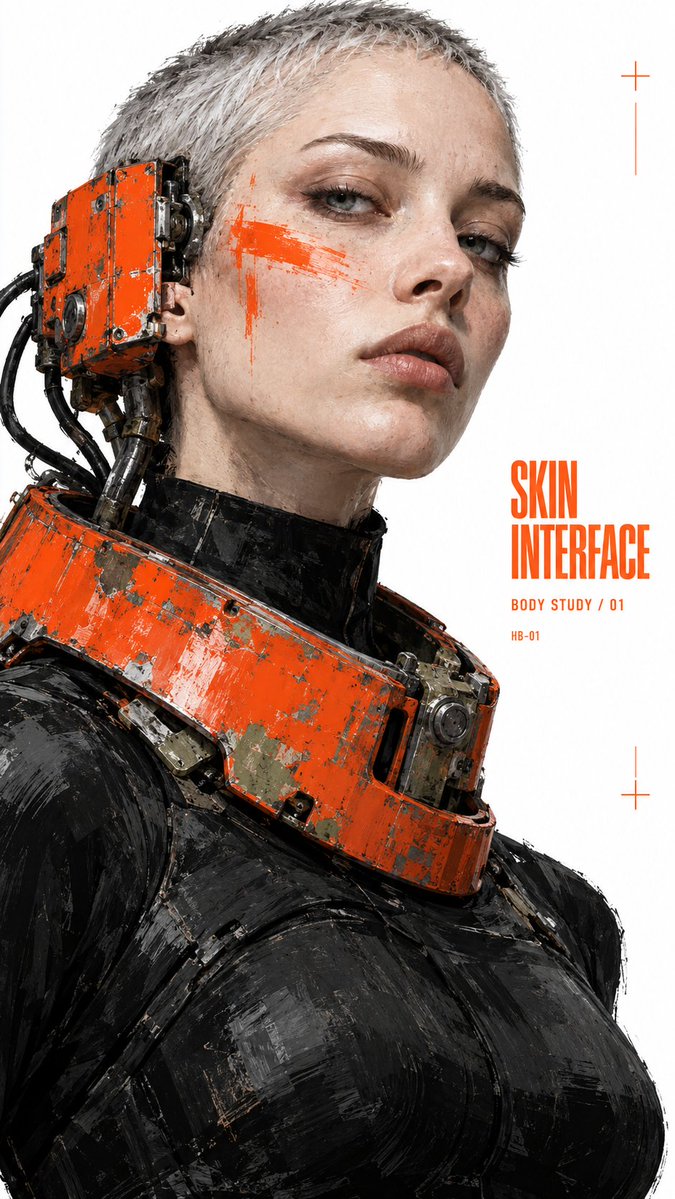
01 SKIN INTERFACE — chipped orange neck ring wired to an ear receiver.
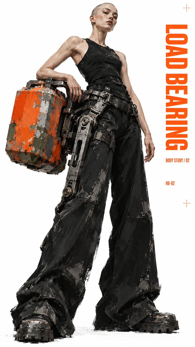
02 LOAD BEARING — orange counterweight on a hip exoskeleton.
03 PHANTOM LIMB — seated on a stool, one giant orange prosthetic boot.
04 TORSION STUDY — rear view, orange external spine, one forearm cuff.
VISUAL OS 095
Salvaged machines worn as fashion.
SKIN INTERFACE — a steel collar wired into her ear.
LOAD BEARING — a counterweight bolted to the hip.
PHANTOM LIMB — one leg swapped for a giant orange boot.
TORSION STUDY — a spine worn on the outside.
Prompt below ↓
Prompt ↓
Experimental fashion editorial poster, [RATIO], on pure white. No scene, no horizon.
One dominant model fused with heavy worn machinery: [MODEL + OUTFIT], with [MACHINE PART] attached to the [BODY AREA], changing the silhouette. Cold, self-possessed pose.
Painted realism, not a clean photo: broad scraped enamel, angular dry-brush planes in the black clothing, some unfinished edges. Signal-orange hardware chipped down to gray metal and muted olive. Face and anatomy stay believable.
Small solid-orange condensed headline "[HEADLINE]" in the white margin, plus "[LINE]" and a tiny code "[CODE]". Type stays smaller than the figure and never touches it. A few tiny orange registration marks.
No logos, weapons, neon, CGI gloss or city background.
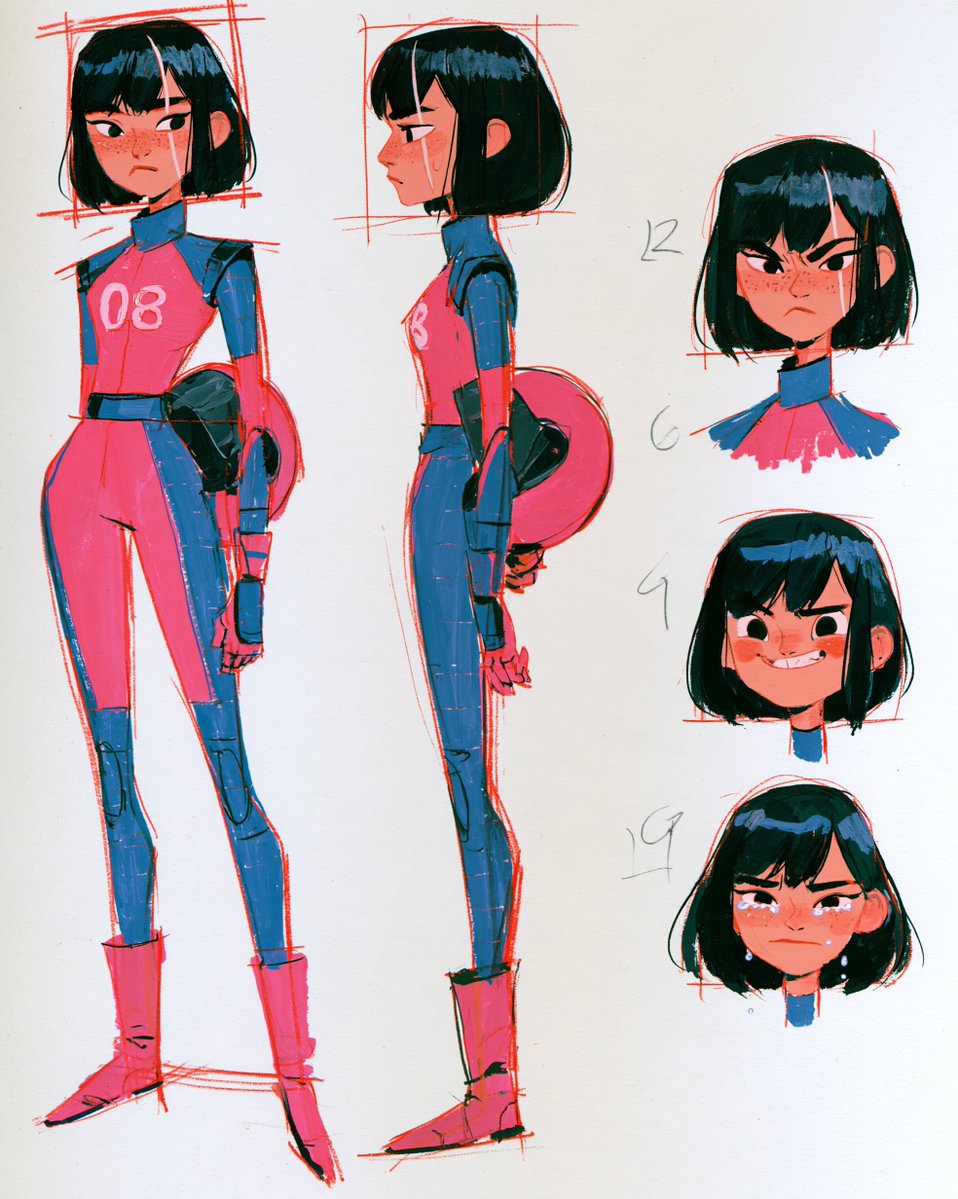
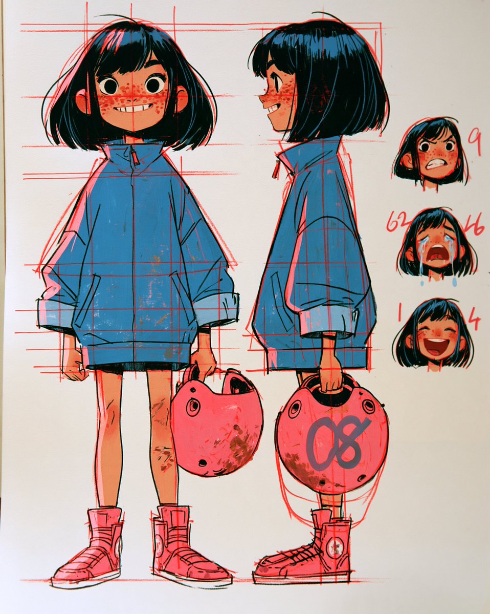
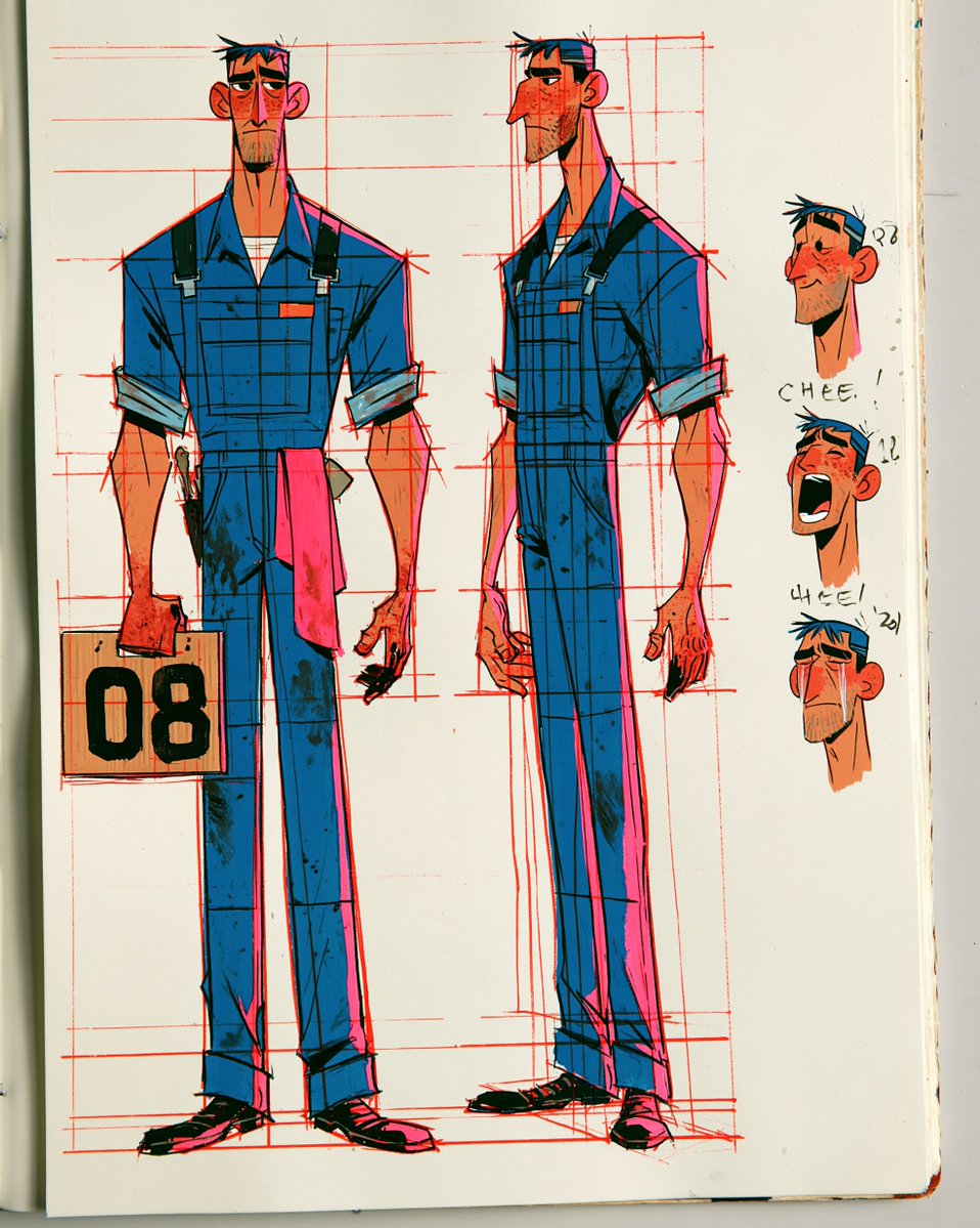
Made a 30-second animated short about one number: 08.
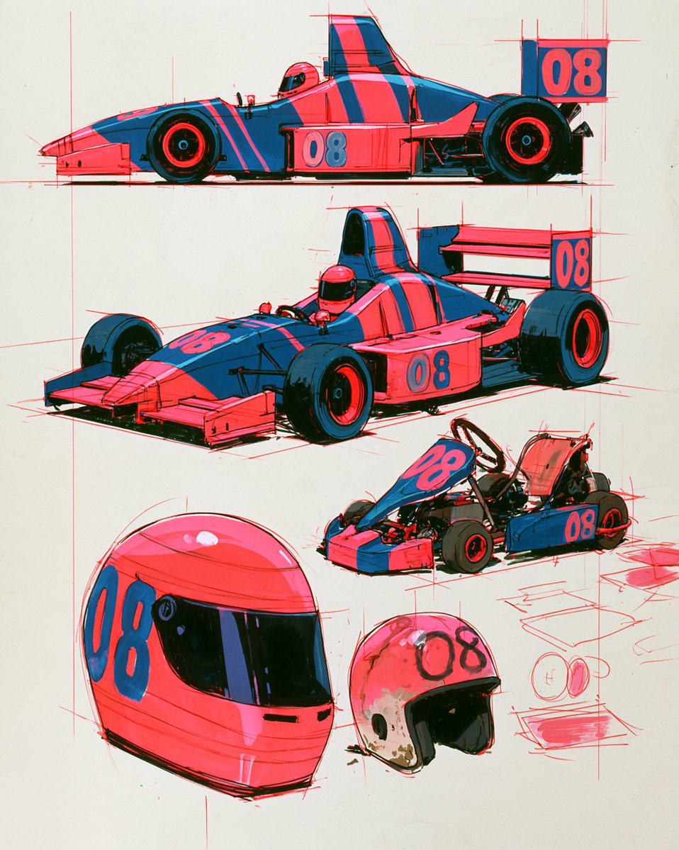
A freckled kid in a beat-up go-kart. Her dad in blue overalls, the one who drops the flag, and the one who picks her up after the crash. Years later, the same scuffed helmet on a starting grid at sunset.
My favorite moment is the last 3 seconds: the stare that slowly breaks into a crying smile. That's the whole story in one face.
Character sheets below ↓
Started with character sheets before animating anything.
01 08, GROWN UP: racing suit, helmet under her arm, a face that's done crying.
02 THE MACHINES: go-kart to open-wheel, same pink and blue livery.
03 DAD: blue overalls, an 08 sign, a rag in his pocket.
04 08, AGE 8: oversized jacket, a dented helmet, freckles.
Locking the designs first is what kept her the same person across 20 years.
MJ Prompt:
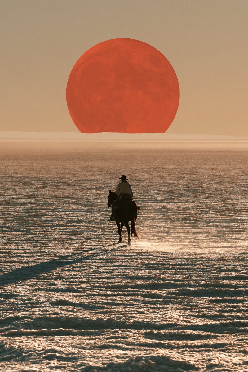
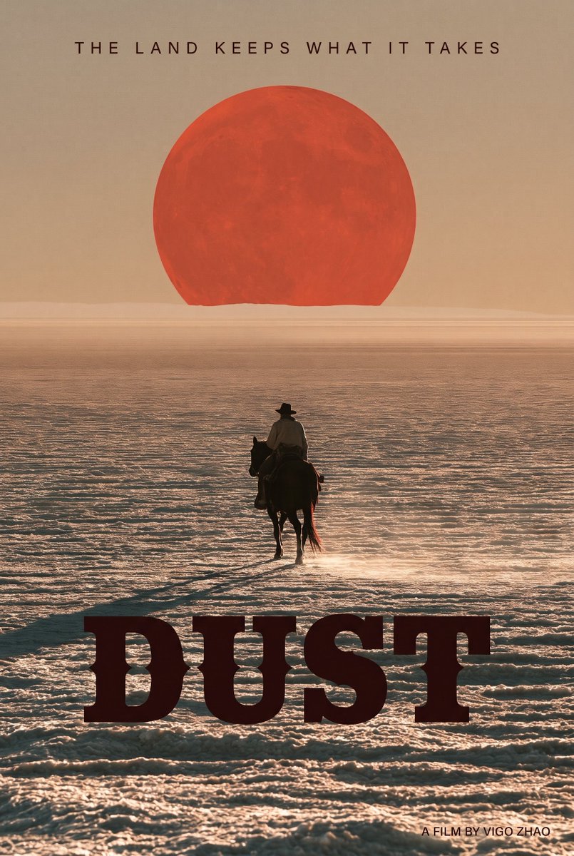
film poster key art, a lone rider on horseback crossing an endless cracked salt flat at dusk, a huge red setting sun on the horizon, a very long shadow stretching toward the camera, heat haze, subject small in the lower half, the top third of the image is clean empty gradient sky, burnt orange and dusty rose palette, cinematic, painterly realism, no text --ar 2:3 --stylize 400
After a sci-fi epic and a fantasy colossus, the "Vigo Zhao fake movie universe" is heading into the Neo-Western territory today: DUST. 🤠🎬
Fell in love with the stark minimalism of this shot—just the salt flats, a lone rider, and that massive blood-red sun/moon on the horizon. Paired it with a heavy spurred western typeface and a cold tagline:
"The land keeps what it takes."
Poster version (1) or clean wallpaper (2)? Which one hits harder? 👇
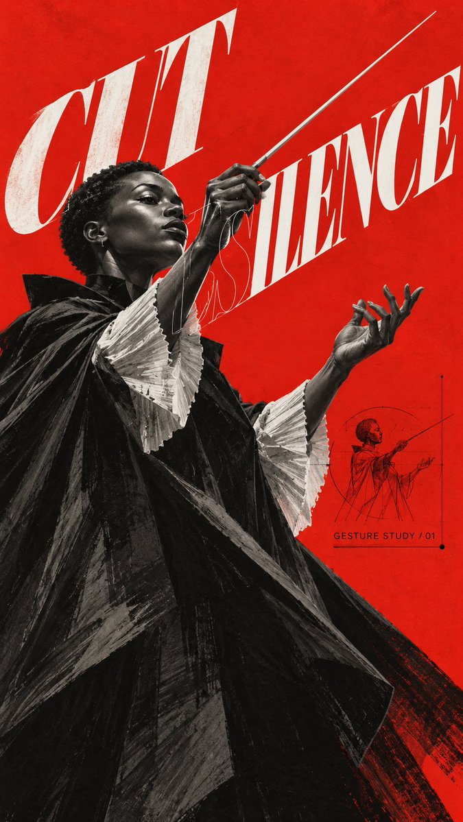
01 CUT SILENCE — conductor in a black cape, baton cutting a red wedge.
02 WING LOAD — steel-plated raven, one wing fanned up past the title.
03 RISE ABOVE — concrete stair on one steel spine, from below.
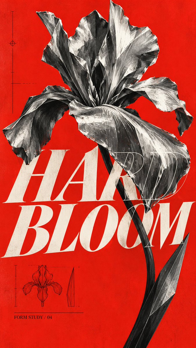
04 HARD BLOOM — sheet-metal iris, stem splitting HARD and BLOOM.
VISUAL OS 094
Red field, gray painted subjects, giant italic serifs.
CUT SILENCE — a conductor's baton slicing the red.
WING LOAD — a steel raven opening its wings.
RISE ABOVE — a stair hung on one steel spine.
HARD BLOOM — an iris folded from sheet metal.
Prompt below ↓
Prompt ↓
Editorial art poster, [RATIO]. Flat saturated vermilion background. Subject in cool grays, near-black and chalk white: [SUBJECT].
Monumental foreshortening, hard raking light, bold cropping. Painted in angular dry charcoal-like brush strokes, not a glossy render.
Huge sharp-cut italic serif title "[TITLE]" in off-white. The solid letters sit behind parts of the subject; a thin white outline copy of the letters crosses the foreground. The full title stays readable.
One small black engineering sketch of the subject with a few fine rules, and a tiny caption "[CAPTION]". No other text.
Fine print grain on the red only. No logos, no neon, no photo scenery, no glossy CGI.
Prompt:
epic cinematic wide shot, a colossal stone giant lying on its side as an entire mountain range, forests and waterfalls growing over its shoulders, a tiny caravan of travelers crossing a bridge over its open hand, golden god rays breaking through storm clouds, layered atmospheric haze, overwhelming scale, painterly realism, large empty sky in the upper third, no text
Trading sci-fi for high fantasy today with a new concept poster: THE SLEEPER.
My favorite part of this piece is the sense of scale as your eyes travel down the frame:
First, you see the sleeping giant in the clouds.
Then you realize the ancient bridge is built right across its resting stone hands.
And finally, the tiny travelers at the bottom...
"Some mountains are waiting."
Honest question: are you crossing that bridge or turning back? 👇
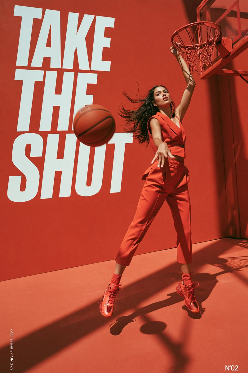
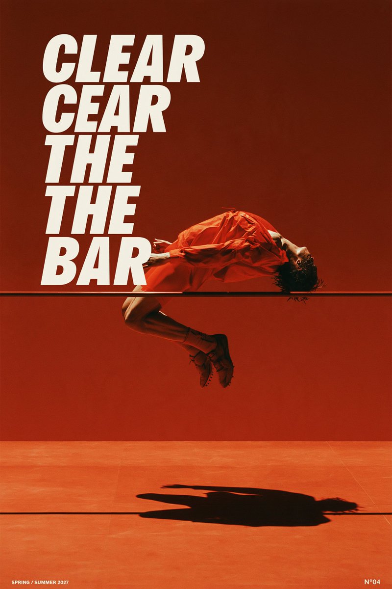
Imagining a Spring/Summer '27 high-fashion sportswear campaign. (Dear Nike & Jacquemus, my DMs are open 👀).
Wanted to monochromatic terracotta red, ground the whole composition. Which one of the 4 has the best energy?
01 MOVE BEYOND — dancer mid-leap, crossing a gap in the grid.
02 SHAPE BY HAND — clay hands on a wheel, one ink circle around it.
03 RISE THROUGH — Brutalist concrete stairs from below, cutting the grid.
04 GROW WILD — three callas rising from one stone, breaking the panels.
VISUAL OS 093
Two inks, oxblood and gray. Coarse halftone, very tall type.
MOVE BEYOND — a dancer leaping across the grid.
SHAPE BY HAND — clay hands, no face.
RISE THROUGH — concrete stairs climbing the frame.
GROW WILD — three callas breaking the panels.
Prompt below ↓
Prompt ↓
Editorial art poster, [RATIO]. Two inks only: deep oxblood red on pale cool-gray paper. All tones come from ink density, no third color.
Photo of [SUBJECT], rendered in coarse, clearly visible halftone dots, with dense red shadows and pale highlights.
Pale rectangular panels split by narrow red gutters form the grid. The subject crosses panel edges: [HOW IT BREAKS THE GRID].
Headline "[HEADLINE]" in extremely tall, ultra-condensed upright sans-serif caps. One short bold sentence "[SENTENCE]" and an issue number "[NN]". No other words.
Printed-paper feel: fine grain, faint fold creases, sparse edge scuffs and ink loss, kept away from the small text. Optional: one ink stroke that echoes the movement.
No full color, no black, no gradients, no mockup frame.