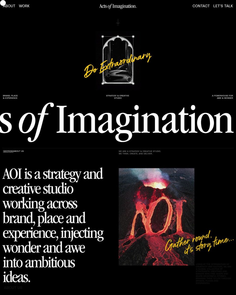
Acts of Imagination is a Melbourne strategy and creative studio working on brands, places, and events. Its black site pairs big condensed serif type with grainy mystical illustrations, a yellow handwritten accent, and wavy melting headlines.
https://t.co/70y0aVNu0X
Elliot& is a San Diego brand and digital design studio for growing tech companies. Its site pairs big bold headlines and italic serif words with a spinning 3D cube of client logos and a dark grid of case studies.
https://t.co/aKSguiODyD
Personal homepage, blog and portfolio site of Gaurav Tiwari, a WordPress developer, content marketer and educator.
Submitted by @wpgaurav
https://t.co/9zuPnxZvML
tragbar is a fashion concept store in Esslingen with separate shops for men and women. The site uses a black, white and grey look with moody model photos and a thin-line custom logo.
https://t.co/zp0vGZ1smP
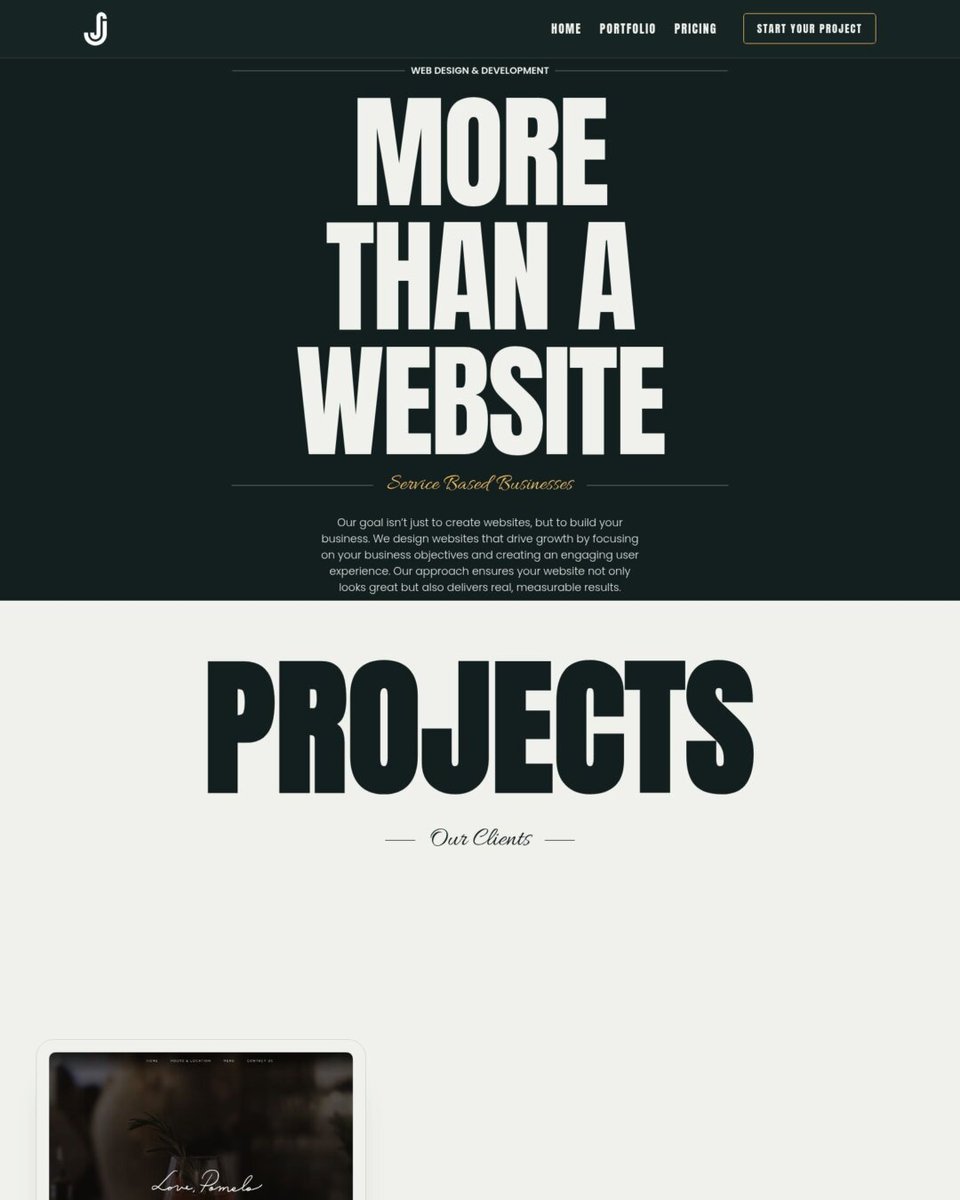
Junn Studios is a web design studio for service businesses. The site pairs big, heavy headlines with a dark green and warm yellow color scheme and shows its work in staggered project cards.
https://t.co/C63mCdApDE
This is the portfolio of Marie Codina, a digital designer and art director based in Barcelona. A short centered intro sits above a neat four-column grid of project images, and the plain black and white text keeps the focus on the work.
https://t.co/rd7AbVVuyh
RELIEF is an architecture firm in Lille that shows its schools, housing, and stadium projects on a black and white site. Tall photo panels with vertical category labels and narrow uppercase headlines give the pages a sharp, editorial feel.
https://t.co/SwhO5lr9Dx
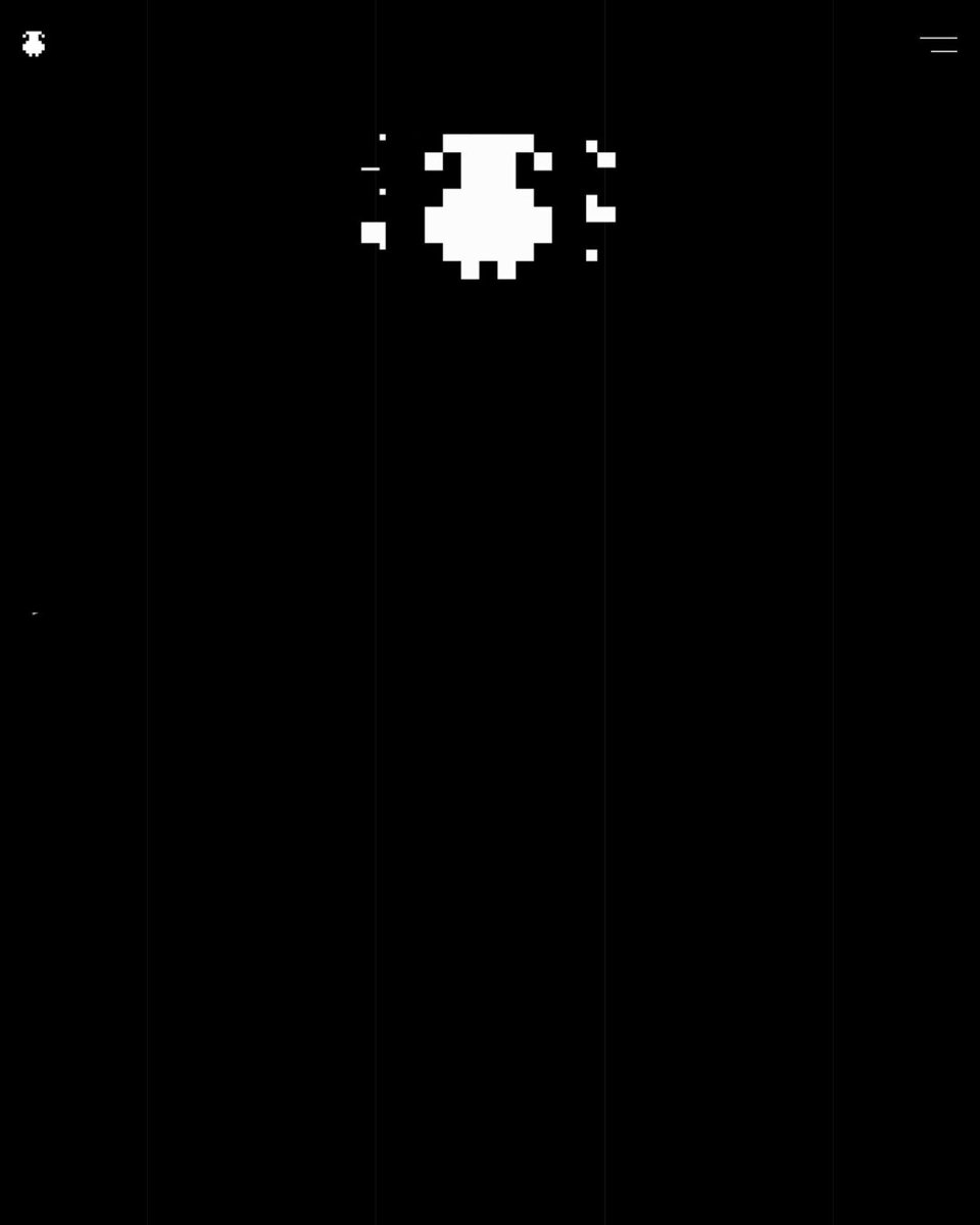
Sheep n Sons is an Austrian design agency offering branding, web design, print, and social media. The site is all black and white, with a pixel sheep logo, big outlined type, and device and brochure mockups that move as you scroll.
https://t.co/55MweGeX6n
Gian Media is a web design and SEO studio that builds interactive websites for brands. The site uses an all-black, grayscale look with a 3D block hero, a spinning gallery of past work, and a large pixel-style logo in the footer.
https://t.co/6duqdO2p7q
Week 17 on WP Showoff: 7 new WordPress sites, toured in about 4 minutes.
Viens-là, BSWT, Glad Studio, Stéphane Issartel, April Taylor, LANDMARK and Neuropelvic Surgery.
Full video: https://t.co/e3IfhfT2WK
4WIDE is a creative web studio in Aichi, Japan, that does design and development. Its site uses a black and white look with a curved strip of grayscale photos that scrolls sideways past a long list of project names set in a thin serif font.
https://t.co/X1dZU077bQ
A site for a fellowship and training program in robotic pelvic nerve surgery led by Dr. Khashayar Shakiba. It pairs bold black headlines and lots of white space with glossy orange 3D images and an orange gradient footer.
https://t.co/7grLyFrW32
LANDMARK is a New Jersey real estate developer, and its site shows off building renderings in rounded image cards with lots of white space. Thin modern type, big stat numbers, and a dark rounded footer with a contact form give it a calm, upscale feel.
https://t.co/ayxXvglEHE
April Taylor is a London advisory firm that helps shape strategy and branding for high-value real estate projects. The site pairs big serif headlines on a cream background with a staggered photo portfolio and a layered image collage.
https://t.co/4zqIDGgNNQ
Portfolio of a Paris-based brand and product designer, showing branding and digital product work. It uses soft blurred photos, lots of white space, a staggered project grid, and a large scrolling text banner.
https://t.co/MHFtTgqR9Y
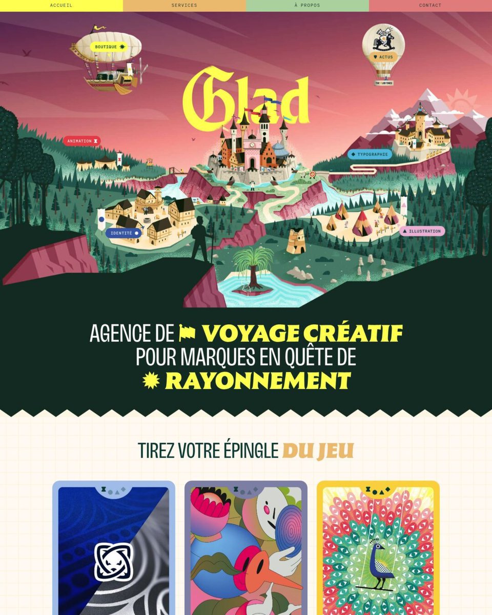
Glad Studio is a French creative agency for animation, branding, illustration, and type, and its site is built like a fantasy kingdom. A large illustrated map serves as the menu, and projects show up as colorful collectible cards.
https://t.co/ctAd9O8Yf0
Fledge @fledge14594770: Supporting today’s innovators to create tomorrow’s products, services and solutions by implementing tailor-made Talent Management solutions. #WordPress website made with @elemntor
https://t.co/IfP8cM0IEU