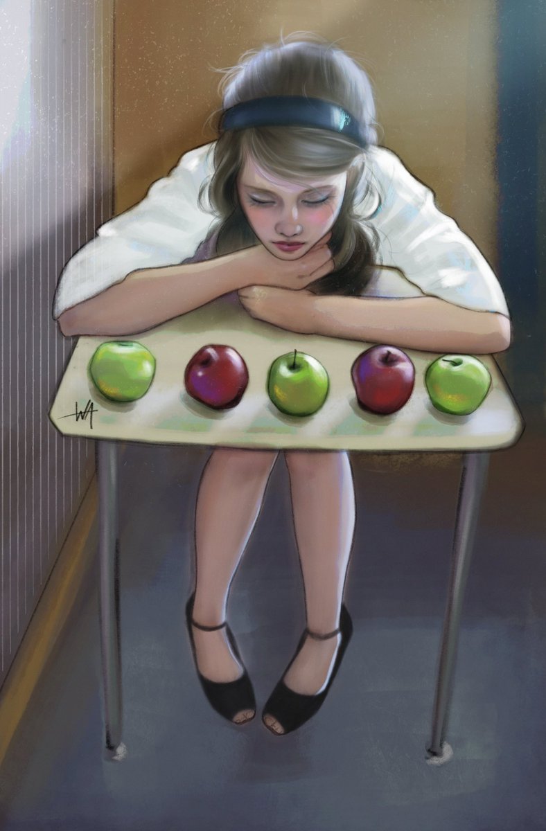
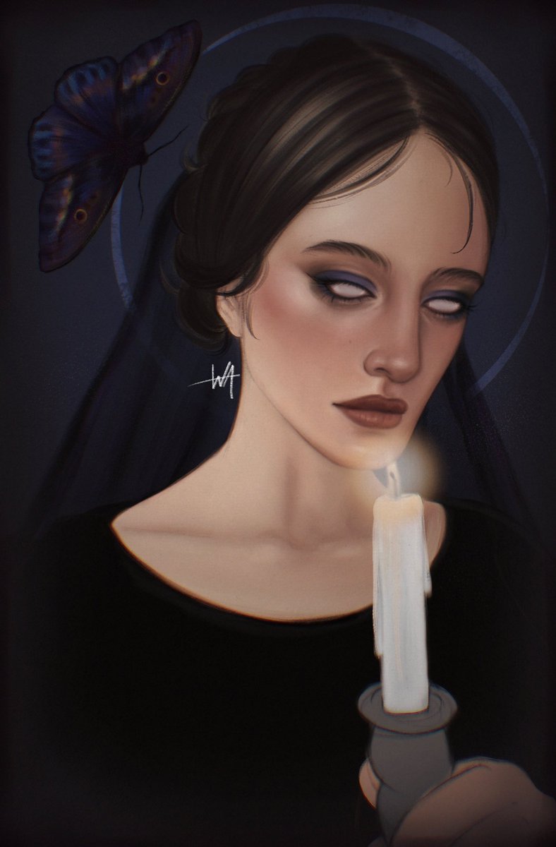
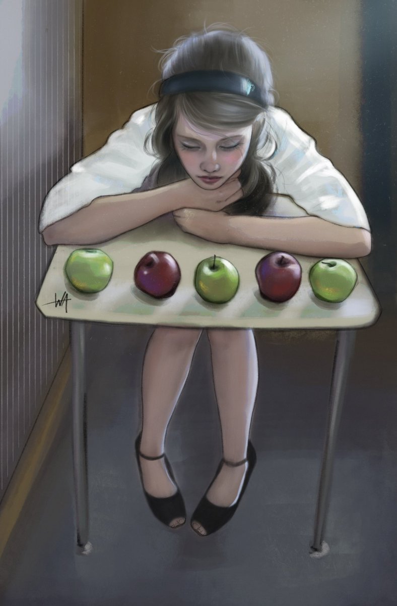
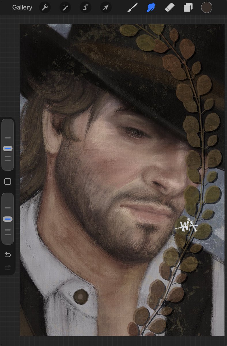
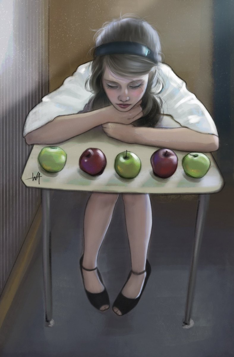
맑은 느낌의 파스텔톤 보정법!
묘사와 색을 많이 얹은 그림에 효과적이에요
주황 휘도를 하드 라이트로 얹으면 명도 대비가 완화되고 색이 투명해집니다
채도를 그대로 유지하기에 스포이드로 보면 채도 변화는 거의 없지만
시각적으로는 색이 밝고 생생해져 파스텔톤처럼 맑은 인상이 만들어집니다
Frieren! (This is a pixel art study I made to practice. It’s based on an artwork I found on Pinterest, but unfortunately I don’t know the original artist’s username to credit them.)
#PixelArt
@Procreate Hi, after updating to iOS 26 on my iPad mini 6, I noticed that the brush tool is overlapping the transform tool, making it hard to use. Could you please look into this issue?