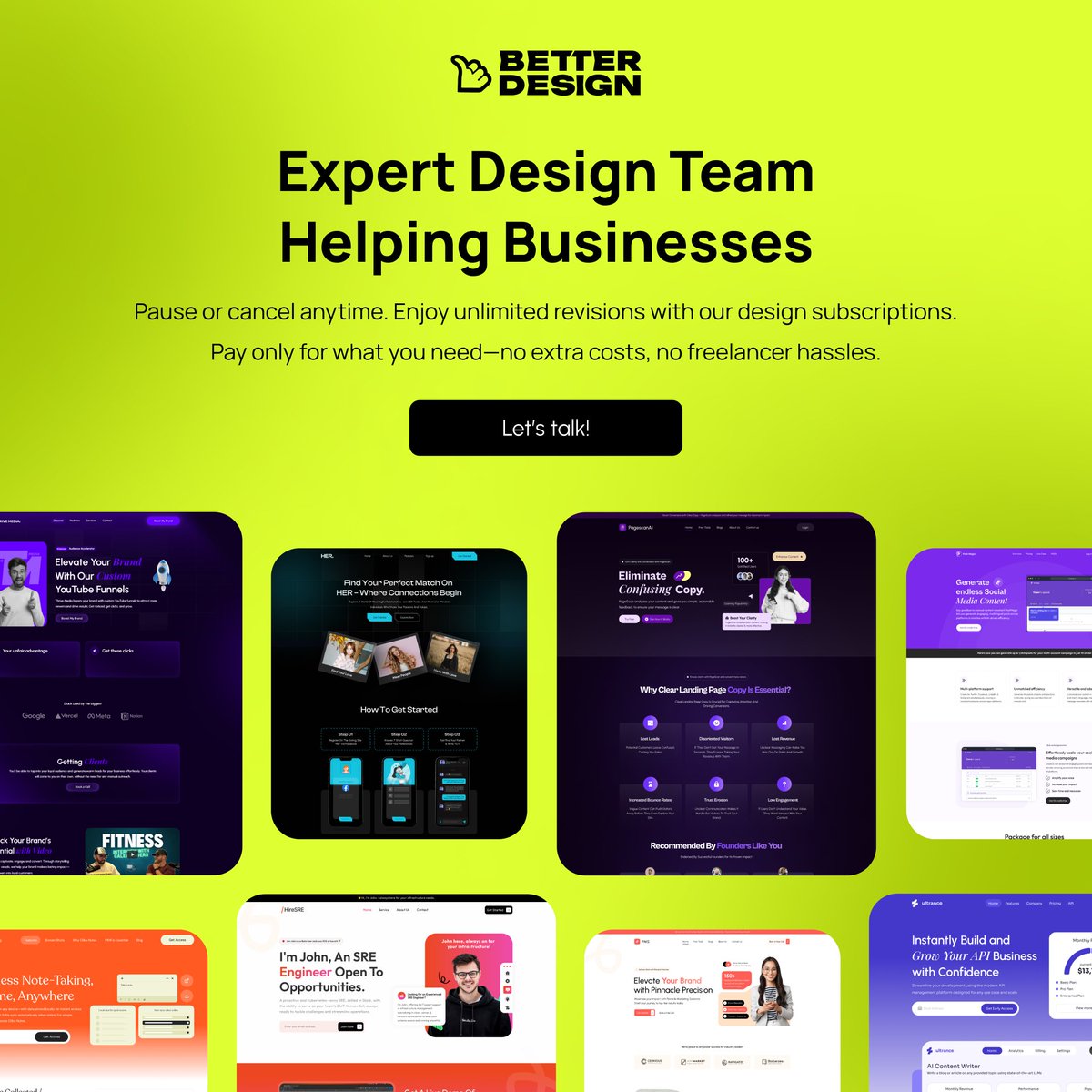
Specializing in website redesigns that drive results for startups & businesses | Don’t settle for less, let’s transform your site into a growth engine!
Imagine this: Your startup is launching a new product, and you need designs for everything, the app, promotional graphics, packaging... the works.
Instead of hiring a dozen freelancers, you subscribe to a service that handles it all.
Seamless, stress free, and so much cheaper than you'd expect.
Do you like the the sound of it?
#DesignSales #startups #BusinessGrowth
@ThePeterMick Hey founders!
Looking for a new landing page design, product design, or branding posts?
Try https://t.co/ZAOwuZQKf5 free for one week! Sign up, send unlimited requests, and transform your brand. No strings attached. Start today!
I've seen many startups skimp on design, focusing more on adding features than on strong branding or user friendly interfaces.
💡 Often, it's the steep costs that hold them back with web design starting at $1500 or $30-50/hr on platforms like Upwork.
That's why I started @WeBetterDesign, a subscription studio where $1980/month gets you unlimited design requests with 48-hour turnarounds.
Need a landing page, complete product design, or engaging branding?
We've got you covered. Just tell us what you need!
#startup #BusinessOwners #StartupSuccess #uiux #buildinpublic #indiehackers #founders
Excited to share this review from our recent landing page redesign!
Proud of the impact we're making.
Get your landing page revamped today!✨
#uiux#indiehackers#buildinpublic
Just wrapped up a UX audit and here are the key findings:
🟥 Before:
Missing brand logo — affects homepage identity.
Confusing CTA icons — don't provide new info.
Dropdowns need clearer symbols.
Side menu & results overlap — bad for filtering.
Inconsistent text styles for search results — hard to differentiate databases.
Background image was distracting and took away focus from important elements.
🟩 After (Resolved):
Brand logo placed consistently across the homepage.
Icons simplified for clearer user actions.
Dropdowns now use intuitive symbols.
Improved separation of side menu and results for better filtering.
Consistent text styles for easy database differentiation.
Background image removed for a cleaner and more focused interface.
#UXAudit #UXDesign #buildinpublic #indiehackers
Hey everyone! 👋
Exciting news! I've just launched my new design service, We Better Design!
We’re here to help with everything, from perfect ui designs for your products, engaging graphics for social media, or if you're looking to outsource your design needs.
Let's create something amazing together!
Explore our services and Stay updated with our latest projects: @webetterdesign
@chayan_ux Great work! cleaner layout, and easily guiding users through content and the colors create a calming effect. Perfect for a mental health focused platform