To wrap this up. @DataCamp has a couple of courses on Plotly and Bokeh. These are tools that you can use to create interactive data visualizations. I find Plotly easier but don't have enough experience to recommend one above the other. #Python#dataviz
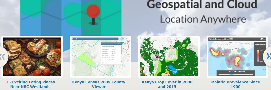
I've been learning #Python on @DataCamp for the last 4 years now. With a background in #geospatial I really enjoyed data visualization. In this thread, I will recommend some of the best courses.
This is the course that introduced me to geopandas and folium: https://t.co/iiXr0ESYZP Highly recommended if you work or would like to work with #geospatial data.
I've just completed 'Building Dashboards with Dash and Plotly' a new DataCamp course. This increases my dashboarding skills beyond Power BI and ArcGIS Dashboards.
https://t.co/FMP5t3me9B via @DataCamp
@AsigeAlex@kot_hacker@so_benn The few people living in remote areas have other priorities than browsing the Internet. Not quite sure how they planned to make money.
@AsigeAlex Open data and technology are key to innovation and efficiency (doing more with less) in Governance. That's hard to explain to the cabals in GoK, but I do empathize with the young brilliant minds that are left idle.
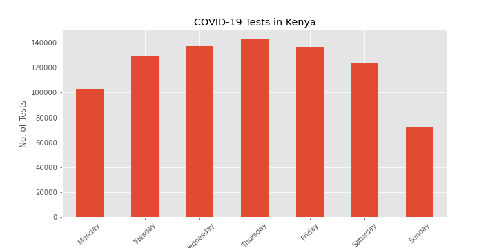
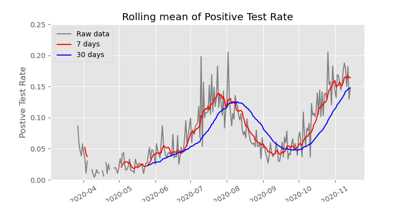
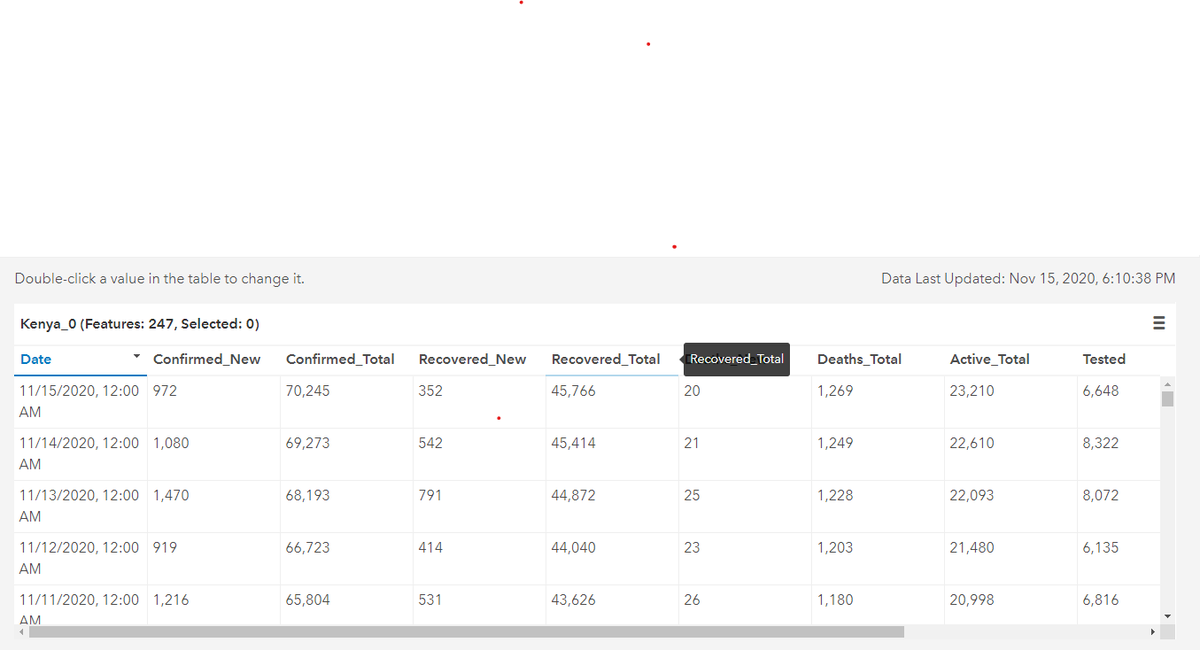
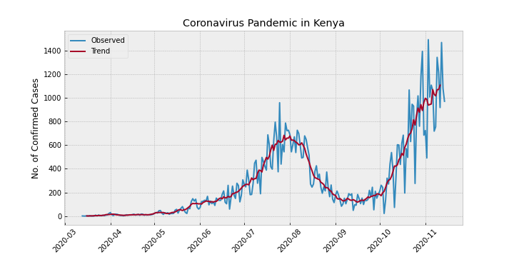
I am having close to 250 daily updates on COVID-19 in Kenya. From today I will start analyzing the data in Python. Follow the thread to follow me on the journey. #DataScience#COVID19#Kenya