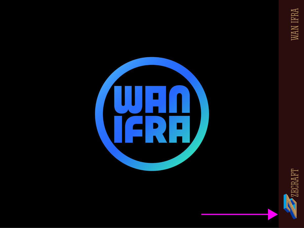
New project: The @NewspaperWorld visual identity we’ve designed strengthen the cohesion of myriad activities and communities, preserving the autonomy of the communities, highlighting what brings them together! https://t.co/lI6YQEX2on #thread
💥NEW💥
Deréon is a hybrid typeface, sober in the basic version, it unfolds its curves and volutes with its swash letters.
➽ https://t.co/ictRV0R6OD
In its prestigious earlier life, it was specially designed for the identity of House of Deréon launched by Beyoncé.
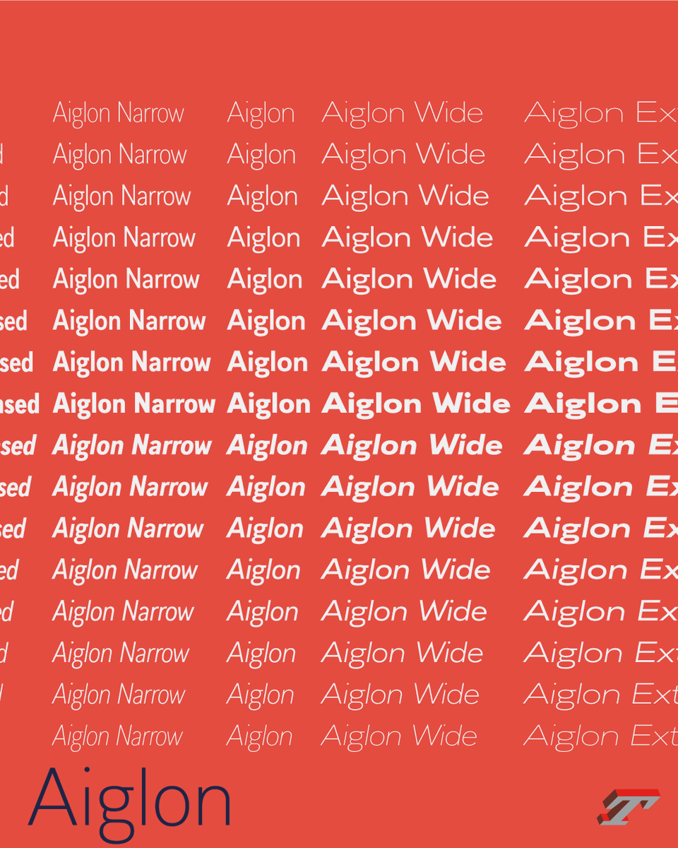
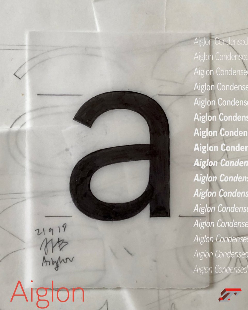
Aiglon won a Certificate of Excellence in Typography at @ISTDworldwide
➽ https://t.co/9C0N2vPNkN
Many thanks to the venerable International Society of Typographic Designers, to her President @AstridStavro as well jury members for ISTD Awards 2024.
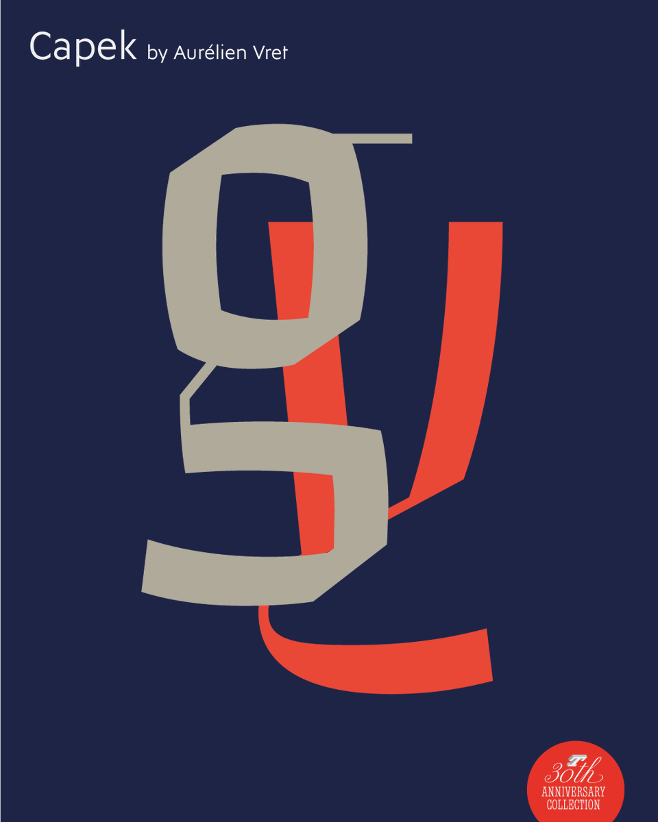
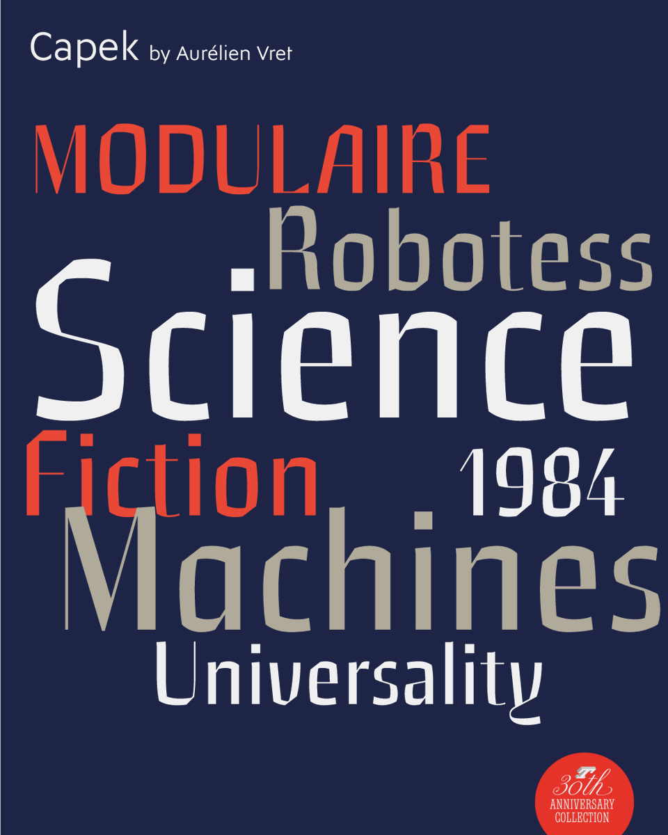
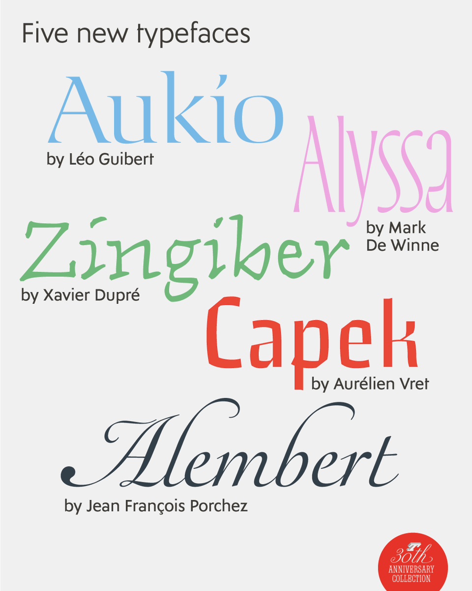
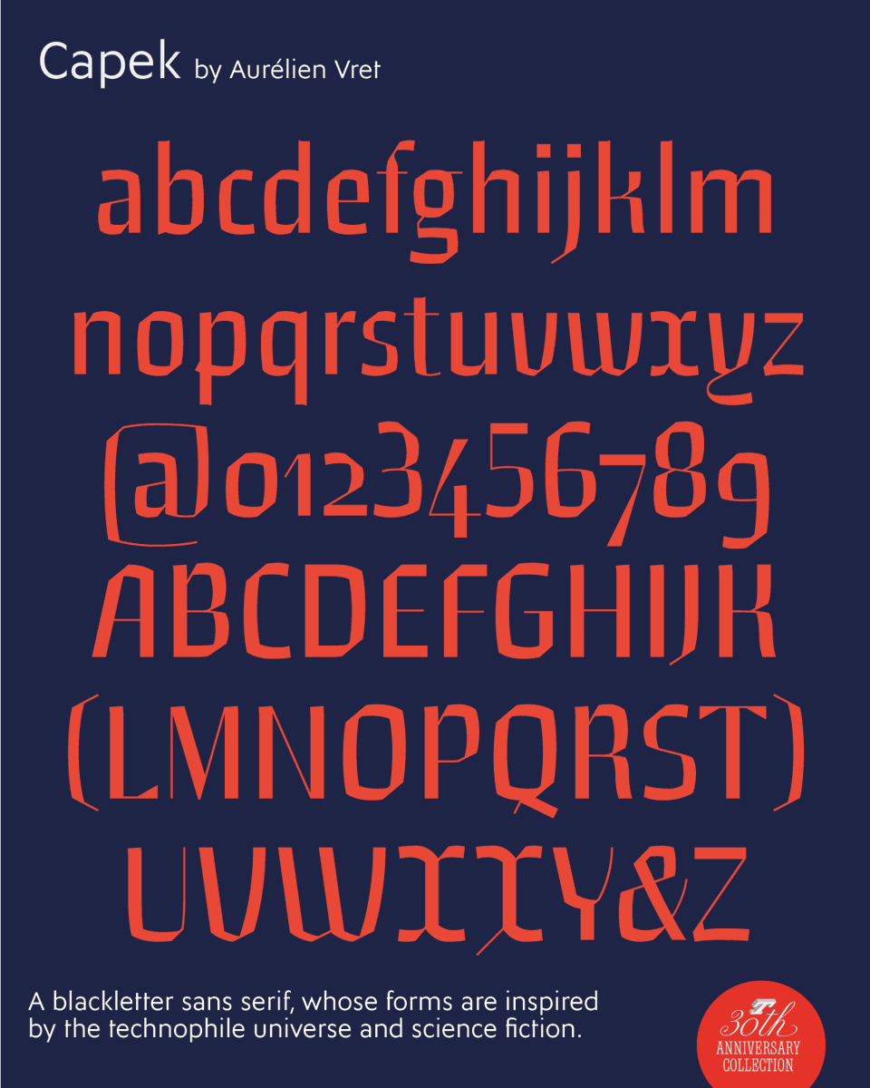
Capek – part of the five new typefaces designed for the Typofonderie 30th Anniversary – is a blackletter sans serif, whose forms are inspired by the technophile universe and science fiction.
➽ https://t.co/FM54KaCG1s
By @aurelien_vret
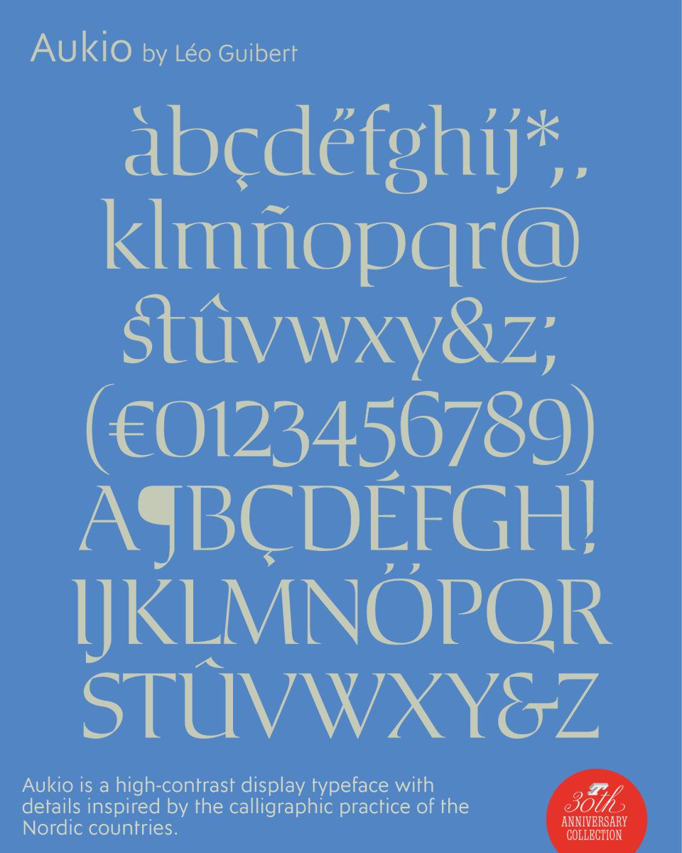
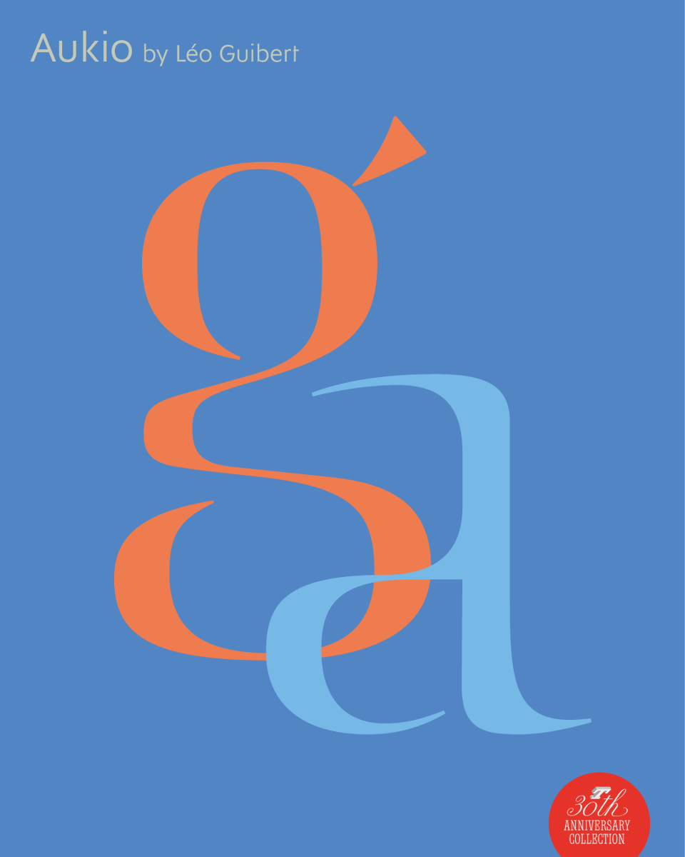
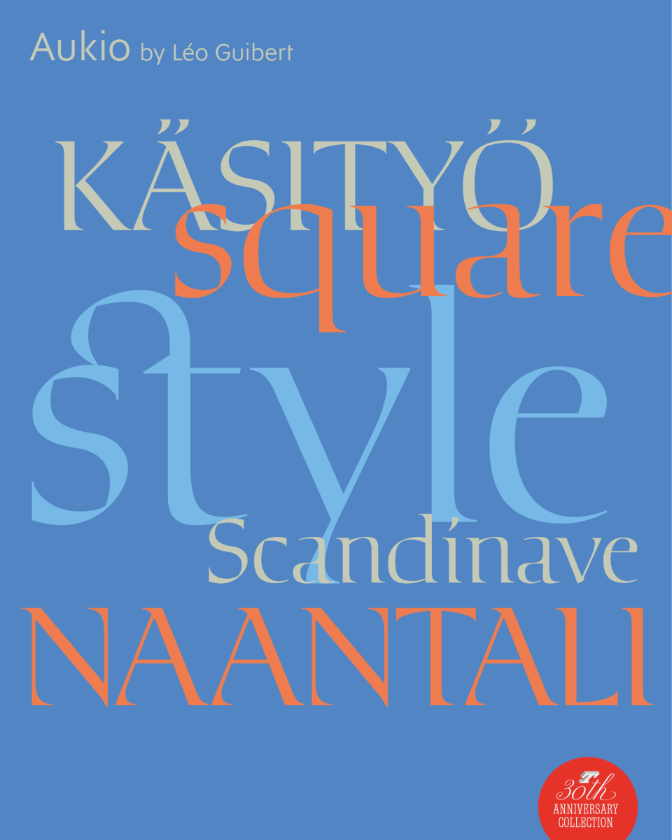
Aukio – part of the five new typefaces designed for the Typfonderie 30th Anniversary – is a high-contrast display typeface with details inspired by the calligraphic practice of the Nordic countries.
➽ https://t.co/kdjRRP4aMx
By @guibert_leo
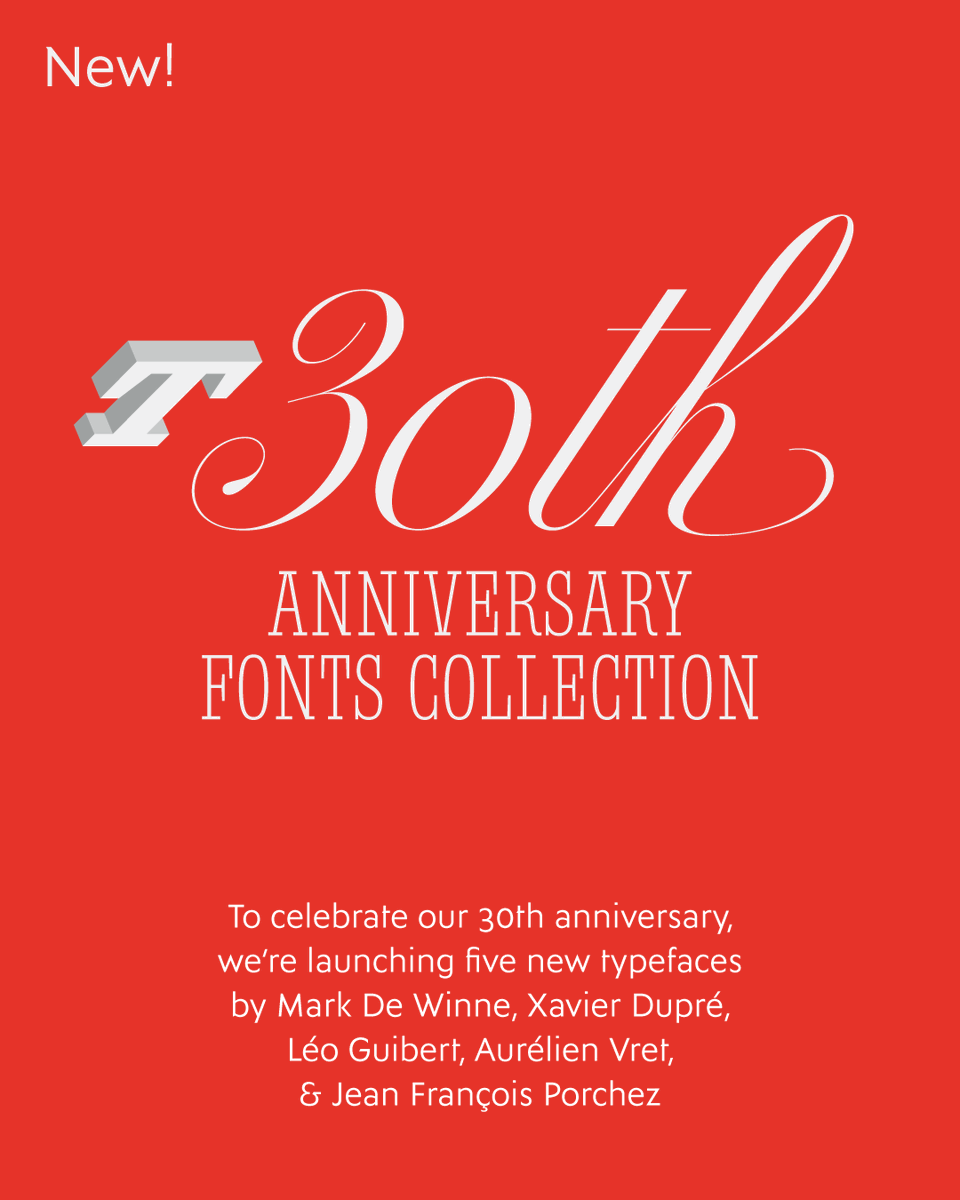
New!
Zingiber – part of the five new typefaces designed for the Typfonderie 30th Anniversary – is an elegant yet relaxed script typeface, showcases the skilled touch of a handcrafted design.
➽ https://t.co/bAbk8uaZsz
By Xavier Dupré
The Typofonderie adventure began in October 1994. To commemorate these 30 years, we are delighted to present you five new designs by Mark De Winne, Xavier Dupré, Léo Guibert, Aurélien Vret, and Jean François Porchez.
➽ https://t.co/eNmFfQO7rj
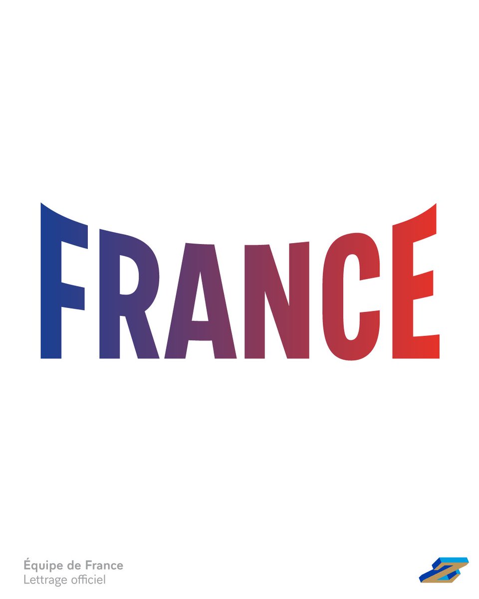
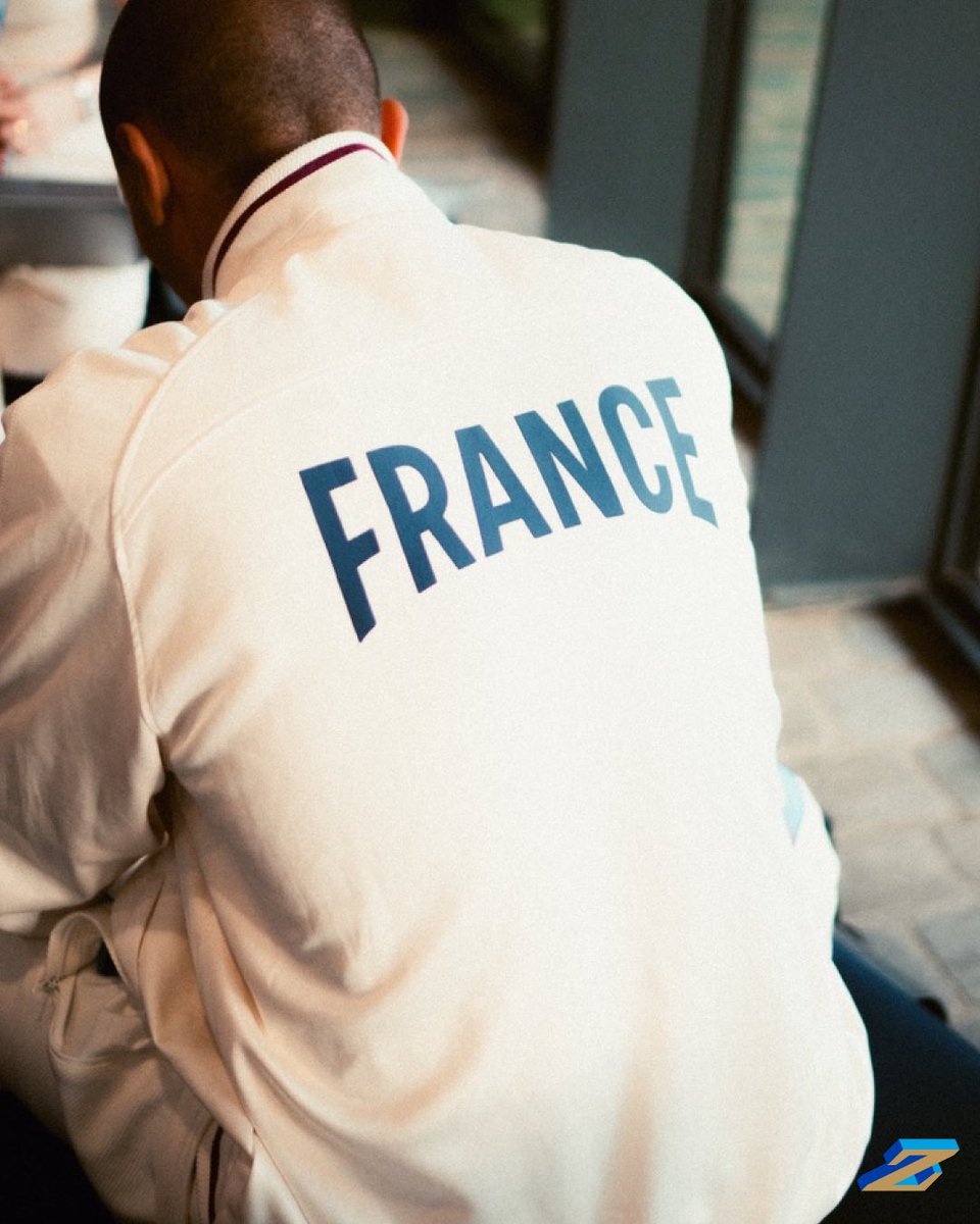
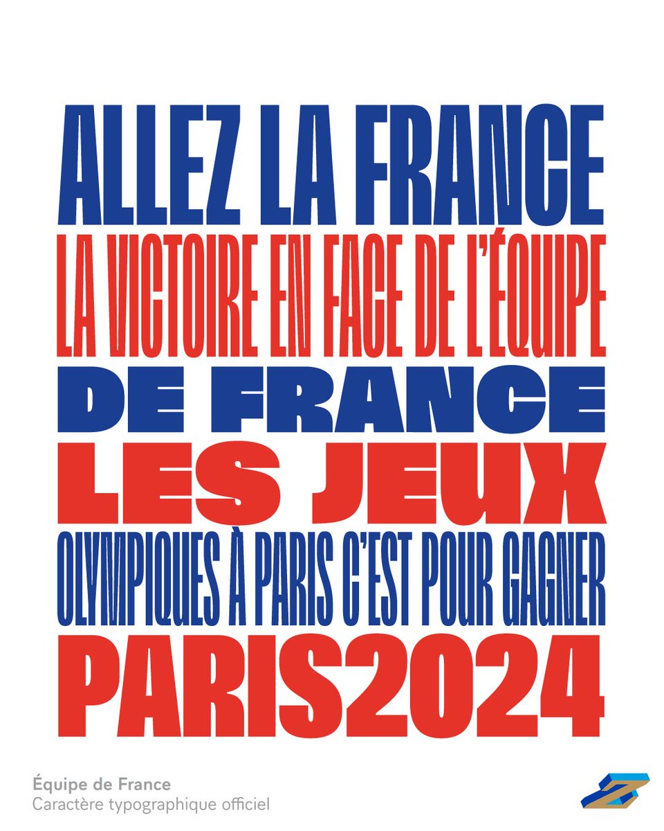
🇫🇷Soutenons l’@EquipeFRA pour les jeux Olympiques #paris2024! Let’s support the French team for Paris 2025 Olympic Games! Objective: victory.
➽ France, Official wordmark (in two versions) of the French Olympic team
https://t.co/OBcLpes5pH
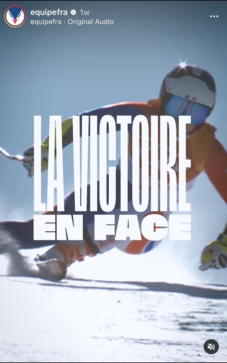
🇫🇷Soutenons l’@EquipeFRA pour les jeux Olympiques #paris2024! Let’s support the French team for Paris 2025 Olympic Games! Objective: victory.
➽ France 2024, Official typeface of the French Olympic team
https://t.co/7blWKR0tck
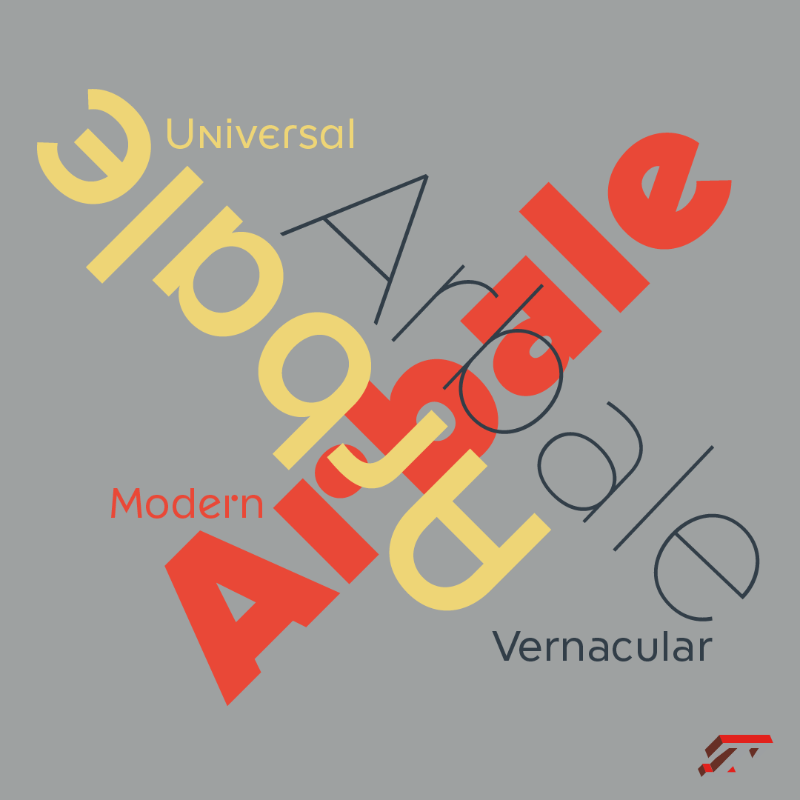
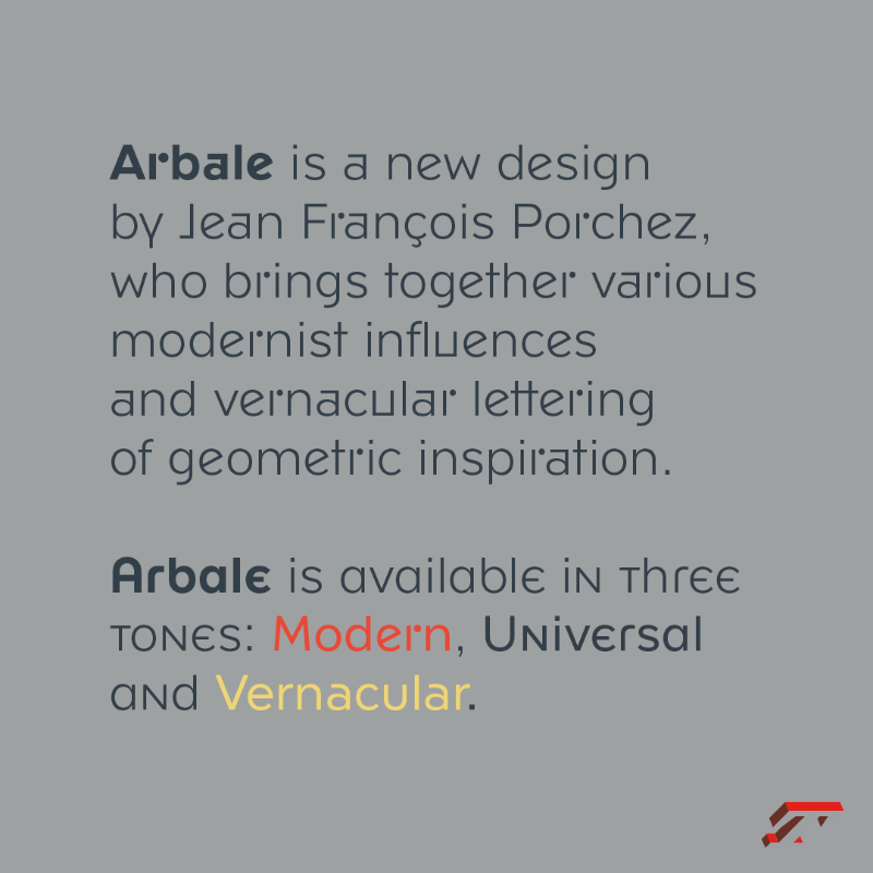
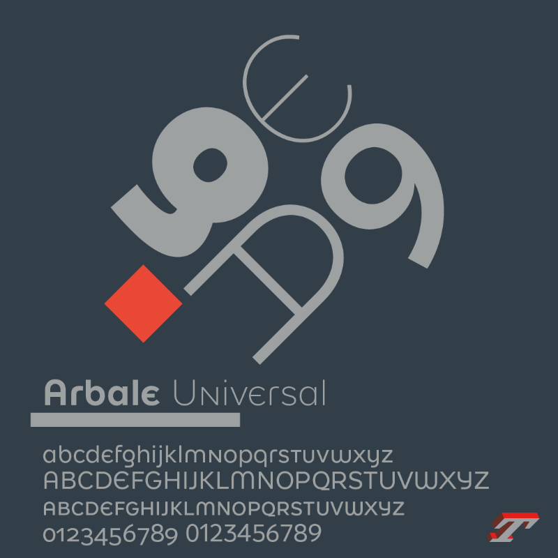
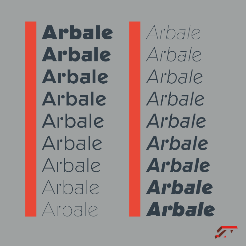
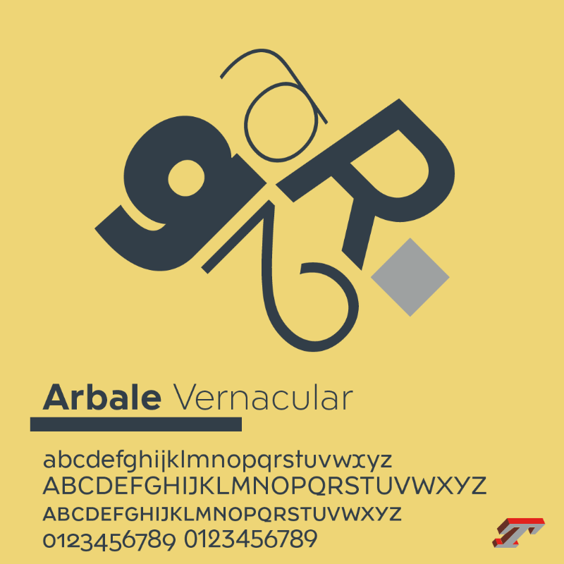
⏰ New! Arbale brings together various modernist influences and vernacular lettering of geometric inspiration from the 20th century. Designed by @jfporchez, Arbale is available in three tones: Modern, Universal and Vernacular⏰ New! Arbale brings together various modernist influences and vernacular lettering of geometric inspiration from the 20th century. Designed by @jfporchez, Arbale is available in three tones: Modern, Universal and Vernacular⏰ New! Arbale brings together various modernist influences and vernacular lettering of geometric inspiration from the 20th century. Designed by @jfporchez, Arbale is available in three tones: Modern, Universal and Vernacular⏰ New! Arbale brings together various modernist influences and vernacular lettering of geometric inspiration from the 20th century. Designed by @jfporchez, Arbale is available in three tones: Modern, Universal and Vernacular⏰ New! Arbale brings together various modernist influences and vernacular lettering of geometric inspiration from the 20th century. Designed by @jfporchez, Arbale is available in three tones: Modern, Universal and Vernacular⏰ New! Arbale brings together various modernist influences and vernacular lettering of geometric inspiration from the 20th century. Designed by @jfporchez, Arbale is available in three tones: Modern, Universal and Vernacular.
Some improvements on interpolations between masters of the 60s Sans. Almost invisible, but that's the life of type designers. Using the different fonts in the family to see if the range of widths and weights makes sense.
👋Comments welcome.
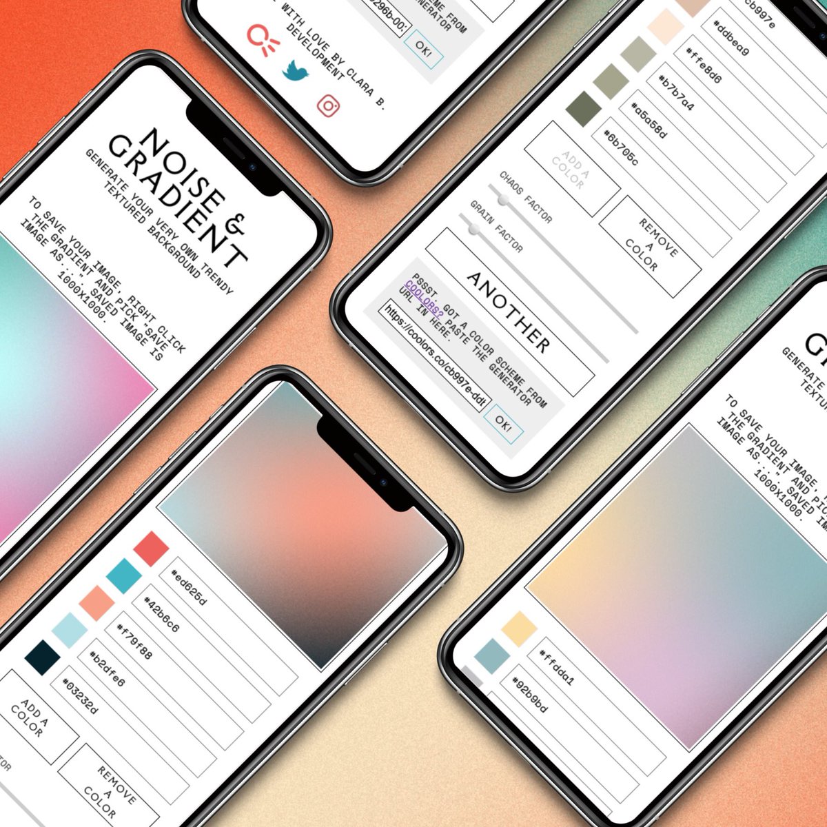
hey friends! especially designers or people who sometimes act like designers (which is, based on my understanding, everyone). I made you a tool for generating textured backgrounds with your own colors!
https://t.co/L5PfS1IAhg
"Comment les marques peuvent-elles éviter les pièges classiques des process de transformation?"
Un sujet passionnant et une tribune co-signée par @DenisGancel et @JohanneCasa dans @LADN_EU.
#contributing
https://t.co/hV1CfxsubX
It was a real pleasure to work with @NewspaperWorld + @vincentpeyregne team on the new #wanIfra identity launched today! Read about your concept "we are already in the future" ➡️https://t.co/B6nij6u6hy
“WAN-IFRA’s new brand identity will help bring coherence and showcase the breadth of our offerings consistently. It reaffirms our objective to be the preferred organisation for the global news media ecosystem,” said Fernando de Yarza, President of WAN-IFRA https://t.co/J0sW1HdL5F
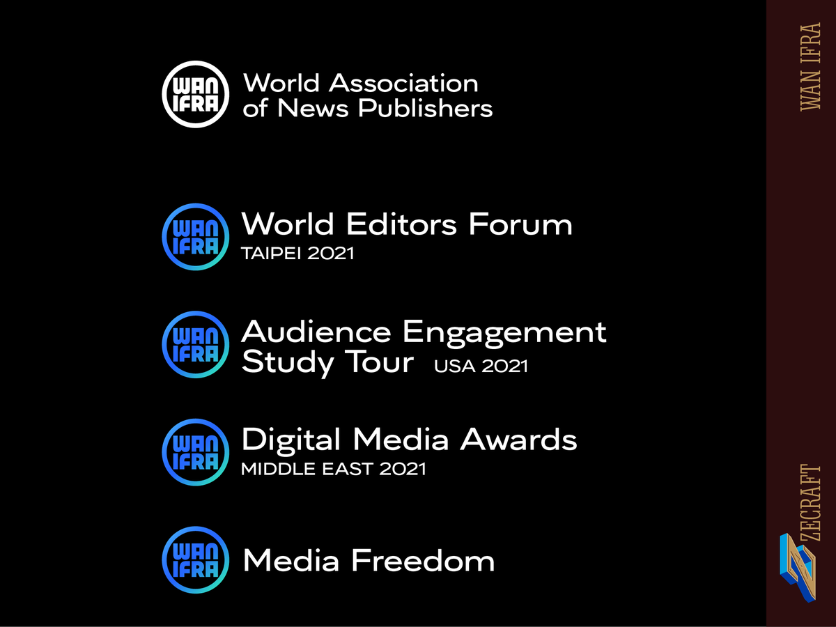
We reduced the Wan Ifra hierarchy, instead of three levels, we have now two levels, who highlight the communities and events. The blue-green gradient expresses multiplicity, hinting the various facets of @NewspaperWorld's activities. https://t.co/lI6YQEX2on
New project: The @NewspaperWorld visual identity we’ve designed strengthen the cohesion of myriad activities and communities, preserving the autonomy of the communities, highlighting what brings them together! https://t.co/lI6YQEX2on #thread
We simplified the original @NewspaperWorld brand, now more abstract, the symbol reduced to the core expression of a planet: a simple circle. The wordmark is moved inside the planet (the circle) to create a monogram-label. Step by step evolution: https://t.co/lI6YQEX2on