@ZachCohenFB@movieswithmex The last idea I experimented with used a lighter gold just like this but with a more retro inspired helmet logo on a silver lid. I’ll get it out soon!
@ZachCohenFB I think that version of the outlines looks the cleanest, if this does wind up being the new logo. Imo I hope they don’t keep navy. Moving to the oilers color scheme is perfect. I messed with other versions too and liked this one best for sure. (6 strings/stripes on the lid 👀🎸)
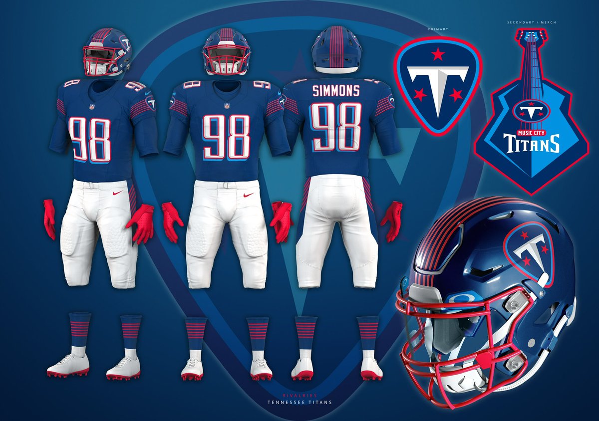
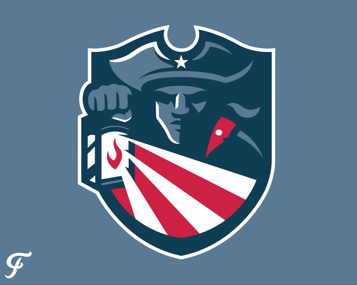
Rivalries - AFC South (3/4)
Titans music city rivalry concept. Lighter navy than the usual, leaning into red accents, 6-string stripes and guitar pick logo. I always really liked their old uniform # font, so I kept that with a Titan blue drop shadow. #TitanUp
@ZachCohenFB I think that version of the outlines looks the cleanest, if this does wind up being the new logo. Imo I hope they don’t keep navy. Moving to the oilers color scheme is perfect. I messed with other versions too and liked this one best for sure. (6 strings/stripes on the lid 👀🎸)
Rivalries - AFC South (3/4)
Titans music city rivalry concept. Lighter navy than the usual, leaning into red accents, 6-string stripes and guitar pick logo. I always really liked their old uniform # font, so I kept that with a Titan blue drop shadow. #TitanUp
@TitanUppppppp @BroganHigh @maristfroze@Romellz_ Totally get if you don’t like it! But this is a concept for the rivalries uniform lol not the main/primaries.