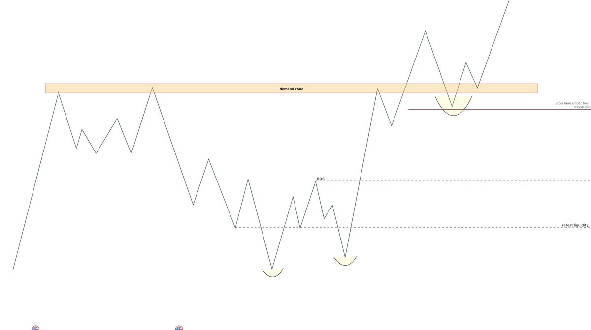
Support and resistance levels are among the simplest yet most misunderstood concepts in technical analysis. The longer a price zone holds over time, the greater its practical significance tends to be. The difference between an inexperienced trader and an experienced one lies in their approach: the former seeks the perfect level, whilst the latter observes how the market reacts within a zone of interest.
Liquidity sweeps, deviations, reclaims and structural confirmations are often the elements that allow us to distinguish a simple reaction from a high-probability opportunity.
Ultimately, support and resistance levels are not used to predict the future, but to identify areas where it is worth paying closer attention and waiting for the market to reveal its intentions.
Study these slides and they will be useful to you
A retweet would be helpful
@eliz883 Hey Eliz can you explain what defines the upside from the red box. The bottom is ez cause of the Fib Level but i dont understand why u chose there the upside. Love ur work. Keep going🩵
$BTC $ETH
As I often say, a bottom does not form in the same way as a top: they are two completely opposite processes in terms of price behaviour and, above all, volume interpretation.
A top occurs when there is still apparent strength, breakouts, enthusiasm and incoming liquidity, allowing the biggest players to distribute 'at the top'. In these phases, the OBV often remains positive or stable, precisely because distribution occurs while the public is buying strongly.
A bottom, on the other hand, is the opposite: it is not a sudden explosion, but a slow process of absorption, consolidation and progressive loss of selling pressure. This is why OBV is fundamental: it shows you whether sales are still draining liquidity or whether, on the contrary, the flow is beginning to reverse silently.
To date, OBV continues to show outgoing pressure, with no signs of reversal. This is why I continue to say that we do not yet have real confirmation of a bottom, even though we are in an interesting technical area.
Three key levels are clearly visible on the chart:
The upper red zone: a recovery in this area would restore structural strength and pave the way for new highs, but at the moment it is distant and not supported by volume.
The current area (limbo zone): here the price is seeking stability, but without a reversal in volume it remains only a technical rebound.
The lower support: the level where it would make most sense to build a real base, especially if accompanied by progressive accumulation on the OBV.
In summary, as long as the OBV does not stop discharging and does not build an accumulation structure, we are talking about a simple pullback, not a bottom.
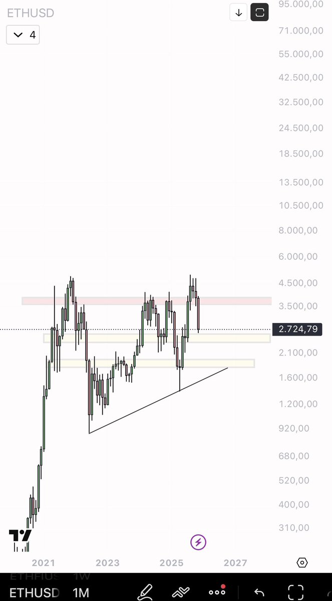
And I would like to add something that I have been repeating for days: in dump phases, I find it more sensible to accumulate ETH than BTC. The structural context, especially on pairs, leaves much more relative room for ETH than for BTC, which is still trapped in a zone of macro indecision.
For macro chart ETH usdt similar to BTC
A top and a bottom do not arise in the same way because they arrive in two opposite emotional and technical worlds.
A top is formed when everything still seems strong: people are euphoric, buying high, wanting to participate in the last part of the trend. The price often accelerates, breaking out above the highs, everyone projects new targets and almost no one thinks about protecting themselves. Behind the scenes, however, those who have been in for months are starting to sell off, taking advantage of the enthusiasm of those who are late to the party. From the outside, it still looks like a bull market, but inside there is distribution. The final movement can be rapid, almost theatrical: final surge → sharp reversal.
A bottom, on the other hand, occurs when no one believes in it anymore. There is no enthusiasm, no FOMO, only fatigue, resignation and mistrust. People sell because they are forced to, not because they want to: stop, margin call, burnt narrative. Capitulation can be violent, but the real bottom is not that candle: it is what comes after. It is usually a flat, slow, unsexy area where volatility is crushed, volumes change quality and those who accumulate silently begin to emerge while the public no longer looks at the charts.
A top is noisy.
A bottom is silent.
The top arises from the desire not to miss the opportunity;
the bottom arises from surrender, from the fact that the masses have stopped to try.
That's why a top can be quick and euphoric , while a bottom requires time, consolidation and patience. It's a foundation that is built when everyone is mentally absent, not a perfect point that appears out of nowhere.
$BTC did exactly what I had planned, even though everyone else seemed to be expecting the opposite.
When you follow the chart and not opinions, this is what happens: less noise, more results.
Now I'm just waiting for the Monday Range to close.
For me, this is one of the most important moments of the week, because the first price range that is created between Monday's opening and the first hours of movement already gives us the direction: if the price plays around, creates false breaks and then returns, I know it is building liquidity. If, on the other hand, it breaks that zone and stays above it, it means that the push is real and worth following.
It's a bit like watching the market breathe before deciding which direction to run in.
The red area at the top remains the main wall: every time BTC gets there, the market stops and makes a decision. It is an important resistance on the high timeframes, and until it is convincingly overcome, I prefer to remain clear-headed and not get carried away by enthusiasm.
For now, I'll just watch.
The chart has already proven that the plan was correct.
Now it's up to it to speak, not me.
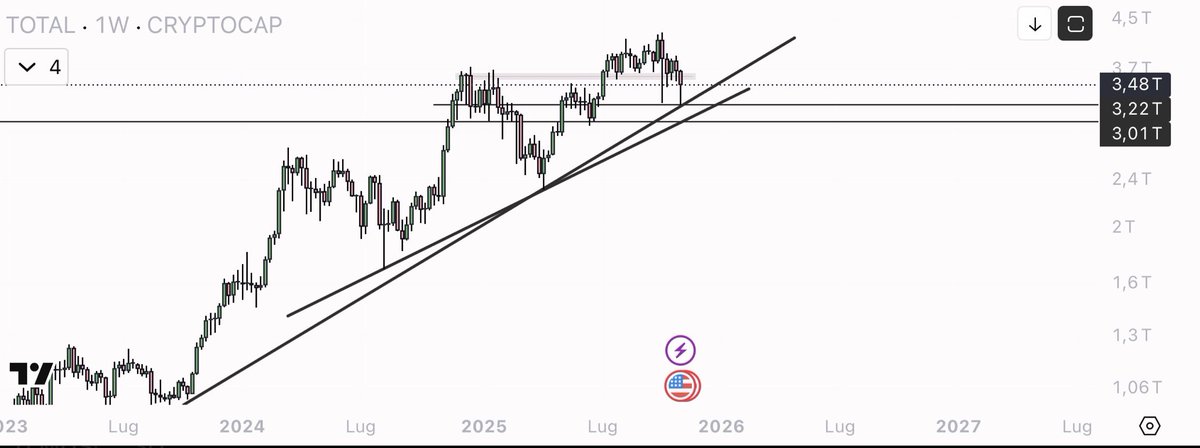
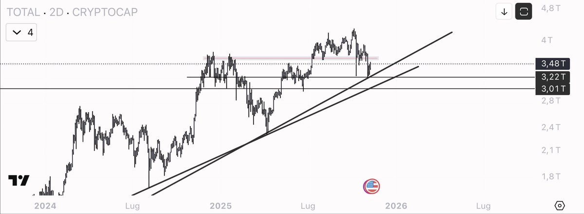
I wanted to give you a general idea of the market. $TOTAL
The red box up there is the barrier holding back the market: it is not just a line, it is an area where supply has repeatedly prevailed. As long as we remain below it, the rises may be violent but they tend to fizzle out: we need acceptance and clean closes above that area to talk about a real continuation of the cycle, not just simple rebounds.
Below, the confluence of the two trend lines is the point that really matters. It is a 'structural' support: that is where the memory of the trend lies and where the market has defended its directionality several times. As long as it holds, the narrative remains constructive👉🏻perhaps messy, perhaps slow, but with a still positive bias. If we lose it, however, we can expect those unpleasant phases: compressed volatility, messy candles, red days alternating with rebounds without follow-through. In a word: choppy.
Operationally, it's simple for me: above the red box with volume and higher-timeframe closes, it makes sense to look for 'tomo'. At the confluence of the trendlines, on the other hand, I look for signs of absorption and reclaim to work rebounds with defined risk. If the level jumps, no ego: I wait for the market to rebuild a base lower down.
is better to be guided by the chart than by expectations.
You shouldn't care where $TAO goes in the immediate term.
This market is a game of patience: narratives don't explode when you look at them, they explode when everyone ignores them. And as far as I'm concerned, TAO is one of the most underrated narratives on the market.
The point is not to chase every price movement, but to understand where the flow is going in the coming months. I prefer to position myself before the crowd, not after. I may be wrong, of course. That's part of the game.
But this is my view: I prefer to expose myself to a narrative I believe in, knowing that at worst, my investment in this coin could go to zero.
The difference lies in risk management: it is obsessive, rigorous, calculated.
I never go all-in on an idea. I position myself, monitor, and if the market proves me wrong, I close and move on to the next opportunity.
In trading, you don't have to be right, you have to know how to manage risk.
$BTC I didn't trade it because I preferred to focus my capital and attention on altcoins. It was a deliberate choice: the setup was valid, but the rotation and momentum I was following on some mid-caps offered a more attractive risk/return profile for me. The key point is that the plan followed the initial idea exactly: levels worked, structure respected, no FOMO. I executed where I had the greatest edge and let it go where the probability was not in my favour.
Now I am waiting for Monday to set up the new plan. The procedure is simple: I define the Monday Range, observe how the price behaves at the highs/lows of the first part of the day and assess whether there are sweeps with reabsorption or a real acceptance outside the range. If I see a clean retake after a false break, I consider entries with defined risk; if, on the other hand, there is expansion with continuation, I look for entry on pullback towards the key zone. In both cases, clear invalidation and active management: no downward averages, no ego, just process.
Yesterday's analysis was spot on: the price reached exactly the area we had identified as the critical point.
Now the important thing is not the upward spike, but what the price will do in the green box.
That area is a balance zone: here, the market needs to breathe, consolidate and demonstrate that the movement was not just an impulsive surge. If the price manages to stay above this area, turning it into stable support, then we will have a solid structure from which to restart the trend.
$ICP