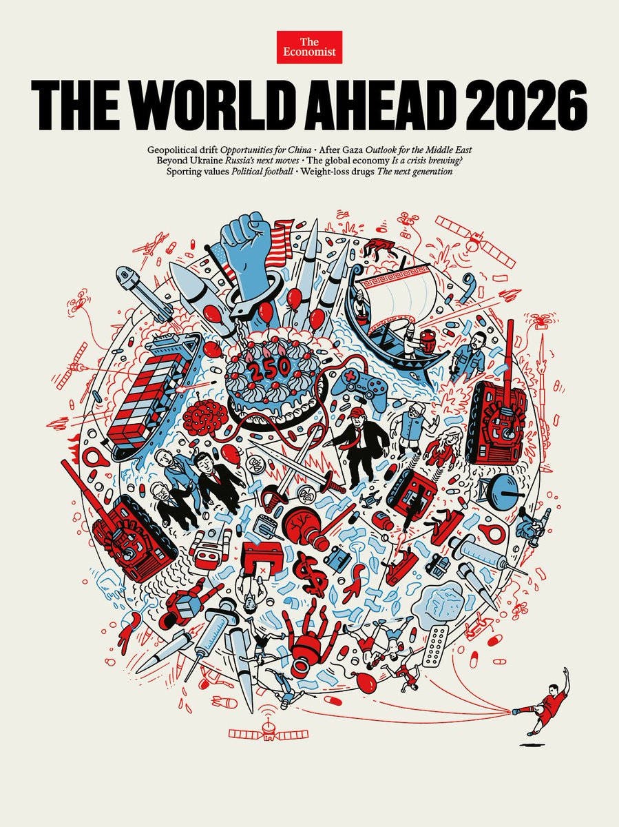
👁️ The World Ahead 2026 👁️
I want to offer you my personal intepretation of the last cover of "The Economist" which has raised a lot of questions, so I will try to do my best in order to decipher it with an eye on financial markets. (long post but well worth it in my opinion)
- Main thesis -
The central thesis of my interpretation is that the cover of The World Ahead 2026 depicts a world being structured to function under permanent instability.
War, economic stress, technological disruption, health intervention, cultural conflict..everything is part of an interdependent mechanism of a single system where instability is the operating condition through which power is exercised and maintained.
This is why the illustration is so crowded.
If you think about, nothing exists on isolation, right?
♻️Military conflict bleeds into economics, economics into health, health into technology, technology into culture, and culture back into politics.
The absence of clear boundaries is not a "mistake of the author" but its a message: separation itself has ended.
The thesis, therefore, is not that chaos is imminent, but that chaos has been domesticated making it more predictable, governable, and in some cases (most of them) economically productive.
Just look around you..the system adapts populations to volatility through continuous intervention: policy, media, medicine, and technology.
"What?"
Well:
- Conflicts are contained rather than concluded
- Economic stress is offset rather than eliminated
- Social tension is redirected rather than reconciled
What we can extract, therefore?
That seen through this lens, the cover functions as a declaration of a "new normal", communicating to its intended audience that the future will not be defined by grand solutions but by adjustments and control within limits.
The task of power in 2026 is not to restore order, but to operate effectively inside disorder so everything that appears on the cover, from missiles to medicines, from financial symbols to cultural icons serves this single idea, in my opinion.
- Element by element -
1. Globe as a soccer ball ⚽️
As we can see the world is drawn like a soccer ball and this is a clear metaphor tied to the 2026 FIFA World Cup that will be co‑hosted by the U.S., Canada, and Mexico making sport a global stage for "soft power" and identity.
Now what I'm thinking is that the iconic figure of Ronaldo kicking the ball may be interpreted less as an athlete and more as an emblem of institutional power, demonstrating how deliberate interventions can set a globally interconnected system in motion, exactly as he does with the ball, bringing volatility on the table.
Start date: 11th June 2026
End date: 19th July 2026
I would keep an eye on the start.
2. U.S. flag behind a large birthday cake 🇺🇸
This is a clean reference to the U.S. 250th anniversary in 2026 that should put America at the heart of global history.
However in here we have an important factor to pay attention at, which is the juxtaposition of celebration and crisis as the cake is surrounded by "doom" elements like missiles, war ships etc meaning, in my humble opinion, that the country may not be immune to global shocks.
3. Raised fist + broken gavel ✊
With the U.S. flag slightly behind, this likely means societal tension, possibly unrest and friction between authority and civil populations (BLV docet) where the cracked gavel denotes weakened institutions.
As an implication, political legitimacy and justice systems will be under strain with implications for policy consistency and economic confidence.
4. Missiles across the sky + tanks on globe 🪖
These are straightforward references to military conflict and armament escalation both ongoing and potentially emerging.
Tanks and missiles together imply multi‑domain warfare (land and strategic weapons) showing conflict as a pervasive backdrop of world affairs, not isolated crises. (remember what we were saying in the beginning?)
Conflict becomes background noise rather than a singular shock.
From an investment standpoint, this favors sectors tied to defense, energy security, logistics, and commodities.
5. Red/blue code 🔴📘
Something that people may not notice is the intended colors to represent the drawing.
Red is a color used to express danger and tension and in this context could be interpreted as a conflicts between countries and therefore, strong volatility.
Blue instead, flags authority or governance and based on my belief, it can signal the forced introduction of a new technology to gain control. (CBCDs?)
Essentially, competing forces, so think of it like a chessboard where red pieces create pressure or threats, and blue pieces try to contain or manage that pressure.
6. Syringes/pills 💉💊
In here we have oversyzed syringes and scattered pills dispersed around so this should represent:
- The rise of biotech, drugs, defensive stocks
- Potential pandemics/flu
- Potential vaccination campaigns, innovations etc
Medicine/healthcare should be a primary narrative.
7. Brain plugged into a gaming controller 🧠🎮
To me this is a clear reference to AI (human integration) and possible digital control.
It shows that attention, perception, and decision-making are increasingly engineered within interconnected systems so control over information and behavior becomes a core domain of power, with, as you can imagine, direct implications for economics, governance, and social stability.
Deep fakes? Algos driving your interest?
It may be just the beginning.
It may be not stupid to consider as investment chips, cloud, cybersecurity, and platform providers..
8. Ancient style boat⛵️
A boat is by de-facto a symbol of movement, transition and exploration of the uncertainty.
Because the boat is anachronistic compared with the other elements, it likely isn’t meant to point to a specific 2026 event, but rather to hint that long‑standing historical currents, traditions, or ideas continue to influence modern dynamics.
If we assume that 2026 will be a year of changes and especially in a context of technological disruption, geopolitical tension, and volatility well..we have a +1.
9. Melting ice cubes 🧊
On the external part of the globe we can find melting ice cubes which are an ideological representation of climate change and overall enviornmental instability.
Alone is a reason to pay attention because climate change is widely recognized as a systemic risk to financial markets (supply chain, harvests, production costs) that may affect asset values across specific sectors.
It may also signal another reason to pay attention to "new solutions" in the agricultural landscape.
If this is the case, I would look into alternative agriculture, water, energy infrastructure, and climate adaptation..
10. Geopolitical tensions & financial markets ⚔️
The thing that jumps out immediately below the cake is a chart with swords crossing each others, likely mirroring the trade war between China and U.S.
The chart clearly appears chaotic, with peaks and troughs emphasized, creating a sense of volatility and tension..but the predominant color is red, and this alone is a powerful sign.
Red implies risk, pressure, or threat and it can be associated with loss, drawdowns and negative sentiment, aka economic impact.
11. 3 extras I noticed 🛰️ 💸🤖
- Satellites likely meaning global observation, surveillance, connectivity and space-defense
- Money printing that can flash bank interventions and stimulus as the dollar is "cracked"/broken currency indicating structural fragility in global currencies and overall economy
- Robots/dogs/drones that may be interpreted as automation and replacement of humans in the production chain/companies + further adoption of robots in our daily lives
--------------------------------------------------------
👁️Bottom line and considerations:
In reality, the cover of "The Economist" isn't an overall mistery to me and this simply because I had the perception of a potential very turbulent year explained here https://t.co/Och3W6SScg so it goes hand in hand with the thesis.
However, despite my expectations for an overall complicated year, I believe that at least the Q1 will be positive and this is not based on some details in the cover but is explained in my charts https://t.co/30DQbmSsxa and their liquidity dynamics, so before a potential collapse I see us performing well.
"Any other indication?"
Something that may be added is BTC seasonality/cycle.
If we consider:
- Top2top -> 1490 days (first cycle)
- Bottom2bottom -> 1430 days (first cycle)
- Top2top -> 1431 days (second cycle)
- Bottom2bottom -> 1431 days (second cycle)
Then, if this is the top (we may even get a new high but this doesn't change the overall idea) then our bottom should be in late 2026 and considering everything we stated above, well..we have a good recipe.
This post will updated step by step as we transition into the next year looking quarter by quarter to see what we have and how things are evolving.
If you like this post and find value in it, the like and repost buttons are just a few centimeters below.
That $BTC.D needs to go to ….is just herd consensus.
It won’t.
The tides will turn before that.
Not everyone’s gonna print this run especially not the ones who’ve been here for a few cycles thinking it’ll play out just like before.
The market makers are watching.
And they want a piece too.
That’s all I’m gonna say.
Ciao.
If you’re standing on a table and someone else is on the ground,
it’s always easier for them to pull you down
than for you to pull them up.
It’s the same in life:
I might try once or twice to pull someone up.
But if I see it’s not working,
I’m out – before they drag me off the table.