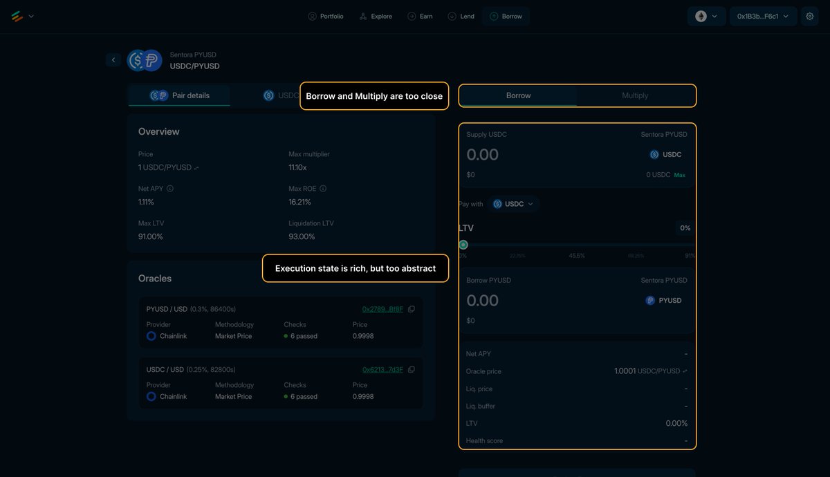
Borrow and Multiply are too close in this flow.
Two high-impact actions sit side by side, but the execution state below is too abstract to help users understand what changes between them.
That weakens decision confidence before input even starts.
Fix: separate the modes more clearly and make the active path explain its payoff, risk, and mechanics in plain language.
@eulerfinance
If your DeFi app has more than 20 assets or pools and no search, you've decided that finding things is the user's problem.
Every user who can't locate what they need in 10 seconds is a user reconsidering the entire session.
Good product flows keep the current job clean.
This one does the opposite: withdraw scheduling muddies the deposit flow by surfacing exit logistics inside the entry path.
Fix: separate deposit intent from withdraw timing, and only surface scheduling where it helps the current action.
@ipor_io
Every flow needs an obvious exit.
Not a back button buried in the corner.
A clear, prominent way to stop without consequences.
Most DeFi apps hide this because they fear abandonment.
The irony is that hidden exits cause more abandonment, not less.
Why does this screen show an active withdraw flow when withdrawal is not available?
The input looks ready to use, while the actual blocker is reduced to lightweight warning copy underneath.
Fix: disable the withdraw surface structurally and replace it with a dominant "withdraw opens later" state.
@D2_Finance
Why does this blocked borrow flow say only "There was an issue with your account"?
That is not a usable diagnosis. Users do not know whether the problem is collateral, wallet state, permissions, network, or backend failure.
Fix: make the error actionable.
Show the exact blocker and the next step instead of a generic refresh message.
@project0
Visual inconsistency in a DeFi protocol is a subconscious red flag.
If the team can't keep button styles consistent, are they keeping their security practices consistent?
Users make that leap without knowing they're making it.
If you go to a proper shop and ask for something they don't have, a competent sale assistant would propose you a suitable alternative ("you can order and have it tomorrow" / "we don't have it in blue, but green looks nice on you")
When a search or filter returns no results, offer a reason and a next step.
"No pools found" is a dead end.
"No pools matching this pair on Ethereum, try switching to Arbitrum" is a bridge.
Dead ends don't convert.
Why can users spend time configuring a borrow that the product already knows is impossible?
This modal mixes setup, educational detail, and blocking-state recovery in one surface, then reveals the real constraint at the bottom.
Fix: establish borrow eligibility first, and move secondary loan details behind a valid state.
@ExactlyProtocol
The confirmation screen after a successful transaction is the highest-trust moment in your product.
Most teams waste it with a transaction hash.
Use it: what they did, what they received, what happens next.
This is where trust compounds, or doesn't.
And btw, keep it simple.
Good product flows separate browsing from committing.
This page does the opposite: exploration and execution are merged into one surface.
The result is a clean interface with weak mode clarity.
Fix: make the market table the comparison layer, and reveal the execution panel only after users have clearly selected a market.
@Curvance
Price impact is the most commonly misrepresented number in DeFi UX.
Showing "0.12%" without context is meaningless.
Showing "0.12% (normal range for this pool size)" is information.
The difference is whether your team understands what users are actually trying to evaluate.
Why does a staking page tell users to buy instead?
That collapses two different mental models into one form: staking here, buying there.
And the sidebar metrics do not help much either.
They look useful, but they do not answer the actual question: can I stake on this network right now, and what do I get back?
Fix: make the staking path self-contained, and use supporting stats that clarify the current action instead of decorating the page.
@noon_capital
You can tell a lot about a DeFi team by how they handle wallet addresses.
Truncated, copyable, with ENS resolution if available: GOOD.
A raw 42-character string with no copy button: BAD.
Good lending UX makes the tradeoff obvious.
This page does the opposite: APY is louder than user outcome, and the supply panel mixes input, account state, and risk state together.
The result is a clean interface with weak decision support.
Fix: separate action from diagnostics, and explain the user outcome with the same emphasis as the APY.
@hyperlendx
Cross-chain interactions are where DeFi UX goes from difficult to dangerous.
Network selection, bridge timing, fee breakdowns across chains, all of this is the most complex surface in the product.
Most teams add it late.
Users encounter it like a landmine.
Happy to help.
As I mentioned, I'd explain in simple terms why the ratio is not exactly 1:1.
Further, I'd also add some basic notes regarding custody (who's keeping my funds?), withdrawal conditions (can I withdraw my deposit whenever I want?), risks (is my deposit risk free? If not, what am I risking?)
Good DeFi UX does not stop at output math.
This flow has the opposite problem: exchange-rate precision adds complexity without clarity, and the decision-support layer is too thin.
The result is a clean form that explains the numbers less than it should.
Fix: keep the math, but pair it with clear product meaning, risk, and redemption context near the action.
@yield
Good risk UX does not just disclose downside.
It makes downside hard to miss.
Here, yield is louder than downside, and precision creates false clarity through huge share numbers and exact-looking conversion math.
Fix: reduce numeric theater, surface first-loss risk earlier, and make the product tradeoff readable at a glance.
@roycoprotocol