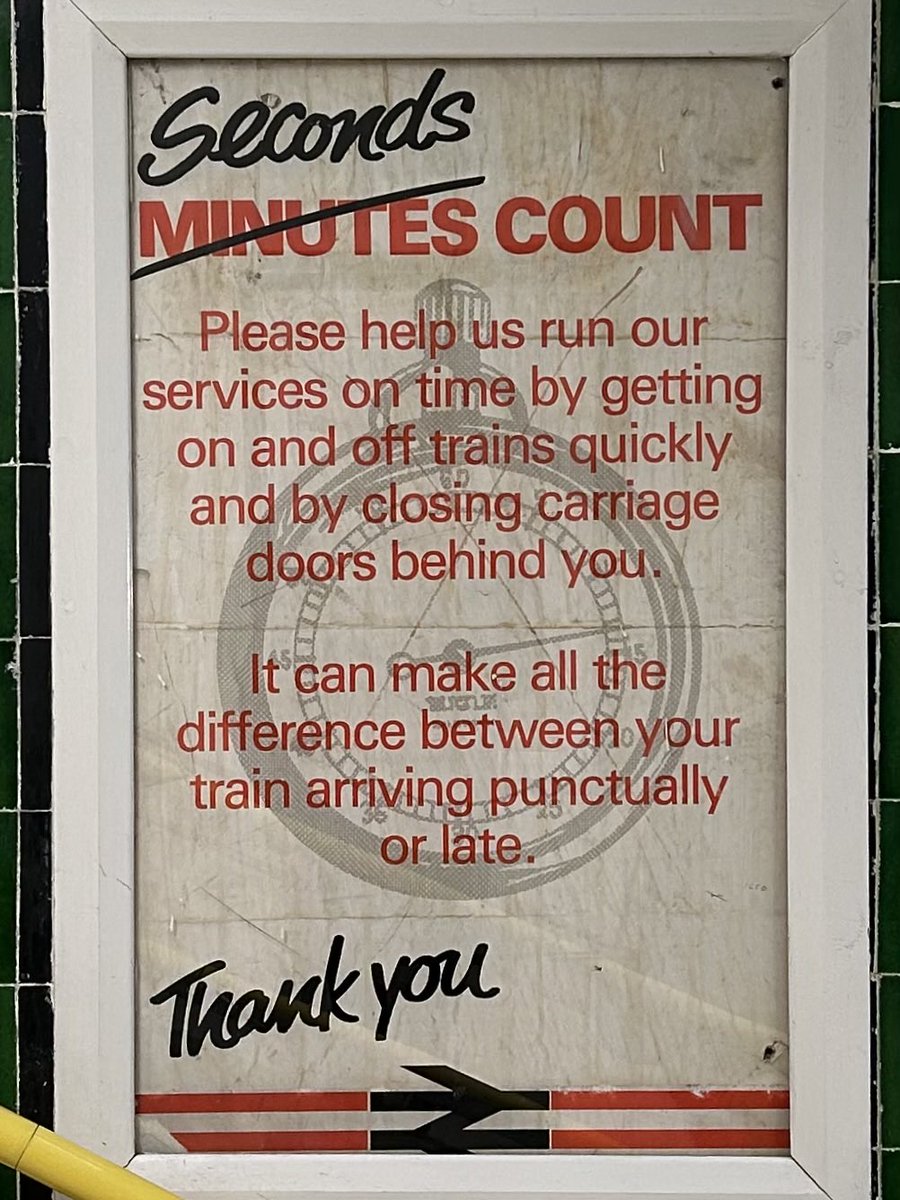
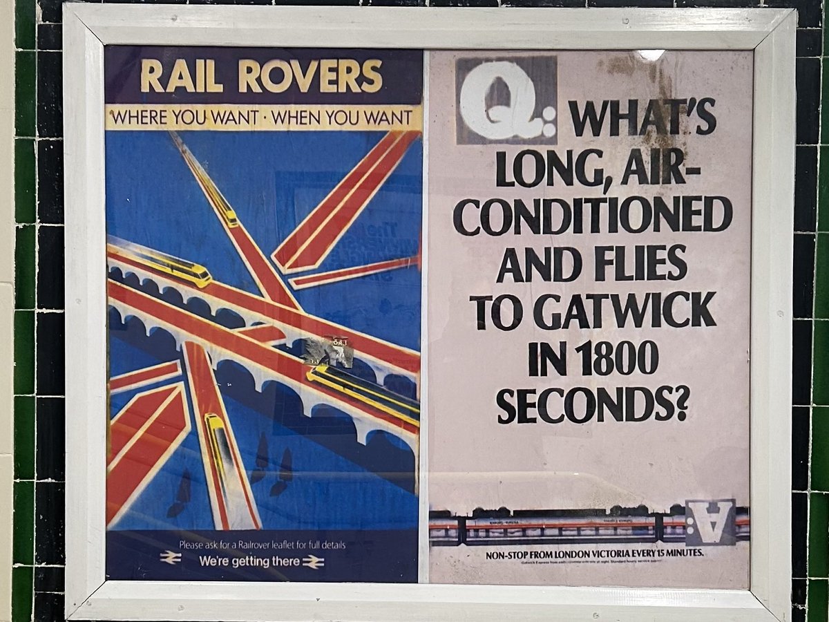
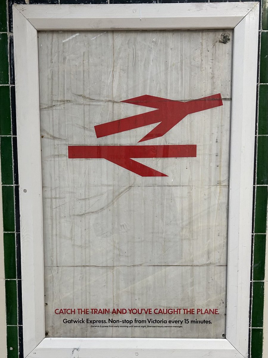
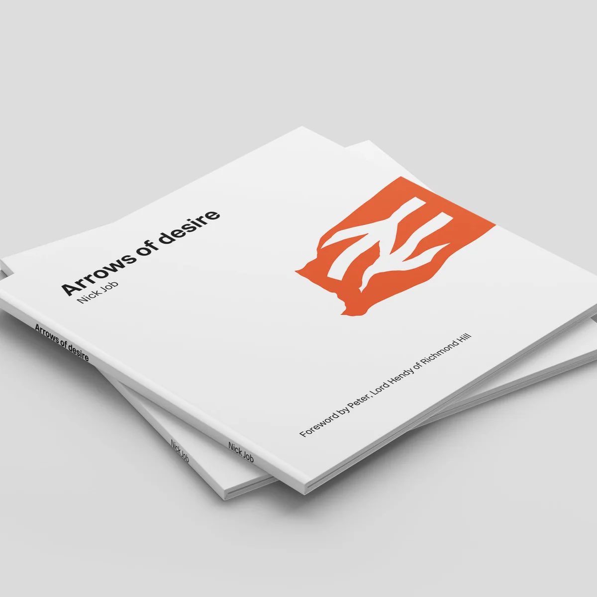
‘Arrows of desire’, a book all about the illustrious British Rail symbol, published by the modernist® @modernistmag is now available for pre-order at…
https://t.co/r7BcYhHpVg
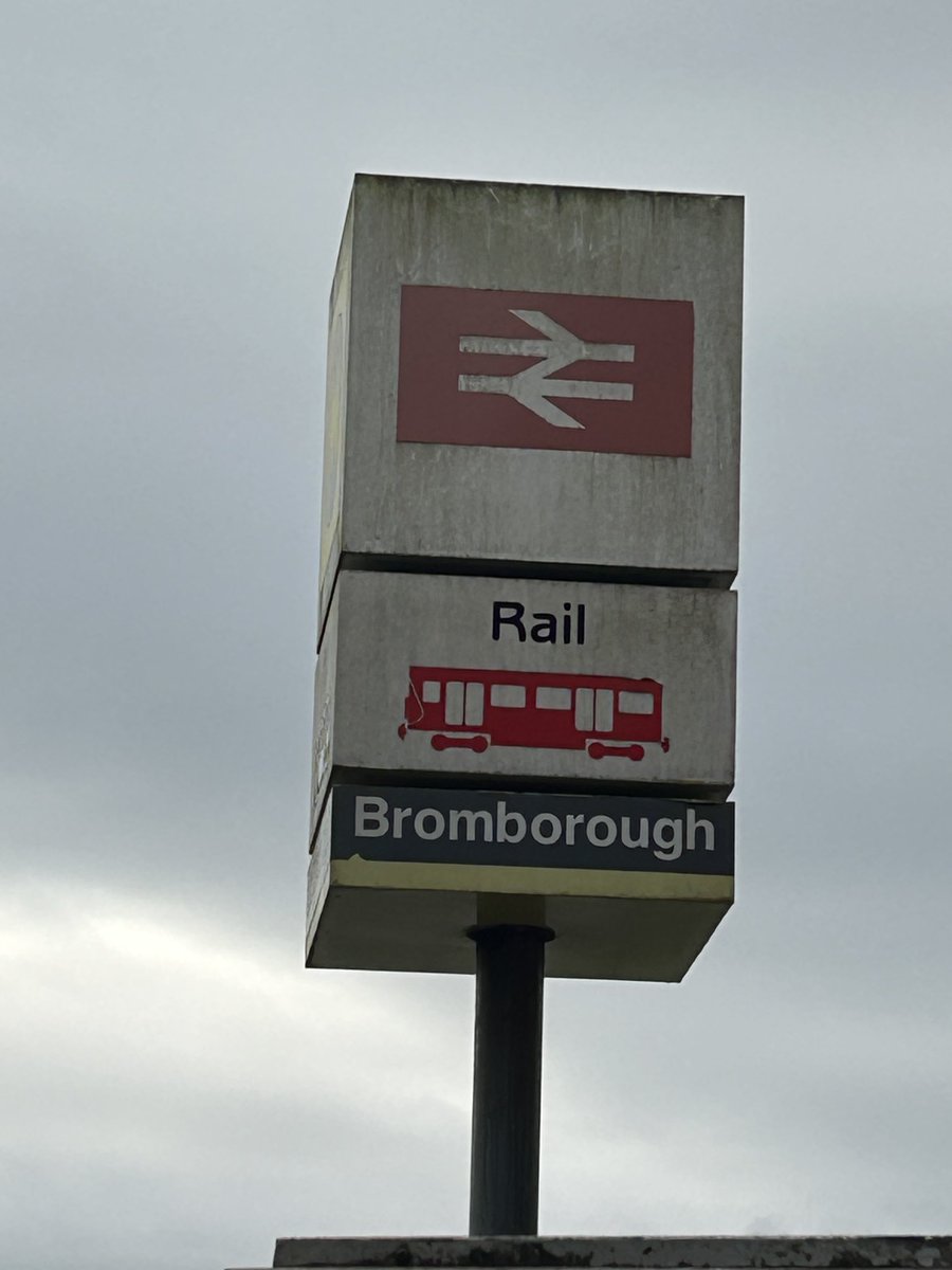
Network NorthWest (the short-lived branding used for Provincial services in parts of the north west of England, introduced in May 1989 I think) lives on! Ignore the fat British Rail double arrow and the flower! 😂 @_doublearrow
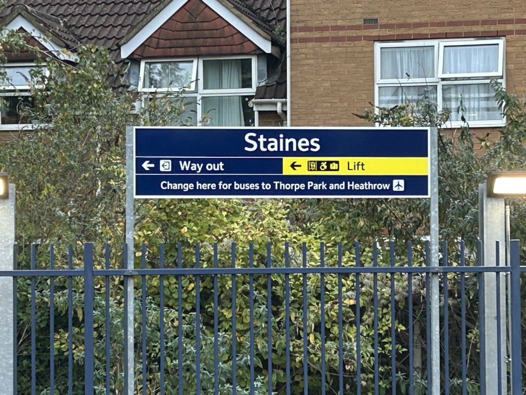
@RPMarks@ParallaxFluxTX I think that sign has too much information on it which probably isn’t helping; if the RA2 typeface is used as part of the new overall scheme I think it works fine
A digital facsimile of the forerunner to Jock Kinneir and Margaret Calvert’s Heath/Rail/BAA Alphabet; Airport by Revolver Type leaning heavily into the lettering devised in 1961 by Matthew Carter for Colin Forbes’ signage at the Oceanic Terminal (T3) at London [Heathrow] Airport
Airport - A new typeface family.
A digital reimagination of Matthew Carter’s alphabet for London Airport.
Originally drawn in 1961 for the wayfinding system in the newly built Oceanic Terminal, today known as Heathrow Terminal 3.
Available now from https://t.co/gS1BiPwfxg
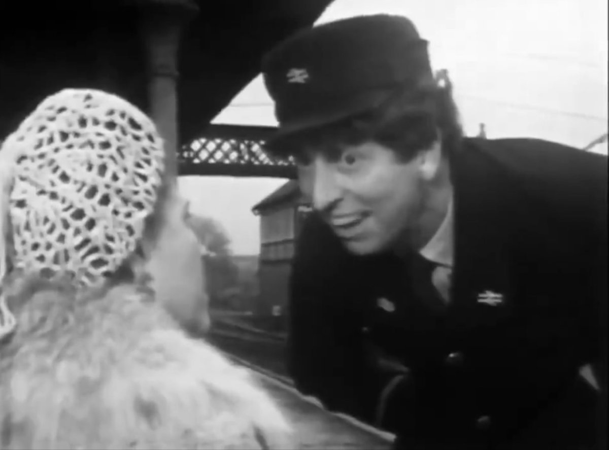
Since Tom Baker is trending, it's only right and proper to once again enjoy his brief scene-stealing performance opposite Sidney James and Peggy Mount in George and The Dragon (3rd February 1968).
Good morning everyone. As was usual, the Crewe Works open days were superb affairs, giving the general public a fascinating glimpse behind the scenes. One of the undoubted stars of the 1984 open day was 56133 'Crewe Locomotive Works', seen here just after the naming ceremony 😉👍