-34% de clics sur la position #1 Google
C'est ce que montre une étude réalisée par Ahrefs en 2025 sur l'impact des résumés IA dans les résultats de recherche
En gros, ça veut dire que vos prospects reçoivent déjà leur réponse avant même d'arriver sur votre site.
Bientôt, la LP ne sera plus le point d'entrée vers un produit ou service, le premier contact se fera ailleurs : moteurs de recherche avec IA, ChatGPT, Perplexity, Claude, etc.
Ça ressemble au début de la fin pour les sites web et leur UI léchée.
Mais perso, j'ai envie de croire que non.
Certes le premier point d'entrée vers un produit ne sera bientôt plus le site web.
Mais ce dernier aura toujours un rôle crucial. Il deviendra une couche de confiance et d'action, plutôt que le canal principal de découverte.
Pour s'adapter, il faut repenser l'UX en deux branches :
🔹 L'AX (Agent eXperience) : l'expérience des agents IA qui extraient, citent et activent l'information
🔹 La HX (Human eXperience) : l'expérience humaine, là où l'utilisateur intéragit, décide, signe, paye
Il faut aussi repenser les landing pages. L'utilisateur va de plus en plus arriver informé sur une LP grâce au résumé IA qu'il aura déjà lu. Il aura moins besoin qu'on lui décrive le produit, mais cherchera plutôt à passer directement à l'action.
Le paysage digital évolue. Les sites web commencent à perdre leur position hégémonique en tant que première porte d'entrée.
À nous designers de comprendre ces changements et de nous y adapter
📌 It’s amazing how complex a seemingly simple design like this is 🤯
I guess that’s why so many designers still get it wrong.
Here are some design guidelines I applied to fix this example:
1️⃣ Most icons are designed to be displayed at a small size, so a container is used to house the icons and provide a sense of scale.
2️⃣ Icons and text are left aligned to create a neat left edge. Reducing the number of different alignments helps to improve readability and aesthetics and also creates more room for text in this example.
3️⃣ Text links are made to describe their destination, so they’re scannable and can be read out of context by screen readers.
4️⃣ Text links are underlined to indicate they’re interactive, so those who are colour blind can distinguish them from other text.
5️⃣ Secondary text is less important than headings, so it’s made less prominent (using size and contrast) to create a clear visual hierarchy.
6️⃣ Secondary text line height is increased to 1.5 to improve readability.
7️⃣ Spacing inside each block is made to be less than the spacing between each block to create clear groups of related information. Spacing is based on a set of predefined spacing options to improve consistency.
Do you agree? What would you do differently? 🤔
[#UIdesign] : la cohérence d'une interface repose aussi sur le choix de la typo : un interlettrage plus étroit pour les titres que pour les textes
@AdhamDannaway https://t.co/vMyPLBlhKD
I'm obsessed with design psychology.
After 10 years of building products, I've discovered a UI/UX secret:
Dark Mode makes apps harder to use.
Here's why we're all getting Dark Mode wrong, how to use it properly, and what @Apple knew all along:
Free 🅰️/🅱️ test results collection
Learn design tricks to increase your conversion rates from this curated collection of A/B test results from top apps.
→ https://t.co/UmUQNWxvDx
💭 Prototyping isn’t just for user testing anymore → it’s for brainstorming ideas too.
Now, with AI, prototyping is so fast you can use it during ideation to explore multiple directions 🙌
In this demo, I used @ReaddyAI to generate a prototype of a pet care app, added a Lottie animation, then ‘continued to generate’ an additional 2 pages on the fly 🤯
Traditionally, during the ideation phase, we sketch out a bunch of concepts, then pick one to prototype and test with users before investing time and money into building it.
Sketching is a great low-cost way to generate ideas, but it’s hard to ‘feel’ a product from a sketch. And sometimes, your best ideas don’t make it past the early sketch phase.
Here’s how I use Readdy to brainstorm ideas:
1️⃣ Describe the website or app idea
2️⃣ Make tweaks through conversation
3️⃣ Extend the prototype and generate new pages on the fly
4️⃣ Rinse and repeat for each idea
Prototypes are no longer the output of your thinking, they’re part of it.
Give it a try and let me know what you think 👇
https://t.co/fBTk96A2PP
#ad #ux #uxdesign
@AdhamDannaway@ReaddyAI 😍Just huge! I'm still dreading the moment when the AI uses the brand's design system to produce and structure mock-ups. Or is that already the case?
#icon : super article sur les pictos avec ce bel exemple d'Heroicons qui gère les différents états selon la taille du picto :
https://t.co/nT5sXDvoh3
#UIdesign#heroicons#tailwind
Cards horizontales ou verticales : quel format choisir ?
On s'est tous posé la question ! Cet article explore les avantages et inconvénients de chaque approche. 🔍👇
https://t.co/DRrlomiTQc
#UXDesign#ProductDesign#EcommerceUX
@yashwanth941v Left! Because it's visually simpler. Every element has its place. The right-hand version is visually nicer, but more complex to maintain when there are lots of different products and photos. I'd just highlight the price
En UX, la loi de Miller conforte le fameux "Moins c'est plus" auquel j'ajouterais la nécessité de structurer et hiérarchiser @jeffdavidsond in @Prototypr https://t.co/Lw186XqE2N
#UX#loiMiller#ui
@BastiUi - Le côté timing/timer/chrono avec, anciennement, la type du "20" est abandonné et est compensé par une mise en évidence du mot "minutes"
- Simplicité est souvent synonyme d'efficacité, mais ça aurait mérité d'avoir un lettrage du "20" un tout petit peu plus graphique
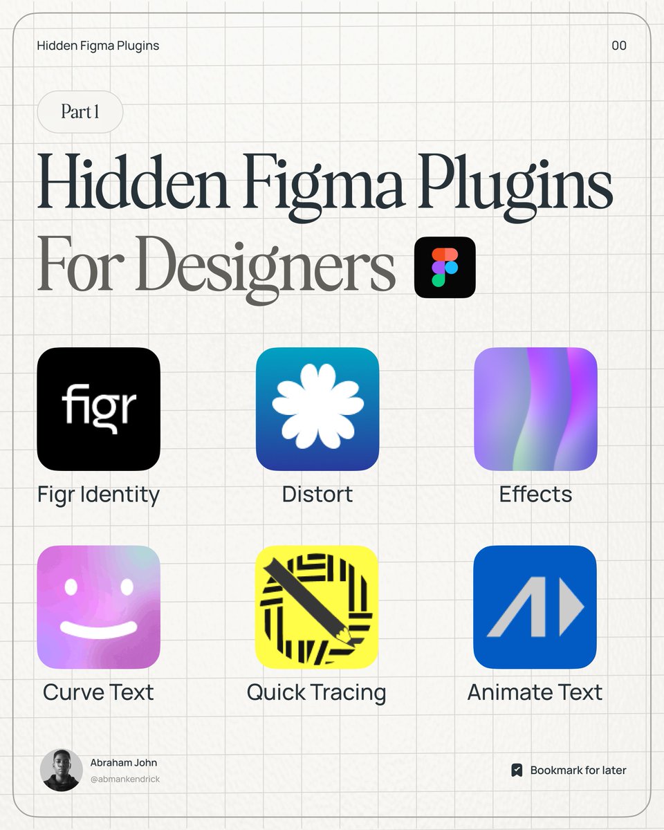


