🗳️📈🇫🇷Follow the French elections with @TheEconomist’s poll tracker. From @_rospearce, the excellent special-projects team and me https://t.co/1FD0mT8cBp
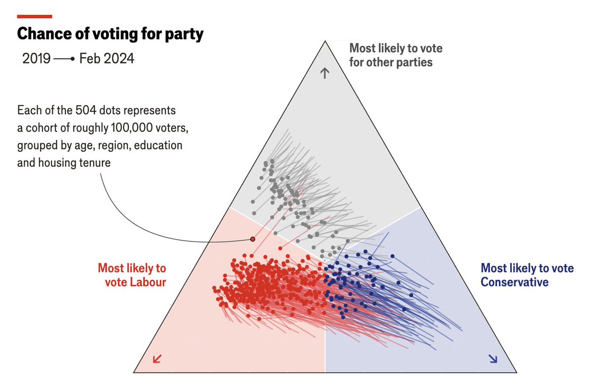
Explore how different groups are likely to vote in the next British election (spoiler: there's been a huge shift to Labour)
Had a lot of fun building this tool with @JamesFransham and @futuraprime#BuildABritishVoter https://t.co/awXfmxm4vN
This was a fascinating dataset to work with: explore who dating app users say they're willing to date vs who they actually like.
With @doug_dowson https://t.co/UMkV40UnPp
One of those maps that you can get lost in.
It uses satellite imagery originally designed to detect forest fires to map the extent of the war in Ukraine.
With @Sondreus and @MatterofMatt https://t.co/IVI3WEDXdU
There is no question about the bravery of Iranian protesters. But what is less clear is how widespread the protests are, if they are still growing - and how they might end. I looked at data on tens of thousands of events to find out (charts: @_rospearce ) https://t.co/zJw3IBfGEZ
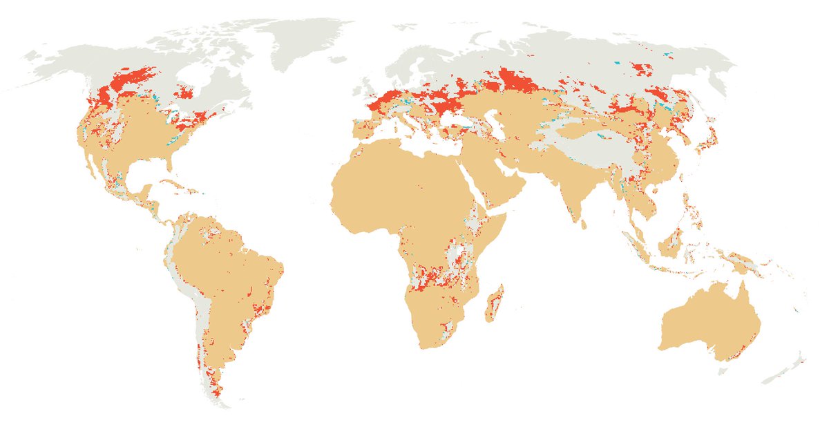
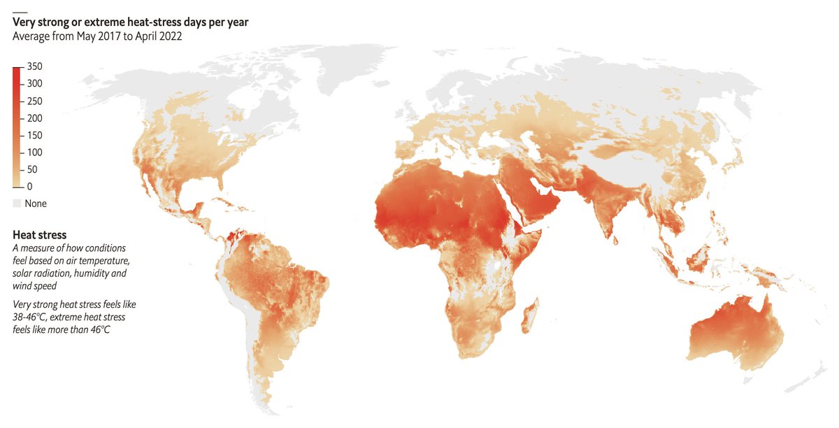
A draft of a map we didn't have space to include. It's interesting to see how the areas experiencing "very strong" or "extreme" heat stress have expanded north
🔴 New regions in 2017-22 compared with 1980-84
This map shows how many days of "very strong" or "extreme" heat stress each region had on average per year between 2017-22
#dataviz with @AinslieJstone https://t.co/MxylTWv6vH
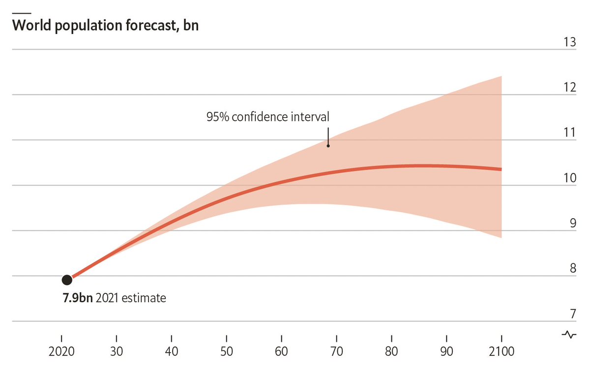
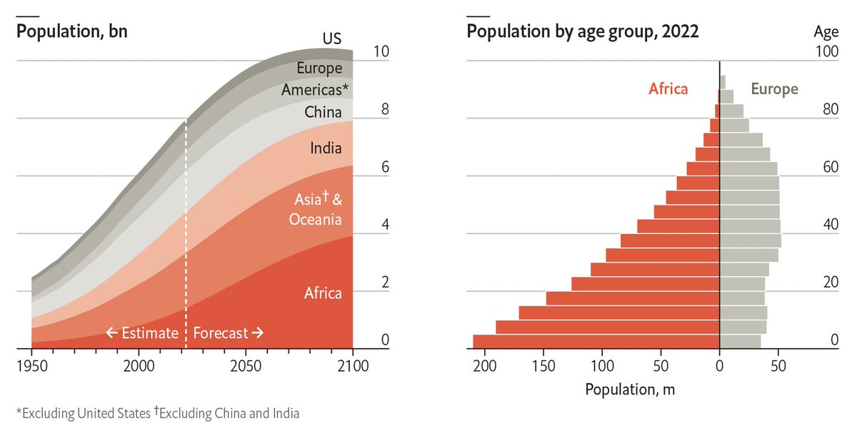
The distribution of humanity across the world is set to shift dramatically, according to the UN's population forecast.
As China shrinks, India will continue to add citizens.
The population of Europe, the world’s oldest region, is forecast to decline. Africa, the youngest region, will account for 25% of the world's population by 2050.
@bucknam I considered it but decided it looked fussy adding a halo to both. These connecting lines don't need to stand out as much. And yes it's best to avoid covering up the map below where possible
Nearly half of Mariupol's built-up area has been damaged 🔴 since the war began.
This map is so detailed that editing it was almost too much for my laptop
https://t.co/b1igoG8QaC
Most data comes with some uncertainty, yet it looks definitive when plotted on a chart. Making this uncertainty visible is one of the trickiest aspects of #dataviz
I've written a brief intro to some of our approaches @TheEconomist in our data newsletter https://t.co/t161JzTq3L