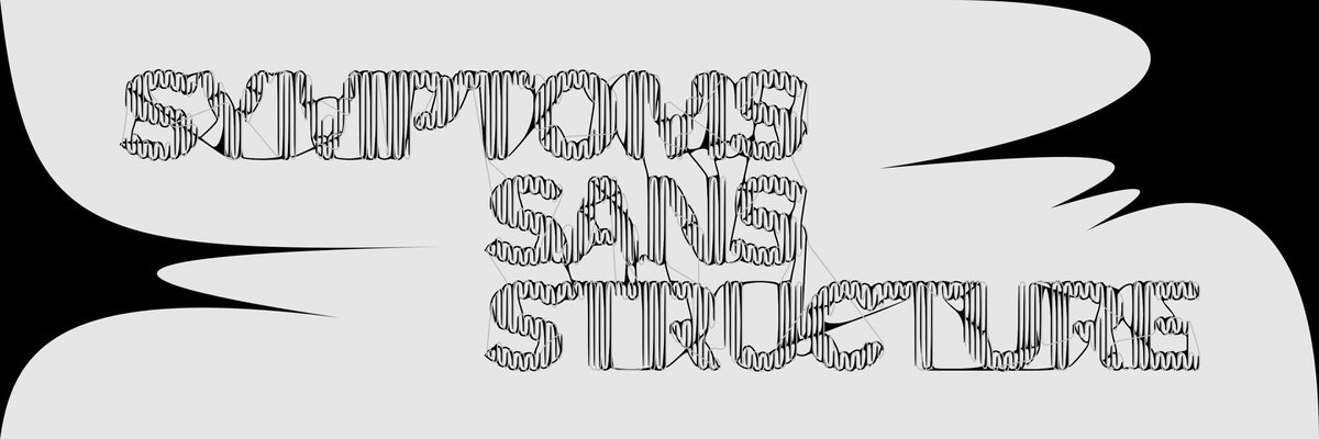
��︎ Symptoms sans Structure
‘Constructive criticism’ functions as an ideological tool—managing affect in the absence of critical infrastructure capable of holding contradiction, interpretation, and cultural labour.
https://t.co/bYvwsizBsq
While theoretically informed, the text was influenced by recent developments in TD, most notably those that attend not just to form but the full stack of typography (e.g. new licensing models like those developed by @abcdinamo and @nan_xyz_ and platforms @fonts_xyz
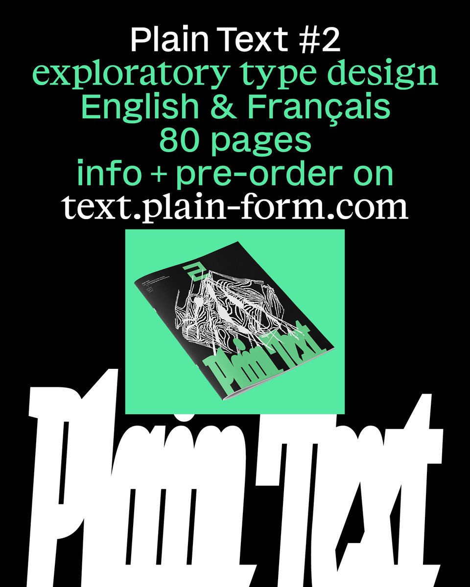
⁂ Constellating Typography, my essay that works towards a dialectical approach to typography is now published in Plain Text 2 by @plain_form a publication dedicated to exploratory design.
Order at https://t.co/k8kqZLzw1o
The youth mental health crisis speaks to the abnegation of responsibility among adults—liberals and leftists foremost. Expressions of distress in spectacle-oriented activities must be rejected for a mature, radical politics.
@bureaucatliu in Damage today
https://t.co/Xby02z9CJB
Thanks again to everyone who supported the first issue, we hope you'll enjoy this second one as much as we do!
If you want to pre-order: https://t.co/WSrc6uWM2M
https://t.co/WSrc6uWM2M
–
2nd issue is out for pre-orders! 😤
-
This second issue is out only 6 months after the first, and we're thrilled to continue on our journey for a weirder and more theoritical field of type design!
The first issue was sold out after just 3 months, thx!
@Tyler_A_Harper It’s what David Berry, professor of Digital Humanities, names the inversion which leads to post-consciousness
See: https://t.co/g8eAPACbX0
@beingandevent
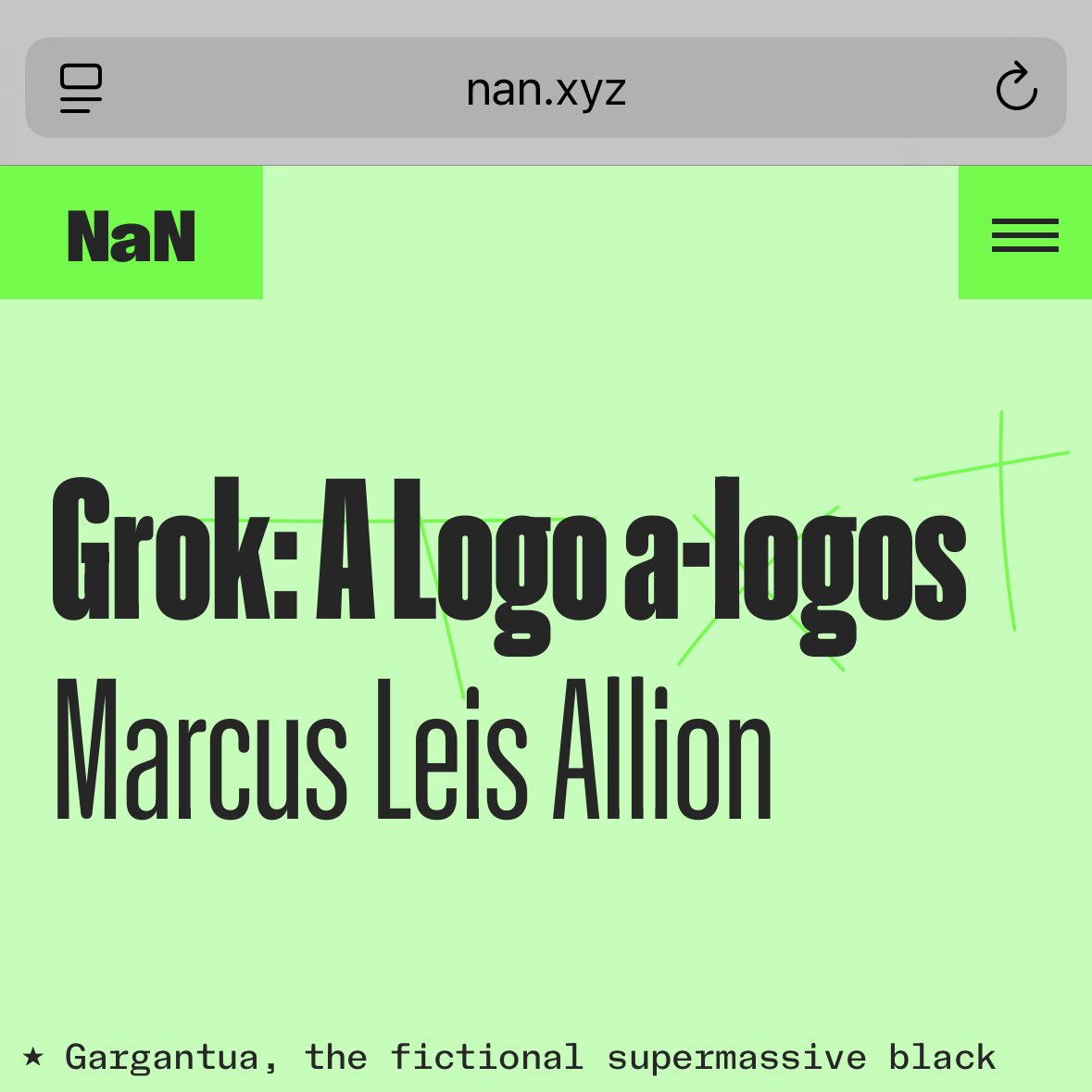
Hello, as a fellow subject to the truth of the Badiouian event, I thought you might be interested in this essay on the encyclopaedic ideology of the Grok logo in contrast to the truth of the ∅
https://t.co/LY5YFhtjpK
Grok: A Logo a-lóyos
https://t.co/LY5YFhtjpK
In this text, I explore how a seemingly simple graphic—the logo for xAI’s Grok—condenses and reveals the ideological logic of contemporary computation.
@nan_xyz_
@typographica Yes, otherwise they'd work slow on purpose... BTW this is why "logotypes" (sorts of multiple letters) never took off, even though they made great sense: printer's unions opposed the loss of income. Too efficient. :-/
A slide of French "logotypes" from my @ictvc talk of 2004:
Grok: A Logo a-λόγος
New essay coming soon
https://t.co/zHYJw4c9cO @nan_xyz_
Image: λόγος / logos (letters loosely based on Grok wordmark, designer unknown)