design is not the first thing i do for clients.
first, i need to understand the problem.
my process is simple:
→ intro call
we talk about the business, the goal, and where i can help.
→ scoping call
we map the project. timeline, features, use cases, icp and the main success metric.
→ proposal call
i walk through the plan, answer objections, and clear up anything i missed.
then i design.
because design without strategy is art, something that looks good but does not move the business.
this flow turns a painful inventory setup into 2 brain-dead steps:
bulk upload for pros, and
guided add missing info for edge cases
this effectively cuts the cost of switching software providers to essentially zero.
Well … here is where the magic happens.
Feast your eyes on this beautiful mess, (it's a bit organized, which contradicts its definition… 🤔).
P.S. If I get a whopping 250 ‘👍’ in the comments, I might, just might, bind my soul to actually whip up the full internal app!
Mockups… oh, why on Earth would I love them? It’s not like they’re the pinnacle of creativity or anything!
I can’t get enough of those perfectly rendered images that make everything look way better than it actually is.
Who wouldn’t be obsessed, RIGHT?
tl;dr: I can’t show the internal tools I’ve shipped, so I’m re-imagining how the world’s biggest companies would actually design theirs.
Week 1 of the journey to my first 20k+ retainer.
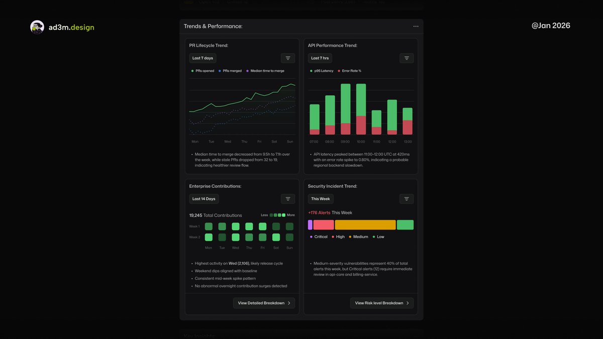
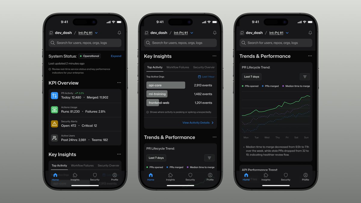
Here the PR lifecycles show if teams are actually shipping, API performance exposes platform health, security trends reveal risk direction, and Heatmap shows if the engineer is alive, or busy ...
tl;dr: I can’t show the internal tools I’ve shipped, so I’m re-imagining how the world’s biggest companies would actually design theirs.
Week 1 of the journey to my first 20k+ retainer.
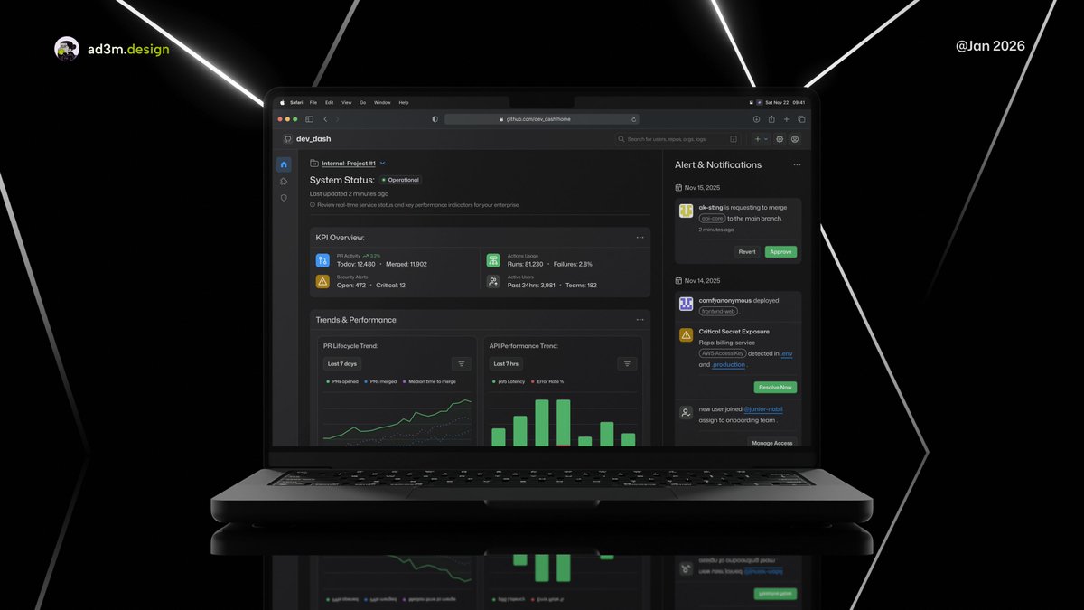
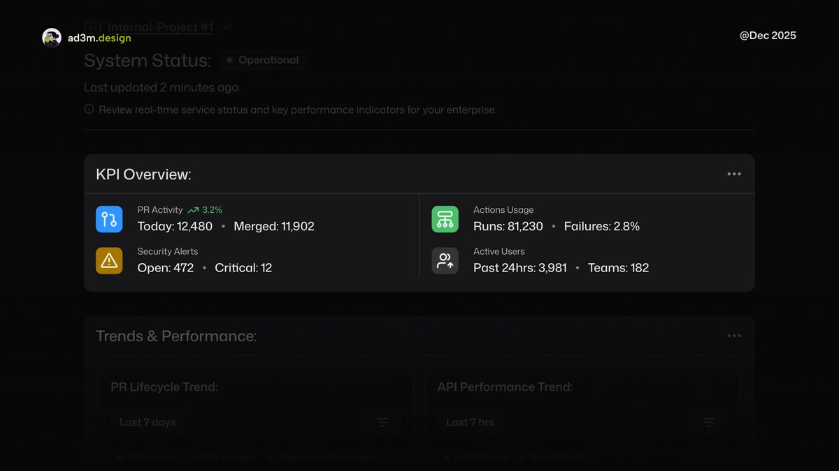
The spine of my @github's Enterprise Metrics Tool.
Where PRs show velocity. Actions expose CI/CD health and cost. Security Alerts scream risk. Active Users reveal real engagement.
Clear signals, better decisions.
tl;dr: I can’t show the internal tools I’ve shipped, so I’m re-imagining how the world’s biggest companies would actually design theirs.
Week 1 of the journey to my first 20k+ retainer.
This is the spine of my @github's Enterprise Metrics Tool.
PRs show velocity. Actions expose CI/CD health and cost. Security Alerts scream risk. Active Users reveal real engagement.
Clear signals, better decisions.
tl;dr: I can’t show the internal tools I’ve shipped, so I’m re-imagining how the world’s biggest companies would actually design theirs.
Week 1 of the journey to my first 20k+ retainer.
@_ka1eab@github I’m really trying to make this more practical. When it’s actually implemented, it needs to make real-world sense.
My goal is to bring practical design together with solid technical functionality and introduce it to the mainstream.
Wish me luck…
Building internal tools is easy. Making them useful is rare.
After reviewing endless dashboards, the pattern is clear: data overload, zero clarity.
This is how I’d design @github's Enterprise Metrics Tool ... scan repos, surface risk, cut the noise.
tl;dr: I thought Jitter would be a headache to learn because there weren’t many tutorials.
I avoided it for months.
Then I tried it… and yeah, I was completely wrong.
It’s great.
Apparently, good motion design (thanks, @jittervideo) makes the whole experience feel better.
Who knew.
P.S. For the nitpickers, it’s dev_dash, not dev ash.
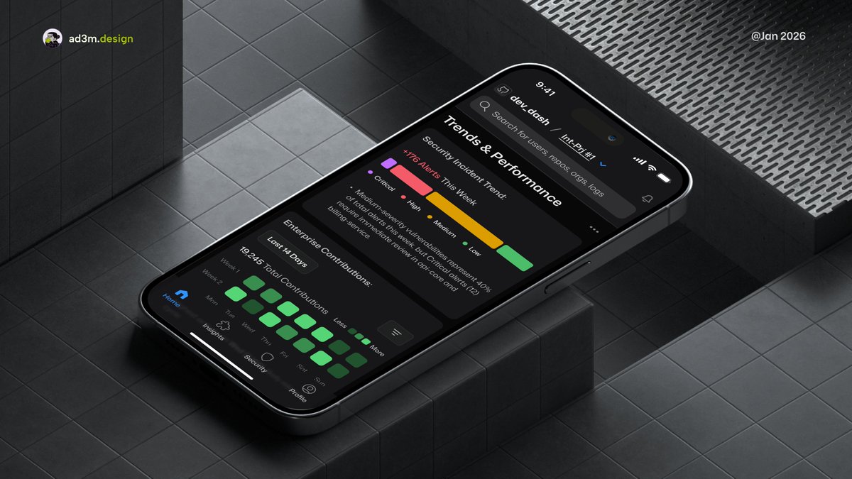
Most dashboards are desktop-first for a reason.
But there are moments when you want a quick glance without reaching for your laptop, especially when you’re the lucky engineer on-call for the week.
Apparently, good motion design (thanks, @jittervideo ) makes the whole experience feel better,
Who knew...
P.S. For the nitpickers, it’s dev_dash, not dev ash...
Most dashboards are desktop-first for a reason.
But there are moments when you want a quick glance without reaching for your laptop, especially when you’re the lucky engineer on-call for the week.
Most dashboards are desktop-first for a reason.
But there are moments when you want a quick glance without reaching for your laptop, especially when you’re the lucky engineer on-call for the week.
Most dashboards are desktop-first for a reason.
But there are moments when you want a quick glance without reaching for your laptop, especially when you’re the lucky engineer on-call for the week.
tl;dr: I can’t show the internal tools I’ve shipped, so I’m re-imagining how the world’s biggest companies would actually design theirs.
Week 1 of the journey to my first 20k+ retainer.
tl;dr: I thought Jitter would be a headache to learn because there weren’t many tutorials.
I avoided it for months.
Then I tried it… and yeah, I was completely wrong.
It’s great.
tl;dr: I thought Jitter would be a headache to learn because there weren’t many tutorials.
I avoided it for months.
Then I tried it… and yeah, I was completely wrong.
It’s great.
tl;dr: I can’t show the internal tools I’ve shipped, so I’m re-imagining how the world’s biggest companies would actually design theirs.
Week 1 of the journey to my first 20k+ retainer.
tl;dr: I can’t show the internal tools I’ve shipped, so I’m re-imagining how the world’s biggest companies would actually design theirs.
Week 1 of the journey to my first 20k+ retainer.